
Recommended
More Related Content
What's hot
What's hot (20)
Similar to Mag Front Cover Elements
Similar to Mag Front Cover Elements (20)
More from barrettlasharn
More from barrettlasharn (18)
Mag Front Cover Elements
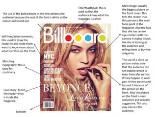
- 1. Main image; usually Title/Masthead; this is the biggest picture on used so that the The use of the bold colours in the title attracts the the front cover. This audience know what the audience because the rest of the font is white so the tells the reader that magazine is called colours will stand out this person is the main focal point of the magazine. Also the fact that she has centre Sell lines/advertisements, eye-contact with the this used to draw the camera it makes it look reader in and make them like she is looking at want to know more about the audience and what’s written on the front. telling them to buy the magazine The use of a close up Matching picture makes sure typography; this is that the audience can used for see exactly who it is continuity. even from afar so that if they happen to walk past it they are enticed to read it because of Lead story; to tell the person on the the reader what front. Also the picture is inside the on the front is very magazine. seductive and sexually suggestive. This also may interest the Barcode audience.
- 2. Title/Masthead; his is normally in big, bold writing so that the 2nd story; this is used reader knows what its because the reader called. Some of the may not be name has been interested in the covered by the main main story so they image which means will use the second that the magazine is story to entice the well known enough reader to buy the for it to be recognised magazine. without seeing the whole of the name. Main image; the person The fact that the word on the front is normally “Virgin” in in bigger very well known in this handwriting and is in type of genre of music or a different colour just music in general. from the rest of the This person is also text makes it stand normally the main focal out. The colour used point of the magazine. counteracts the actual word because red Matching typography; represents danger this is to show continuity and romance and love on the magazine. whereas the word virgin represents a sense of innocence. The fact that he is wearing a red t-shirt make him stand out be because it is a very bold Barcode and bright colour. The fact that the colour of the t-shirt and the word “virgin” are the same shows that the story is somehow linked to him.
- 3. Main image; the fact that her hair is red Title/Masthead; the makes the picture fact that the writing stand out, also she is is written like its staring straight into graffiti shows that the camera which the target audience attracts the audience is possibly younger to it. She is doing a people. seductive look which may make the target audience more varied because females may Sell lines, this tells buy it because of the the audience what it stories inside whereas is going to entail. males may buy it 2nd story; this shows the because she is on the audience what else will front. be in the magazine. Matching typography; this makes the magazine look more organised. It also stands out from the rest of the writing that is white which means that these are Sell lines; these are used to the things that will attract the audiences interest the reader so attention if they aren’t they want to make it interested in the main story stand out so they will see it.