
Recommended
More Related Content
What's hot
What's hot (19)
Viewers also liked
Similar to Colour palette analysis
Similar to Colour palette analysis (20)
Recently uploaded
Recently uploaded (20)
Colour palette analysis
- 1. This colour palette uses simple colours that both contrast and compliment each other. The less vibrant colours such as grey, black and white would be used in the negative space and as a background for the main text which would be written in the brighter colours such as the yellow and blue. I would use the yellow for the masthead as it is the brightest and the blue for the subheadings as it draws the secondary focus as it is not as bright as the yellow. This palette revolves around the idea of hot colours, suggesting the idea of anger, aggression and passion. These are all key elements within the genre, however they might overpower the cover by putting too much into one small amount of space. There isn’t much of a contrast, but the black and white would stand against the hot colours and give them more of a bold edge. These colours are more earthy which link to the celestial, bohemian side of the indie rock genre. Whilst these colours connote a naturalistic theme, they don’t really imply the idea of rock very well as the genre tends to be quite bright and funky. However, if I chose to go for a softer feel when choosing my images and what tone the magazine cover will convey, this palette would work well as it is more of a calm, collective combination.
- 2. This palette has more of a bright, funky feel to it and would be effective if I were aiming it at a young audience of around 10-15 year olds. However, as my magazine will be aimed at a slightly older audience I think that this combination might look too child like and will therefore demean my audience. However, the colours work well together and might be better off being used on a double page spread to reflect an artist rather than the magazine itself. I think that this colour palette could be used for the magazine cover as it has contrasting and complimentary combination that would draw the audiences attention without being too ‘in your face’. The pink and green combination would work well for the masthead and headlines as they compliment each other and are bright and attractive. The other colours would be used in the background in order to make the brighter colours stand out. Orange in this combination looks a little odd and draws attention because of this. I would use this to my advantage and highlight special offers using it so that the reader will be drawn towards it. This combination is quite cartoon like and might suggest that it is a child’s magazine at it uses all of the primary colours which are bright and would make the page rather noisy and overpowering.
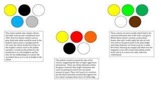
- 3. These colours are quite bold and edgy when put next to each other which implies separation and seriousness. However, at the same time, the yellow and red stand out very well against the black, white and grey creating a good contrast. I do feel that it might look too bold and might be harsh on the eyes when looking at a first glance. I really like this combination as it has elements of light against dark and the brighter colours aren’t too bright as to be harsh on the eyes but are bright enough to draw attention and look attractive at the same time. The colours are universal and don’t refer to any specific age group or gender which means I can widen my audience. This palette is also very attractive and pleasant on the eye. It uses the idea of bright colours against darker shades in order to draw attention which works well as the colours are also complimentary against the darker background.
- 4. I love this colour combination. The colours that would stand out and be used as the main text would be the pink, blue and white, they are both complimentary and universal and the fact that they aren’t extremely bright makes it nicer on the eyes. As the brighter colours are considered to be more common and can be found in most images, it will almost undoubtedly compliment the image I choose to have as my centre of visual interest as well as the rest of the text on the cover. They can also be used as reoccurring themes throughout the magazine.