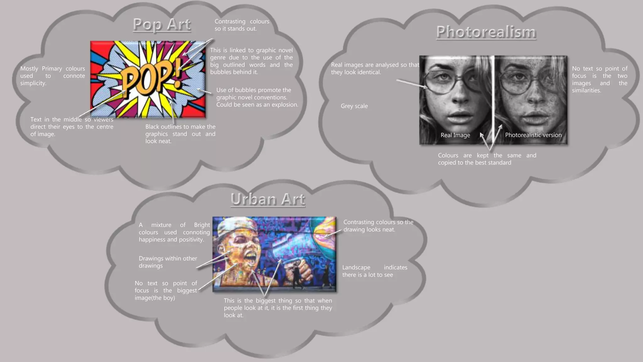
Black outlines to make the
graphics stand out and
look neat.
Contrasting colours
so it stands out.
Text in the middle so viewers
direct their eyes to the centre
of image. Real Image Photorealistic version
Real images are analysed so that
they look identical.
Colours are kept the same and
copied to the best standard
Mostly Primary colours
used to connote
simplicity.
This is linked to graphic novel
genre due to the use of the
big outlined words and the
bubbles behind it.
Use of bubbles promote the
graphic novel conventions.
Could be seen as an explosion.
A mixture of Bright
colours used connoting
happiness and positivity.
Drawings within other
drawings
Contrasting colours so the
drawing looks neat.
This is the biggest thing so that when
people look at it, it is the first thing they
look at.
Landscape indicates
there is a lot to see
Grey scale
No text so point of
focus is the two
images and the
similarities.
No text so point of
focus is the biggest
image(the boy)

Task 1b

  • 1.
    Black outlines tomake the graphics stand out and look neat. Contrasting colours so it stands out. Text in the middle so viewers direct their eyes to the centre of image. Real Image Photorealistic version Real images are analysed so that they look identical. Colours are kept the same and copied to the best standard Mostly Primary colours used to connote simplicity. This is linked to graphic novel genre due to the use of the big outlined words and the bubbles behind it. Use of bubbles promote the graphic novel conventions. Could be seen as an explosion. A mixture of Bright colours used connoting happiness and positivity. Drawings within other drawings Contrasting colours so the drawing looks neat. This is the biggest thing so that when people look at it, it is the first thing they look at. Landscape indicates there is a lot to see Grey scale No text so point of focus is the two images and the similarities. No text so point of focus is the biggest image(the boy)