SlideShare a Scribd company logo
1 of 4
The colour scheme of red, black and white gives the
magazine a ‘dangerous’ feel as red symbolises danger
Whilst black symbolises death and rebellion. Also, all the
colours are quite masculine and, therefore, appeals to a
male audience. There is a secondary colour of yellow but it
fails to stand out like the red and black, making the yellow
sell lines less important then the red and black sell lines.
The colour scheme of red, black and light purple gives
the magazine a more feminine feel as the red is faded
and the faded purple is more appealing to females. This
makes readers feel that the red symbolises passion and
love rather then danger as it is less in your face. The
use of the black on the list of celebrities makes it stand
out to the reader and encourages them to read it if
they notice their idol on the front cover.
The colour scheme of yellow, red and black makes the
readers assume that the magazine is going to focus on
rock music as those colours are associated with that
genre. These colours make the front cover look very busy
as they almost clash against each other, making the
magazine appeal less to an older audience and more to a
younger audience of 16-25 as they like busy and informal
covers.
These colours wouldn’t work well as a colour scheme as
they are all bold and would clash together. This would
cause the page to look crowded and make it hard to
concentrate as everything would stand out. Also, these
colours alone do not work well in a magazine as they
are not appealing to the eye in text.
These colours work well together but wouldn’t suit
my magazine as they can’t be associated with the
rock/pop genre. These colours would fit more in a
magazine focusing on pop as they appeal to a
younger audience of 11-16 with girls most likely being
to majority of the readers as they are feminine
colours. This would also be a problem if it was the
colour scheme of my magazine as I wasn’t it to appeal
to both male and female.
These colours would suit my magazine as they can be associated
with both pop and rock and are unisex colours, meaning they
will appeal to both male and female. They will attract people
around 16-25 as they are bright colours (off putting to an older
generation) but aren’t considered ‘baby’ colours, meaning they
don’t really appeal to younger people such as children.
Also, the white allows the green and yellow to stand out so the
page won’t clash with too much colour like the green, orange
and blue colour scheme.

More Related Content

What's hot

Task two Evaluation
Task two Evaluation Task two Evaluation
Task two Evaluation Pancakes31
 
Cd Covers Powerpoint
Cd Covers PowerpointCd Covers Powerpoint
Cd Covers Powerpointwhateverestt
 
Ppt double page spread
Ppt   double page spreadPpt   double page spread
Ppt double page spreadAsmaSabir
 
Magazine Covers Analysis
Magazine Covers AnalysisMagazine Covers Analysis
Magazine Covers AnalysisLaura Burgess
 
Masthead analysis
Masthead analysisMasthead analysis
Masthead analysistps_caprice
 
Evaluation question 2
Evaluation question 2Evaluation question 2
Evaluation question 2Lauren Walton
 
Magazine analysis
Magazine analysisMagazine analysis
Magazine analysisShazgreen17
 
Mumford & Sons
Mumford & SonsMumford & Sons
Mumford & SonsZac
 
Brand identity and mode of address analysis
Brand identity and mode of address analysisBrand identity and mode of address analysis
Brand identity and mode of address analysisginagoodall
 
Evaluation Activity 2
Evaluation Activity 2Evaluation Activity 2
Evaluation Activity 2animalbod
 

What's hot (18)

Task two Evaluation
Task two Evaluation Task two Evaluation
Task two Evaluation
 
Cd Covers Powerpoint
Cd Covers PowerpointCd Covers Powerpoint
Cd Covers Powerpoint
 
Ray and amarni
Ray and amarniRay and amarni
Ray and amarni
 
Question 2
Question 2Question 2
Question 2
 
Ppt double page spread
Ppt   double page spreadPpt   double page spread
Ppt double page spread
 
Question 2
Question 2Question 2
Question 2
 
Magazine Covers Analysis
Magazine Covers AnalysisMagazine Covers Analysis
Magazine Covers Analysis
 
Task 5
Task 5Task 5
Task 5
 
Contents
ContentsContents
Contents
 
Masthead analysis
Masthead analysisMasthead analysis
Masthead analysis
 
Evaluation question 2
Evaluation question 2Evaluation question 2
Evaluation question 2
 
Cover 3
Cover 3Cover 3
Cover 3
 
Magazine analysis
Magazine analysisMagazine analysis
Magazine analysis
 
Mumford & Sons
Mumford & SonsMumford & Sons
Mumford & Sons
 
Question 2
Question 2Question 2
Question 2
 
Brand identity and mode of address analysis
Brand identity and mode of address analysisBrand identity and mode of address analysis
Brand identity and mode of address analysis
 
Evaluation Activity 2
Evaluation Activity 2Evaluation Activity 2
Evaluation Activity 2
 
Cd cover analysis
Cd cover analysisCd cover analysis
Cd cover analysis
 

Viewers also liked

Technologies i have used
Technologies i have usedTechnologies i have used
Technologies i have usedsomwatkins
 
Audience Profile
Audience ProfileAudience Profile
Audience Profilesomwatkins
 
Britney spears Evaluation
Britney spears EvaluationBritney spears Evaluation
Britney spears Evaluationsomwatkins
 
Audience Profile
Audience ProfileAudience Profile
Audience Profilesomwatkins
 
Britney spears evaluation
Britney spears evaluationBritney spears evaluation
Britney spears evaluationsomwatkins
 
Britney spears evaluation
Britney spears evaluationBritney spears evaluation
Britney spears evaluationsomwatkins
 
Audience For Music Videos
Audience For Music VideosAudience For Music Videos
Audience For Music Videossomwatkins
 
Britney Spears Evaluation
Britney Spears EvaluationBritney Spears Evaluation
Britney Spears Evaluationsomwatkins
 
Questionnaire Results
Questionnaire ResultsQuestionnaire Results
Questionnaire Resultssomwatkins
 
Venue Finding - A guide to room layouts
Venue Finding -  A guide to room layoutsVenue Finding -  A guide to room layouts
Venue Finding - A guide to room layoutsIn 2 Events Limited
 
Britney Spears Replica Evaluation
Britney Spears Replica EvaluationBritney Spears Replica Evaluation
Britney Spears Replica Evaluationsomwatkins
 
Artist profile
Artist profile Artist profile
Artist profile somwatkins
 

Viewers also liked (13)

Technologies i have used
Technologies i have usedTechnologies i have used
Technologies i have used
 
Audience Profile
Audience ProfileAudience Profile
Audience Profile
 
Britney spears Evaluation
Britney spears EvaluationBritney spears Evaluation
Britney spears Evaluation
 
Audience Profile
Audience ProfileAudience Profile
Audience Profile
 
Britney spears evaluation
Britney spears evaluationBritney spears evaluation
Britney spears evaluation
 
Britney spears evaluation
Britney spears evaluationBritney spears evaluation
Britney spears evaluation
 
Beruby Branding
Beruby BrandingBeruby Branding
Beruby Branding
 
Audience For Music Videos
Audience For Music VideosAudience For Music Videos
Audience For Music Videos
 
Britney Spears Evaluation
Britney Spears EvaluationBritney Spears Evaluation
Britney Spears Evaluation
 
Questionnaire Results
Questionnaire ResultsQuestionnaire Results
Questionnaire Results
 
Venue Finding - A guide to room layouts
Venue Finding -  A guide to room layoutsVenue Finding -  A guide to room layouts
Venue Finding - A guide to room layouts
 
Britney Spears Replica Evaluation
Britney Spears Replica EvaluationBritney Spears Replica Evaluation
Britney Spears Replica Evaluation
 
Artist profile
Artist profile Artist profile
Artist profile
 

Similar to Colour palette evaluation

Researching magazine genres
Researching magazine genresResearching magazine genres
Researching magazine genrespangratiou
 
Magazine research
Magazine researchMagazine research
Magazine researchlivbarnes
 
Task 5 – deciding which genre and style
Task 5 – deciding which genre and styleTask 5 – deciding which genre and style
Task 5 – deciding which genre and styleAS Media Column D
 
Task 5 – deciding which genre and style
Task 5 – deciding which genre and styleTask 5 – deciding which genre and style
Task 5 – deciding which genre and styleAS Media Column D
 
Task 5 – deciding which genre and style
Task 5 – deciding which genre and styleTask 5 – deciding which genre and style
Task 5 – deciding which genre and styleAS Media Column D
 
Masthead analysis (1)
Masthead analysis (1)Masthead analysis (1)
Masthead analysis (1)10bertal
 
Presentation1111
Presentation1111Presentation1111
Presentation1111sam_sasi
 
Signs and Signifiers
Signs and SignifiersSigns and Signifiers
Signs and Signifiersanniemyatt
 
Magazine covers
Magazine coversMagazine covers
Magazine coversffion001
 
Double page analysis
Double page analysisDouble page analysis
Double page analysisarnellgrace
 
Masthead analysis
Masthead analysisMasthead analysis
Masthead analysiscassidy111
 
Masthead anaylsis
Masthead anaylsisMasthead anaylsis
Masthead anaylsiseilisbell
 
Analysis double page spread
Analysis   double page spreadAnalysis   double page spread
Analysis double page spreademrhodes95
 
Deconstructions
DeconstructionsDeconstructions
DeconstructionsMeg Lily
 

Similar to Colour palette evaluation (20)

Researching magazine genres
Researching magazine genresResearching magazine genres
Researching magazine genres
 
Magazine research
Magazine researchMagazine research
Magazine research
 
Media q 2
Media q 2Media q 2
Media q 2
 
Rate cards
Rate cardsRate cards
Rate cards
 
Task 5 – deciding which genre and style
Task 5 – deciding which genre and styleTask 5 – deciding which genre and style
Task 5 – deciding which genre and style
 
Task 5 – deciding which genre and style
Task 5 – deciding which genre and styleTask 5 – deciding which genre and style
Task 5 – deciding which genre and style
 
Task 5 – deciding which genre and style
Task 5 – deciding which genre and styleTask 5 – deciding which genre and style
Task 5 – deciding which genre and style
 
Masthead analysis (1)
Masthead analysis (1)Masthead analysis (1)
Masthead analysis (1)
 
Presentation1111
Presentation1111Presentation1111
Presentation1111
 
Question 2
Question 2Question 2
Question 2
 
Signs and Signifiers
Signs and SignifiersSigns and Signifiers
Signs and Signifiers
 
Magazine covers
Magazine coversMagazine covers
Magazine covers
 
Magazine covers
Magazine coversMagazine covers
Magazine covers
 
Double page analysis
Double page analysisDouble page analysis
Double page analysis
 
Masthead analysis
Masthead analysisMasthead analysis
Masthead analysis
 
Masthead anaylsis
Masthead anaylsisMasthead anaylsis
Masthead anaylsis
 
Analysis double page spread
Analysis   double page spreadAnalysis   double page spread
Analysis double page spread
 
Q2
Q2Q2
Q2
 
Q2
Q2Q2
Q2
 
Deconstructions
DeconstructionsDeconstructions
Deconstructions
 

More from somwatkins

Music institutions
Music institutionsMusic institutions
Music institutionssomwatkins
 
Conventions Evaluation
Conventions EvaluationConventions Evaluation
Conventions Evaluationsomwatkins
 
Ancillary pack evaluations
Ancillary pack evaluationsAncillary pack evaluations
Ancillary pack evaluationssomwatkins
 
Music institutions
Music institutionsMusic institutions
Music institutionssomwatkins
 
Ancillary pack
Ancillary packAncillary pack
Ancillary packsomwatkins
 
Britney spears Evaluation
Britney spears EvaluationBritney spears Evaluation
Britney spears Evaluationsomwatkins
 
Inspiration For My Music Video
Inspiration For My Music VideoInspiration For My Music Video
Inspiration For My Music Videosomwatkins
 

More from somwatkins (8)

Music institutions
Music institutionsMusic institutions
Music institutions
 
Conventions Evaluation
Conventions EvaluationConventions Evaluation
Conventions Evaluation
 
Ancillary pack evaluations
Ancillary pack evaluationsAncillary pack evaluations
Ancillary pack evaluations
 
Music institutions
Music institutionsMusic institutions
Music institutions
 
Ancillary pack
Ancillary packAncillary pack
Ancillary pack
 
Britney spears Evaluation
Britney spears EvaluationBritney spears Evaluation
Britney spears Evaluation
 
Inspiration For My Music Video
Inspiration For My Music VideoInspiration For My Music Video
Inspiration For My Music Video
 
IMOVIE
IMOVIEIMOVIE
IMOVIE
 

Colour palette evaluation

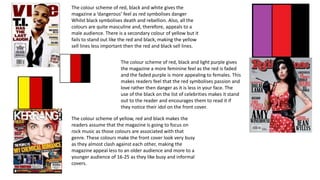
  • 1. The colour scheme of red, black and white gives the magazine a ‘dangerous’ feel as red symbolises danger Whilst black symbolises death and rebellion. Also, all the colours are quite masculine and, therefore, appeals to a male audience. There is a secondary colour of yellow but it fails to stand out like the red and black, making the yellow sell lines less important then the red and black sell lines. The colour scheme of red, black and light purple gives the magazine a more feminine feel as the red is faded and the faded purple is more appealing to females. This makes readers feel that the red symbolises passion and love rather then danger as it is less in your face. The use of the black on the list of celebrities makes it stand out to the reader and encourages them to read it if they notice their idol on the front cover. The colour scheme of yellow, red and black makes the readers assume that the magazine is going to focus on rock music as those colours are associated with that genre. These colours make the front cover look very busy as they almost clash against each other, making the magazine appeal less to an older audience and more to a younger audience of 16-25 as they like busy and informal covers.
  • 2. These colours wouldn’t work well as a colour scheme as they are all bold and would clash together. This would cause the page to look crowded and make it hard to concentrate as everything would stand out. Also, these colours alone do not work well in a magazine as they are not appealing to the eye in text.
  • 3. These colours work well together but wouldn’t suit my magazine as they can’t be associated with the rock/pop genre. These colours would fit more in a magazine focusing on pop as they appeal to a younger audience of 11-16 with girls most likely being to majority of the readers as they are feminine colours. This would also be a problem if it was the colour scheme of my magazine as I wasn’t it to appeal to both male and female.
  • 4. These colours would suit my magazine as they can be associated with both pop and rock and are unisex colours, meaning they will appeal to both male and female. They will attract people around 16-25 as they are bright colours (off putting to an older generation) but aren’t considered ‘baby’ colours, meaning they don’t really appeal to younger people such as children. Also, the white allows the green and yellow to stand out so the page won’t clash with too much colour like the green, orange and blue colour scheme.