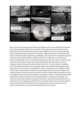
1. Here, you can see the final outcome for Ben and I’s Digipak. As you can see, following from previous
work, we have decided to add in a few extra effects. The changes that were made was a tearing
effect that was placed in three different sections of the Digipak. We have also included a barcode
and licencing brand images on the back of our Digipak.I suggested the idea of a tearing look to ben
and also created this idea alongside him using Photoshop. The reason for the tearing effect would be
to connote an idea towards a passive audience of the inner message that our song is trying to
portray. Throughout Ben and I’s music video, through the lyrics and visuals, there is a clear message
towards the main charcters brother. By using this tearing effect this then allows for the inner
message to show and also helps to links the visuals to the lyrics. The effect allows for something
more interesting to beoverlaid across the location imagery. Even though the photographs capture
the essence of the music video connoting ideas of sorrow and depression, from including the effect
it looks realistic and worked more effective that just having words written across the image. As for
the Brand images on the back this was purely done to portray a realistic effect that would be seen on
every Digipak for legal reason for the production and selling of a product. One effect that Ben added
towards the Final product would be the CD shadowed effect on one section of the Digipak. The
reason he has done this would be to connote to the audience where the CD would be placed. From
having the Lyrics in the background, behind the CD, means that when the passive audience take the
CD and are then directed towards the lyrics. This then makes the song more personal, not just
towards the brother but to the audience by allowing the lyrics to be shown.