1. How Effective is the Combination of your main product with ancillary texts?
For my media A2 assignment I was given the brief to create a music video that would mean all of the
planning, organising, promoting, filming and showcasing were down to myself and my partner Ben.
Upon creating this product I had three key sections on which to focus my work which would be
collaborated together to help promote my music video to an audience. The three stages are the
music video itself, the digipak creation and the magazine cover. Upon creating these three sectionsI
explored a variety of ways in which I could relate and link these products together. The main idea
was that I would keep the band the same and that I, playing the maincharacter of the music video,
would be the focusin all three aspectsof the media production. That way the audience can then
make the relation between all three aspects thus providing the use of
synergy. One band that has used this
idea of collaborating their music video,
digipak and magazine cover would be
‘The Black eyed Peas’ promoting their
latest album “The E-N-D”. From using
the band in each shot, there is a
relation in both the music video and
magazine. As you can see from a screen shot you can see that the
clothing is kept the same during their music video. This portrays the
use of combining their ancillary texts towards the music video. Between
the magazine cover and the album cover you can see that the band has
used the same font effect that would relate to one another. From this use
of same text I have also incorporated this idea to present collaboration.
From looking at this example I then developed a clearer understanding of
how these two ancillary texts can collaborate together.
A Way to relate the two ancillary texts together was to include a ripped
effect. This would then relate to the black eyed peas album and cover and their title featuring in
both ancillary texts. I incorporated this effect to express ideology of a hidden message within which
the audience could then relate to the music video with the main character singing a message
towards his dying brother. Ben and I chose to use this effect on the digipak and the magazine to
show a collaboration between the two ancillary texts.
2. One main aspect in which Iwould relate my ancillary texts to my music video would be the choice of
location. Throughout the music video the choice of location was key to exemplify the genre and
emotion of the song. Whilst on set for filming we came
across a field that portrayed isolation. Because the film
looks upon the brother dying the use of location then
helped to connote the ideology of depression. To link in
with this idea of a depressive state, for my digipak I
followed along with this idea and created a digipak that
would represent the bleakness and the loneliness of the
song. That way the character featured on the digipak
front cover would be portrayed alone. This would then
link back to the music video and the audience can
make the relation of this character losing his brother
and would understand why he isunaccompanied. To
get a depressive feel towards the audience I, along
with my fellow team mate Ben, chose to add in a
black and white overlay on the image, then to change
the contrast and exposure levels. That way the
bleakness really stood out. This would relate back to
the use of a black and white effect during the flash
back scenes through my music video. From using this,
the look that was createdreflected that of the character in the music video meaning the two sections
were conveying synergy through the feeling and the state in which the character is in.
For the magazine Thus use of location, being a secluded field aided in the
relation towards the digipak. This then created a depressive atmosphere.
From creating this bleak and dark atmosphere, with death hanging
between each key section, it helps to synergise the products and enables
them to work off one another to help promote the same idea, just with a
different style. This idea of representing the band in a depressive state
has been used by the band ‘U2’ and their album promoting “Joshua tree”.
For the digipak the cover is a depressing black and white image that
portrays the band in a melancholic state,
emphasised by their facial expressions,
which show hardly any emotion. The
location that is featured al relates to the.
The use of facial expressions was shown through my digipak with the
main character singing in the field. The use of mise en scene helped
to represent this bleak depression through a secluded land scape
with one lonely Joshua tree
that looks to be dying. The
magazine cover also features
this Joshua tree dying alone
and helps to incorporate ideas
of loneliness and death. Both
3. the digipak and magazine cover have collaborated in the promotion of their new album and Ben and
I have also incorporated these ideas expressed to help in the promotion of ours.
For the mise en scene that is featured throughout I used this idea of
seclusion and isolation to help link an idea between the three sections.
This was done through the use of location. When a shot comes up of an
empty field it portrays not only the
conventions of folk but also conjures up
ideas of loneliness and seclusion from the
world. This idea, Ben and I focused upon
quite a lot to help promote the same idea,
just in different formats. We came across
this idea of an empty field when on location
for shooting. Originally we chose to shoot
the performance part on the field, but the
wind worked against us. Because of this Ben was able to capture some images that connoted the
character’s emotions quite well. Even though this location doesn’t feature throughout the music
video there is still a relation from this field in the digipak and the magazine cover. One idea for the
magazine cover was that main characterwould be standing in the field
with an acoustic guitar. This shot helps relate the music with the
visuals. With an acoustic guitar featuring throughout, the audience
can then relate this instrument back to the genre of indie. But from
thesecluded location the mise en scene has helped with the synergy
of each key section by linking on together. The digipak has many
images of the field in different opacities and from different angles. For
instance in one shot there is dying shrubbery. From having this image
in the foreground and with the rule of thirds aiding the image it helps to connote ideas of death and
despair. So from linking these locations with one another the use of synergy is shown to work
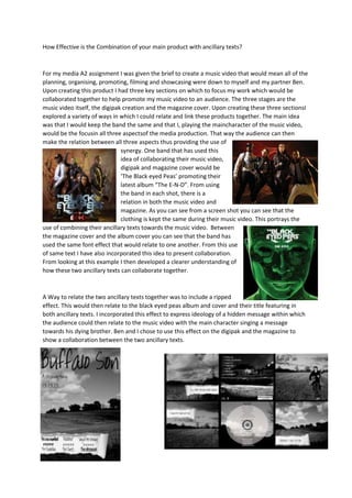
positively. This idea has been seen through the digipak and magazine cover of ‘Katie Campbell’s’
“Twang on a wire” where barbedwire and a lonely flower are in the foreground and a secluded field
is in the
background. This
idea brings across
the emotions of
loneliness and
freedom being
blocked. In the
magazine cover
you can see that Kate has incorporated herself within the cover to helps the audience relate the
artist to the song. This is the same idea that I have done with my magazine. You can see that Kate
has used the same sepia effect for both her magazine
cover and digipak cover. This is again an idea that
myself and Ben have incorporated in my media
4. products to help connect the ancillary texts together and towards the music video.