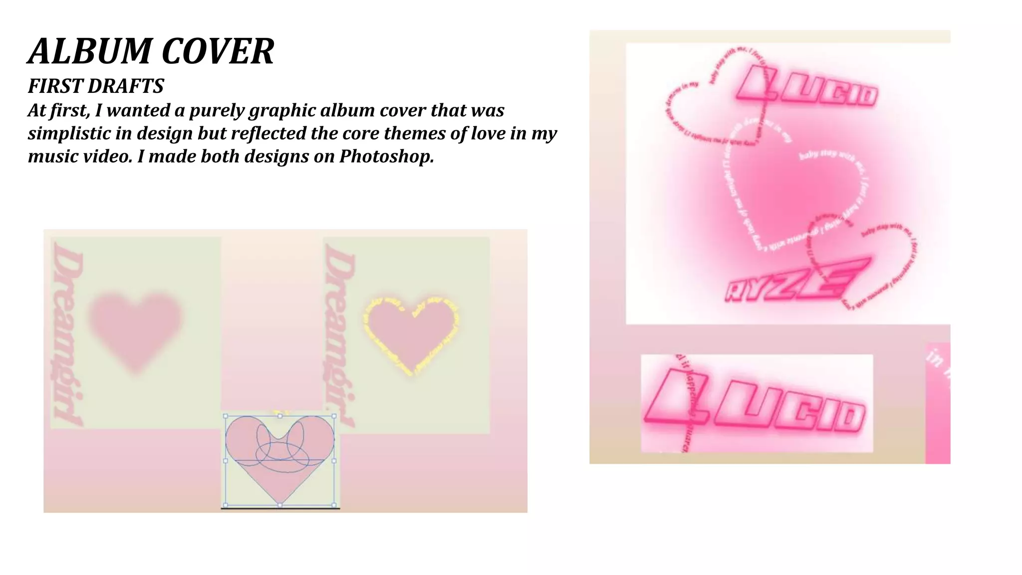
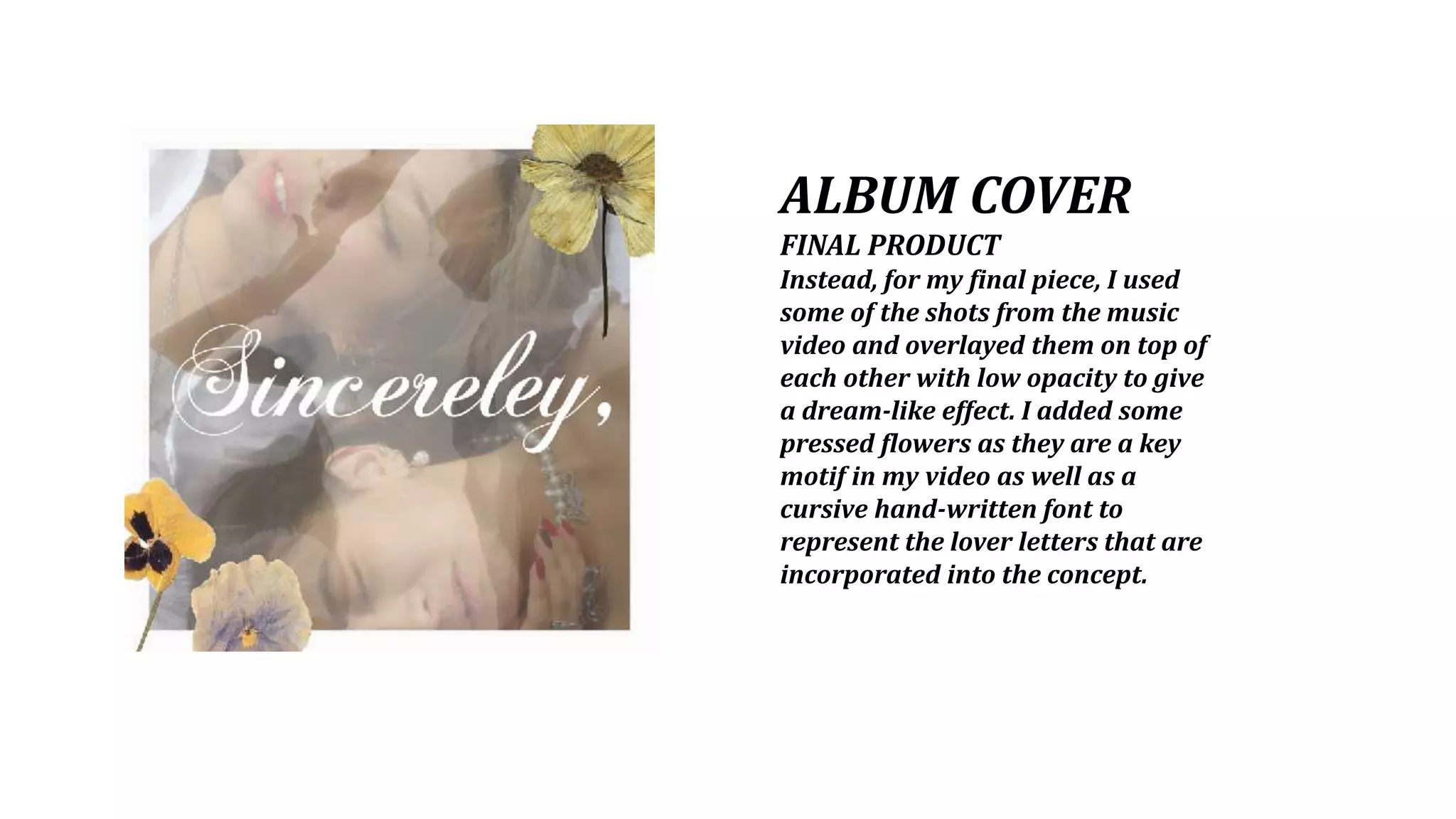
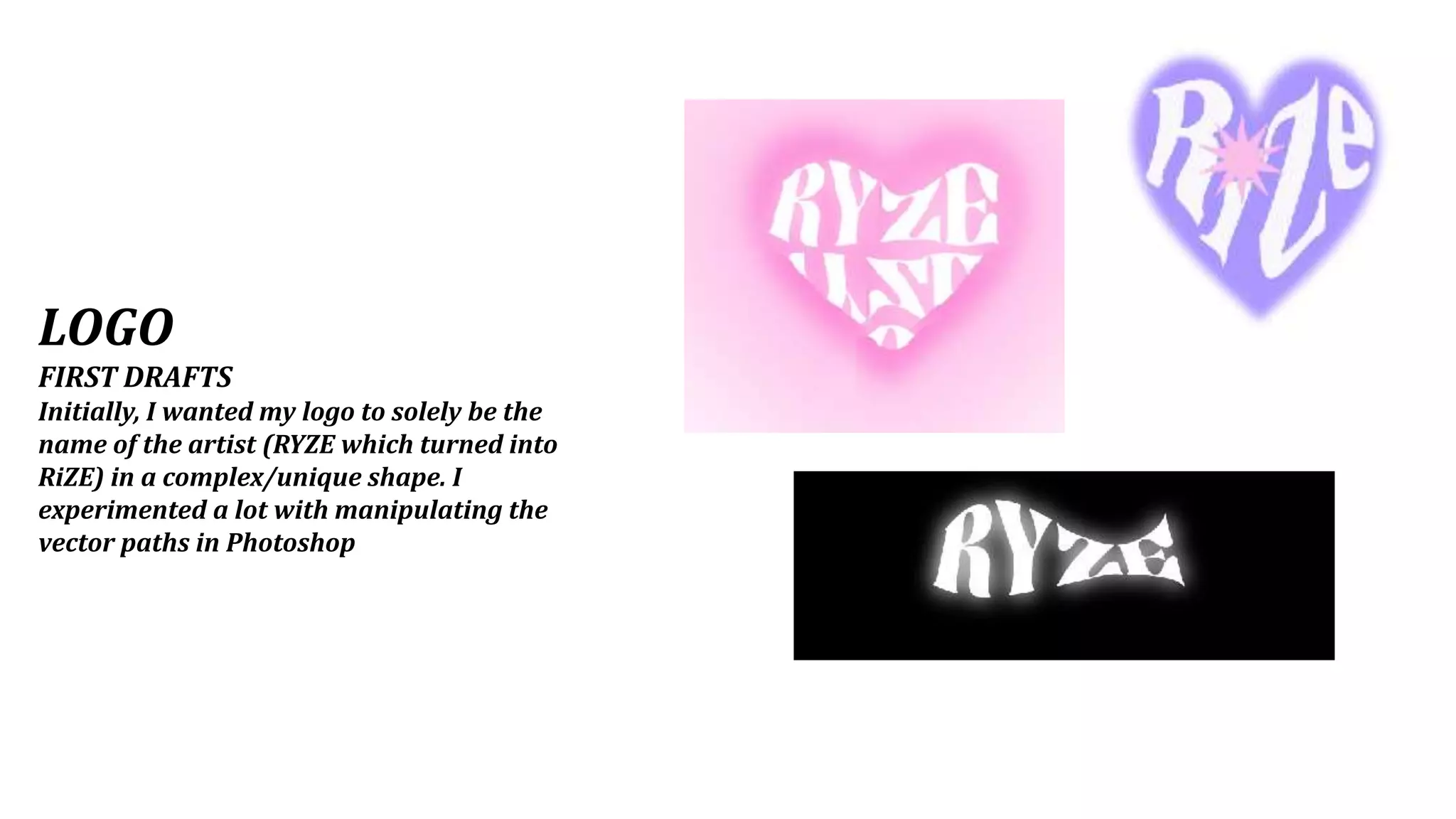
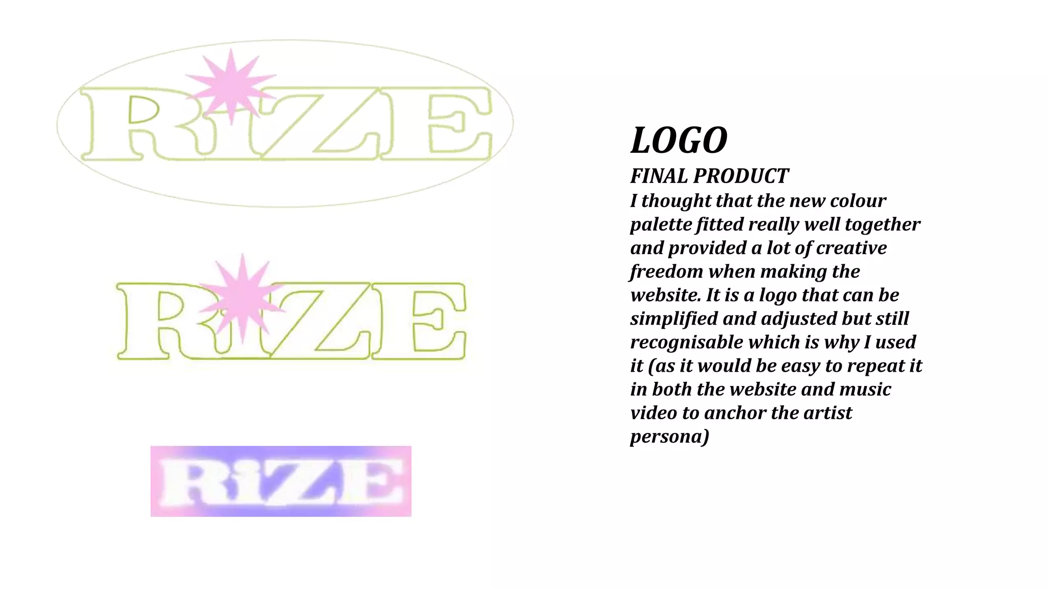
DESIGN PROGRESS
ALBUM COVER
FIRST DRAFTS
At first, I wanted a purely graphic album cover that was
simplistic in design but reflected the core themes of love in my
music video. I made both designs on Photoshop.
ALBUM COVER
FINAL PRODUCT
Instead, for my final piece, I used
some of the shots from the music
video and overlayed them on top of
each other with low opacity to give
a dream-like effect. I added some
pressed flowers as they are a key
motif in my video as well as a
cursive hand-written font to
represent the lover letters that are
incorporated into the concept.
LOGO
FIRST DRAFTS
Initially, I wanted my logo to solely be the
name of the artist (RYZE which turned into
RiZE) in a complex/unique shape. I
experimented a lot with manipulating the
vector paths in Photoshop
LOGO
FINAL PRODUCT
I thought that the new colour
palette fitted really well together
and provided a lot of creative
freedom when making the
website. It is a logo that can be
simplified and adjusted but still
recognisable which is why I used
it (as it would be easy to repeat it
in both the website and music
video to anchor the artist
persona)

Design progress

  • 1.
  • 2.
    ALBUM COVER FIRST DRAFTS Atfirst, I wanted a purely graphic album cover that was simplistic in design but reflected the core themes of love in my music video. I made both designs on Photoshop.
  • 3.
    ALBUM COVER FINAL PRODUCT Instead,for my final piece, I used some of the shots from the music video and overlayed them on top of each other with low opacity to give a dream-like effect. I added some pressed flowers as they are a key motif in my video as well as a cursive hand-written font to represent the lover letters that are incorporated into the concept.
  • 4.
    LOGO FIRST DRAFTS Initially, Iwanted my logo to solely be the name of the artist (RYZE which turned into RiZE) in a complex/unique shape. I experimented a lot with manipulating the vector paths in Photoshop
  • 5.
    LOGO FINAL PRODUCT I thoughtthat the new colour palette fitted really well together and provided a lot of creative freedom when making the website. It is a logo that can be simplified and adjusted but still recognisable which is why I used it (as it would be easy to repeat it in both the website and music video to anchor the artist persona)