SlideShare a Scribd company logo
1 of 7
I decided to use the same watercolour style group image as the focus of my poster, as it was the
    image I used for the front panel of my digipak so I wanted to use it to create consistency
 between the two texts. Also I wanted to use one simple image to cover the entire poster, like
                                  Ben Howard’s digipak poster.
I decided to use the watercolour style sky image, which is also in my digipak, to create
   consistency throughout the two texts, but also because I feel it gives the poster a greater
alternative feel. It provides an eye-catching background and the effect of it’s juxtaposition with
           the band name ‘Blue Sky’ adds mystery and increases the alternative feel.
I placed the CD front cover against the
sky background to make it clear what the
  poster is advertising, but it also means
there’s a consistency between my digipak
  and digipak poster. I used a green text
   colour to continue the green colour
 scheme that is in my two ancillary tasks
 and put all of the conventions of digipak
posters, that I’d found from my research,
       at the bottom of the poster.
I then decided to put ‘debut album’ at the
top and remove the second ‘Blue Sky’ logo
 on the image of the band. I feel it was too
   repetitive moving down the poster, so
   removing the extra album names/band
names means it’s more interesting to look
                     at.
I then decided to change the text colour
again because I felt the green didn’t work
 on the poster. I shifted the background
  mask to make the white text show up
 against the background and changed the
   text at the bottom to black so it was
                   visible.
I then altered some of the text at the
    bottom to add where the digipak is
available (a common convention of digipak
                 posters).

    I feel this poster not only provides
  consistency with the themes present in
      the digipak. I also feel it uses the
alternative conventions of posters well, as
   well as clearly advertising the digipak.

More Related Content

What's hot

Digi pak final write up
Digi pak final write upDigi pak final write up
Digi pak final write up3minidjluke
 
Skills Development Journal CD
Skills Development Journal   CDSkills Development Journal   CD
Skills Development Journal CDChloe Scott
 
Digipak prints
Digipak printsDigipak prints
Digipak prints957422
 
Evaluation question 4 powerpoint
Evaluation question 4 powerpointEvaluation question 4 powerpoint
Evaluation question 4 powerpointEdward Thomas
 
How we used the internet to help us q4 p1
How we used the internet to help us q4 p1How we used the internet to help us q4 p1
How we used the internet to help us q4 p1Zaralucille
 
Task 3B evaluation of final desgin
Task 3B evaluation of final desginTask 3B evaluation of final desgin
Task 3B evaluation of final desginGaetan Lundula
 
Digipak Construction
Digipak ConstructionDigipak Construction
Digipak Constructionthomasjpmoran
 
Evaluation question 2
Evaluation question 2Evaluation question 2
Evaluation question 2Lewis2922
 
Digipak Development
Digipak DevelopmentDigipak Development
Digipak Developmentciaranemmett
 
Task 3 Evaluation
Task 3 EvaluationTask 3 Evaluation
Task 3 Evaluationdorcasnzita
 

What's hot (19)

Quesiton 2
Quesiton 2Quesiton 2
Quesiton 2
 
Digipak
DigipakDigipak
Digipak
 
Digi pak final write up
Digi pak final write upDigi pak final write up
Digi pak final write up
 
Skills Development Journal CD
Skills Development Journal   CDSkills Development Journal   CD
Skills Development Journal CD
 
Digipak prints
Digipak printsDigipak prints
Digipak prints
 
Evaluation question 4 powerpoint
Evaluation question 4 powerpointEvaluation question 4 powerpoint
Evaluation question 4 powerpoint
 
Evaluation
EvaluationEvaluation
Evaluation
 
How we used the internet to help us q4 p1
How we used the internet to help us q4 p1How we used the internet to help us q4 p1
How we used the internet to help us q4 p1
 
Task 3B evaluation of final desgin
Task 3B evaluation of final desginTask 3B evaluation of final desgin
Task 3B evaluation of final desgin
 
Cd analysis
Cd analysisCd analysis
Cd analysis
 
Digipak feedback
Digipak feedbackDigipak feedback
Digipak feedback
 
Q1 poster
Q1 poster Q1 poster
Q1 poster
 
Evaluation 1
Evaluation 1Evaluation 1
Evaluation 1
 
Design Origination
Design OriginationDesign Origination
Design Origination
 
Digipak Construction
Digipak ConstructionDigipak Construction
Digipak Construction
 
Evaluation 2
Evaluation 2Evaluation 2
Evaluation 2
 
Evaluation question 2
Evaluation question 2Evaluation question 2
Evaluation question 2
 
Digipak Development
Digipak DevelopmentDigipak Development
Digipak Development
 
Task 3 Evaluation
Task 3 EvaluationTask 3 Evaluation
Task 3 Evaluation
 

Similar to Consistent watercolour style poster

Making ancillary products
Making ancillary productsMaking ancillary products
Making ancillary productsKaylee1234
 
Ancillary production process
Ancillary production processAncillary production process
Ancillary production processRepetoryRecords
 
Contact Sheet/Image Manipulation
Contact Sheet/Image ManipulationContact Sheet/Image Manipulation
Contact Sheet/Image ManipulationEstelleLouise97
 
Construction process
Construction processConstruction process
Construction processerneststaszak
 
Design process of digipak and album advertisement
Design process of digipak and album advertisementDesign process of digipak and album advertisement
Design process of digipak and album advertisementChloe Howcroft
 
Design process of digipak
Design process of digipakDesign process of digipak
Design process of digipakChloe Howcroft
 
EVALUATION QUESTION 2
EVALUATION QUESTION 2EVALUATION QUESTION 2
EVALUATION QUESTION 2Hollie Wistow
 
A2 media evalution. question 2
A2 media evalution. question 2 A2 media evalution. question 2
A2 media evalution. question 2 Hipexa Patel
 
Final Digipack
Final DigipackFinal Digipack
Final Digipackharrywbfmv
 
How effective is the combination of your main
How effective is the combination of your mainHow effective is the combination of your main
How effective is the combination of your mainRoseannn19
 
Alice digi pack analysis
Alice digi pack analysisAlice digi pack analysis
Alice digi pack analysiscowlingalice
 
Question 2 powerpoint
Question 2 powerpointQuestion 2 powerpoint
Question 2 powerpointMartin Welsby
 
6. fmp production reflection
6. fmp production reflection6. fmp production reflection
6. fmp production reflectionchrislaw34
 
Qu 2 final eval
Qu 2 final evalQu 2 final eval
Qu 2 final evalMae Burton
 
Media Evaluation Answer 2.
Media Evaluation Answer 2.Media Evaluation Answer 2.
Media Evaluation Answer 2.Mattyhorne_
 
+ Process of digipack
+ Process of digipack+ Process of digipack
+ Process of digipackcaitlinejm
 
Making my digipak - Hell on Heels
Making my digipak - Hell on HeelsMaking my digipak - Hell on Heels
Making my digipak - Hell on HeelsErinRubyTalbot
 

Similar to Consistent watercolour style poster (20)

Making ancillary products
Making ancillary productsMaking ancillary products
Making ancillary products
 
My digipak
My digipakMy digipak
My digipak
 
Ancillary production process
Ancillary production processAncillary production process
Ancillary production process
 
Contact Sheet/Image Manipulation
Contact Sheet/Image ManipulationContact Sheet/Image Manipulation
Contact Sheet/Image Manipulation
 
Construction process
Construction processConstruction process
Construction process
 
Design process of digipak and album advertisement
Design process of digipak and album advertisementDesign process of digipak and album advertisement
Design process of digipak and album advertisement
 
Design process of digipak
Design process of digipakDesign process of digipak
Design process of digipak
 
EVALUATION QUESTION 2
EVALUATION QUESTION 2EVALUATION QUESTION 2
EVALUATION QUESTION 2
 
A2 media evalution. question 2
A2 media evalution. question 2 A2 media evalution. question 2
A2 media evalution. question 2
 
Final Digipack
Final DigipackFinal Digipack
Final Digipack
 
How effective is the combination of your main
How effective is the combination of your mainHow effective is the combination of your main
How effective is the combination of your main
 
Alice digi pack analysis
Alice digi pack analysisAlice digi pack analysis
Alice digi pack analysis
 
Question 2 powerpoint
Question 2 powerpointQuestion 2 powerpoint
Question 2 powerpoint
 
6. fmp production reflection
6. fmp production reflection6. fmp production reflection
6. fmp production reflection
 
Qu 2 final eval
Qu 2 final evalQu 2 final eval
Qu 2 final eval
 
Media Evaluation Answer 2.
Media Evaluation Answer 2.Media Evaluation Answer 2.
Media Evaluation Answer 2.
 
Evaluation Question 2
 Evaluation Question 2 Evaluation Question 2
Evaluation Question 2
 
+ Process of digipack
+ Process of digipack+ Process of digipack
+ Process of digipack
 
Making my digipak - Hell on Heels
Making my digipak - Hell on HeelsMaking my digipak - Hell on Heels
Making my digipak - Hell on Heels
 
Q2
Q2Q2
Q2
 

Consistent watercolour style poster

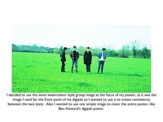
  • 1. I decided to use the same watercolour style group image as the focus of my poster, as it was the image I used for the front panel of my digipak so I wanted to use it to create consistency between the two texts. Also I wanted to use one simple image to cover the entire poster, like Ben Howard’s digipak poster.
  • 2. I decided to use the watercolour style sky image, which is also in my digipak, to create consistency throughout the two texts, but also because I feel it gives the poster a greater alternative feel. It provides an eye-catching background and the effect of it’s juxtaposition with the band name ‘Blue Sky’ adds mystery and increases the alternative feel.
  • 3. I placed the CD front cover against the sky background to make it clear what the poster is advertising, but it also means there’s a consistency between my digipak and digipak poster. I used a green text colour to continue the green colour scheme that is in my two ancillary tasks and put all of the conventions of digipak posters, that I’d found from my research, at the bottom of the poster.
  • 4. I then decided to put ‘debut album’ at the top and remove the second ‘Blue Sky’ logo on the image of the band. I feel it was too repetitive moving down the poster, so removing the extra album names/band names means it’s more interesting to look at.
  • 5. I then decided to change the text colour again because I felt the green didn’t work on the poster. I shifted the background mask to make the white text show up against the background and changed the text at the bottom to black so it was visible.
  • 6. I then altered some of the text at the bottom to add where the digipak is available (a common convention of digipak posters). I feel this poster not only provides consistency with the themes present in the digipak. I also feel it uses the alternative conventions of posters well, as well as clearly advertising the digipak.
  • 7. I then altered some of the text at the bottom to add where the digipak is available (a common convention of digipak posters). I feel this poster not only provides consistency with the themes present in the digipak. I also feel it uses the alternative conventions of posters well, as well as clearly advertising the digipak.