
Recommended
More Related Content
What's hot
What's hot (20)
Viewers also liked
Viewers also liked (18)
Similar to Poster and magazine
Similar to Poster and magazine (20)
More from welche8692
More from welche8692 (20)
Recently uploaded
Recently uploaded (20)
Poster and magazine
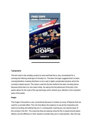
- 1. Typography: The font used in this ancillary product is sans serif bold this is very conventional for a comedy and inferring what type of comedy it is. The basic font type suggests that it is basic comedy therefore meaning that there is not a real in depth complicated storyline which the comedy is based around. The colours used for the text reinforce the basic comedy stance because all the text is in one colour white. As well as this the placement of the text in the poster allows for the route of the eye technique which attracts your attention to the important parts of the poster. Image: The image in the poster is very conventional because it contains an array of features that are used for a comedic effect. The mid shot allows the audience to see all the characters and what surrounding and setting they are in, consequently meaning you can see the basis of the comedy in the film. The costumes they are wearing show the film is based around police officers, but the difference in their reaction connotes they are in a bad position. Also the way
- 2. they seem to air-born suggests that they reach an enormous high compared to their norm in the film and the character on the right enjoys it whereas the character on the left does not. Colour: The colours used are very bright and light around the car which is stereotypical for police offers because they are meant to be a signal of safety and security, but in the car it seems to have less light and be darker. This is consequently showing that they are not real police officers and therefore symbolise the opposite. Layout: The layout is conventional for any type of film poster because of the use of the route of the eye technique. It has the main title at the top centre of the poster and then positions the main picture containing the main characters in the centre of the screen, then finally ending with the promotionally company logos at the bottom of the screen. It is very conventional the poster because of the positioning of the tag line at the top of the screen. In addition to this the positioning of the sponsors and producers in the terminal area is also very conventional, as well as the company logos being in there because they are less important that other key bit of information of the poster. Language: The language used in the poster connotes a very masculine feel because of things such as the screaming faces that they both are showing in it. Not only has this but the showing of them wearing cop uniforms showed them to be in a stereotypical masculine trait. The phrase used fake cops real trouble also connotes that they are in trouble and gives the feel that comedy will be around their miss fortune. Conventions: The ancillary product is very conventional because of different features that are used in it, for example the style of the picture showing over exaggerated facial expressions for the situation they are in. Continuing from that the phrase that is used in shows schadenfreude which is what the comedy is based around.
- 3. Typography: The majority of the font style that is used across the front of the magazine is the sans serif; this connotes the feel of it being a very masculine theme as well as it being a comedy because of the basic fonts which also is a small insight to the type of comedy that is used in the film. The size of the font that is used is also extremely conventional because the masthead is in the centre of the magazine and is and should be the most visible text on the page alongside the title. The sub header are smaller on the page because they are of a lower significance but also are quite important, alongside the smallest text being specific details for other parts of the magazine which will require a more in depth look at rather than a glance over. Image: The image used in the magazine is a long shot which shows all of the main characters and also means they are the background of the magazine which means all the attention revolves around them. The clothes that the characters are wearing are quite humorous and consequently connote a comedic feel because of the old fashioned style that is being worn in a modern era. This is shown by the fur jacket, red leather jacket and the big moustaches. The characters are the only photo on the screen which shows they are the main focus and the most important in the magazine. Colour: The colours used in the magazine are fairly plain but bold which adds to the basic comedic feel to the magazine cover. The background colour of the magazine are is very plain with
- 4. means the bold colours of the cover line are more easily seen and therefore attract the attention of the eye. In addition to this the bold colours of the characters costumes also stick out greatly when compared to the background, also the dark colours that have been used in the costumes also shows its very old fashioned and therefore adding at comedic effect to magazine as well. Layout: The layout of the magazine is very conventional and follows the route of the eye system, firstly with the positioning of the masthead in the primary optical area. Then having the cover story being the largest text on the screen in the centre of the magazine, finally ending with extra details about what is in the magazine in the terminal area. The image placement is also conventional because it is shown as the main feature of the magazine because it is in the centre of the screen. Language: The language used in the magazine is fairly basic and simple, the reason it is like this is due to it not wanting it to be too complicated and be appealing at just a glance as if it was on a shelf. This consequently means that the text would be short and sharp. The magazine differs to the poster because the magazine is concerned about promoting their own magazine not just one film. Conventions: The magazine is a very conventional one because it has the main image in the centre of the screen, with the font type of sans serif also being conventional for a comedy. These are conventional because it draws the attentions of the reader to the mains story of it. The costumes and characters are conventional for a comedy because they are very exaggerated costumes and old fashioned at that which shows it is comedy because it goes over the top on everyday things.