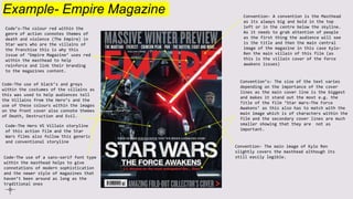
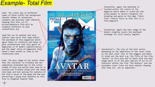
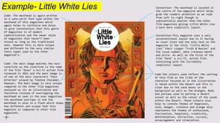
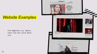
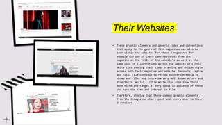
Research task
2: Generic
codes and
conventions
Magazine Brief: Ben
Chandler
Magazine Examples
Film Magazines e.g. Empire, Total Film and Little White Lies
Example- Empire Magazine
Code’s-The colour red within the
genre of action connotes themes of
death and violence (The Empire) in
Star wars who are the villains of
the franchise this is why this
issue of ‘Empire Magazine’ uses red
within the masthead to help
reinforce and link their branding
to the magazines content.
Convention- A convention is the Masthead
as its always big and bold in the top
left or in the centre below the skyline.
As it needs to grab attention of people
as the first thing the audience will see
is the title and then the main central
image of the magazine in this case Kylo-
Ren the main villain of this film (as
this is the villain cover of the force
awakens issues)
Code-The use of black’s and greys
within the costumes of the villains as
this was used to help audiences tell
the Villains from the Hero’s and the
use of these colours within the images
on the front cover also connote themes
of Death, Destruction and Evil.
Code-The Hero VS Villain storyline
of this action film and the Star
Wars films also follow this generic
and conventional storyline
Convention’s- The size of the text varies
depending on the importance of the cover
lines as the main cover line is the biggest
and makes it stand out the most e.g. the
Title of the film ‘Star Wars-The Force
Awakens’ as this also has to match with the
main image which is of characters within the
film and the secondary cover lines are much
smaller showing that they are not as
important.
Code-The use of a sans-serif font type
within the masthead helps to give
connotations of modern sophistication
and the newer style of magazines that
haven’t been around as long as the
traditional ones
Convention- The main image of Kylo Ren
slightly covers the masthead although its
still easily legible.
Example- Total Film
Code- The colour way of different
types of blues within the background
connote themes of relaxation,
calmness and possibly some sadness
showing that this sci-fi
action/adventure film will be
slightly different to your
conventional one
Convention- again the masthead is
located within the centre of the
magazine which makes it stand out and
allow people to easily recognise its
branding and genre as the name ‘Total
film’ clearly tells us that this is a
film magazine
Convention- Again the main image of the
Avatar slightly covers the masthead
although its still easily legible.
Convention’s- The size of the text varies
depending on the importance of the cover lines
as the main cover line is the biggest and makes
it stand out the most e.g. the Title of the film
‘Avatar’ as this also has to match with the main
image which is of the main species of Sci-fi of
character within the film ‘The Avatars’ and the
secondary cover lines are much smaller showing
that they are not as important.
Code-The use of another and very
similar sans-serif font type within
the masthead of this magazines which
again helps to reinforce and helps to
give connotations that this genre of
magazines is of modern sophistication
and the newer style of magazines that
haven’t been around as long as the
traditional ones
Code- The main image of the avatar shows
that the character is friendly and not
completely alienated due to the colour
scheme of blue and yellow that show he is
relaxed and friendly along with the human
like body and hair giving the audience of
the film a sense of the good and bad and
attracting a young teen audience as this
film is targeted towards them.
Example- Little White Lies
Code- The masthead is again written
in a sans-serif font type within the
masthead of this magazines which
again helps to reinforce and helps
to give connotations that this genre
of magazines is of modern
sophistication and the newer style
of magazines that haven’t been
around as long as the traditional
ones. However this is more unique
and different to the very similar
fonts types used by the other
magazine’s.
Convention- The masthead is located in
the centre of the magazine which helps
grab the readers attention as we read
from left to right though is
substantially smaller than the other
film magazines giving Little White Lies
a much more simplistic layout.
Convention-This magazine uses a very
unconventional layout due to it having
no cover lines and the only text on the
magazine is the title ‘Little White
Lies’ their slogan ‘Truth & Movies’ and
the issue number, date (release month
and price. As well as the title of the
film ‘Dune’ a sci-fi, action film.
Continuing with the incredibly
simplistic layout.
Code- The main image matches the main
coverline as the coverline is the name
of the film ‘Dune’ a Sci-Fi action film
released in 2021 and the main image is
of one of the main characters ‘Paul
Arteries’ played by Timotee Chalamet.
However, The main image is very unique
compared to the other film magazines
analysed as its an illustration and
therefore instead of overlapping the
masthead as seen in the over magazines
the masthead overlaps it and the
masthead is also in a flash which shows
how different and unique that this
magazine is compared to other film
magazines.
Code-The colours used reflect the setting
of this film as the tribe of the
character focused on in the illustration
is based within the Desert and this is
clear due to the sand dunes in the
background as well as the Oranges, Reds
and yellows used to portray a desert
sunset as well as the colour of the sands
within the Desert. These colours also
help to connote themes of Happiness,
love, danger, violence and orange also
represents the themes of enthusiasm,
fascination, happiness, creativity,
determination, attraction, success,
encouragement and stimulation.
Website Examples
Film Magazines e.g. Empire,
Total Film and Little White
Lies
Their Websites
• These graphic elements and generic codes and conventions
that apply to the genre of film magazines can also be
seen within the websites for these 3 magazines for
example the use of there same Mastheads from the
magazine as the title of the website’s as well as the
same uses of illustrations within the website of Little
White Lies showing their clear branding and unique style
across both their magazine and website. Secondly, Empire
and Total Film continue to review mainstream media TV
shows and films and interview very well known actors and
director's. Whilst, Little White Lies also show their
more niche and target a very specific audience of those
who have the time and interest in film.
• Therefore, showing that these common graphic elements
from the 3 magazine also repeat and carry over to their
3 websites.

Research task 2-Generic codes and conventions.pptx

  • 1.
    Research task 2: Generic codesand conventions Magazine Brief: Ben Chandler
  • 2.
    Magazine Examples Film Magazinese.g. Empire, Total Film and Little White Lies
  • 3.
    Example- Empire Magazine Code’s-Thecolour red within the genre of action connotes themes of death and violence (The Empire) in Star wars who are the villains of the franchise this is why this issue of ‘Empire Magazine’ uses red within the masthead to help reinforce and link their branding to the magazines content. Convention- A convention is the Masthead as its always big and bold in the top left or in the centre below the skyline. As it needs to grab attention of people as the first thing the audience will see is the title and then the main central image of the magazine in this case Kylo- Ren the main villain of this film (as this is the villain cover of the force awakens issues) Code-The use of black’s and greys within the costumes of the villains as this was used to help audiences tell the Villains from the Hero’s and the use of these colours within the images on the front cover also connote themes of Death, Destruction and Evil. Code-The Hero VS Villain storyline of this action film and the Star Wars films also follow this generic and conventional storyline Convention’s- The size of the text varies depending on the importance of the cover lines as the main cover line is the biggest and makes it stand out the most e.g. the Title of the film ‘Star Wars-The Force Awakens’ as this also has to match with the main image which is of characters within the film and the secondary cover lines are much smaller showing that they are not as important. Code-The use of a sans-serif font type within the masthead helps to give connotations of modern sophistication and the newer style of magazines that haven’t been around as long as the traditional ones Convention- The main image of Kylo Ren slightly covers the masthead although its still easily legible.
  • 4.
    Example- Total Film Code-The colour way of different types of blues within the background connote themes of relaxation, calmness and possibly some sadness showing that this sci-fi action/adventure film will be slightly different to your conventional one Convention- again the masthead is located within the centre of the magazine which makes it stand out and allow people to easily recognise its branding and genre as the name ‘Total film’ clearly tells us that this is a film magazine Convention- Again the main image of the Avatar slightly covers the masthead although its still easily legible. Convention’s- The size of the text varies depending on the importance of the cover lines as the main cover line is the biggest and makes it stand out the most e.g. the Title of the film ‘Avatar’ as this also has to match with the main image which is of the main species of Sci-fi of character within the film ‘The Avatars’ and the secondary cover lines are much smaller showing that they are not as important. Code-The use of another and very similar sans-serif font type within the masthead of this magazines which again helps to reinforce and helps to give connotations that this genre of magazines is of modern sophistication and the newer style of magazines that haven’t been around as long as the traditional ones Code- The main image of the avatar shows that the character is friendly and not completely alienated due to the colour scheme of blue and yellow that show he is relaxed and friendly along with the human like body and hair giving the audience of the film a sense of the good and bad and attracting a young teen audience as this film is targeted towards them.
  • 5.
    Example- Little WhiteLies Code- The masthead is again written in a sans-serif font type within the masthead of this magazines which again helps to reinforce and helps to give connotations that this genre of magazines is of modern sophistication and the newer style of magazines that haven’t been around as long as the traditional ones. However this is more unique and different to the very similar fonts types used by the other magazine’s. Convention- The masthead is located in the centre of the magazine which helps grab the readers attention as we read from left to right though is substantially smaller than the other film magazines giving Little White Lies a much more simplistic layout. Convention-This magazine uses a very unconventional layout due to it having no cover lines and the only text on the magazine is the title ‘Little White Lies’ their slogan ‘Truth & Movies’ and the issue number, date (release month and price. As well as the title of the film ‘Dune’ a sci-fi, action film. Continuing with the incredibly simplistic layout. Code- The main image matches the main coverline as the coverline is the name of the film ‘Dune’ a Sci-Fi action film released in 2021 and the main image is of one of the main characters ‘Paul Arteries’ played by Timotee Chalamet. However, The main image is very unique compared to the other film magazines analysed as its an illustration and therefore instead of overlapping the masthead as seen in the over magazines the masthead overlaps it and the masthead is also in a flash which shows how different and unique that this magazine is compared to other film magazines. Code-The colours used reflect the setting of this film as the tribe of the character focused on in the illustration is based within the Desert and this is clear due to the sand dunes in the background as well as the Oranges, Reds and yellows used to portray a desert sunset as well as the colour of the sands within the Desert. These colours also help to connote themes of Happiness, love, danger, violence and orange also represents the themes of enthusiasm, fascination, happiness, creativity, determination, attraction, success, encouragement and stimulation.
  • 6.
    Website Examples Film Magazinese.g. Empire, Total Film and Little White Lies
  • 7.
    Their Websites • Thesegraphic elements and generic codes and conventions that apply to the genre of film magazines can also be seen within the websites for these 3 magazines for example the use of there same Mastheads from the magazine as the title of the website’s as well as the same uses of illustrations within the website of Little White Lies showing their clear branding and unique style across both their magazine and website. Secondly, Empire and Total Film continue to review mainstream media TV shows and films and interview very well known actors and director's. Whilst, Little White Lies also show their more niche and target a very specific audience of those who have the time and interest in film. • Therefore, showing that these common graphic elements from the 3 magazine also repeat and carry over to their 3 websites.