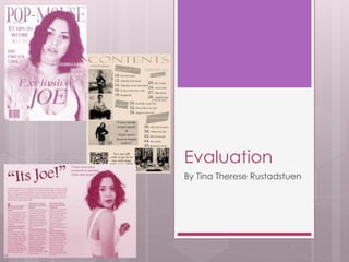
SlideShare a Scribd company logo
1 of 44
Evaluation
By Tina Therese Rustadstuen
Question 1
In what ways does your media
product use, develop or challenge
forms and conventions of real
media products?
Front cover
The master head
Fig 1
Fig 2
Fig 3
Fig 4
I wonted my masthead (Fig 1) to stand out by looking exclusive and elegant. When I started
to create my master head I was inspired by figure 3 and 4 by having it across the page not just in the
corner as figure 2 has. I chose my master head to be a combination of purple and pink, pink because
my reader recourse told me that my target group liked pink. The pink colour is fading in to purple and
This draw attention to the magazine and it looks more professional. The name of my magazine is easy
To say and remember, it also give the reader an idea of what the magazine is about. The under line
On left hand side make the magazine more professional and it makes it easy for my reader to see
have much the magazine cost and witch issue it is, this is important because my target group is
Between 16 and 24 and they want to get the information they need quick and with out to much work.
My master head is also placed behind my models head (fig 6), which draw the focus on to the model,
which my readers are going to be interested in. By putting the
Masthead behind the models head it makes it look more
Professional and was inspired by figure 5, witch was a part of my
Style sheet.
Fig 5Fig 6
Fig 1 Fig 2
Fig 3 Fig 4
Main image
My slash image (Fig 4) is taken in a studio, just like
Figure 1,2 and 3. by shooting I a studio it looks more
Professional. I have used a medium shot (fig 4) similar
To figure 1, 2 and 3. it focus on the models face so the
Main focus is on the models face. My model (fig 4)
Make direct eye contact just like figure 1, 2 and 3, this
Dowse the rider to the magazine and it makes the
Rider feel more pressured to buy the magazine. I have
used a young female on my front cover because it
Appeals to young girls and men feels attracted to it.
All my figures have used a young female on there
Front cover. All the models as heavy styled, this make
Them look more exclusive and important.
The similarities between figure 2 and 4
Is that the magazine name is behind the models head
And the models name is in front of the image, figure 1
Also have the models name in front of the image.
Figure 3 have the models name in a plug, I think this is
hiding the name of the main person of the magazine
And I wonted the name to stand out like it dos in
Figure 1 and 2.
The similarities between figure 2 and 4
Is that the magazine name is behind the models
head and the models name is in front of the image,
figure 1also have the models name in front of the
image. Figure 3 have the models name in a plug, I
think this is hiding the name of the main person of the
magazine and I wonted the name on my magazine
to stand out like it dos in figure 1 and 2.
The head line
Cover lines
My layout (fig 4) is most similar to figure 1 by having the
Cover lines next to the models head. Its similar to figure 2
By not covering her body, but using the space on the
side. The similarities between figure 4 and 3 is that the
Cover lines are placed and left hand side.
I have chosen not to have to match text on my front page
Because of the elegant and tidy effect.
Colour scheme
My main colours are pink/purple, black, white, yellow
and blue. By not having to many colours on my
Magazine it doesn't look messy or chaotic. This is similar
to figure 2 where they have only 4 main colours.
I chose to have a white background similar to figure 1,
2 and 3. by using the white background it looks more
Professional and clean, it also make sure it doesn't
Draw attention away from the splash image and text.
Barcode
I have placed my barcode in the left corner of the page. Figure 1 and 3 has also
Ben placed in the corner of the page, on the right hand side following the
Z-reading pattern. I chose to place the barcode, not following the Z-reading pattern
Because I didn't wont to cover up my model.
Contents page
Master head, headline
and date
Fig 1 Fig 2 Fig 3 Fig 4
My headline (fig 2) says “contents” like figure 4. Both figure 1,2 and 3 are
Putt on a white background an other similarity is the simple font that is
Used on the headline.
Compered to figure 1,3 and 4 I have mentioned the date of the magazine
Under my headline (fig 2). I have also put the magazine web-page address
Under the headline so the readier remember the magazine name and know
That there is more to look at if they visit the magazines wed-page.
Images and layout
I chose to put my images on left hand side, starting in the upper left corner going across to
The lower right corner, this follow the fact that humans reads from left to right. My contents
Page (fig 2) is most similar to figure 4, thinking about the photos, because of the tidy way to plays the
photos and the amount of images. Compared to figure 1, 3 and 4 I don’t have much text on my
contents page (fig 2), this is because my readers are more interested in looking at photos.
Similar to figure 1 and 3 I have different models on each photo, so everyone can find something that
interest them. Half of the amount of my photos are taken in a studio, and the rest is taken on the street
or in a regular room. My contents page layout (fig 2) is similar to figure 3 by having photos in left upper
Corner and right lower corner and the columns are mostly on right hand side.
Page numbers and fonts
I (fig 2) placed the page numbers beside the images so the readers easily could see witch page
To go to to find the articles about the images. I made them big so it was easy to spot. My magazine
(fig 2) is most similar to figure 4 when it comes to the numbers on the photos, I think this is a much
More tidy way to present then on figure 3.
When it comes to the fonts I (fig 2) have decided to have a small headline over each category just
Like figure 3 have done. This is to make it more tidy and easy for my reader to find exactly what
They wont to read about. Just like figure 1 I (fig 2) have big page number in the fonts.
Double page
spread
Headline
Fig 1 Fig 2 Fig 3
Fig 4
My (fig 4) is inspired by figure 1 by having the writing skewed and
By using apostrophes and an exclamation. Figure 3 also use an
Exclamation I think this make the headline stand out more and it
Gives it a stronger effect.
I was also inspired by figure 3 by using the main persons name in
The headline to make it clear to the reads that article is about
Them.
Layout
Fig 1 Fig 2 Fig 3
Fig 4
For my layout (fig 4) I wanted it to be an equal amount of text and images.
On the left side page is a full photo that also can be used as a pull- out
Poster witch is attractive to young readers. This is also used on figure 3.
My layout (fig 4) is similar to figure 1 and 3 because of the balance
Between text and images, so readers get what they pay for but don’t
Get to much text to read.
Images
Fig 1 Fig 2 Fig 3
Fig 4
I (fig 4) chose to have an equal amount of images and text.
I also wanted to have a big photo on one of the pages so it could
Be used as a rip out poster just as figure 3. You also have a similar
Photo on figure 1 except it would not be able to be used as a poster
Because of the headline that go over both pages.
I chose to use a medium close up and eye contact with the camera,
This is so the readers feel drawn into the article.
Color scheme
Fig 1 Fig 2 Fig 3
Fig 4
Compered to figure 1, 2 and 3 figure 4 is the less colorful. I (fig4) used a
Photo taken in a studio with a white background and I made the
First page the same color as the background and all my text is all in black.
I made it this simple to have the classical and tidy touch.
Figure 1 and 2 is using the same color scheme and figure 3 is using
Brighter colors .
Writing style
Fig 1 Fig 2 Fig 3
Fig 4
I opened my (fig 4) article with a big and bold letter, just like in figure 3,
and I made my questions in a thicker writing so the readers easier could
spot out the questions they are interested to know the answers too.
This idea was something I got from figure 1and 3.
Question 2
How does your media product
represent particular social groups?
Gender
My photos are mainly of girls, basically because I chose to
Make my main story about a girl and that’s why I have a
Female on my front cover, double page spread and on
one of the images on my contents page.
The women are stereotypical represented by being heavily
Styled in fashionable cloths, using makeup and styled hair.
They are also represented in two different dresses, they are
Both thigh. The purple dress is more elegant and are more suitable
for an elegant evening. The other dress is more of a
“out in town” dress. The top photo is focusing on the feminine
front part by wearing a reviling top and a skinny jeans, this is a
Typical way to dress for a teenage girl this days.
The boys are represented in a more casual way. The bottom photo
Is showing of the man power by using a frog angle, this is a
Stereotypical way and maybe an old fashion way to show of
a man.
Age
My models are mainly around 17-19 years old, this is my readers
Main age and that’s why I chose to use the models around
That age. Since my readers are between 16 and 24 I chose
To add a photo of a band were the artists are between 20 and
24.
The boy on the photo in the left corner are representing a
Stereotypical teenage boy by wearing skinny jeans and a white
Simple t-shirt.
The band photo represent typical hipsters that like to go their own
Way, witch many young people dos now days.
The photos of the girls are showing of fashionable girls that’s like
To dress up just like many teenage girls like to do.
Class
Because social class is defined by work my readers and my models
will be defined by the roles of their parents.
My magazine is aiming for the working/middle class and I think
These photos are representing this class in a good way by what
They are wearing.
The band photo is representing the working
Class by standing on the street, not on a stage, playing there
Music. The other photos of the girls represent more a middle class
By being heavily styled, this shows us that they have enough
Money to by good products and fashionable cloths.
Question 3
What kind of media institution might
distribute your media product and
why?
Immediate media co sell over 70 million magazines every
year and reach 22 million people online every month. This is
one of the reason I think immediate media co would be a
good publisher for my magazine. They reach out to many
readers by paper and an other important factor is that
they reach out to so many people online, this is important
Because teenagers now days spend most there time
online. Due to the company's experience and variation of
targets groups I think this would be a good match.
I think immediate media co
would benefit from working
With my magazine, Pop mouse,
because they already
Know have to promote and work
with retching out to
A teenage market.
Question 4
Who would be the audience for
your media product?
Audience
This is Julia! She is a perfect Pop-mouse reader. She is
17 years old and lives in London. She is from a well off
family. She likes to use her money on music,
magazines, clothes, make-up and on coffees with her
friends, this is also what she is most interested in.
She loves to read exclusive interviews with big pop-stars.
She would also like to be famous one day as well.
Her favourite colours are pink, red and yellow, but she also
like the standard colours, black and white.
To find my audience I created some question on survey monkey, out from these questions I
Made a reader profile.
I also researched other types of music magazine that aimed for the same target group to
Create a better and more detailed reader profile.
Gender
The largest group of my audience will be female, but
The magazine will also attract boys when using Laura
Mulvey's theory of the Male Gaze.
Because of my model being a young and attractive girl,
girls want to look like her and boys what a girl like her.
My female readers will find appearance very important
and the magazine will therefore be focusing on the
stereotypical girl, that find fashion, makeup and hairstyles
very interesting.
Age
I chose to have a mix between pink and purple, this
Is a typical girl color and it represent teenage girls.
This is because the color is bright and bold, and from
A young age girls always are represented by the
Color pink.
The articles suggest a young
Audience, first you have the
Four headline to categorize
So the audience easily can
Find the articles they are most
Interested in. the language is
Also easy to understand and
Informal.
An other thing that suggest
That the audience is young is
QR code and the connection
To social media.
The headline suggest it’s a young audience by being short
And snappy. The amount of text and the questions are in
A thicker font so it is easier to read and it suggest that the
article is aimed for a young reader.
Interests
Question 5
How did you attract/address your
audience?
Have dos my magazine appeal to the
audience?
Since 100% of the people answering my questions on surver
monkey use Facebook, I maid Facebook available on my
contents page by doing this my audience get the newest
information and pictures direct on there phone or laptop.
For the photos I would also use Instagram since 92.31% use
it, I also made sure my readers know that the magazine
have an Instagram page as well on the contents page.
Just over half said they use Twitter so I would create an
account and post the newest information on there, this is
also mention on my contest page. Because Tumbler,
Myspace and Other have gotten under
40% I would not focusing on this in my magazine.
Since all the asked people like exclusive
Interviews I was sure to have one in my
magazine and it will be inn focus on the front
cover, by using the headline “Exclusive Joe”.
Because the asked people said they liked
Pink and all the people asked are girls I choose
To use pink on my headlines and master headline
To attract as many girls as possible.
Everything that is
don whit the
magazine is based
On the facts I got
from my audience
researched.
Photos
The photos I chose to use was chosen to appeal to
Teenagers. I did this by using a young girl on my front
Cover that is fashionable and styled whit makeup and
Styled hair. My cover girl can inspire other girl by her
Look and boys will think she is attractive.
She is also looking straight in to the camera and this draw
The audience attention to the magazine and draw them
To buy it.
Question 6
What have you learnt about
technologies from the process of
constructing this product?
This is some of the software and websites
I used to do all my work;
 Google chrome
 Blogger
 Slideshere
 Survey Monkey
 Adobe Photoshop
 QR reader
 Microsoft PowerPoint
Her is some of the hardware I used;
 Camera
 MacBook pro
 Memory Stick
 Computer
 IPhone
 Lights
Research;
 Google chrome
 Microsoft PowerPoint
 Survey Monkey
 Slideshare
 Blogger
 IPhone
 MacBook pro
 Computer
 Memory Stick
Planning;
 Google chrome
 Microsoft PowerPoint
 Slideshare
 Blogger
 MacBook pro
 Computer
 Memory Stick
Production;
 Adobe Photoshop
 Blogger
 QR Reader
 MacBook pro
 Computer
 Memory Stick
 Camera
 Lights
Evaluation;
 Google chrome
 Blogger
 Microsoft PowerPoint
 Slideshere
 MacBook pro
 Computer
 Memory Stick
This is were I used the technologiesThis is what kind of technologies I used
Technologies
I could not have done anything without my MacBook or the computer
In the classroom. All my recherché, planning, production and
Evaluation is don on a computer/MacBook.
If there is something I could have managed without it would have
Been my phone. I only used it to record my interview during my
Recherché. I know if I had used my camera the quality would
Have been much better.
My memory stick have been a key thing in all of my work. It has
Allowed me to work at college and bring my work home whit me.
It has not been enough just to save all my work on the memory stick
Because I have lost it a number of times and I have found myself
Lucky to find it again every time.
Whit out a camera I would not have a magazine, because I
Wouldn't have any original photos.
The lighting I used while I used the studio helped me get the best
Photos I possible could get.
Google chrome is something I really
Have had a massive use of. I have used it for my recherché to fore example find out about
Different companies that publish music magazines and to find all the photos of the magazines
I have analyzed. I have used Google chrome during my planning to get inspiration and I
used it during my evaluation by looking up have other people have maid there evaluation.
I have found photos that I have used on this PowerPoint presentation.
I also needed Google chrome to get on to Blogger, the wed page I used to to post all my
Work. I have never had a blog and by having one now I have learned have to upload stuff
And have to do the layout on my blog. I also liked to do all my work using a computer/
MacBook first of all because it easier to keep it organized and second because it saves the
Environment by not coping up paper.
Because Blogger don’t support the file formats PowerPoint I had to use slideshere to manage
to upload all my work. I learned have to set up an account and have to upload all the
PowerPoint presentations I have maid.
If it wasn't for Photo shop I wouldn't’t have any magazine to upload. I had never used
Photo shop before so I feel I have learned a great deal. I first taught it was a bit difficult
But I got the hang of it after using it a few times. I now know have much you can edit a
Photo.
I chose to present all of my recherché, planning and evaluation by using PowerPoint.
I thing I comes trough in a more tidy way and it is easier to be creative because the
Opportunities to do fancy things are bigger.
Question 7
Looking back at your preliminary
task, what do you feel you have
learnt in the progression from it to
the full product?
What have I learned?
This is the stages I went through to make my music magazine;
 Research: Audience, market
 Planning: Pitch, flat plans, style sheet, photography plans, draft layouts
 Production: Image manipulation, text manipulation, layout manipulation, photography
This is the four main skills that I learned whilst completing my project;
 Planning
 Research
 “Styling”
 Technical
Planning
Planning have been very important for me to create the type
Of magazine I wanted to make. By planning everything I have
Saved a lot of time and because of that I have had the
Opportunity to be more creative.
By planning all my magazines pages I knew exactly what to do
when it came to the production.
Planning was the key for my magazine to look alright. Just have
A look at the college magazine I made in the start proses.
I did not plan any thing for it and it ended up looking really bad,
An other thing that made it look unprofessional was the fact that
I didn't know have to use photo shop.
My photographs plans were good, because
When I went in to the studio I knew exactly what
To do, this saved me lots of time in the studio and
I could use that time to be creative.
I had planed every costume my model were going
To be photographed in and this gave my photos
A more professional look because the model was
Not wearing normal every day cloths.
Research
I have learned that before you start something, such as a magazine you need to do
Some research to see if there is a marked for the product you wish to create. If it is a
Magazine you wish to create you would have to find someone who wants to sell
Your product, and to find the perfect publisher you would have to do some research.
It might be that you would like a publisher that have published a similar magazine
Before or you might like to take a chance on someone that haven't don a similar
category before. To decide this you would need to some research!
I have learned throughout my research have to create a professional and sailable
Magazine. By looking at other, similar type of magazines as my own I have gotten
ideas have to make my magazine to look professional.
I also did some research to find and create my reader profile. I used survey monkey to
Find out what my readers like and I did an interview. By looking at other pop magazines
Reader profiles I manage to make my own.
Style
When it comes to the way my magazine looks I have learned how to style photographs,
writing and layout and manipulate images. I used photo shop to manipulate photos and
My page layouts, because it was easy to learn and use.
If you have a look to the right you can see my college
Magazine and my music magazine. My music magazine
Looks more appealing because of the combination
Of colors and text fonts. Also the front cover girl is styled
On the music magazine, she is wearing “clubbing” cloths
And her hair is styled! An other thing is that
On the college magazine I placed some
Of the text so it covered the models head,
And on my music magazine I wanted all the
Text to be around the models head, first of
All because it looks better but also because
The model is the one in focus.
Technical
To make my music magazine I had to use the right kind of
Software for each job.
Photo shop is the software I used and learned to make my
music magazine. For my Research, planning and evaluation I
used PowerPoint, slideschere, survey monkey and google
chrome.
By using survey monkey to find out what my target audience
liked I managed to create an appealing and salable
magazine. I asked questions like “Have much would you be
willing to pay?” and “What are you're favorite colors?” by
asking there questions I could set a price most people could
afford and be willing to pay for The magazine once a month.
I also found out what colors that appealed to my target
audience and that is for example why my master head line
And my other headline on my front cover is pink,
I also made a QRL code and placed it
On my content page so the readers that are
interested in getting even more information
Would have the opportunity.(I don’t have a
Webpage for my magazine so this QRL is
Linking to my blog.)

More Related Content

What's hot

Media evaluation steffan
Media evaluation steffanMedia evaluation steffan
Media evaluation steffansteffharris123
 
Magazine front cover analysis
Magazine front cover analysisMagazine front cover analysis
Magazine front cover analysisshaniajay
 
Task 10 cover, contents and double page spread plan analysis
Task 10 cover, contents and double page spread plan analysisTask 10 cover, contents and double page spread plan analysis
Task 10 cover, contents and double page spread plan analysisasmediac15
 
Contents page analysis
Contents page analysisContents page analysis
Contents page analysisshaniajay
 
Evaluation one powerpoint
Evaluation one powerpointEvaluation one powerpoint
Evaluation one powerpointshanhayward
 
Evaluation one powerpoint
Evaluation one powerpointEvaluation one powerpoint
Evaluation one powerpointshanhayward
 
Final research and planning
Final research and planningFinal research and planning
Final research and planningEsther1943
 
Analysis of music magazine one nme
Analysis of music magazine one nmeAnalysis of music magazine one nme
Analysis of music magazine one nmealishalumsden
 
Contents page and dps analysis task - emily vaughan marked
Contents page and dps   analysis task - emily vaughan marked Contents page and dps   analysis task - emily vaughan marked
Contents page and dps analysis task - emily vaughan marked emilyvaughan2000
 
Evaluation question 1
Evaluation question 1Evaluation question 1
Evaluation question 1Alliicceee
 
Inspirations research media
Inspirations research mediaInspirations research media
Inspirations research mediaSionyTatey
 
Inspirations research media
Inspirations research mediaInspirations research media
Inspirations research mediaSionyTatey
 

What's hot (16)

Evaluation
EvaluationEvaluation
Evaluation
 
Media evaluation steffan
Media evaluation steffanMedia evaluation steffan
Media evaluation steffan
 
Magazine front cover analysis
Magazine front cover analysisMagazine front cover analysis
Magazine front cover analysis
 
Task 10 cover, contents and double page spread plan analysis
Task 10 cover, contents and double page spread plan analysisTask 10 cover, contents and double page spread plan analysis
Task 10 cover, contents and double page spread plan analysis
 
Contents page analysis
Contents page analysisContents page analysis
Contents page analysis
 
Evaluation one powerpoint
Evaluation one powerpointEvaluation one powerpoint
Evaluation one powerpoint
 
Evaluation one powerpoint
Evaluation one powerpointEvaluation one powerpoint
Evaluation one powerpoint
 
Blog 6 student work
Blog 6 student workBlog 6 student work
Blog 6 student work
 
Final research and planning
Final research and planningFinal research and planning
Final research and planning
 
Music magazine analysis
Music magazine analysisMusic magazine analysis
Music magazine analysis
 
Task 8
Task 8Task 8
Task 8
 
Analysis of music magazine one nme
Analysis of music magazine one nmeAnalysis of music magazine one nme
Analysis of music magazine one nme
 
Contents page and dps analysis task - emily vaughan marked
Contents page and dps   analysis task - emily vaughan marked Contents page and dps   analysis task - emily vaughan marked
Contents page and dps analysis task - emily vaughan marked
 
Evaluation question 1
Evaluation question 1Evaluation question 1
Evaluation question 1
 
Inspirations research media
Inspirations research mediaInspirations research media
Inspirations research media
 
Inspirations research media
Inspirations research mediaInspirations research media
Inspirations research media
 

Viewers also liked

5 reasons why machine translators can never replace human translators
5 reasons why machine translators can never replace human translators5 reasons why machine translators can never replace human translators
5 reasons why machine translators can never replace human translatorsVerztec Consulting
 
A classroom experiment in student oriented design and textbook
A classroom experiment in student oriented design and textbookA classroom experiment in student oriented design and textbook
A classroom experiment in student oriented design and textbookHameed Al-Zubeiry
 
Things to check in the translated document before the submission
Things to check in the translated document before the submissionThings to check in the translated document before the submission
Things to check in the translated document before the submissionlee shin
 
Lean Translation -
Lean Translation - Lean Translation -
Lean Translation - PhraseApp
 
Needs analysis questionnaire 10 may 2010 maf.mod.gov.mypendidikanborangborang...
Needs analysis questionnaire 10 may 2010 maf.mod.gov.mypendidikanborangborang...Needs analysis questionnaire 10 may 2010 maf.mod.gov.mypendidikanborangborang...
Needs analysis questionnaire 10 may 2010 maf.mod.gov.mypendidikanborangborang...Hameed Al-Zubeiry
 
Editor, translator or post-editor? by Celia Rico
Editor, translator or post-editor? by Celia RicoEditor, translator or post-editor? by Celia Rico
Editor, translator or post-editor? by Celia RicoCelia Rico
 
ESP (Course Design and skills and strategies)
ESP (Course Design and skills and strategies)ESP (Course Design and skills and strategies)
ESP (Course Design and skills and strategies)Lord Mark Jayson Ilarde
 
Approaches To Course Design
Approaches To Course DesignApproaches To Course Design
Approaches To Course DesignRomina_BsAs
 
Esp course design for teachers
Esp course design for teachersEsp course design for teachers
Esp course design for teachersHameel Khan
 
ESP - English for specific purposes
ESP - English for specific purposesESP - English for specific purposes
ESP - English for specific purposesBasharat Mirza
 
ESP PPT : GROUP 3 SYLLABUS AND COURSE DESIGN IN ESP
ESP PPT : GROUP 3 SYLLABUS AND COURSE DESIGN IN ESPESP PPT : GROUP 3 SYLLABUS AND COURSE DESIGN IN ESP
ESP PPT : GROUP 3 SYLLABUS AND COURSE DESIGN IN ESPDieyana Rahman
 

Viewers also liked (20)

5 reasons why machine translators can never replace human translators
5 reasons why machine translators can never replace human translators5 reasons why machine translators can never replace human translators
5 reasons why machine translators can never replace human translators
 
Feedback1
Feedback1Feedback1
Feedback1
 
A classroom experiment in student oriented design and textbook
A classroom experiment in student oriented design and textbookA classroom experiment in student oriented design and textbook
A classroom experiment in student oriented design and textbook
 
Historyofrhyme
HistoryofrhymeHistoryofrhyme
Historyofrhyme
 
Things to check in the translated document before the submission
Things to check in the translated document before the submissionThings to check in the translated document before the submission
Things to check in the translated document before the submission
 
Check In
Check InCheck In
Check In
 
Lean Translation -
Lean Translation - Lean Translation -
Lean Translation -
 
Needs analysis questionnaire 10 may 2010 maf.mod.gov.mypendidikanborangborang...
Needs analysis questionnaire 10 may 2010 maf.mod.gov.mypendidikanborangborang...Needs analysis questionnaire 10 may 2010 maf.mod.gov.mypendidikanborangborang...
Needs analysis questionnaire 10 may 2010 maf.mod.gov.mypendidikanborangborang...
 
Arab's writing problems
Arab's writing problemsArab's writing problems
Arab's writing problems
 
Editor, translator or post-editor? by Celia Rico
Editor, translator or post-editor? by Celia RicoEditor, translator or post-editor? by Celia Rico
Editor, translator or post-editor? by Celia Rico
 
Lecture 6
Lecture 6Lecture 6
Lecture 6
 
ESP Materiasl Evaluation
ESP Materiasl EvaluationESP Materiasl Evaluation
ESP Materiasl Evaluation
 
Evaluation in ESP
Evaluation in ESPEvaluation in ESP
Evaluation in ESP
 
Lecture 1
Lecture 1Lecture 1
Lecture 1
 
Esp syllabus
Esp syllabusEsp syllabus
Esp syllabus
 
ESP (Course Design and skills and strategies)
ESP (Course Design and skills and strategies)ESP (Course Design and skills and strategies)
ESP (Course Design and skills and strategies)
 
Approaches To Course Design
Approaches To Course DesignApproaches To Course Design
Approaches To Course Design
 
Esp course design for teachers
Esp course design for teachersEsp course design for teachers
Esp course design for teachers
 
ESP - English for specific purposes
ESP - English for specific purposesESP - English for specific purposes
ESP - English for specific purposes
 
ESP PPT : GROUP 3 SYLLABUS AND COURSE DESIGN IN ESP
ESP PPT : GROUP 3 SYLLABUS AND COURSE DESIGN IN ESPESP PPT : GROUP 3 SYLLABUS AND COURSE DESIGN IN ESP
ESP PPT : GROUP 3 SYLLABUS AND COURSE DESIGN IN ESP
 

Similar to Final evaluation

Question 1
Question 1Question 1
Question 1ghrg
 
Magazine and phots powerpoint1
Magazine and phots powerpoint1Magazine and phots powerpoint1
Magazine and phots powerpoint1benhyde1996
 
Magazine and phots powerpoint1
Magazine and phots powerpoint1Magazine and phots powerpoint1
Magazine and phots powerpoint1benhyde1996
 
Evidence of my work!
Evidence of my work!Evidence of my work!
Evidence of my work!haajira1996
 
Photoshoot- Raw Photo Analysis
Photoshoot- Raw Photo AnalysisPhotoshoot- Raw Photo Analysis
Photoshoot- Raw Photo Analysiscowlingalice
 
Do all my images meet my intentions
Do all my images meet my intentionsDo all my images meet my intentions
Do all my images meet my intentionsjakestar09
 
Do all my images meet my intentions
Do all my images meet my intentionsDo all my images meet my intentions
Do all my images meet my intentionsjakestar09
 
Photograph selection for outit 4 (lo4)
Photograph selection for outit 4 (lo4)Photograph selection for outit 4 (lo4)
Photograph selection for outit 4 (lo4)Olivia Lewis-Brown
 
Prelimary tasks
Prelimary tasksPrelimary tasks
Prelimary tasksTaylorNC
 
Question 1 presentation AS Media
Question 1 presentation AS MediaQuestion 1 presentation AS Media
Question 1 presentation AS MediaKirsty-Jane Jervis
 

Similar to Final evaluation (20)

Evaluation
EvaluationEvaluation
Evaluation
 
Evaluation
EvaluationEvaluation
Evaluation
 
Question 1
Question 1Question 1
Question 1
 
Magazine and phots powerpoint1
Magazine and phots powerpoint1Magazine and phots powerpoint1
Magazine and phots powerpoint1
 
Magazine and phots powerpoint1
Magazine and phots powerpoint1Magazine and phots powerpoint1
Magazine and phots powerpoint1
 
Evidence of my work!
Evidence of my work!Evidence of my work!
Evidence of my work!
 
Photoshoot- Raw Photo Analysis
Photoshoot- Raw Photo AnalysisPhotoshoot- Raw Photo Analysis
Photoshoot- Raw Photo Analysis
 
Do all my images meet my intentions
Do all my images meet my intentionsDo all my images meet my intentions
Do all my images meet my intentions
 
Draft
DraftDraft
Draft
 
Evaluation (4)
Evaluation (4)Evaluation (4)
Evaluation (4)
 
Do all my images meet my intentions
Do all my images meet my intentionsDo all my images meet my intentions
Do all my images meet my intentions
 
Question 5
Question 5Question 5
Question 5
 
Magizine Presentation
Magizine PresentationMagizine Presentation
Magizine Presentation
 
Magizine Presentation
Magizine PresentationMagizine Presentation
Magizine Presentation
 
Photograph selection for outit 4 (lo4)
Photograph selection for outit 4 (lo4)Photograph selection for outit 4 (lo4)
Photograph selection for outit 4 (lo4)
 
Evaluation text
Evaluation textEvaluation text
Evaluation text
 
Progression
ProgressionProgression
Progression
 
Prelimary tasks
Prelimary tasksPrelimary tasks
Prelimary tasks
 
Eval Q1
Eval Q1Eval Q1
Eval Q1
 
Question 1 presentation AS Media
Question 1 presentation AS MediaQuestion 1 presentation AS Media
Question 1 presentation AS Media
 

More from tinathereserustadstuen (11)

Media photos
Media photosMedia photos
Media photos
 
Medie interview
Medie interviewMedie interview
Medie interview
 
Final evaluation
Final evaluationFinal evaluation
Final evaluation
 
Final evaluation
Final evaluation Final evaluation
Final evaluation
 
Task 14 photography plans
Task 14 photography plansTask 14 photography plans
Task 14 photography plans
 
Task 7 questionnaire analysis
Task 7 questionnaire analysisTask 7 questionnaire analysis
Task 7 questionnaire analysis
 
Task 7 questionnaire analysis
Task 7 questionnaire analysisTask 7 questionnaire analysis
Task 7 questionnaire analysis
 
Task 10 style sheet
Task 10 style sheetTask 10 style sheet
Task 10 style sheet
 
Task 10 Style Sheet
Task 10 Style Sheet Task 10 Style Sheet
Task 10 Style Sheet
 
Questionnaire analysis
Questionnaire analysisQuestionnaire analysis
Questionnaire analysis
 
Music magazine analysis
Music magazine analysisMusic magazine analysis
Music magazine analysis
 

Recently uploaded

Russian Escort Service in Delhi 11k Hotel Foreigner Russian Call Girls in Delhi
Russian Escort Service in Delhi 11k Hotel Foreigner Russian Call Girls in DelhiRussian Escort Service in Delhi 11k Hotel Foreigner Russian Call Girls in Delhi
Russian Escort Service in Delhi 11k Hotel Foreigner Russian Call Girls in Delhikauryashika82
 
Unit-IV- Pharma. Marketing Channels.pptx
Unit-IV- Pharma. Marketing Channels.pptxUnit-IV- Pharma. Marketing Channels.pptx
Unit-IV- Pharma. Marketing Channels.pptxVishalSingh1417
 
microwave assisted reaction. General introduction
microwave assisted reaction. General introductionmicrowave assisted reaction. General introduction
microwave assisted reaction. General introductionMaksud Ahmed
 
1029 - Danh muc Sach Giao Khoa 10 . pdf
1029 -  Danh muc Sach Giao Khoa 10 . pdf1029 -  Danh muc Sach Giao Khoa 10 . pdf
1029 - Danh muc Sach Giao Khoa 10 . pdfQucHHunhnh
 
1029-Danh muc Sach Giao Khoa khoi 6.pdf
1029-Danh muc Sach Giao Khoa khoi  6.pdf1029-Danh muc Sach Giao Khoa khoi  6.pdf
1029-Danh muc Sach Giao Khoa khoi 6.pdfQucHHunhnh
 
Class 11th Physics NEET formula sheet pdf
Class 11th Physics NEET formula sheet pdfClass 11th Physics NEET formula sheet pdf
Class 11th Physics NEET formula sheet pdfAyushMahapatra5
 
Presentation by Andreas Schleicher Tackling the School Absenteeism Crisis 30 ...
Presentation by Andreas Schleicher Tackling the School Absenteeism Crisis 30 ...Presentation by Andreas Schleicher Tackling the School Absenteeism Crisis 30 ...
Presentation by Andreas Schleicher Tackling the School Absenteeism Crisis 30 ...EduSkills OECD
 
IGNOU MSCCFT and PGDCFT Exam Question Pattern: MCFT003 Counselling and Family...
IGNOU MSCCFT and PGDCFT Exam Question Pattern: MCFT003 Counselling and Family...IGNOU MSCCFT and PGDCFT Exam Question Pattern: MCFT003 Counselling and Family...
IGNOU MSCCFT and PGDCFT Exam Question Pattern: MCFT003 Counselling and Family...PsychoTech Services
 
Grant Readiness 101 TechSoup and Remy Consulting
Grant Readiness 101 TechSoup and Remy ConsultingGrant Readiness 101 TechSoup and Remy Consulting
Grant Readiness 101 TechSoup and Remy ConsultingTechSoup
 
social pharmacy d-pharm 1st year by Pragati K. Mahajan
social pharmacy d-pharm 1st year by Pragati K. Mahajansocial pharmacy d-pharm 1st year by Pragati K. Mahajan
social pharmacy d-pharm 1st year by Pragati K. Mahajanpragatimahajan3
 
Disha NEET Physics Guide for classes 11 and 12.pdf
Disha NEET Physics Guide for classes 11 and 12.pdfDisha NEET Physics Guide for classes 11 and 12.pdf
Disha NEET Physics Guide for classes 11 and 12.pdfchloefrazer622
 
Web & Social Media Analytics Previous Year Question Paper.pdf
Web & Social Media Analytics Previous Year Question Paper.pdfWeb & Social Media Analytics Previous Year Question Paper.pdf
Web & Social Media Analytics Previous Year Question Paper.pdfJayanti Pande
 
Activity 01 - Artificial Culture (1).pdf
Activity 01 - Artificial Culture (1).pdfActivity 01 - Artificial Culture (1).pdf
Activity 01 - Artificial Culture (1).pdfciinovamais
 
Interactive Powerpoint_How to Master effective communication
Interactive Powerpoint_How to Master effective communicationInteractive Powerpoint_How to Master effective communication
Interactive Powerpoint_How to Master effective communicationnomboosow
 
Explore beautiful and ugly buildings. Mathematics helps us create beautiful d...
Explore beautiful and ugly buildings. Mathematics helps us create beautiful d...Explore beautiful and ugly buildings. Mathematics helps us create beautiful d...
Explore beautiful and ugly buildings. Mathematics helps us create beautiful d...christianmathematics
 
Accessible design: Minimum effort, maximum impact
Accessible design: Minimum effort, maximum impactAccessible design: Minimum effort, maximum impact
Accessible design: Minimum effort, maximum impactdawncurless
 
BAG TECHNIQUE Bag technique-a tool making use of public health bag through wh...
BAG TECHNIQUE Bag technique-a tool making use of public health bag through wh...BAG TECHNIQUE Bag technique-a tool making use of public health bag through wh...
BAG TECHNIQUE Bag technique-a tool making use of public health bag through wh...Sapna Thakur
 
Sanyam Choudhary Chemistry practical.pdf
Sanyam Choudhary Chemistry practical.pdfSanyam Choudhary Chemistry practical.pdf
Sanyam Choudhary Chemistry practical.pdfsanyamsingh5019
 
Key note speaker Neum_Admir Softic_ENG.pdf
Key note speaker Neum_Admir Softic_ENG.pdfKey note speaker Neum_Admir Softic_ENG.pdf
Key note speaker Neum_Admir Softic_ENG.pdfAdmir Softic
 
APM Welcome, APM North West Network Conference, Synergies Across Sectors
APM Welcome, APM North West Network Conference, Synergies Across SectorsAPM Welcome, APM North West Network Conference, Synergies Across Sectors
APM Welcome, APM North West Network Conference, Synergies Across SectorsAssociation for Project Management
 

Recently uploaded (20)

Russian Escort Service in Delhi 11k Hotel Foreigner Russian Call Girls in Delhi
Russian Escort Service in Delhi 11k Hotel Foreigner Russian Call Girls in DelhiRussian Escort Service in Delhi 11k Hotel Foreigner Russian Call Girls in Delhi
Russian Escort Service in Delhi 11k Hotel Foreigner Russian Call Girls in Delhi
 
Unit-IV- Pharma. Marketing Channels.pptx
Unit-IV- Pharma. Marketing Channels.pptxUnit-IV- Pharma. Marketing Channels.pptx
Unit-IV- Pharma. Marketing Channels.pptx
 
microwave assisted reaction. General introduction
microwave assisted reaction. General introductionmicrowave assisted reaction. General introduction
microwave assisted reaction. General introduction
 
1029 - Danh muc Sach Giao Khoa 10 . pdf
1029 -  Danh muc Sach Giao Khoa 10 . pdf1029 -  Danh muc Sach Giao Khoa 10 . pdf
1029 - Danh muc Sach Giao Khoa 10 . pdf
 
1029-Danh muc Sach Giao Khoa khoi 6.pdf
1029-Danh muc Sach Giao Khoa khoi  6.pdf1029-Danh muc Sach Giao Khoa khoi  6.pdf
1029-Danh muc Sach Giao Khoa khoi 6.pdf
 
Class 11th Physics NEET formula sheet pdf
Class 11th Physics NEET formula sheet pdfClass 11th Physics NEET formula sheet pdf
Class 11th Physics NEET formula sheet pdf
 
Presentation by Andreas Schleicher Tackling the School Absenteeism Crisis 30 ...
Presentation by Andreas Schleicher Tackling the School Absenteeism Crisis 30 ...Presentation by Andreas Schleicher Tackling the School Absenteeism Crisis 30 ...
Presentation by Andreas Schleicher Tackling the School Absenteeism Crisis 30 ...
 
IGNOU MSCCFT and PGDCFT Exam Question Pattern: MCFT003 Counselling and Family...
IGNOU MSCCFT and PGDCFT Exam Question Pattern: MCFT003 Counselling and Family...IGNOU MSCCFT and PGDCFT Exam Question Pattern: MCFT003 Counselling and Family...
IGNOU MSCCFT and PGDCFT Exam Question Pattern: MCFT003 Counselling and Family...
 
Grant Readiness 101 TechSoup and Remy Consulting
Grant Readiness 101 TechSoup and Remy ConsultingGrant Readiness 101 TechSoup and Remy Consulting
Grant Readiness 101 TechSoup and Remy Consulting
 
social pharmacy d-pharm 1st year by Pragati K. Mahajan
social pharmacy d-pharm 1st year by Pragati K. Mahajansocial pharmacy d-pharm 1st year by Pragati K. Mahajan
social pharmacy d-pharm 1st year by Pragati K. Mahajan
 
Disha NEET Physics Guide for classes 11 and 12.pdf
Disha NEET Physics Guide for classes 11 and 12.pdfDisha NEET Physics Guide for classes 11 and 12.pdf
Disha NEET Physics Guide for classes 11 and 12.pdf
 
Web & Social Media Analytics Previous Year Question Paper.pdf
Web & Social Media Analytics Previous Year Question Paper.pdfWeb & Social Media Analytics Previous Year Question Paper.pdf
Web & Social Media Analytics Previous Year Question Paper.pdf
 
Activity 01 - Artificial Culture (1).pdf
Activity 01 - Artificial Culture (1).pdfActivity 01 - Artificial Culture (1).pdf
Activity 01 - Artificial Culture (1).pdf
 
Interactive Powerpoint_How to Master effective communication
Interactive Powerpoint_How to Master effective communicationInteractive Powerpoint_How to Master effective communication
Interactive Powerpoint_How to Master effective communication
 
Explore beautiful and ugly buildings. Mathematics helps us create beautiful d...
Explore beautiful and ugly buildings. Mathematics helps us create beautiful d...Explore beautiful and ugly buildings. Mathematics helps us create beautiful d...
Explore beautiful and ugly buildings. Mathematics helps us create beautiful d...
 
Accessible design: Minimum effort, maximum impact
Accessible design: Minimum effort, maximum impactAccessible design: Minimum effort, maximum impact
Accessible design: Minimum effort, maximum impact
 
BAG TECHNIQUE Bag technique-a tool making use of public health bag through wh...
BAG TECHNIQUE Bag technique-a tool making use of public health bag through wh...BAG TECHNIQUE Bag technique-a tool making use of public health bag through wh...
BAG TECHNIQUE Bag technique-a tool making use of public health bag through wh...
 
Sanyam Choudhary Chemistry practical.pdf
Sanyam Choudhary Chemistry practical.pdfSanyam Choudhary Chemistry practical.pdf
Sanyam Choudhary Chemistry practical.pdf
 
Key note speaker Neum_Admir Softic_ENG.pdf
Key note speaker Neum_Admir Softic_ENG.pdfKey note speaker Neum_Admir Softic_ENG.pdf
Key note speaker Neum_Admir Softic_ENG.pdf
 
APM Welcome, APM North West Network Conference, Synergies Across Sectors
APM Welcome, APM North West Network Conference, Synergies Across SectorsAPM Welcome, APM North West Network Conference, Synergies Across Sectors
APM Welcome, APM North West Network Conference, Synergies Across Sectors
 

Final evaluation

  • 2. Question 1 In what ways does your media product use, develop or challenge forms and conventions of real media products?
  • 4. The master head Fig 1 Fig 2 Fig 3 Fig 4 I wonted my masthead (Fig 1) to stand out by looking exclusive and elegant. When I started to create my master head I was inspired by figure 3 and 4 by having it across the page not just in the corner as figure 2 has. I chose my master head to be a combination of purple and pink, pink because my reader recourse told me that my target group liked pink. The pink colour is fading in to purple and This draw attention to the magazine and it looks more professional. The name of my magazine is easy To say and remember, it also give the reader an idea of what the magazine is about. The under line On left hand side make the magazine more professional and it makes it easy for my reader to see have much the magazine cost and witch issue it is, this is important because my target group is Between 16 and 24 and they want to get the information they need quick and with out to much work. My master head is also placed behind my models head (fig 6), which draw the focus on to the model, which my readers are going to be interested in. By putting the Masthead behind the models head it makes it look more Professional and was inspired by figure 5, witch was a part of my Style sheet. Fig 5Fig 6
  • 5. Fig 1 Fig 2 Fig 3 Fig 4 Main image My slash image (Fig 4) is taken in a studio, just like Figure 1,2 and 3. by shooting I a studio it looks more Professional. I have used a medium shot (fig 4) similar To figure 1, 2 and 3. it focus on the models face so the Main focus is on the models face. My model (fig 4) Make direct eye contact just like figure 1, 2 and 3, this Dowse the rider to the magazine and it makes the Rider feel more pressured to buy the magazine. I have used a young female on my front cover because it Appeals to young girls and men feels attracted to it. All my figures have used a young female on there Front cover. All the models as heavy styled, this make Them look more exclusive and important. The similarities between figure 2 and 4 Is that the magazine name is behind the models head And the models name is in front of the image, figure 1 Also have the models name in front of the image. Figure 3 have the models name in a plug, I think this is hiding the name of the main person of the magazine And I wonted the name to stand out like it dos in Figure 1 and 2.
  • 6. The similarities between figure 2 and 4 Is that the magazine name is behind the models head and the models name is in front of the image, figure 1also have the models name in front of the image. Figure 3 have the models name in a plug, I think this is hiding the name of the main person of the magazine and I wonted the name on my magazine to stand out like it dos in figure 1 and 2. The head line
  • 7. Cover lines My layout (fig 4) is most similar to figure 1 by having the Cover lines next to the models head. Its similar to figure 2 By not covering her body, but using the space on the side. The similarities between figure 4 and 3 is that the Cover lines are placed and left hand side. I have chosen not to have to match text on my front page Because of the elegant and tidy effect.
  • 8. Colour scheme My main colours are pink/purple, black, white, yellow and blue. By not having to many colours on my Magazine it doesn't look messy or chaotic. This is similar to figure 2 where they have only 4 main colours. I chose to have a white background similar to figure 1, 2 and 3. by using the white background it looks more Professional and clean, it also make sure it doesn't Draw attention away from the splash image and text.
  • 9. Barcode I have placed my barcode in the left corner of the page. Figure 1 and 3 has also Ben placed in the corner of the page, on the right hand side following the Z-reading pattern. I chose to place the barcode, not following the Z-reading pattern Because I didn't wont to cover up my model.
  • 11. Master head, headline and date Fig 1 Fig 2 Fig 3 Fig 4 My headline (fig 2) says “contents” like figure 4. Both figure 1,2 and 3 are Putt on a white background an other similarity is the simple font that is Used on the headline. Compered to figure 1,3 and 4 I have mentioned the date of the magazine Under my headline (fig 2). I have also put the magazine web-page address Under the headline so the readier remember the magazine name and know That there is more to look at if they visit the magazines wed-page.
  • 12. Images and layout I chose to put my images on left hand side, starting in the upper left corner going across to The lower right corner, this follow the fact that humans reads from left to right. My contents Page (fig 2) is most similar to figure 4, thinking about the photos, because of the tidy way to plays the photos and the amount of images. Compared to figure 1, 3 and 4 I don’t have much text on my contents page (fig 2), this is because my readers are more interested in looking at photos. Similar to figure 1 and 3 I have different models on each photo, so everyone can find something that interest them. Half of the amount of my photos are taken in a studio, and the rest is taken on the street or in a regular room. My contents page layout (fig 2) is similar to figure 3 by having photos in left upper Corner and right lower corner and the columns are mostly on right hand side.
  • 13. Page numbers and fonts I (fig 2) placed the page numbers beside the images so the readers easily could see witch page To go to to find the articles about the images. I made them big so it was easy to spot. My magazine (fig 2) is most similar to figure 4 when it comes to the numbers on the photos, I think this is a much More tidy way to present then on figure 3. When it comes to the fonts I (fig 2) have decided to have a small headline over each category just Like figure 3 have done. This is to make it more tidy and easy for my reader to find exactly what They wont to read about. Just like figure 1 I (fig 2) have big page number in the fonts.
  • 15. Headline Fig 1 Fig 2 Fig 3 Fig 4 My (fig 4) is inspired by figure 1 by having the writing skewed and By using apostrophes and an exclamation. Figure 3 also use an Exclamation I think this make the headline stand out more and it Gives it a stronger effect. I was also inspired by figure 3 by using the main persons name in The headline to make it clear to the reads that article is about Them.
  • 16. Layout Fig 1 Fig 2 Fig 3 Fig 4 For my layout (fig 4) I wanted it to be an equal amount of text and images. On the left side page is a full photo that also can be used as a pull- out Poster witch is attractive to young readers. This is also used on figure 3. My layout (fig 4) is similar to figure 1 and 3 because of the balance Between text and images, so readers get what they pay for but don’t Get to much text to read.
  • 17. Images Fig 1 Fig 2 Fig 3 Fig 4 I (fig 4) chose to have an equal amount of images and text. I also wanted to have a big photo on one of the pages so it could Be used as a rip out poster just as figure 3. You also have a similar Photo on figure 1 except it would not be able to be used as a poster Because of the headline that go over both pages. I chose to use a medium close up and eye contact with the camera, This is so the readers feel drawn into the article.
  • 18. Color scheme Fig 1 Fig 2 Fig 3 Fig 4 Compered to figure 1, 2 and 3 figure 4 is the less colorful. I (fig4) used a Photo taken in a studio with a white background and I made the First page the same color as the background and all my text is all in black. I made it this simple to have the classical and tidy touch. Figure 1 and 2 is using the same color scheme and figure 3 is using Brighter colors .
  • 19. Writing style Fig 1 Fig 2 Fig 3 Fig 4 I opened my (fig 4) article with a big and bold letter, just like in figure 3, and I made my questions in a thicker writing so the readers easier could spot out the questions they are interested to know the answers too. This idea was something I got from figure 1and 3.
  • 20. Question 2 How does your media product represent particular social groups?
  • 21. Gender My photos are mainly of girls, basically because I chose to Make my main story about a girl and that’s why I have a Female on my front cover, double page spread and on one of the images on my contents page. The women are stereotypical represented by being heavily Styled in fashionable cloths, using makeup and styled hair. They are also represented in two different dresses, they are Both thigh. The purple dress is more elegant and are more suitable for an elegant evening. The other dress is more of a “out in town” dress. The top photo is focusing on the feminine front part by wearing a reviling top and a skinny jeans, this is a Typical way to dress for a teenage girl this days. The boys are represented in a more casual way. The bottom photo Is showing of the man power by using a frog angle, this is a Stereotypical way and maybe an old fashion way to show of a man.
  • 22. Age My models are mainly around 17-19 years old, this is my readers Main age and that’s why I chose to use the models around That age. Since my readers are between 16 and 24 I chose To add a photo of a band were the artists are between 20 and 24. The boy on the photo in the left corner are representing a Stereotypical teenage boy by wearing skinny jeans and a white Simple t-shirt. The band photo represent typical hipsters that like to go their own Way, witch many young people dos now days. The photos of the girls are showing of fashionable girls that’s like To dress up just like many teenage girls like to do.
  • 23. Class Because social class is defined by work my readers and my models will be defined by the roles of their parents. My magazine is aiming for the working/middle class and I think These photos are representing this class in a good way by what They are wearing. The band photo is representing the working Class by standing on the street, not on a stage, playing there Music. The other photos of the girls represent more a middle class By being heavily styled, this shows us that they have enough Money to by good products and fashionable cloths.
  • 24. Question 3 What kind of media institution might distribute your media product and why?
  • 25. Immediate media co sell over 70 million magazines every year and reach 22 million people online every month. This is one of the reason I think immediate media co would be a good publisher for my magazine. They reach out to many readers by paper and an other important factor is that they reach out to so many people online, this is important Because teenagers now days spend most there time online. Due to the company's experience and variation of targets groups I think this would be a good match. I think immediate media co would benefit from working With my magazine, Pop mouse, because they already Know have to promote and work with retching out to A teenage market.
  • 26. Question 4 Who would be the audience for your media product?
  • 27. Audience This is Julia! She is a perfect Pop-mouse reader. She is 17 years old and lives in London. She is from a well off family. She likes to use her money on music, magazines, clothes, make-up and on coffees with her friends, this is also what she is most interested in. She loves to read exclusive interviews with big pop-stars. She would also like to be famous one day as well. Her favourite colours are pink, red and yellow, but she also like the standard colours, black and white. To find my audience I created some question on survey monkey, out from these questions I Made a reader profile. I also researched other types of music magazine that aimed for the same target group to Create a better and more detailed reader profile.
  • 28. Gender The largest group of my audience will be female, but The magazine will also attract boys when using Laura Mulvey's theory of the Male Gaze. Because of my model being a young and attractive girl, girls want to look like her and boys what a girl like her. My female readers will find appearance very important and the magazine will therefore be focusing on the stereotypical girl, that find fashion, makeup and hairstyles very interesting.
  • 29. Age I chose to have a mix between pink and purple, this Is a typical girl color and it represent teenage girls. This is because the color is bright and bold, and from A young age girls always are represented by the Color pink. The articles suggest a young Audience, first you have the Four headline to categorize So the audience easily can Find the articles they are most Interested in. the language is Also easy to understand and Informal. An other thing that suggest That the audience is young is QR code and the connection To social media. The headline suggest it’s a young audience by being short And snappy. The amount of text and the questions are in A thicker font so it is easier to read and it suggest that the article is aimed for a young reader.
  • 31. Question 5 How did you attract/address your audience?
  • 32. Have dos my magazine appeal to the audience? Since 100% of the people answering my questions on surver monkey use Facebook, I maid Facebook available on my contents page by doing this my audience get the newest information and pictures direct on there phone or laptop. For the photos I would also use Instagram since 92.31% use it, I also made sure my readers know that the magazine have an Instagram page as well on the contents page. Just over half said they use Twitter so I would create an account and post the newest information on there, this is also mention on my contest page. Because Tumbler, Myspace and Other have gotten under 40% I would not focusing on this in my magazine.
  • 33. Since all the asked people like exclusive Interviews I was sure to have one in my magazine and it will be inn focus on the front cover, by using the headline “Exclusive Joe”. Because the asked people said they liked Pink and all the people asked are girls I choose To use pink on my headlines and master headline To attract as many girls as possible. Everything that is don whit the magazine is based On the facts I got from my audience researched.
  • 34. Photos The photos I chose to use was chosen to appeal to Teenagers. I did this by using a young girl on my front Cover that is fashionable and styled whit makeup and Styled hair. My cover girl can inspire other girl by her Look and boys will think she is attractive. She is also looking straight in to the camera and this draw The audience attention to the magazine and draw them To buy it.
  • 35. Question 6 What have you learnt about technologies from the process of constructing this product?
  • 36. This is some of the software and websites I used to do all my work;  Google chrome  Blogger  Slideshere  Survey Monkey  Adobe Photoshop  QR reader  Microsoft PowerPoint Her is some of the hardware I used;  Camera  MacBook pro  Memory Stick  Computer  IPhone  Lights Research;  Google chrome  Microsoft PowerPoint  Survey Monkey  Slideshare  Blogger  IPhone  MacBook pro  Computer  Memory Stick Planning;  Google chrome  Microsoft PowerPoint  Slideshare  Blogger  MacBook pro  Computer  Memory Stick Production;  Adobe Photoshop  Blogger  QR Reader  MacBook pro  Computer  Memory Stick  Camera  Lights Evaluation;  Google chrome  Blogger  Microsoft PowerPoint  Slideshere  MacBook pro  Computer  Memory Stick This is were I used the technologiesThis is what kind of technologies I used Technologies
  • 37. I could not have done anything without my MacBook or the computer In the classroom. All my recherché, planning, production and Evaluation is don on a computer/MacBook. If there is something I could have managed without it would have Been my phone. I only used it to record my interview during my Recherché. I know if I had used my camera the quality would Have been much better. My memory stick have been a key thing in all of my work. It has Allowed me to work at college and bring my work home whit me. It has not been enough just to save all my work on the memory stick Because I have lost it a number of times and I have found myself Lucky to find it again every time. Whit out a camera I would not have a magazine, because I Wouldn't have any original photos. The lighting I used while I used the studio helped me get the best Photos I possible could get.
  • 38. Google chrome is something I really Have had a massive use of. I have used it for my recherché to fore example find out about Different companies that publish music magazines and to find all the photos of the magazines I have analyzed. I have used Google chrome during my planning to get inspiration and I used it during my evaluation by looking up have other people have maid there evaluation. I have found photos that I have used on this PowerPoint presentation. I also needed Google chrome to get on to Blogger, the wed page I used to to post all my Work. I have never had a blog and by having one now I have learned have to upload stuff And have to do the layout on my blog. I also liked to do all my work using a computer/ MacBook first of all because it easier to keep it organized and second because it saves the Environment by not coping up paper. Because Blogger don’t support the file formats PowerPoint I had to use slideshere to manage to upload all my work. I learned have to set up an account and have to upload all the PowerPoint presentations I have maid. If it wasn't for Photo shop I wouldn't’t have any magazine to upload. I had never used Photo shop before so I feel I have learned a great deal. I first taught it was a bit difficult But I got the hang of it after using it a few times. I now know have much you can edit a Photo. I chose to present all of my recherché, planning and evaluation by using PowerPoint. I thing I comes trough in a more tidy way and it is easier to be creative because the Opportunities to do fancy things are bigger.
  • 39. Question 7 Looking back at your preliminary task, what do you feel you have learnt in the progression from it to the full product?
  • 40. What have I learned? This is the stages I went through to make my music magazine;  Research: Audience, market  Planning: Pitch, flat plans, style sheet, photography plans, draft layouts  Production: Image manipulation, text manipulation, layout manipulation, photography This is the four main skills that I learned whilst completing my project;  Planning  Research  “Styling”  Technical
  • 41. Planning Planning have been very important for me to create the type Of magazine I wanted to make. By planning everything I have Saved a lot of time and because of that I have had the Opportunity to be more creative. By planning all my magazines pages I knew exactly what to do when it came to the production. Planning was the key for my magazine to look alright. Just have A look at the college magazine I made in the start proses. I did not plan any thing for it and it ended up looking really bad, An other thing that made it look unprofessional was the fact that I didn't know have to use photo shop. My photographs plans were good, because When I went in to the studio I knew exactly what To do, this saved me lots of time in the studio and I could use that time to be creative. I had planed every costume my model were going To be photographed in and this gave my photos A more professional look because the model was Not wearing normal every day cloths.
  • 42. Research I have learned that before you start something, such as a magazine you need to do Some research to see if there is a marked for the product you wish to create. If it is a Magazine you wish to create you would have to find someone who wants to sell Your product, and to find the perfect publisher you would have to do some research. It might be that you would like a publisher that have published a similar magazine Before or you might like to take a chance on someone that haven't don a similar category before. To decide this you would need to some research! I have learned throughout my research have to create a professional and sailable Magazine. By looking at other, similar type of magazines as my own I have gotten ideas have to make my magazine to look professional. I also did some research to find and create my reader profile. I used survey monkey to Find out what my readers like and I did an interview. By looking at other pop magazines Reader profiles I manage to make my own.
  • 43. Style When it comes to the way my magazine looks I have learned how to style photographs, writing and layout and manipulate images. I used photo shop to manipulate photos and My page layouts, because it was easy to learn and use. If you have a look to the right you can see my college Magazine and my music magazine. My music magazine Looks more appealing because of the combination Of colors and text fonts. Also the front cover girl is styled On the music magazine, she is wearing “clubbing” cloths And her hair is styled! An other thing is that On the college magazine I placed some Of the text so it covered the models head, And on my music magazine I wanted all the Text to be around the models head, first of All because it looks better but also because The model is the one in focus.
  • 44. Technical To make my music magazine I had to use the right kind of Software for each job. Photo shop is the software I used and learned to make my music magazine. For my Research, planning and evaluation I used PowerPoint, slideschere, survey monkey and google chrome. By using survey monkey to find out what my target audience liked I managed to create an appealing and salable magazine. I asked questions like “Have much would you be willing to pay?” and “What are you're favorite colors?” by asking there questions I could set a price most people could afford and be willing to pay for The magazine once a month. I also found out what colors that appealed to my target audience and that is for example why my master head line And my other headline on my front cover is pink, I also made a QRL code and placed it On my content page so the readers that are interested in getting even more information Would have the opportunity.(I don’t have a Webpage for my magazine so this QRL is Linking to my blog.)