SlideShare a Scribd company logo
1 of 6
EVALUATION ONE
In what ways does your media product use, develop or
challenge forms and conventions of real media products?
Other magazines – The Wire
Title – White bold masthead which is spread out over the whole top of the front cover. Short, snappy, memorable magazine
name.
Layout – Simplistic and neat laid out layout. Variety of unusual layouts especially on the spread on the head line/masthead.
Sophisticated and aligned layout on contents.
Costumes, etc – Simple, plain casual outfit, and simple background on cover with a sky blue. On contents there is a variety
of different sceneries. Relaxed ideology created due to clothing and backgrounds.
Camera work – Variety of close ups and long shots throughout the cover, contents and spread.
Framing of images – All images are mainly central, but the artists themselves are positioned on an angle or facing forward.
Lighting – Lighting has been accounted for, with artificial lighting on covers, and a mixture of natural and artificial lighting on
contents and on the spread it consists of more natural lighting due to the shadows on the artists face.
Genre and how its represented – The genre is presented throughout the magazine as they incorporate the list of artists
which are in the magazine. Also the genre is linked in with the way the magazine has been laid out.
Artists and how they are represented – Matana Roberts, is portrayed as a casual, cool artist, who is very independent
with her looks and clothes.
Colour scheme – Colour scheme is simple with neutral toned colours of whites, blues and blacks. The stronger colours are
represented through the images.
Font and sizing – Front is simple and block capitals to stand out and the font size is large in places which needs to attract
the audience and then is smaller for the contents and article.
My chosen magazine title was ‘Phoenix’ which
resembles a mythical bird which connotes to be
free and independent. This enabled me to
represent my music magazine to allow my target
audience to be independent, to be their own
person and to be motivated. The masthead is short
and simple like usual magazines so it attracts the
attention of the audience and is easily
remembered. The font I chose was downloaded
from ‘www.DaFont.com’ which gave me the choice
of a variety of fonts. I believed that this font was
the best out of them all because of the bold spaced
out lettering which shows a clear magazine title. A
bold, stand out magazine title is a typical
convention of a high street magazine brand, as it
grabs the attention of the audience or viewers. My
masthead symbolises other brands like NME,
FADER, Wonderland and other indie/alternative
music magazine brands, with a simple, stand out
masthead. These three magazine titles use bold
fonts to attract the attention of the audience. All
three of these magazine titles have their own
independent characteristic. For NME most of their
magazines the masthead always has the bright red
font colour, this is creative as it draws attention to
the magazine with their bright colours. Fader is
extremely unique with how the masthead is laid
out, by having the ‘F’ inside out. This is done so
then their target audience remember the
magazines name as it is unique and different,
which portrays independence for the magazine
itself. Wonderland is creative as the colour of the
title corresponds to the colour scheme throughout
the whole magazine. It is independent as it has a
full stop on every cover on the masthead, it may do
this to keep individuality for the magazine.
For my magazine ‘Phoenix’ I believe the masthead portrays most characteristics for a music magazine masthead as it is bold and
bright. By using colours like I decided which is lilac to attract the attention of my viewers it has made my masthead stand out. I am
also glad I used this specific font as it has made my masthead, cover lines and tag lines, etc. to stand out.
My magazine is laid out rather simplistic and sophisticated with simple and small amounts of text. I use two
kinds of fonts which are ‘Bebas’ and ‘Trajon Pro’. I used two different kinds of text to show a difference between
the key features I want my audience to focus on; the masthead, the band, price and dates. I also used ‘Trajon
Pro’ fonts for the tag line which is the other bands that are featured in the magazine. The colours of my text do
not stand out due to the cool/ colour scheme I wanted to incorporate, but ensured to make them bold so they will
be noticed. My masthead is lilac, like the tag lines to represent the extra colours and to brighten up the front
cover and to show the colour scheme of the titles. The white colours represent the backgrounds of my magazine
throughout, but also stand out due to the models outfits. For
the price, date and issue of my magazine, I used black to allow it to stand out due to the white background. The tag lines with the
‘+’ enables the viewers to understand that these are the bands which are in the magazine. It also enables the viewers to
understand that the ‘Asphalt Coasts’ is the key band in the magazine due to their own bold title and cover line.
Underneath my cover line of ‘Asphalt Coasts’ I added in a headline of what the magazine will be about as there
is a hint with ‘Drive’ as it is their new single. I think my magazine front cover shows conventions of a magazine
due to the balance and use of the masthead, cover lines, headlines, tag lines, price, date, etc. I have
understood key parts of a music magazine incorporating music bands to attract my target audience. By having
spaced out letters for my title it will allow it to stand out and the way my magazine is laid out
suggests a music magazine. In my contents page I tried to make my music magazine similar to ‘The Wire’ magazines contents.
I loved the layout and how it was all aligned and neat, and I knew I wanted my contents to be neat and sophisticated. I took
inspiration from ‘The Wire’ magazine as it included most aspects as to what I wanted my magazine to be laid out like. It fits the
conventions of a music magazine because of the layout and the design and also the colour
scheme which I wanted.
Throughout my double page spread I took inspiration from a different magazine, as I liked the fonts
which they used for the headlines and cover lines, they seemed very eye catching. Plus, the layout
was also sophisticated which I also liked. My double page spread hit the conventions of a music
magazine as it showed variety of things in which a music magazine would contain. It contains a bold
masthead which signified the artists themselves, and I also incorporated a headline to allow my
audience to understand who the band was to give them an insight.
The outfits my models portray symbolises an indie music magazine. The outfits they wear are smart and casual, which was what I
wanted for my magazine. I ensured that the boys in the band wore polo shirts to make them look smart and sophisticated. The girls
stayed simplistic with plain colours which contributed to the colour scheme I wanted for my magazine. They wore jackets or bomber
jackets with simplistic colours like black or grey and I wanted them to wear plain tops so it matched with the simple colour scheme of
my magazine throughout. The girl in the band on the double page spread had an outfit change to portray another style which is
suitable for my magazine. She wore a grey top, black jeans and a black Harrington jacket, this has a contrast with the white wall to
enable her to stand out. I did not use any props as I decided to keep my magazine simple with a lack of things so then the viewers
would focus more on the models which are in my magazine.
I believe I didn’t use a variety of camera shots as my shots consisted
of short and medium shots. By using these shots it has enabled me to
understand my models facial expressions. The framing of all my
models I used are all centred to make them be centre of attention and
important to notice. The front cover has them framed differently to all
the others, as they are framed close together and are cut off at the
sides the models on the end.
The fonts and styles I used were simple as I used Ariel which is a regular font throughout Microsoft
software's, and Bebas for a bold title and masthead. By incorporating these fonts it has made my magazine
stand out much more, especially with the Bebas font which is bold and big which enables my magazine to be
noticed more. My article was the same as the titles and headers a simple thin but bold font which enabled the
titles, headers and the article itself to stand out. The article is bold as I made sure that it would be noticed
and look intriguing.
The genre of my music magazine is Indie/alternative and it is portrayed on my front cover due to the bands which are in my
music magazine which are stated on the front cover. Due to wanting my magazine to seem sophisticated and simple, my
models are wearing simple clothes. The boys are wearing polo shirts which are quite sophisticated and mainstream clothes,
due to the polo shirts and the Hollister brand too. I portrayed this as my target audience was 17-24 which are suggested as
young adults and the clothes which my band wore is what most teenagers would wear. The second boy in the band which is
also wearing and polo which makes them look smart also. The girl in the band looks very sophisticated also, due to her jacket
which makes her look smart. The girl in the band seems exactly like my audience profile which I created during research. On
my contents page it contains 3 pictures, one of the band and two artists. The two artists are both wearing bomber jackets, one
beige and one black. They seem sophisticated and quite indie with the variety of colours which are incorporated. The double
page spread shows the girl and both boys in the band, the boys are wearing the same, but the girl is wearing something
different. She is wearing a Harrington jacket, which is quite indie as they’re quite unique and stylish. I wanted my band and
artists to be stylish but independent in their own way, I wanted them to express their own style in which they liked.
The colour scheme of my magazine was simple with monochrome colours in which I wanted, and
then the pastel colours which I wanted to incorporate. I wanted my magazine to be simple,
sophisticated and I did want a small amount of bright colours, so I decided to use purple but in small
amounts. These colours come across as more sophisticated and simple, as I did prefer my
magazine to be less bright as I preferred it instead of the draft magazine with the green. I wanted to
keep the conventions of a regular magazine, especially a music magazine, as they mainly contain
neutral colour schemes which are mainly black and white. By doing this it made me assume my
magazine seemed real due to the layout and the colours in which I used.

More Related Content

What's hot

Evaluation 1 in what ways does your media product use, develop or challenge ...
Evaluation 1  in what ways does your media product use, develop or challenge ...Evaluation 1  in what ways does your media product use, develop or challenge ...
Evaluation 1 in what ways does your media product use, develop or challenge ...FrancoisAli
 
Evalutiaon for music magazine
Evalutiaon for music magazineEvalutiaon for music magazine
Evalutiaon for music magazineCharlene
 
Evaluation question 1
Evaluation question 1Evaluation question 1
Evaluation question 1sana0001
 
Inspirations research media
Inspirations research mediaInspirations research media
Inspirations research mediaSionyTatey
 
Inspirations research media
Inspirations research mediaInspirations research media
Inspirations research mediaSionyTatey
 
Media studies magazine evaluation
Media studies   magazine evaluationMedia studies   magazine evaluation
Media studies magazine evaluationjessiemc
 
Evaluation of Media Magazine
Evaluation of Media Magazine Evaluation of Media Magazine
Evaluation of Media Magazine Eleanore Ramsey
 
Mag evaluation final
Mag evaluation finalMag evaluation final
Mag evaluation finalPatrycjaLaska
 
My Music magazine project
My Music magazine projectMy Music magazine project
My Music magazine projectMeganLydia
 

What's hot (18)

Unit 13 lo2
Unit 13 lo2Unit 13 lo2
Unit 13 lo2
 
Evaluation 1 in what ways does your media product use, develop or challenge ...
Evaluation 1  in what ways does your media product use, develop or challenge ...Evaluation 1  in what ways does your media product use, develop or challenge ...
Evaluation 1 in what ways does your media product use, develop or challenge ...
 
Evaluation question one
Evaluation question one Evaluation question one
Evaluation question one
 
Evalutiaon for music magazine
Evalutiaon for music magazineEvalutiaon for music magazine
Evalutiaon for music magazine
 
Evaluation
EvaluationEvaluation
Evaluation
 
Evaluation question 1
Evaluation question 1Evaluation question 1
Evaluation question 1
 
Front cover analysis
Front cover analysisFront cover analysis
Front cover analysis
 
Inspirations research media
Inspirations research mediaInspirations research media
Inspirations research media
 
Inspirations research media
Inspirations research mediaInspirations research media
Inspirations research media
 
Media studies magazine evaluation
Media studies   magazine evaluationMedia studies   magazine evaluation
Media studies magazine evaluation
 
Evaluation
Evaluation Evaluation
Evaluation
 
Evaluation of Media Magazine
Evaluation of Media Magazine Evaluation of Media Magazine
Evaluation of Media Magazine
 
Mag evaluation final
Mag evaluation finalMag evaluation final
Mag evaluation final
 
Magazine anaylisis
Magazine anaylisisMagazine anaylisis
Magazine anaylisis
 
Evaluation
EvaluationEvaluation
Evaluation
 
Evaluation
EvaluationEvaluation
Evaluation
 
Contents page anlysis
Contents page anlysisContents page anlysis
Contents page anlysis
 
My Music magazine project
My Music magazine projectMy Music magazine project
My Music magazine project
 

Similar to Phoenix Magazine Front Cover

Similar to Phoenix Magazine Front Cover (20)

Evaluation question 1
Evaluation question 1Evaluation question 1
Evaluation question 1
 
Evau
EvauEvau
Evau
 
Evau
EvauEvau
Evau
 
Evaulation
EvaulationEvaulation
Evaulation
 
Evaluation
EvaluationEvaluation
Evaluation
 
Evaluation presentation for magazine final
Evaluation presentation for magazine finalEvaluation presentation for magazine final
Evaluation presentation for magazine final
 
Q1
Q1 Q1
Q1
 
Question 1
Question 1Question 1
Question 1
 
Evaluation Question 1
Evaluation Question 1Evaluation Question 1
Evaluation Question 1
 
Evaluation q1
Evaluation q1Evaluation q1
Evaluation q1
 
Finipre
FinipreFinipre
Finipre
 
Finipre
FinipreFinipre
Finipre
 
Media evaluation
Media evaluationMedia evaluation
Media evaluation
 
Evaluation 1 final presentation
Evaluation 1 final presentationEvaluation 1 final presentation
Evaluation 1 final presentation
 
AS Media - Evaluation (Magazine)
AS Media - Evaluation (Magazine)AS Media - Evaluation (Magazine)
AS Media - Evaluation (Magazine)
 
2
22
2
 
Evaluation
EvaluationEvaluation
Evaluation
 
EVALUATION
EVALUATIONEVALUATION
EVALUATION
 
Question 1
Question 1Question 1
Question 1
 
Evaluation
EvaluationEvaluation
Evaluation
 

Recently uploaded

Presentation by Andreas Schleicher Tackling the School Absenteeism Crisis 30 ...
Presentation by Andreas Schleicher Tackling the School Absenteeism Crisis 30 ...Presentation by Andreas Schleicher Tackling the School Absenteeism Crisis 30 ...
Presentation by Andreas Schleicher Tackling the School Absenteeism Crisis 30 ...EduSkills OECD
 
Paris 2024 Olympic Geographies - an activity
Paris 2024 Olympic Geographies - an activityParis 2024 Olympic Geographies - an activity
Paris 2024 Olympic Geographies - an activityGeoBlogs
 
1029 - Danh muc Sach Giao Khoa 10 . pdf
1029 -  Danh muc Sach Giao Khoa 10 . pdf1029 -  Danh muc Sach Giao Khoa 10 . pdf
1029 - Danh muc Sach Giao Khoa 10 . pdfQucHHunhnh
 
APM Welcome, APM North West Network Conference, Synergies Across Sectors
APM Welcome, APM North West Network Conference, Synergies Across SectorsAPM Welcome, APM North West Network Conference, Synergies Across Sectors
APM Welcome, APM North West Network Conference, Synergies Across SectorsAssociation for Project Management
 
The basics of sentences session 2pptx copy.pptx
The basics of sentences session 2pptx copy.pptxThe basics of sentences session 2pptx copy.pptx
The basics of sentences session 2pptx copy.pptxheathfieldcps1
 
Sanyam Choudhary Chemistry practical.pdf
Sanyam Choudhary Chemistry practical.pdfSanyam Choudhary Chemistry practical.pdf
Sanyam Choudhary Chemistry practical.pdfsanyamsingh5019
 
SOCIAL AND HISTORICAL CONTEXT - LFTVD.pptx
SOCIAL AND HISTORICAL CONTEXT - LFTVD.pptxSOCIAL AND HISTORICAL CONTEXT - LFTVD.pptx
SOCIAL AND HISTORICAL CONTEXT - LFTVD.pptxiammrhaywood
 
Interactive Powerpoint_How to Master effective communication
Interactive Powerpoint_How to Master effective communicationInteractive Powerpoint_How to Master effective communication
Interactive Powerpoint_How to Master effective communicationnomboosow
 
Measures of Central Tendency: Mean, Median and Mode
Measures of Central Tendency: Mean, Median and ModeMeasures of Central Tendency: Mean, Median and Mode
Measures of Central Tendency: Mean, Median and ModeThiyagu K
 
BASLIQ CURRENT LOOKBOOK LOOKBOOK(1) (1).pdf
BASLIQ CURRENT LOOKBOOK  LOOKBOOK(1) (1).pdfBASLIQ CURRENT LOOKBOOK  LOOKBOOK(1) (1).pdf
BASLIQ CURRENT LOOKBOOK LOOKBOOK(1) (1).pdfSoniaTolstoy
 
A Critique of the Proposed National Education Policy Reform
A Critique of the Proposed National Education Policy ReformA Critique of the Proposed National Education Policy Reform
A Critique of the Proposed National Education Policy ReformChameera Dedduwage
 
Beyond the EU: DORA and NIS 2 Directive's Global Impact
Beyond the EU: DORA and NIS 2 Directive's Global ImpactBeyond the EU: DORA and NIS 2 Directive's Global Impact
Beyond the EU: DORA and NIS 2 Directive's Global ImpactPECB
 
Student login on Anyboli platform.helpin
Student login on Anyboli platform.helpinStudent login on Anyboli platform.helpin
Student login on Anyboli platform.helpinRaunakKeshri1
 
Software Engineering Methodologies (overview)
Software Engineering Methodologies (overview)Software Engineering Methodologies (overview)
Software Engineering Methodologies (overview)eniolaolutunde
 
JAPAN: ORGANISATION OF PMDA, PHARMACEUTICAL LAWS & REGULATIONS, TYPES OF REGI...
JAPAN: ORGANISATION OF PMDA, PHARMACEUTICAL LAWS & REGULATIONS, TYPES OF REGI...JAPAN: ORGANISATION OF PMDA, PHARMACEUTICAL LAWS & REGULATIONS, TYPES OF REGI...
JAPAN: ORGANISATION OF PMDA, PHARMACEUTICAL LAWS & REGULATIONS, TYPES OF REGI...anjaliyadav012327
 
Ecosystem Interactions Class Discussion Presentation in Blue Green Lined Styl...
Ecosystem Interactions Class Discussion Presentation in Blue Green Lined Styl...Ecosystem Interactions Class Discussion Presentation in Blue Green Lined Styl...
Ecosystem Interactions Class Discussion Presentation in Blue Green Lined Styl...fonyou31
 
microwave assisted reaction. General introduction
microwave assisted reaction. General introductionmicrowave assisted reaction. General introduction
microwave assisted reaction. General introductionMaksud Ahmed
 
Russian Call Girls in Andheri Airport Mumbai WhatsApp 9167673311 💞 Full Nigh...
Russian Call Girls in Andheri Airport Mumbai WhatsApp  9167673311 💞 Full Nigh...Russian Call Girls in Andheri Airport Mumbai WhatsApp  9167673311 💞 Full Nigh...
Russian Call Girls in Andheri Airport Mumbai WhatsApp 9167673311 💞 Full Nigh...Pooja Nehwal
 
Kisan Call Centre - To harness potential of ICT in Agriculture by answer farm...
Kisan Call Centre - To harness potential of ICT in Agriculture by answer farm...Kisan Call Centre - To harness potential of ICT in Agriculture by answer farm...
Kisan Call Centre - To harness potential of ICT in Agriculture by answer farm...Krashi Coaching
 

Recently uploaded (20)

Presentation by Andreas Schleicher Tackling the School Absenteeism Crisis 30 ...
Presentation by Andreas Schleicher Tackling the School Absenteeism Crisis 30 ...Presentation by Andreas Schleicher Tackling the School Absenteeism Crisis 30 ...
Presentation by Andreas Schleicher Tackling the School Absenteeism Crisis 30 ...
 
Paris 2024 Olympic Geographies - an activity
Paris 2024 Olympic Geographies - an activityParis 2024 Olympic Geographies - an activity
Paris 2024 Olympic Geographies - an activity
 
1029 - Danh muc Sach Giao Khoa 10 . pdf
1029 -  Danh muc Sach Giao Khoa 10 . pdf1029 -  Danh muc Sach Giao Khoa 10 . pdf
1029 - Danh muc Sach Giao Khoa 10 . pdf
 
APM Welcome, APM North West Network Conference, Synergies Across Sectors
APM Welcome, APM North West Network Conference, Synergies Across SectorsAPM Welcome, APM North West Network Conference, Synergies Across Sectors
APM Welcome, APM North West Network Conference, Synergies Across Sectors
 
The basics of sentences session 2pptx copy.pptx
The basics of sentences session 2pptx copy.pptxThe basics of sentences session 2pptx copy.pptx
The basics of sentences session 2pptx copy.pptx
 
Sanyam Choudhary Chemistry practical.pdf
Sanyam Choudhary Chemistry practical.pdfSanyam Choudhary Chemistry practical.pdf
Sanyam Choudhary Chemistry practical.pdf
 
SOCIAL AND HISTORICAL CONTEXT - LFTVD.pptx
SOCIAL AND HISTORICAL CONTEXT - LFTVD.pptxSOCIAL AND HISTORICAL CONTEXT - LFTVD.pptx
SOCIAL AND HISTORICAL CONTEXT - LFTVD.pptx
 
Interactive Powerpoint_How to Master effective communication
Interactive Powerpoint_How to Master effective communicationInteractive Powerpoint_How to Master effective communication
Interactive Powerpoint_How to Master effective communication
 
Measures of Central Tendency: Mean, Median and Mode
Measures of Central Tendency: Mean, Median and ModeMeasures of Central Tendency: Mean, Median and Mode
Measures of Central Tendency: Mean, Median and Mode
 
BASLIQ CURRENT LOOKBOOK LOOKBOOK(1) (1).pdf
BASLIQ CURRENT LOOKBOOK  LOOKBOOK(1) (1).pdfBASLIQ CURRENT LOOKBOOK  LOOKBOOK(1) (1).pdf
BASLIQ CURRENT LOOKBOOK LOOKBOOK(1) (1).pdf
 
A Critique of the Proposed National Education Policy Reform
A Critique of the Proposed National Education Policy ReformA Critique of the Proposed National Education Policy Reform
A Critique of the Proposed National Education Policy Reform
 
Beyond the EU: DORA and NIS 2 Directive's Global Impact
Beyond the EU: DORA and NIS 2 Directive's Global ImpactBeyond the EU: DORA and NIS 2 Directive's Global Impact
Beyond the EU: DORA and NIS 2 Directive's Global Impact
 
Student login on Anyboli platform.helpin
Student login on Anyboli platform.helpinStudent login on Anyboli platform.helpin
Student login on Anyboli platform.helpin
 
Software Engineering Methodologies (overview)
Software Engineering Methodologies (overview)Software Engineering Methodologies (overview)
Software Engineering Methodologies (overview)
 
JAPAN: ORGANISATION OF PMDA, PHARMACEUTICAL LAWS & REGULATIONS, TYPES OF REGI...
JAPAN: ORGANISATION OF PMDA, PHARMACEUTICAL LAWS & REGULATIONS, TYPES OF REGI...JAPAN: ORGANISATION OF PMDA, PHARMACEUTICAL LAWS & REGULATIONS, TYPES OF REGI...
JAPAN: ORGANISATION OF PMDA, PHARMACEUTICAL LAWS & REGULATIONS, TYPES OF REGI...
 
Advance Mobile Application Development class 07
Advance Mobile Application Development class 07Advance Mobile Application Development class 07
Advance Mobile Application Development class 07
 
Ecosystem Interactions Class Discussion Presentation in Blue Green Lined Styl...
Ecosystem Interactions Class Discussion Presentation in Blue Green Lined Styl...Ecosystem Interactions Class Discussion Presentation in Blue Green Lined Styl...
Ecosystem Interactions Class Discussion Presentation in Blue Green Lined Styl...
 
microwave assisted reaction. General introduction
microwave assisted reaction. General introductionmicrowave assisted reaction. General introduction
microwave assisted reaction. General introduction
 
Russian Call Girls in Andheri Airport Mumbai WhatsApp 9167673311 💞 Full Nigh...
Russian Call Girls in Andheri Airport Mumbai WhatsApp  9167673311 💞 Full Nigh...Russian Call Girls in Andheri Airport Mumbai WhatsApp  9167673311 💞 Full Nigh...
Russian Call Girls in Andheri Airport Mumbai WhatsApp 9167673311 💞 Full Nigh...
 
Kisan Call Centre - To harness potential of ICT in Agriculture by answer farm...
Kisan Call Centre - To harness potential of ICT in Agriculture by answer farm...Kisan Call Centre - To harness potential of ICT in Agriculture by answer farm...
Kisan Call Centre - To harness potential of ICT in Agriculture by answer farm...
 

Phoenix Magazine Front Cover

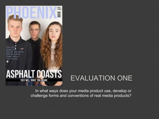
  • 1. EVALUATION ONE In what ways does your media product use, develop or challenge forms and conventions of real media products?
  • 2. Other magazines – The Wire Title – White bold masthead which is spread out over the whole top of the front cover. Short, snappy, memorable magazine name. Layout – Simplistic and neat laid out layout. Variety of unusual layouts especially on the spread on the head line/masthead. Sophisticated and aligned layout on contents. Costumes, etc – Simple, plain casual outfit, and simple background on cover with a sky blue. On contents there is a variety of different sceneries. Relaxed ideology created due to clothing and backgrounds. Camera work – Variety of close ups and long shots throughout the cover, contents and spread. Framing of images – All images are mainly central, but the artists themselves are positioned on an angle or facing forward. Lighting – Lighting has been accounted for, with artificial lighting on covers, and a mixture of natural and artificial lighting on contents and on the spread it consists of more natural lighting due to the shadows on the artists face. Genre and how its represented – The genre is presented throughout the magazine as they incorporate the list of artists which are in the magazine. Also the genre is linked in with the way the magazine has been laid out. Artists and how they are represented – Matana Roberts, is portrayed as a casual, cool artist, who is very independent with her looks and clothes. Colour scheme – Colour scheme is simple with neutral toned colours of whites, blues and blacks. The stronger colours are represented through the images. Font and sizing – Front is simple and block capitals to stand out and the font size is large in places which needs to attract the audience and then is smaller for the contents and article.
  • 3. My chosen magazine title was ‘Phoenix’ which resembles a mythical bird which connotes to be free and independent. This enabled me to represent my music magazine to allow my target audience to be independent, to be their own person and to be motivated. The masthead is short and simple like usual magazines so it attracts the attention of the audience and is easily remembered. The font I chose was downloaded from ‘www.DaFont.com’ which gave me the choice of a variety of fonts. I believed that this font was the best out of them all because of the bold spaced out lettering which shows a clear magazine title. A bold, stand out magazine title is a typical convention of a high street magazine brand, as it grabs the attention of the audience or viewers. My masthead symbolises other brands like NME, FADER, Wonderland and other indie/alternative music magazine brands, with a simple, stand out masthead. These three magazine titles use bold fonts to attract the attention of the audience. All three of these magazine titles have their own independent characteristic. For NME most of their magazines the masthead always has the bright red font colour, this is creative as it draws attention to the magazine with their bright colours. Fader is extremely unique with how the masthead is laid out, by having the ‘F’ inside out. This is done so then their target audience remember the magazines name as it is unique and different, which portrays independence for the magazine itself. Wonderland is creative as the colour of the title corresponds to the colour scheme throughout the whole magazine. It is independent as it has a full stop on every cover on the masthead, it may do this to keep individuality for the magazine.
  • 4. For my magazine ‘Phoenix’ I believe the masthead portrays most characteristics for a music magazine masthead as it is bold and bright. By using colours like I decided which is lilac to attract the attention of my viewers it has made my masthead stand out. I am also glad I used this specific font as it has made my masthead, cover lines and tag lines, etc. to stand out. My magazine is laid out rather simplistic and sophisticated with simple and small amounts of text. I use two kinds of fonts which are ‘Bebas’ and ‘Trajon Pro’. I used two different kinds of text to show a difference between the key features I want my audience to focus on; the masthead, the band, price and dates. I also used ‘Trajon Pro’ fonts for the tag line which is the other bands that are featured in the magazine. The colours of my text do not stand out due to the cool/ colour scheme I wanted to incorporate, but ensured to make them bold so they will be noticed. My masthead is lilac, like the tag lines to represent the extra colours and to brighten up the front cover and to show the colour scheme of the titles. The white colours represent the backgrounds of my magazine throughout, but also stand out due to the models outfits. For the price, date and issue of my magazine, I used black to allow it to stand out due to the white background. The tag lines with the ‘+’ enables the viewers to understand that these are the bands which are in the magazine. It also enables the viewers to understand that the ‘Asphalt Coasts’ is the key band in the magazine due to their own bold title and cover line. Underneath my cover line of ‘Asphalt Coasts’ I added in a headline of what the magazine will be about as there is a hint with ‘Drive’ as it is their new single. I think my magazine front cover shows conventions of a magazine due to the balance and use of the masthead, cover lines, headlines, tag lines, price, date, etc. I have understood key parts of a music magazine incorporating music bands to attract my target audience. By having spaced out letters for my title it will allow it to stand out and the way my magazine is laid out suggests a music magazine. In my contents page I tried to make my music magazine similar to ‘The Wire’ magazines contents. I loved the layout and how it was all aligned and neat, and I knew I wanted my contents to be neat and sophisticated. I took inspiration from ‘The Wire’ magazine as it included most aspects as to what I wanted my magazine to be laid out like. It fits the conventions of a music magazine because of the layout and the design and also the colour scheme which I wanted. Throughout my double page spread I took inspiration from a different magazine, as I liked the fonts which they used for the headlines and cover lines, they seemed very eye catching. Plus, the layout was also sophisticated which I also liked. My double page spread hit the conventions of a music magazine as it showed variety of things in which a music magazine would contain. It contains a bold masthead which signified the artists themselves, and I also incorporated a headline to allow my audience to understand who the band was to give them an insight.
  • 5. The outfits my models portray symbolises an indie music magazine. The outfits they wear are smart and casual, which was what I wanted for my magazine. I ensured that the boys in the band wore polo shirts to make them look smart and sophisticated. The girls stayed simplistic with plain colours which contributed to the colour scheme I wanted for my magazine. They wore jackets or bomber jackets with simplistic colours like black or grey and I wanted them to wear plain tops so it matched with the simple colour scheme of my magazine throughout. The girl in the band on the double page spread had an outfit change to portray another style which is suitable for my magazine. She wore a grey top, black jeans and a black Harrington jacket, this has a contrast with the white wall to enable her to stand out. I did not use any props as I decided to keep my magazine simple with a lack of things so then the viewers would focus more on the models which are in my magazine. I believe I didn’t use a variety of camera shots as my shots consisted of short and medium shots. By using these shots it has enabled me to understand my models facial expressions. The framing of all my models I used are all centred to make them be centre of attention and important to notice. The front cover has them framed differently to all the others, as they are framed close together and are cut off at the sides the models on the end. The fonts and styles I used were simple as I used Ariel which is a regular font throughout Microsoft software's, and Bebas for a bold title and masthead. By incorporating these fonts it has made my magazine stand out much more, especially with the Bebas font which is bold and big which enables my magazine to be noticed more. My article was the same as the titles and headers a simple thin but bold font which enabled the titles, headers and the article itself to stand out. The article is bold as I made sure that it would be noticed and look intriguing. The genre of my music magazine is Indie/alternative and it is portrayed on my front cover due to the bands which are in my music magazine which are stated on the front cover. Due to wanting my magazine to seem sophisticated and simple, my models are wearing simple clothes. The boys are wearing polo shirts which are quite sophisticated and mainstream clothes, due to the polo shirts and the Hollister brand too. I portrayed this as my target audience was 17-24 which are suggested as young adults and the clothes which my band wore is what most teenagers would wear. The second boy in the band which is also wearing and polo which makes them look smart also. The girl in the band looks very sophisticated also, due to her jacket which makes her look smart. The girl in the band seems exactly like my audience profile which I created during research. On my contents page it contains 3 pictures, one of the band and two artists. The two artists are both wearing bomber jackets, one beige and one black. They seem sophisticated and quite indie with the variety of colours which are incorporated. The double page spread shows the girl and both boys in the band, the boys are wearing the same, but the girl is wearing something different. She is wearing a Harrington jacket, which is quite indie as they’re quite unique and stylish. I wanted my band and artists to be stylish but independent in their own way, I wanted them to express their own style in which they liked.
  • 6. The colour scheme of my magazine was simple with monochrome colours in which I wanted, and then the pastel colours which I wanted to incorporate. I wanted my magazine to be simple, sophisticated and I did want a small amount of bright colours, so I decided to use purple but in small amounts. These colours come across as more sophisticated and simple, as I did prefer my magazine to be less bright as I preferred it instead of the draft magazine with the green. I wanted to keep the conventions of a regular magazine, especially a music magazine, as they mainly contain neutral colour schemes which are mainly black and white. By doing this it made me assume my magazine seemed real due to the layout and the colours in which I used.