1. Evidence of my work
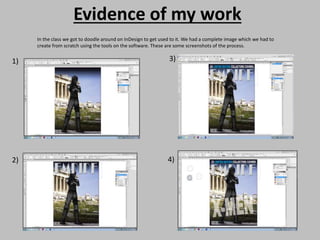
In the class we got to doodle around on InDesign to get used to it. We had a complete image which we had to
create from scratch using the tools on the software. These are some screenshots of the process.
1)
2)
3)
4)
2. I then learnt how to create the
grids and columns, on here I
placed a random image and used
place holder text just so I could
get an outline of the layout and
perhaps get some ideas for mine.
3. For my magazine I created
three pages with the grids and
columns two of which would
be as a double page spread.
However not all my magazine
articles/pages would be three
pages
4. CONTACT SHEET
This was an edited image
from the original I thought
if I increase the exposure I
can use this as the
background and place
another image smaller
and over this. But this
didn’t look well.
This image seemed to
unrealistic and its
dull.
The expression on
my female models
face didn’t seem
serious.
This image seemed to
unrealistic.
My male model has
his middle finger up
which could appear to
be inappropriate.
The
expression on
my female
models face
didn’t seem
serious.
This is the image I
chose. I chose this
because the
expression on
both their face is
very powerful and
supports the
purpose
From the image I chose I
put it onto Photoshop
and cut around so I could
add it onto a plain white
background. I also edited
the image
My male models face is
hidden therefore facial
expressions are not
shown clearly.
My male models face is
hidden therefore facial
expressions are not
shown clearly, and
image is way to bright
This image seemed
to unrealistic and its
dull.
5. Ankits right hand
is blurry
Image is too
stretched
End of the guitar is
blurry
One of the images I was going
to choose however, End of
the guitar is slightly blurry
I used this image for the top of my
interview page it’s a unique image
I used this image on my double page
for my interview, the picture is
perfectly taken with a great angle
Hand is blurry
I used this image for the front cover of my
magazine. It was perfectly taken and
placed and correct use on camera focus
Top of guitar is cropped out
Top of guitar is blurry and facial
expression isn't great
6. When creating this page I knew I wanted the picture to be very large and cover most of the page so that’s exactly what I did. I enlarged the picture
and placed it in the centre so it would be the main focus and the writing would be around it. In the bottom left hand corner I created a black text
box and wrote the title of my feature article in white writing so it would stand out. The title of my feature article is a question because I feel that
this creates more of a discussion and can get people more interested in it. In addition to this I added my headline in the top left hand corner it a
very large size font so it will stand out and catch attention. It is important for it to catch attention because then people will be more interested and
want to read.
7. These are the steps I took in order to create my feature article which is about the correlation between rock music and violence. Photo number 1 is a photo I
took of my friends hand. With a black pen I wrote ‘HATE’ in thick writing then I created the blood effect using different shades of red lipstick and even a little
bit of fake blood. I then transferred the image onto photoshop and darkened it to give it a slightly haunting effect. Image number 2 shows me creating the pull
quotes I included in the article. Keeping to the black and white theme of my magazine, I created a black text box and added white italic writing to contrast. In
addition to this I included who the quote is by. Image number 3 shows the first part of my article. As you can see there are more black text boxes with white
writing, there are paragraphs, quotes, margins, gutters and also a by line, these are all conventions of a typical magazine. At the bottom of every page I made
sure to include the page number, date of issue and the name of the magazine. Image 4 is the rest of my article, which is similar to image 3.
1 2
3
4
8. These are the steps I took to create my contents page. I started off by adding my magazine
title, then in the same font but larger writing I wrote ‘CONTENTS’ to ensure it is clear that
this is the contents page. Next I started adding my images. From looking at layouts of similar
magazines to mine, I decided to place all my images on the right hand side, with the editors
letter underneath. Then I added all the content of my magazine on the left. I used titles and
subtitles to separate each article and I added the page number of each article.
This is for my interview. The very first thing I did was create the double spread introduction page which included a large picture which took over
2 pages. I then started to add some writing introducing the articles and who and what the article is about. On the next page I inserted my picture
which is a photo of an amp along with the bottom half of my interviewee carrying a guitar. I then added my text right underneath that including a
pull quote within a black box and many other questions and answers.