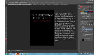
1. This is the stage where I
chose the tagline. I was
aiming to create a tagline in
a slightly different font to
the title. In this case I chose
a serif font with the lines ‘A
MATTER OF LIFE AND
DEATH!’ I chose this tagline
as it matches with the title.
It gives a little insight of the
genre of the film and the
possible events. In this case
being that someone’s life is
likely to be at risk. This is
emphasised by the tagline.
After reading the title of the
film.
2. Having written down the
tagline, I decided to add a
little dramatic effect to the
text. I came with the idea of
blurring the text for that
dramatic effect as illustrate
aside. In order to achieve
this blurry effect, I
duplicated the text layer,
then moved the original text
layer down a little to create
a over layered appearance
which created a blurry
effect on the text. I played
around with the colour on
the text to see which effect I
found the most desirable. I
was aiming to achieve a
different shade of red
through out the tagline to
achieve a more sensational
appearance.
3. I was playing around with
the colours on the tagline
with the reds. The first
image looks as has some
areas of red which is
saturated with a
magenta/pink colour. The
aim here is to create a font
which complements the
film genre, and this pink
effect defeats the purpose.
As a result of that, I
saturated with a different
shade of red as a
replacement (to the pink
areas). This is illustrated
by the image on the right
The text on the tagline
of this piece of work
appears to be a lot
more realistic with
shades of red
throughout. The colour
red complements the
background colour and
the text on the title.
4. I added an image which
depicts an insight of the
story of the film. In this
case, there is some form
of drug use included. The
original image had
colour, but I decided to
change that appearance
to black and white. I
wanted to achieve an
image which
complements well with
the title, and this was
the outsome.
I prefer this piece of
work to the one on
the left hand side
mainly because of
colour which matches
the title. This is also
the main colour
scheme which I
particularly found to
be desirable were
black, white and red.
This effect also
complements the
genre of the film. I
didn’t have the
intention to make this
look too dramatic.
5. This is the stage where
I selected the font and
colour of the names. I
chose to put these at
the top in stead of the
bottom or anywhere
else because I had the
intention of making the
image as the main
source of attention,
therefore I did not
intend to have it
surrounded with text.
I played around with
colours whilst deciding
the colour to chose for
the text on the names.
I decided to use a pale
grey instead of the
white to allow the title
to stand out more.
6. I then added a
certificate of 15 and the
date. I chose a 15
certificate as there is
drug use included in
the film. I also chose
the date colour to be a
light grey to
complement other text.
The date here is much
bigger than the other
text apart from the
title. This is a feature
that engages the
audience attention,
informing them the
date when the film is
out, and to persuade
them to watch the film.
This is my final film
cover.
7. Overall, the most noticeable features on this film cover is the title and the image.
The title is much bigger than all the other texts since it is the main focal attention.
It is also I a colour that is contrasted to the black background for a clear
appearance. Being in capital letters also contributes to enabling the title to be
the focal point. The image is another focal point which is actually the biggest
feature. It takes up almost half of the page. The image and the title provides a
little insight of what the film is about. The same goes with the tagline.
The tagline itself is in a red font. This is for the purpose of separating it from the title
in a way that stands out from the other text. As mentioned before, I created this
text in such a way that is blurry to depict a dramatic effect. The main subject in
the tagline are the words ‘LIFE’ and ‘DEATH’. This is emphasized by the size of the
words in comparison to the rest of the line.
The colours of the suggests that there is something ‘shady’ within the film. In this
case, the film being a drama – thriller emphasises the genre, mainly because of
red and black. Psychologically, other than the positive side of the colour red
being that, is the colour of physical movement, and that is can be associated
with love, it also connotes negative traits including: aggressive and domineering,
over-bearing, tiring, angry and quick-tempered, ruthless, fearful and intolerant,
rebellious and obstinate, resentful, violent and brutal. It all depends on how it is
displayed and the situation. In this case, the tagline includes the words ‘LIFE’ and
‘DEATH’ in capital letters, as well as the image giving an insight of the plot of the
film, the red suggests that there is something negative which happens in the film.
The certificate of this film is 15 as it includes drug use. This is also portrayed by the
image included on the film cover.