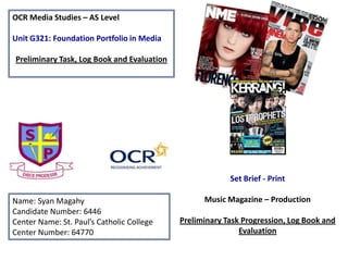
1. OCR Media Studies – AS Level
Unit G321: Foundation Portfolio in Media
Preliminary Task, Log Book and Evaluation
Set Brief - Print
Name: Syan Magahy
Candidate Number: 6446
Center Name: St. Paul’s Catholic College
Center Number: 64770
Music Magazine – Production
Preliminary Task Progression, Log Book and
Evaluation
2. Preliminary Task Progression– Front Cover – Step By Step
1
These are the lines to
help me measure up
my front cover. The
measurements of this
page was 20cm by
21cms
2
I started off with my
masthead and my
strapline, I stuck with
the same colours with
both text to make it
look affective.
3. I then added all small
information such as the
barcode, small logo, issue,
price and date following with
the social network sites for
my magazine. I also added
my main image as she is the
main story of the magazine
3
4
5
After all adding all the
important details I
then put the cover
stories with a puff and
a bit of information
underneath the main
headline which was
exclusive interviews
I then inserted the
masthead for my
magazine ‘St Paul’s
Special’ and added the
main headline ‘Mege
Sebeikaite’ as she was
my main image and
main story
4. Preliminary Task Progression– Contents page – Step By Step
1
I started with a blank
page and these are the
lines to help me
measure up my front
cover. The
measurements of this
page was 20cm by
21cms
I then when on to inserting
my front cover masthead as
well as the contents page
with the logo so it is similar
to my front cover
3
I then inserted my front
cover into my contents page
along with my editorial
2
5. 4
I then added in a picture of myself
next to my editorial so that the
readers will know who created it. I also
added a ‘W’ to welcome with the
same font as my masthead to make it
look more effective and added every
time I said ‘St Pauls' I copied the
masthead and made it small to fit in
with my editorial. I then started on my
subheadings for my cover stories
adding a small St Paul’s logo in the
corner of each one.
5
I then added all the page
numbers for each cover
story so it will be easy
for the readers to find
the pages that are in the
contents page.
6. 6
I then inserted all the cover
stories next to each page
number so it looks all fitted
together and readers will
understand which page is
where
8
This is the finishing
contents page as I
lastly added the 3
interviewee’s which
were on the front
cover
7
I put my signature with
my name and the name
of the magazine along
with the social media
sites for it too and the
page of the number at
the bottom
7. Preliminary Task Progression – Brainstorm
School Magazine names
St Paul’s MAG
St Paul’s Students
St Paul’s News
St Paul’s Studies
St Paul’s Special
ST PAUL’S COLLEGE
College
St Paul’s Sixth Form
Catholic College
10. Music Magazine – Genre research
•
•
•
Top of the Pops magazine is a
monthly published, This magazine
was launched in February 1995 and is
famous for showing all pop
celebrities. The title has had several
editors over the years, including
Peter Lorraine, Corinna Schaffer and
Rosalie Snaith, and contributing
editors including Adam Tanswell. Its
current editor is Peter Hart.
This magazine is based on pop music
which emphasizes the name, the
magazine was also released after the
T.V show Top of the Pops!
The target audience of the top of the
pops magazine are young girl/teens
who are interested in fashion, gossip
and pop celebrities!
Source:
http://en.wikipedia.org/wiki/Top_of_the_Pops_magazi
ne
11. Established Magazine for my Research
Strapline
Masthead
Price, issue
website
Cover lines
Cover lines
Main Image –
Star appeal
(Richard Dyer)
Main headline
12. Target Audience –
The target audience for Q magazine can be denoted as an older
generation. This is because on every front cover for Q magazine, the
celebrities are in their mid 20’s – mid 30’s. So what I think the age
target audience is 25-35 males (Hartley’s Seven Subjectivities).
I think this magazine is ‘informs and educates’ (Katz) the reader
because even on this example of the magazine, the
strap line denotes ‘Great Music Now’.
For Q magazine, the unique selling point is that the magazine always denotes the
exclusive information on the front cover, this is the best unique selling point
because verbal codes such as ‘exclusive’ connotes a story that the media hasn’t
brought out yet, so people will be more interested to know and read it, which
then persuades them to buy the magazine.
Also, the publication is bringing the newest, most up to date music to the readers
but also including older successful bands. The colour scheme and different effects
make the magazine different and therefore unique to sell. The non-verbal code of
the colour red connotes the institutions passion and desire to cover a variety of
different music sub-genres to the reader.
13. Publisher research
This piece of important information
is from a source of evidence from
the Q website.
• Q is the UK’s number one activelypurchased music magazine.
• Q is about quality and character. Q’s
readers prize its lavish photography, indepth reporting and sense of humour.
• Q is about authority and opinion. It
stands for the music that matters, the
stars who make it and the people who
love it.
• Q is trusted and influential. A positive
In this source, it shows the gender ratio of the readers for this
review in Q can make a band’s career –
magazine. As from what shows, more males read Qmagazine than
and Q’s major interviews reverberate
females, I know this because 68.3% males read Q magazine and only
around the world.
31% females read it, so the percentage comparison is higher for
• Q gets unparalleled access to the biggest
males. By researching this, I know that the target audience is more
stars in rock and roll.
likely for men than women. It also explains the age range of it too,
• Q’s audience is younger and more
for people in the category ‘15-24’ is the most from the age range that
affluent than any other music monthly.
read the Q magazine, just by looking at the other age ranges, the
97% of readers rate Q as a quality
category ’15-24’ has a percentage of 35.5% which is more than the
magazine. In research it outperforms
rest.
competitors on measures such as best
interviews, writing and awards winning
photography.
Source: http://magazines.bauermediaadvertising.com/magazines/detail/Q
14. Conventions of a Music Magazine
The codes and conventions that
define this front cover as a pop
music magazine are the bright and
light colours, there aren’t a lot of
dark colours and this helps increase
the utopian vibe of the magazine.
The non-verbal code of the main
image of Justin Bieber connotes that
he’s the top story of the magazine,
for his image being big, it gives a
enigma clue (Barthes) to the
audience that he’s the main story
and it then connotes that it will be
something very interesting for him
to be the main story of the whole
magazine. His presence alone
immediately signifies some ‘star
appeal’ (Richard Dyer) for the
magazine.
Also, the magazine gives the
audience a chance to ‘win’ meeting
the x factor finalists, which makes
the readers more intrigued to buy
the magazine and read more about
it. It also creates a lot of fun for the
readers as winning something
always comes with a challenge, this
then gives the readers something
good to do whilst reading through
the magazine.
There are a different selection of fonts
for all the different kind of texts that
are included on the front cover. This is
effective for the readers, for example
‘shock’ (the main headline) is in bold
and capital letters with the colour of
the colour scheme to make it stand
out, this then shows it is interesting.
The punctuation used in this
front cover establishes the
excitement of the story lines.
When using an exclamation
mark, it denotes to the reader
that the information is exciting
for them.
The genre of this music magazine is
‘pop’. I know this because of the
masthead ‘top of the pops’ which
gives then automatically helps the
reader know what genre can
possibly be an easier process for
them as if they like pop music they
can just pick up the magazine just by
reading the masthead.
There are also smaller, thumb nail images of other
celebrities that anchor the cover lines. This then explains in just one
word or one small sentence that they will be in the magazine also, but
they are not the main story. They too are famous celebrities, which will
be exciting for the readers because they are celebrities that they like too.
logo
15. Target Audience – sand/or socio-economic needs
The target audience for Top of The Pops magazine can be denoted as a young age from my opinion
age 12- 18. From primary research that I have used it says ‘the target audience is 11-15 years Age
range 85% Girls 15% Boys’ I know this because there are vibrant colours that are used on this
magazine which is stereo typically girls colours such as pastel colours
pink, purple, blue and more
The Socio-economic needs I think are because there all young
celebrities that students which are in the appropriate age like and listen
to their music. I also think that there is personal identification which relates to
Kat’z theory because readers who read this magazine, they may relate the celebrities
or musicians on the cover or double page spread.
Also, Heartly’s theory link in with the target audience because of there age and even gender as this
type of magazine that suits young teens as they are most likely to read this.
Lastly, Maslow’s hierarchy of needs as it links in with Caregivers as the readers sympathies with the
bands/artist situations.
The unique selling point (USP) for my chosen magazine of inspiration from
the Pop music genre is the colours are very vibrant, which then attracts the
readers because the colours are there for a purpose which is so it fits in with
the target audience needs of consuming clean cut, female targeted music.
Also, the Masthead is a USP because the font is big and bold, so it will be the
first thing the target audience look at. This is very helpful because the target
audience will find out what it is called so they can buy it straight away. One
the top of the pops magazine, there is a good use of star appeal as Cher Lloyd
is dressed, looked and positioned appropriately for the magazine which
would attract the readers into buying the magazine and also reading it.
16. Publisher research – Top of the Pops
The publisher of my chosen my magazine for Top of the Pops is Martin Stahel
The target readership for my chosen magazine is the age range from 8-17, also its based for girls
as it’s a girly magazine which is strictly for young teenagers.
This shows that latest gossip for young teenagers to know as there are celebrities in the
magazine that young teenagers like. Top Of The Pops' magazine is a monthly periodical which was
first published in February 1995 by the BBC and is most famous for giving The Spice Girls their
well known nicknames.
The magazine started off as a weekly magazine, but as the readership levels have gone down, the
magazine has been changed to being published only once a month. The reader profile also shows
that the majority of the magazine's readers fall into the socio-economic category (109,000) and
only 55,000 fall into the ABC category.
This is probably due to the fact that 'Top Of The Pops' is not a very glossy or expensive magazine,
and so isn't as appealing to the higher or upper classes. Top Of The Pops magazine saw a net
circulation decline of 13.4% in the first half of this year.
Source:
http://www.newsstand.co.uk/
193-Pop-MusicMagazines/2018-Subscribe-toTOP-OF-THE-POPS-MagazineSubscription.aspx