
Recommended
More Related Content
What's hot
What's hot (19)
Similar to Work proof digipak
Similar to Work proof digipak (20)
More from EntenteX
Recently uploaded
Recently uploaded (20)
Work proof digipak
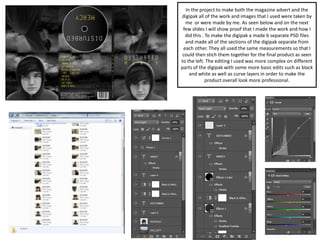
- 1. In the project to make both the magazine advert and the digipak all of the work and images that I used were taken by me or were made by me. As seen below and on the next few slides I will show proof that I made the work and how I did this . To make the digipak a made 6 separate PSD files and made all of the sections of the digipak separate from each other. They all used the same measurements so that I could then stich them together for the final product as seen to the left. The editing I used was more complex on different parts of the digipak with some more basic edits such as black and white as well as curve layers in order to make the product overall look more professional.
- 2. Front Cover The front cover was very simple and only used one main image with a simple edit. For all of my separate pieces of work I followed a simple yet professional and creative design. I layered various basic edits these included a black and white layer to make the digipak match both the advert and the overall feel of the music video. I then layered my images as well as my text. To make the text stand out and look more professional I placed various edits on them including kerning which allowed the space between the text to change and make it look more spaced out. The main image was also simple as all it required was some cutting tolls like magic wand as well as some other edits to smooth it out.
- 3. The back again was very similar to the from cover only I had to add more images as well as a lot more text to create the song list and the more technical Copyright text seen in small at the bottom. Using the same text and colour scheme I made sure that the back looked similar to the front and made sure that text colour as well as layout were similar to make the digipak more consistent. The text was placed to the as well as the declaimer. I experimented with moving these around. To finish I then placed some edit layers on top of the edit to make it look much nicer these included curves layers, Levels and a black and white layer to make it correspond to the other sides. Back Cover
- 4. CD To make the CD part of the digipak I used more practical tools to create this part of the digipak. In order to make this I used the custom shape tool in order to create a shape of my own. This would then allow me to edit the look later on allowing me to further customise and edit the shape more to my liking. Like before I used the same text and colour scheme with the only minor change being the background to reflect the CD part of the digipak. I then made the CD look more professional by adding a shine as well as outlines and colour in order to make it more professional and more realistic