
Recommended
More Related Content
What's hot
What's hot (20)
Viewers also liked
Viewers also liked (12)
Similar to Abstract Elements and Surreal Effects in Progressive House Digipak Design
Similar to Abstract Elements and Surreal Effects in Progressive House Digipak Design (20)
Recently uploaded
Recently uploaded (20)
Abstract Elements and Surreal Effects in Progressive House Digipak Design
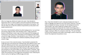
- 1. After my image was edited and ready to be used, I have decided to experiment with it in order to gather some kind of abstract elements that will link the main image to the progressive house/dance music genre. This will also allow me to meet the audience requirements as discussed in the spoken questionnaire. First of all, I have decided to delete the white background so I can just have the portrait image by itself. I have therefore used a “magic wand tool” feature in Photoshop in order to get rid of the majority of the background. Furthermore, there were some small details of the background still visible around the image, therefore, I have decided to use an “eraser” tool in order to make sure that the background is deleted completely, leaving me with a smooth image. As you can see in the screenshot above, I have decided to duplicate the image few times and overlay each individual layer with different colour. Each layer with different portrait colour were placed behind the original image and then some of them were moved left and some right. This has allowed me to obtain an interesting illusion effect linking to the progressive house and computers as this kind of effect can be noticed when a computer “lags”. Applying the illusion effects using three different colours also goes with the codes and conventions of the progressive house/dance music reflecting the colours used as the lighting on different gigs and clubs. Also, I have then decided to insert a dark grey background colour in order to highlight and make the rest of the colours stand out. This was easily completed by having a new layer for the background and the “paint bucket” was used to apply the suitable colour. In order to improve the background and go with the modern technology style, I have decided to add some thin white lines going horizontal through the images creating an effect of a computer screen lag. This can be linked to the act that computers and modern technology is used to create and master the progressive house/dance music.
- 2. Following, I have decided to develop the picture further, therefore, I have used “blending” and “advanced blending” options in the Photoshop in order to play with the channels, including CMYK colours. This has allowed me to gather a lot of different variations of the image, which I have found to be very interesting. You can see the variety of image manipulation outcomes on the left hand side. Overall, I really liked the colour combinations, however in my opinion it was too complicated to use on the front cover of the digipak.
- 3. Due to the fact that I was really inspired by the front cover of the Zedd’s digipak, I have decided to play around with different effects which will allow me to make the picture more surreal which is typical of this music genre. One of the results I have obtained included to use of “Find Edges” effect. As you can see below, the picture turned white and the colours of the other layers were highlighted, creating a beautiful effect. This has allowed me to create my own image “style”. Due to the fact that the layers with different colours were decreased in opacity, all of the tones were nicely blended together. It looks like different colours were coming out of the head of the artist just like the sound waves. This has allowed me to follow the codes and conventions of progressive house music genre as I was inspired through real media texts inducing Zedd. There were also few other digipaks I have looked like in order to get inspiration. These included “Stories” and “True” by Avicii. Both of his digipak front covers were designed in an interesting way including colour overlay. You can see the digipaks below and as you can notice on “Stories”, the model’s face is covered by different colour. The album “True” features image overlay where there is two images of the artist going on top of each other. All of these create a surreal effect which I was trying to incorporate in my work.
- 4. As I have continued to experiment with the location image, I have came up with a good idea to try and link the portrait and the location image together. Therefore I have decided to try and use a clipping mask feature so the portrait image could be covered with the picture with the path and trees. This has allowed me to create a very interesting surreal effect as if the location picture filled in the portrait shot. I really liked this image when compared to the previous image, however in order to go with the codes and conventions I have decided to modify the colours of the image with the path and trees. In order to obtain more vibrant and vivid colours, I have decided to use “hue” and colour saturation. After checking out different levels of colour using hue, I have ended up with an abstract effect where the trees and path included red, pink, blue and yellow colours. Due to the fact that I was planning to make the image the main and the most important element of the digipak, I had to make sure that it stands out and grabs the attention of the audience successfully. Therefore, I have decided to keep the location image as the background however I have made the parts outside of the portrait black and white by using the “desaturation” effect. This has allowed me to make the main image stand out on the dull background which will make the digipak stand out due to the highlighted, vibrant colours within the portrait picture of the artist. Referring back to our music video and also other existing progressive house videos, I have noticed that the nature is used and emphasized a lot which is then reflected within the digipak and advert designs. Due to the fact that I have taken some good images during the music video shooting days, I have decided to use one to experiment with. As you can see, the image which I have chosen was also taken near the recording location in the park and it portrays a path covered by leafs and surrounded by trees on both sides. The image was opened in the Photoshop as well, allowing me to manipulate it.
- 5. Due to the fact that I didn’t like the outline of the artist image with the headphones around the neck, I have selected another image which simply portrayed the artist, without headphones and other additional equipment. That image was used to gather the double exposure effect, using the edited location image. You can see how the digipak front cover has progressed by following the arrows. The final digipak front cover was constructed using Adobe InDesign. This software has helped me in order to accurately structure the digipak front cover. I was able to use guidelines in order to make sure that there main image is placed right in the centre of the front cover. I was able to make sure that the album and artist name are centre aligned.
- 6. Furthermore, I have decided to construct the reverse side of the digipak. In order to follow the codes and conventions of the typical progressive house digipaks, I have decided to list the songs in the middle of the reverse side. Furthermore, in order to make the songs on the CD easier to identify, I have added a number next to each song so that the user knows the order in which the songs appear on the CD. I have decided to include other elements including copyright information, record label logos and barcode. Moreover, I have decided to make the font colour white in order to make the text stand out so that it is easy to read for the audience. As a further development, I have decided to change the font colour to black so that it matches the font colour on the front cover of the digipak. That has allowed me to maintain the house style.
- 7. Due to the fact that I also really liked the initial idea picture I have created at the beginning , I have decided to create a reverse side of the digipak that would follow the same style as this picture. I have therefore used the same picture and used only part of it which includes the headphones. The picture was rotated as seen below. This has resulted in a good starting for the reverse side of the digipak. After some development, a line was added so that the headphones are separated from the list of songs.
- 8. After comparing both of my digipak proposals I have decided to go with the second design, as I think thought it has followed my codes and conventions of progressive house genre. I also think that by including the nature as the picture overlaying the artist would help me to link the digipak to the music video I have created. I have decided to finalise the external sides of the digipak by creating a spine for the album. It includes the album and artist name in the middle. There is a record label (Fly Eye Records) logo at one end and issue number on the other end.
- 9. Due to the fact that I have really liked this images design, I have decided to use it in the interior of the digipak. I have decided to develop this image further in order to make it more interesting for the target audience. First of all, I have created two more layers including the same image. I have then kept the original image in the middle and then placed one image on the left hand side and one on the right hand side. Moreover, the opacity of the images on the sides was decreased providing me with excellent outcome. Additionally, I have decided to change the background colour as visible on the third picture above. This has allowed me to link this design to the digipak front cover.
- 10. Following, I have decided to move on into the CD design which also included the design of the space behind it. As you can see above, I have used Adobe Illustrator in order to create the CD structure. The software was easy to use as it was similar to Photoshop. The software has enabled me to create an accurate CD outline. Furthermore, I have continued by adding border. Additionally, I have decided to use the image which was used at the digipak front cover and use it on the CD. I have used the picture portraying the path in the park surrounded by trees. The CD therefore included the same vibrant colours as the main image at the front cover. I have then added the album at the top and artist name at the bottom part of the CD, using the same font style and colour (black) in order to keep house style. Moreover, I have added the record label logo below the artist name and copyright information going around the CD just like I have noticed in most of the real media texts including CD examples of famous progressive house and house music artists. Lastly, I have decided to use the same picture as on the CD and place it behind the CD, however in black and white colour. Therefore, the Cd and the space behind it created “one big image” however the picture becomes black and white around the outline of the CD. I have then decided to join two designs in order to create the interior of the digipak including the back cover of the booklet (image on the left side) and the CD (on the right side).
- 12. The advert was another part of the ancillary task which I was required to complete. Due to the fact that the advert is meant to advertise and promote the album, I have allowed the poster to maintain the house style of the digipak and therefore to use the same main image that I have used on the digipak front cover. As you can see, the elements included on the advert include a lot of text. The most essential information include the album name: “Destination” and the artist name. which was placed at the top in a form of a logo. Furthermore, one of the most significant elements include the “Out Now” phrase. This phrase was presented in a bolder font making it easier to read even from further distance. It grabs the audience’s attention and encourages them to read more information on the poster when noticed on the street. Moreover, other essential information which help the advert to advertise and promote the music album are the songs listed: “Beautiful Now” and “The only way is up”. The advert states that the new music album includes these two hits making the album more recognisable by the audience. This is because some of the people might have heard one of the songs before at some point. Lastly, other information included in the advert are the record label logo and website address which were placed at the bottom of the poster. The website can be used by audience in order to find out more regarding the music album or other information such as concert tickets.