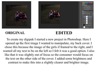
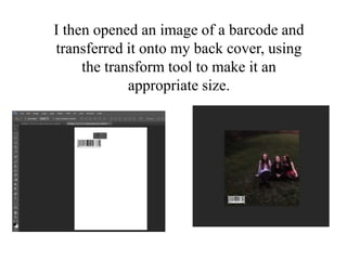
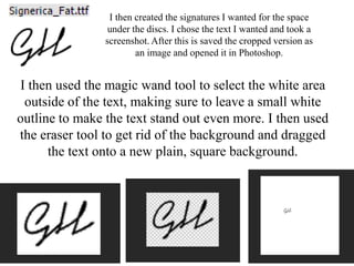
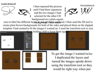
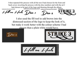
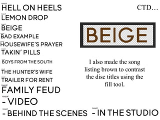
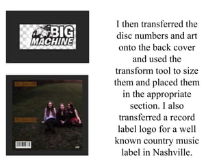
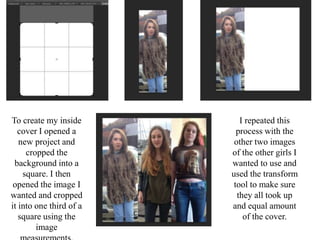
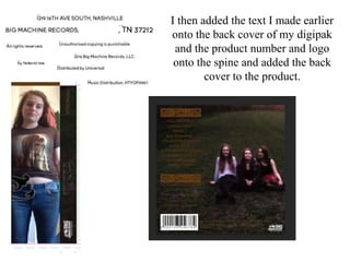
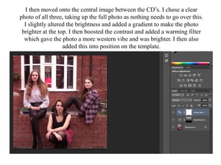
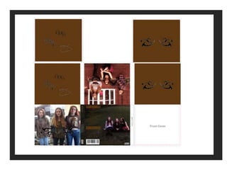
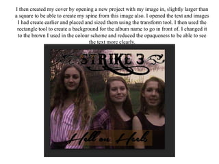
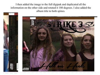
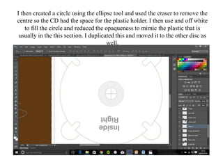
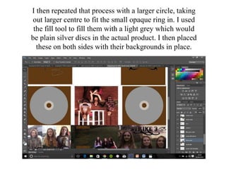
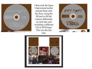
To create my digipak I started a new project in Photoshop. Here I
opened up the first image I wanted to manipulate, my back cover. I
chose this because the image of the girls if framed to the right, and I
wanted all my text to be on the left so I felt it was a good option. I also
like that it was slightly out of focus so the consumer would focus on
the text on the other side of the cover. I added some brightness and
contrast to make this into a slightly clearer and brighter image.
ORIGINAL EDITED
I then opened an image of a barcode and
transferred it onto my back cover, using
the transform tool to make it an
appropriate size.
I then created the signatures I wanted for the space
under the discs. I chose the text I wanted and took a
screenshot. After this is saved the cropped version as
an image and opened it in Photoshop.
I then used the magic wand tool to select the white area
outside of the text, making sure to leave a small white
outline to make the text stand out even more. I then used
the eraser tool to get rid of the background and dragged
the text onto a new plain, square background.
I then repeated the process
until I had three signatures
and the two images I had
selected for the other CD
background on a plain square
background. I also madesure to label the different layers to not get them confused. I then used the fill tool to
create plain brown backgrounds for both of the sides and placed them on the digipak
template I had created to fit the images I wanted on. I used the transform tool so size
them, holding shift to keep them square.
To get the image I wanted twice
I duplicated the layers and
turned the images upside down
using the transform tool so they
would be right way when put
I then repeated this process with all the text I had chosen for the front and
back cover, inverting the process with the disc numbers and with the art I
had chosen to be part of the logo and theming through the album.
I also used the fill tool to add brown into the
distressed section of the logo to keep the look of it,
but make it work better with the colour scheme I had
chosen than a plain white would have.
CTD…
I also made the song
listing brown to contrast
the disc titles using the
fill tool.
I then transferred the
disc numbers and art
onto the back cover
and used the
transform tool to size
them and placed them
in the appropriate
section. I also
transferred a record
label logo for a well
known country music
label in Nashville.
To create my inside
cover I opened a
new project and
cropped the
background into a
square. I then
opened the image I
wanted and cropped
it into one third of a
square using the
image
I repeated this
process with the
other two images
of the other girls I
wanted to use and
used the transform
tool to make sure
they all took up
and equal amount
of the cover.
I then added some art I chose to be part of
the logo for the band onto this image. I used
to lasso and erase tools to get rid of black
section and then the magic wand and erase
tool to remove the white and placed them
over the image using the transform tool to
size them. I then added this onto the actual
digipak, using the transform tool to fit it into
place
I then started creating my spine for the
digipak. I cropped a small section of the
background of the original image for the
back cover to be the spine.
I then transferred it onto my
digipak from the other project
onto this one.
Then I used the transform tool to make
it an accurate shape and added the
record label logo here too as I found
that conventional.
I then added the text I made earlier
onto the back cover of my digipak
and the product number and logo
onto the spine and added the back
cover to the product.
I then moved onto the central image between the CD’s. I chose a clear
photo of all three, taking up the full photo as nothing needs to go over this.
I slightly altered the brightness and added a gradient to make the photo
brighter at the top. I then boosted the contrast and added a warming filter
which gave the photo a more western vibe and was brighter. I then also
added this into position on the template.
I then created my cover by opening a new project with my image in, slightly larger than
a square to be able to create my spine from this image also. I opened the text and images
I had create earlier and placed and sized them using the transform tool. I then used the
rectangle tool to create a background for the album name to go in front of. I changed it
to the brown I used in the colour scheme and reduced the opaqueness to be able to see
the text more clearly.
I then added the image to the full digipak and duplicated all the
information on the other side and rotated it 180 degrees. I also added the
album title to both spines.
I then created a circle using the ellipse tool and used the eraser to remove the
centre so the CD had the space for the plastic holder. I then use and off white
to fill the circle and reduced the opaqueness to mimic the plastic that is
usually in the this section. I duplicated this and moved it to the other disc as
well.
I then repeated that process with a larger circle, taking
out larger centre to fit the small opaque ring in. I used
the fill tool to fill them with a light grey which would
be plain silver discs in the actual product. I then placed
these on both sides with their backgrounds in place.
I then took the logos
I had created earlier
and put them onto
the discs, using the
fill tool to fill the
colours differently
on each disc and
including a different
CD or DVD logo.
This was the last
step.

Making my digipak - Hell on Heels

  • 1.
    To create mydigipak I started a new project in Photoshop. Here I opened up the first image I wanted to manipulate, my back cover. I chose this because the image of the girls if framed to the right, and I wanted all my text to be on the left so I felt it was a good option. I also like that it was slightly out of focus so the consumer would focus on the text on the other side of the cover. I added some brightness and contrast to make this into a slightly clearer and brighter image. ORIGINAL EDITED
  • 2.
    I then openedan image of a barcode and transferred it onto my back cover, using the transform tool to make it an appropriate size.
  • 3.
    I then createdthe signatures I wanted for the space under the discs. I chose the text I wanted and took a screenshot. After this is saved the cropped version as an image and opened it in Photoshop. I then used the magic wand tool to select the white area outside of the text, making sure to leave a small white outline to make the text stand out even more. I then used the eraser tool to get rid of the background and dragged the text onto a new plain, square background.
  • 4.
    I then repeatedthe process until I had three signatures and the two images I had selected for the other CD background on a plain square background. I also madesure to label the different layers to not get them confused. I then used the fill tool to create plain brown backgrounds for both of the sides and placed them on the digipak template I had created to fit the images I wanted on. I used the transform tool so size them, holding shift to keep them square. To get the image I wanted twice I duplicated the layers and turned the images upside down using the transform tool so they would be right way when put
  • 5.
    I then repeatedthis process with all the text I had chosen for the front and back cover, inverting the process with the disc numbers and with the art I had chosen to be part of the logo and theming through the album. I also used the fill tool to add brown into the distressed section of the logo to keep the look of it, but make it work better with the colour scheme I had chosen than a plain white would have.
  • 6.
    CTD… I also madethe song listing brown to contrast the disc titles using the fill tool.
  • 7.
    I then transferredthe disc numbers and art onto the back cover and used the transform tool to size them and placed them in the appropriate section. I also transferred a record label logo for a well known country music label in Nashville.
  • 8.
    To create myinside cover I opened a new project and cropped the background into a square. I then opened the image I wanted and cropped it into one third of a square using the image I repeated this process with the other two images of the other girls I wanted to use and used the transform tool to make sure they all took up and equal amount of the cover.
  • 9.
    I then addedsome art I chose to be part of the logo for the band onto this image. I used to lasso and erase tools to get rid of black section and then the magic wand and erase tool to remove the white and placed them over the image using the transform tool to size them. I then added this onto the actual digipak, using the transform tool to fit it into place
  • 10.
    I then startedcreating my spine for the digipak. I cropped a small section of the background of the original image for the back cover to be the spine. I then transferred it onto my digipak from the other project onto this one. Then I used the transform tool to make it an accurate shape and added the record label logo here too as I found that conventional.
  • 11.
    I then addedthe text I made earlier onto the back cover of my digipak and the product number and logo onto the spine and added the back cover to the product.
  • 12.
    I then movedonto the central image between the CD’s. I chose a clear photo of all three, taking up the full photo as nothing needs to go over this. I slightly altered the brightness and added a gradient to make the photo brighter at the top. I then boosted the contrast and added a warming filter which gave the photo a more western vibe and was brighter. I then also added this into position on the template.
  • 14.
    I then createdmy cover by opening a new project with my image in, slightly larger than a square to be able to create my spine from this image also. I opened the text and images I had create earlier and placed and sized them using the transform tool. I then used the rectangle tool to create a background for the album name to go in front of. I changed it to the brown I used in the colour scheme and reduced the opaqueness to be able to see the text more clearly.
  • 15.
    I then addedthe image to the full digipak and duplicated all the information on the other side and rotated it 180 degrees. I also added the album title to both spines.
  • 16.
    I then createda circle using the ellipse tool and used the eraser to remove the centre so the CD had the space for the plastic holder. I then use and off white to fill the circle and reduced the opaqueness to mimic the plastic that is usually in the this section. I duplicated this and moved it to the other disc as well.
  • 17.
    I then repeatedthat process with a larger circle, taking out larger centre to fit the small opaque ring in. I used the fill tool to fill them with a light grey which would be plain silver discs in the actual product. I then placed these on both sides with their backgrounds in place.
  • 18.
    I then tookthe logos I had created earlier and put them onto the discs, using the fill tool to fill the colours differently on each disc and including a different CD or DVD logo. This was the last step.