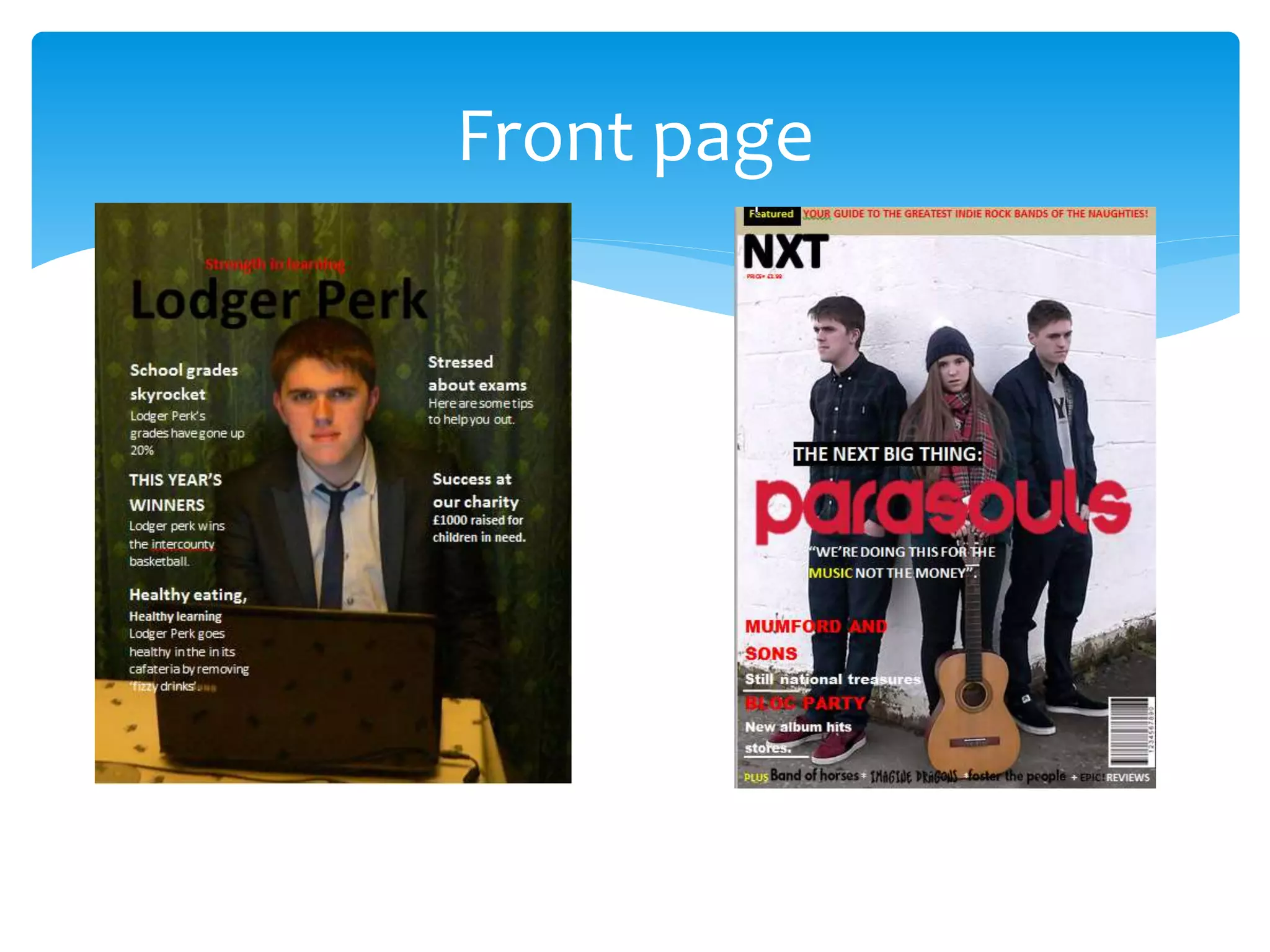
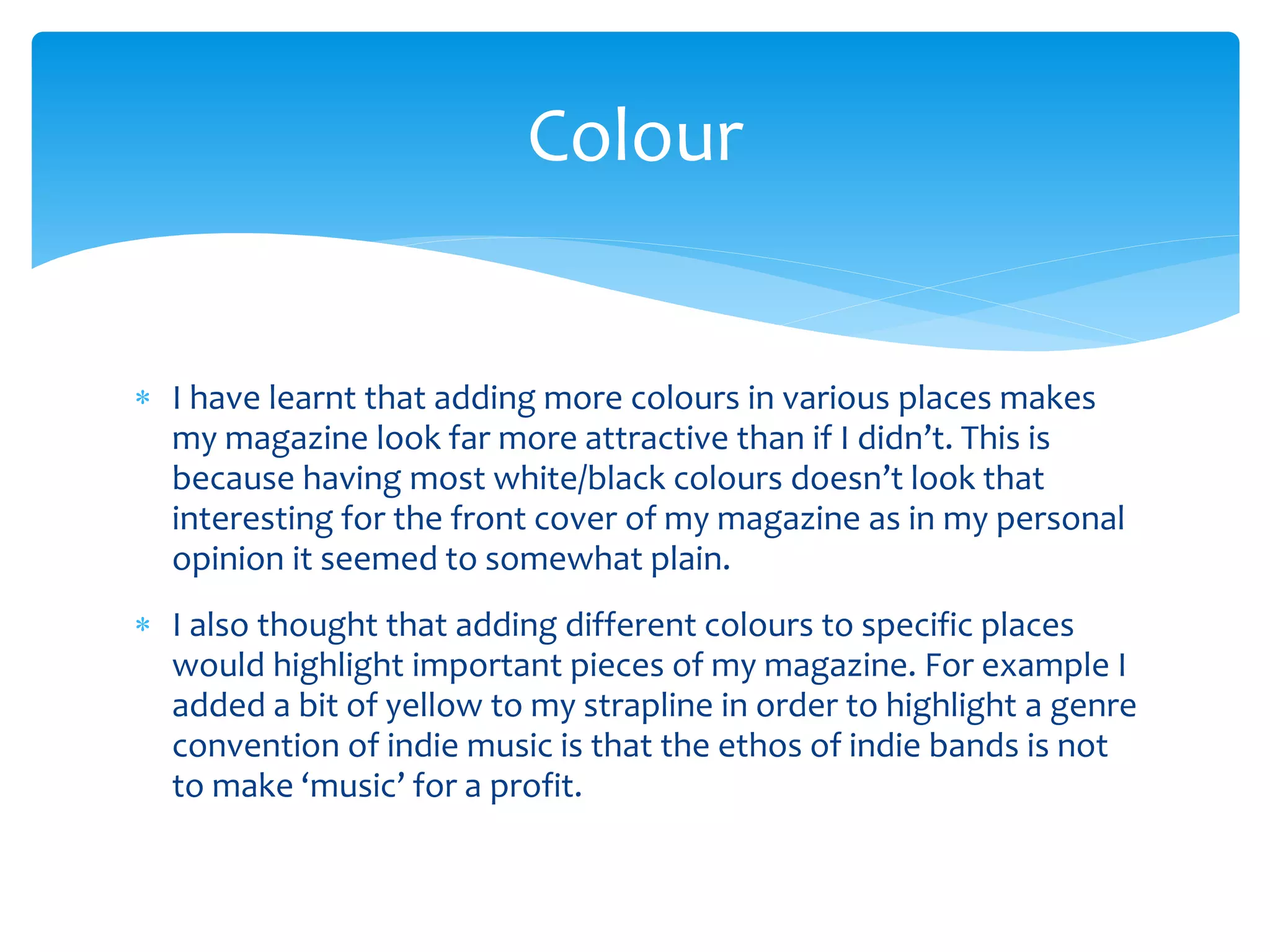
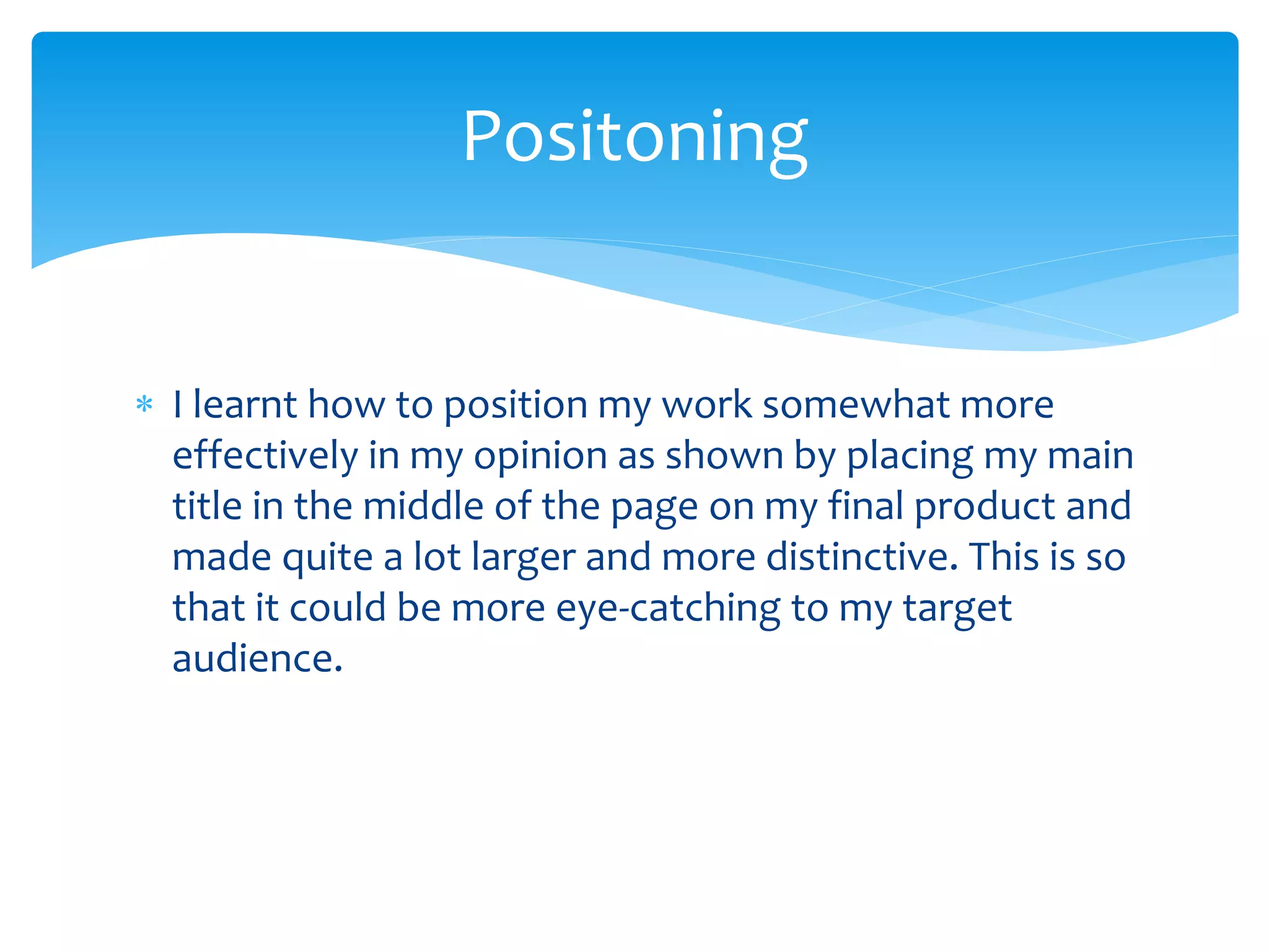
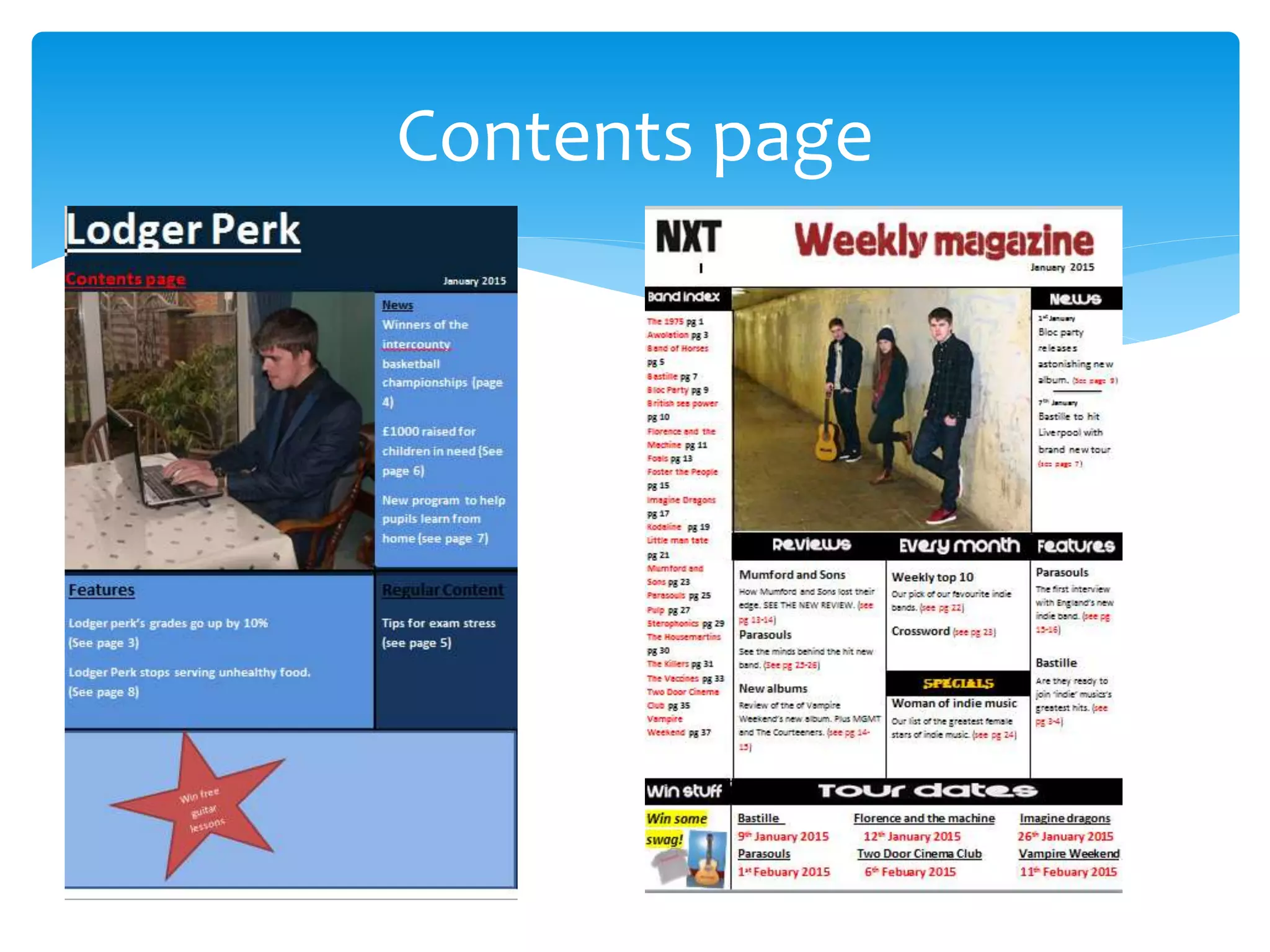
What I have learnt from my
preliminary task my final product?
Front page
 I have learnt that adding more colours in various places makes
my magazine look far more attractive than if I didn’t. This is
because having most white/black colours doesn’t look that
interesting for the front cover of my magazine as in my personal
opinion it seemed to somewhat plain.
 I also thought that adding different colours to specific places
would highlight important pieces of my magazine. For example I
added a bit of yellow to my strapline in order to highlight a genre
convention of indie music is that the ethos of indie bands is not
to make ‘music’ for a profit.
Colour
 I learnt how to position my work somewhat more
effectively in my opinion as shown by placing my main
title in the middle of the page on my final product and
made quite a lot larger and more distinctive. This is so
that it could be more eye-catching to my target
audience.
Positoning
 I also felt that my font was less attractive than it
could be on my indie bands front cover. This is
because it didn’t seem that interesting in my personal
opinion. This is why I altered the fonts on my final
page into something that I felt was more attractive to
my target audience.
Font
 I also felt that the addition of a strapline to my final
magazine would be very useful to me as I felt it would
allow me to hook my target audience more than I
could previously. This is because my strapline allows
me to grab my audiences attention with an
interesting piece of information.
Strapline
Contents page
 I also felt that my font was less attractive than it
could be on my indie bands’ contents page for my
preliminary task. This is because it didn’t seem that
interesting in my personal opinion. This is why I
altered the fonts on my final page into something
that I felt was more attractive to my target audience
Font
 I felt that the colours I used in my preliminary task for my
contents page were not very attractive. This is why I changed it
in my final product so that it would be more appealing to my
target audience and therefore they are more likely to want to
buy it.
 I also changed my background colours from my preliminary task
to my final task from many different colours to white. This is
because I wanted my contents page to look slightly simpler and
more professional as I felt that white would make my magazine
look more business-like and cleaner.
Colour
 I also included far more content than I did my
preliminary task. This is because I felt the content in
preliminary task was quite sparse, which made it look
slightly un-professional. This is because it could have
looked like I did not plan my preliminary contents
page correctly.
Content

What i have learnt from my preliminary task

  • 1.
    What I havelearnt from my preliminary task my final product?
  • 2.
  • 3.
     I havelearnt that adding more colours in various places makes my magazine look far more attractive than if I didn’t. This is because having most white/black colours doesn’t look that interesting for the front cover of my magazine as in my personal opinion it seemed to somewhat plain.  I also thought that adding different colours to specific places would highlight important pieces of my magazine. For example I added a bit of yellow to my strapline in order to highlight a genre convention of indie music is that the ethos of indie bands is not to make ‘music’ for a profit. Colour
  • 4.
     I learnthow to position my work somewhat more effectively in my opinion as shown by placing my main title in the middle of the page on my final product and made quite a lot larger and more distinctive. This is so that it could be more eye-catching to my target audience. Positoning
  • 5.
     I alsofelt that my font was less attractive than it could be on my indie bands front cover. This is because it didn’t seem that interesting in my personal opinion. This is why I altered the fonts on my final page into something that I felt was more attractive to my target audience. Font
  • 6.
     I alsofelt that the addition of a strapline to my final magazine would be very useful to me as I felt it would allow me to hook my target audience more than I could previously. This is because my strapline allows me to grab my audiences attention with an interesting piece of information. Strapline
  • 7.
  • 8.
     I alsofelt that my font was less attractive than it could be on my indie bands’ contents page for my preliminary task. This is because it didn’t seem that interesting in my personal opinion. This is why I altered the fonts on my final page into something that I felt was more attractive to my target audience Font
  • 9.
     I feltthat the colours I used in my preliminary task for my contents page were not very attractive. This is why I changed it in my final product so that it would be more appealing to my target audience and therefore they are more likely to want to buy it.  I also changed my background colours from my preliminary task to my final task from many different colours to white. This is because I wanted my contents page to look slightly simpler and more professional as I felt that white would make my magazine look more business-like and cleaner. Colour
  • 10.
     I alsoincluded far more content than I did my preliminary task. This is because I felt the content in preliminary task was quite sparse, which made it look slightly un-professional. This is because it could have looked like I did not plan my preliminary contents page correctly. Content