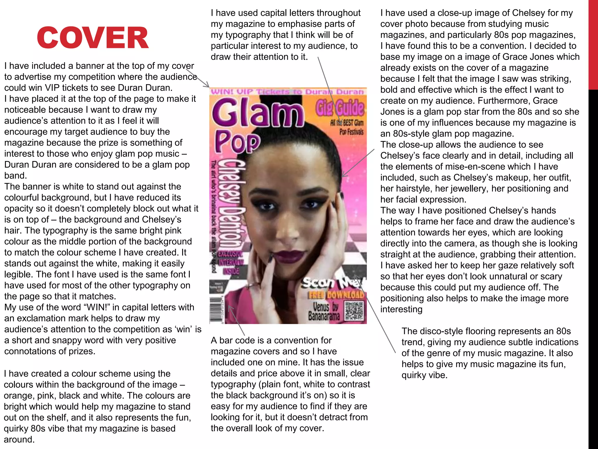
The document discusses the choices made in designing the cover and contents page for a music magazine. For the cover, the designer used a close-up photo of Chelsey inspired by 1980s magazine covers. Cover lines advertise articles and competitions. The contents page continues the 1980s retro theme with ripped paper and Polaroid-style photos. Article names and page numbers are included to aid navigation. The double page spread features a large photo of interview subject Chelsey Denton with a pull quote from the interview as the heading.
Operation “Blue Star” is the only event in the history of Independent India where the state went into war with its own people. Even after about 40 years it is not clear if it was culmination of states anger over people of the region, a political game of power or start of dictatorial chapter in the democratic setup.
The people of Punjab felt alienated from main stream due to denial of their just demands during a long democratic struggle since independence. As it happen all over the word, it led to militant struggle with great loss of lives of military, police and civilian personnel. Killing of Indira Gandhi and massacre of innocent Sikhs in Delhi and other India cities was also associated with this movement.
Palestine last event orientationfvgnh .pptxRaedMohamed3
An EFL lesson about the current events in Palestine. It is intended to be for intermediate students who wish to increase their listening skills through a short lesson in power point.
Macroeconomics- Movie Location
This will be used as part of your Personal Professional Portfolio once graded.
Objective:
Prepare a presentation or a paper using research, basic comparative analysis, data organization and application of economic information. You will make an informed assessment of an economic climate outside of the United States to accomplish an entertainment industry objective.
Honest Reviews of Tim Han LMA Course Program.pptxtimhan337
Personal development courses are widely available today, with each one promising life-changing outcomes. Tim Han’s Life Mastery Achievers (LMA) Course has drawn a lot of interest. In addition to offering my frank assessment of Success Insider’s LMA Course, this piece examines the course’s effects via a variety of Tim Han LMA course reviews and Success Insider comments.
Model Attribute Check Company Auto PropertyCeline George
In Odoo, the multi-company feature allows you to manage multiple companies within a single Odoo database instance. Each company can have its own configurations while still sharing common resources such as products, customers, and suppliers.
Francesca Gottschalk - How can education support child empowerment.pptxEduSkills OECD
Francesca Gottschalk from the OECD’s Centre for Educational Research and Innovation presents at the Ask an Expert Webinar: How can education support child empowerment?
Embracing GenAI - A Strategic ImperativePeter Windle
Artificial Intelligence (AI) technologies such as Generative AI, Image Generators and Large Language Models have had a dramatic impact on teaching, learning and assessment over the past 18 months. The most immediate threat AI posed was to Academic Integrity with Higher Education Institutes (HEIs) focusing their efforts on combating the use of GenAI in assessment. Guidelines were developed for staff and students, policies put in place too. Innovative educators have forged paths in the use of Generative AI for teaching, learning and assessments leading to pockets of transformation springing up across HEIs, often with little or no top-down guidance, support or direction.
This Gasta posits a strategic approach to integrating AI into HEIs to prepare staff, students and the curriculum for an evolving world and workplace. We will highlight the advantages of working with these technologies beyond the realm of teaching, learning and assessment by considering prompt engineering skills, industry impact, curriculum changes, and the need for staff upskilling. In contrast, not engaging strategically with Generative AI poses risks, including falling behind peers, missed opportunities and failing to ensure our graduates remain employable. The rapid evolution of AI technologies necessitates a proactive and strategic approach if we are to remain relevant.
Read| The latest issue of The Challenger is here! We are thrilled to announce that our school paper has qualified for the NATIONAL SCHOOLS PRESS CONFERENCE (NSPC) 2024. Thank you for your unwavering support and trust. Dive into the stories that made us stand out!
How to Make a Field invisible in Odoo 17Celine George
It is possible to hide or invisible some fields in odoo. Commonly using “invisible” attribute in the field definition to invisible the fields. This slide will show how to make a field invisible in odoo 17.
Biological screening of herbal drugs: Introduction and Need for
Phyto-Pharmacological Screening, New Strategies for evaluating
Natural Products, In vitro evaluation techniques for Antioxidants, Antimicrobial and Anticancer drugs. In vivo evaluation techniques
for Anti-inflammatory, Antiulcer, Anticancer, Wound healing, Antidiabetic, Hepatoprotective, Cardio protective, Diuretics and
Antifertility, Toxicity studies as per OECD guidelines
2. COVER
I have used a close-up image of Chelsey for my
cover photo because from studying music
magazines, and particularly 80s pop magazines,
I have found this to be a convention. I decided to
base my image on a image of Grace Jones which
already exists on the cover of a magazine
because I felt that the image I saw was striking,
bold and effective which is the effect I want to
create on my audience. Furthermore, Grace
Jones is a glam pop star from the 80s and so she
is one of my influences because my magazine is
an 80s-style glam pop magazine.
The close-up allows the audience to see
Chelsey’s face clearly and in detail, including all
the elements of mise-en-scene which I have
included, such as Chelsey’s makeup, her outfit,
her hairstyle, her jewellery, her positioning and
her facial expression.
The way I have positioned Chelsey’s hands
helps to frame her face and draw the audience’s
attention towards her eyes, which are looking
directly into the camera, as though she is looking
straight at the audience, grabbing their attention.
I have asked her to keep her gaze relatively soft
so that her eyes don’t look unnatural or scary
because this could put my audience off. The
positioning also helps to make the image more
interesting
I have included a banner at the top of my cover
to advertise my competition where the audience
could win VIP tickets to see Duran Duran.
I have placed it at the top of the page to make it
noticeable because I want to draw my
audience’s attention to it as I feel it will
encourage my target audience to buy the
magazine because the prize is something of
interest to those who enjoy glam pop music –
Duran Duran are considered to be a glam pop
band.
The banner is white to stand out against the
colourful background, but I have reduced its
opacity so it doesn’t completely block out what it
is on top of – the background and Chelsey’s
hair. The typography is the same bright pink
colour as the middle portion of the background
to match the colour scheme I have created. It
stands out against the white, making it easily
legible. The font I have used is the same font I
have used for most of the other typography on
the page so that it matches.
My use of the word “WIN!” in capital letters with
an exclamation mark helps to draw my
audience’s attention to the competition as ‘win’ is
a short and snappy word with very positive
connotations of prizes.
I have used capital letters throughout
my magazine to emphasise parts of
my typography that I think will be of
particular interest to my audience, to
draw their attention to it.
I have created a colour scheme using the
colours within the background of the image –
orange, pink, black and white. The colours are
bright which would help my magazine to stand
out on the shelf, and it also represents the fun,
quirky 80s vibe that my magazine is based
around.
A bar code is a convention for
magazine covers and so I have
included one on mine. It has the issue
details and price above it in small, clear
typography (plain font, white to contrast
the black background it’s on) so it is
easy for my audience to find if they are
looking for it, but it doesn’t detract from
the overall look of my cover.
The disco-style flooring represents an 80s
trend, giving my audience subtle indications
of the genre of my music magazine. It also
helps to give my music magazine its fun,
quirky vibe.
3. COVER
I have used a QR code on the front of my music
magazine to give my audience a free download of
an 80s glam pop song because when I visited the
newsagents and the supermarket magazine
shelves to research into what music magazines
are like in general at the moment, I found that
almost all of them included free gifts of CDs.
However, I know that because of the rapid
development in technology that has taken place
in the last few years, barely anyone listens to
CDs anymore. Most people are far more likely to
listen to digital formats of music from iPods,
mobile phones and other music streaming
platforms because it is quicker and easier. The
QR code allows my audience to download the
song straight away and listen to it straight from
their technology which should be more appealing
to them because it’s easier than copying a CD
over. It also means that they will be able to keep
the track for a longer period of time, whereas a
CD is more likely to get lost or broken.
I decided that if I were really to publish this
magazine, I would get everyone to enter their
email address once they scanned the QR code,
before they could download the track so that I
would be able to email them promoting the
magazine. I would have to get them to tick/untick
a permission box for me to be able to do this
though.
I have used alliteration in this cover line to
make the article name more catchy and
pleasant to hear/say because this
consequently makes the article itself appear
better, encouraging people to buy my
magazine so that they can read it.
The colours I have used here also fit in with
my colour scheme. The pink is taken from the
background and the purple is taken from the
lipstick Chelsey is wearing. The font matches
the font underneath it to make it aesthetically
pleasing for my audience. The font I have
chosen is easily legible, but fun and quirky to
match the mood of my cover at the same time.
Underneath the title of the article I have
provided a short description of it for my
audience so that it is more clear what the
article is about, so that they can decide
whether they are interested in it, and
ultimately whether they want to read it. The
language I have used to describe the article is
intended to make my audience want to read
the article. The lexis “best” in particular gives a
good impression of the article and its topic.
The name of my music magazine makes it immediately obvious to my audience what genre it
belongs to, attracting people who would be most interested in it. It important for me to establish
what genre my music magazine belongs to straight away because I am targeting a niche market.
I have presented the masthead in a logo format so that I can use the logo I have created
elsewhere in my magazine, such as on my double page spread. This helps me to create a
brand/identity which over time, people will begin to recognise.
I have presented this cover line at a different
angle to make my cover quirky and more
interesting. It is based upon the ‘Pop’
magazine ‘80s excess issue’ which had cover
lines at this angle too. I think it is effective at
drawing my audience’s attention and this is
the impression I got from my audience
research as well. Again, here I have included
a small description and advertised the
interview which forms my double page spread.
I have put a drop shadow on
this text so that it is legible on
top of the busy, vibrant
background that I have
chosen. The colour of this text,
like the rest of the text on my
cover fits with my colour
scheme and is taken from the
background.
4. COVER
I haven’t placed any cover lines on this part of
the cover because if I did, my cover would be
too busy; there would be too much covering
my photograph which is intended to be the
main part of my cover. As I have covered part
of Chelsey’s face with cover lines on the
opposite side of the cover, I did not want to do
the same thing here, especially because her
hands are the outer part of the image and they
are essential parts of the mise-en-scene I have
taken a lot of care to create.
I have included cover lines in the bottom right
of the page to balance my cover more. This is
why they don’t span the bottom of the page but
also, it’s difficult to see them against the
business of the image at when they are at the
bottom of the page. I need my audience to be
able to read the cover lines clearly because
they are designed to entice my audience to
buy and read the magazine.
5. CONTENTS PAGE
I have taken an image of lined paper and
used the eraser tool to make edges look
jagged, as if paper has been ripped out and
attached to the contents page (as
represented by the paper clip). This look was
inspired by a Smash Hits contents page
which did something similar with lined paper.
It gives the impression that the magazine has
been created by hand, connoting that a lot of
time and effort has gone into it (which is
true!). As Smash Hits was a top pop
magazine in the 1980s, I felt that using a
style similar to theirs would give my
magazine an authentic 80s feel.
I have also manipulated the image of the
paper clip to make it look as though it is
hooked round the paper and the same purple
colour as Chelsey’s lipstick on the cover to
create a theme with my colour scheme.
On top of the lined paper, I have included the
name of the articles which I consider to be
important enough to make the contents page
(as not all articles generally do with
magazines), but not important or exciting
enough to be accompanied by a photograph
because photographs take up a lot of room
on contents pages and therefore there can’t
be many of them. I have tried to come up
with catchy, light-hearted and funny names
for the articles to make them more appealing
and memorable for my audience. This is
stereotypical of pop magazines as they
usually have an informal tone to make light,
fun reading for their audience..
I have made the page numbers larger to make them more noticeable and also to
differentiate them from the article titles. The difference in colour also helps with the
differentiation. The pink is the same pink that has been used elsewhere on the page and
also on the contents page to maintain my colour scheme. I made the article titles black to
fit in with the colour scheme too, but also to make them clear for my audience to read.
This is also reflected in the simplistic, clear font I have used for the article names.
I have included a pink banner at the top of the
page to make the background more interesting
and to keep up with my colour scheme. A
contents page banner is something I noticed to
be quite common in pop magazines, so to keep
in line with my chosen genre, I included one.
I have decided to do my editor’s note in
the form of a note from a notice board to
keep in line with the theme I have created
of it being old-school and home made.
I have made the note itself orange to in
keep with my colour scheme and I have
used mainly black text because the two
colours contrast and therefore the
typography is clear and easy to read. The
first ‘W’ is in white to make it stand out to
draw my audience’s attention to the sticky
note as one of the first things they read
(supported by the fact that it is located at
the top of the page), and it also helps to
make the big chunk of text more
interesting.
I have ‘signed’ my name at the bottom in
a quirky font which resembles handwriting
to enforce the idea that the magazine has
been lovingly crafted by hand and to give
it a personal touch. As pop magazines
have typically been more popular with
girls who want pin-ups for their room, I
suspect that my magazine will be more
popular with females than males and so I
have included kisses in my signing,
something that stereotypically girls do
more than boys. This is also the reason
why I have used a lot of pink within my
music magazine.
6. CONTENTS PAGE
I have included several small images down
the right hand side of my contents page. I
have done this to advertise some of the
articles which I think will appeal most to my
target audience because the images attract
more attention and provide some context
about the articles for my audience, so that
they can decide whether they want to read
the article or not quickly and easily.
I have included a variety of different images
to present the different articles and to
introduce some more colours and themes ,
making my contents page more interesting
for my audience.
I have tried to present my images as
Polaroid-style photographs which are
pinned onto the page, like the ripped lined
paper and editors note. I have used a drop
shadow effect on the rectangles to give the
impression that they are 3D and popping off
the page slightly. I have overlapped the
photos in order to try and create the same
effect.
I have used the same yellow colour for the
background of the Polaroid photos as the
lined paper in order to establish a slightly
different colour scheme on this page to my
cover, to make it more aesthetically
pleasing for my audience. I also did this to
differentiate them from the white
background.
I have included a caption on the Polaroid-
style photographs to provide more
information on the article for my audience.
Real Polaroid photos were captioned like
this, usually in black marker pen and so my
captions help my Polaroid photos to look
more authentic.
This is the only photograph that I have used on my contents page which isn’t original
and this is because it is a genuine photograph from the 80s which I couldn’t have taken
myself, as I wasn’t alive then. I feel the addition of this photograph makes my magazine
more authentic in its 80s style. It also helps me to represent the ‘where are they now?’
section of my magazine which I thought of during the planning stages of my production
because I thought this section would be entertaining and effective.
I have included page numbers in my
list of articles so that it is easy for my
audience to navigate through my
magazine.
I have differentiated between the
article names and the page numbers
by making the page numbers pink,
and the article names black. These
colours help me to stick to the colour
scheme I have created using colours
from the cover and from the yellow
paper I have added.
I have added in some colourful musical
notes which fit my colour scheme to
cover some of the white spaces that
were too small to fill with photographs. I
feel that they represent the fun vibe of
80s glam pop music.
I placed my heading at the top of the lined paper which is the top left of the page as a whole
because in this position, it will be the first thing that the audience reads and so they will
immediately recognise the function of the page. I have chosen for it not to span across the
whole page because I feel that it is big enough and bold enough in this position, leaving
room for more images and the editor's note to make my contents page busy and crazy and
fun, which appears to be a convention of pop magazine contents pages.
7. DOUBLE PAGE SPREAD
I have included an original
image of the subject of the
interview – Chelsey Denton
which spans the whole of the
right-hand page. I chose to
make the photograph so large
because I found this to be a
convention of double page
spread interviews, and also
because I wanted the photo to
attract that audience’s attention
as they are flicking through the
magazine so that they will
wonder who she is and stop to
read the article.
I intended for the shot to be a
full shot during the planning
stages of the shoot, but due to
the size of the windows and the
size of Chelsey who is sat in the
window, I found that this
medium/full shot worked better,
and still achieves a very similar
effect where all the elements of
mise-en-scene (minus the neon
yellow heels) can be seen within
the shot. These elements add to
the overall effect of the image
which I feel screams 80s glam
pop, meaning that the image fits
in with the style and genre of my
music magazine.
I decided that the heading of my article
should feature Chelsey’s name in order
to introduce her to the audience before
they continue to read the article. I felt
that this was important as she isn’t an
established glam pop star, so many
members of my audience won’t know
who she is. However, to comply with
conventions that I discovered during
the research and planning stages, I
included a pull quote from the interview
in the heading. I judged this quote
about Justin Bieber to be the most
interesting for my audience because he
is a well-known celebrity who both
males and females are extremely
interested in (although mainly females)
which would appeal to my target
audience of both genders, but more-so
girls. I have made the pull quote and
the heading the same colour to make it
obvious that they go together to make
up the heading.
Underneath the heading, I have included a brief summary of the article, which doesn’t
give any of Chelsey’s actual responses away, encouraging my audience to read the
article to find out what Chelsey’s answers are. Its purpose is to ‘set the scene’ for the
audience and entice them gently into the article. This isn’t in the pink colour that the
heading is in to differentiate it and make it easier to read. It is black n a white
background because the colours contrast so much that the text is easily legible.
I included the logo I created on my cover
on the bottom of this page to reinforce the
branding of the product to my audience
so that they are more likely to remember
who made the magazine so that they can
go out and buy the next issue if they liked
it (which hopefully they will have).
8. DOUBLE PAGE SPREAD I have included a small side banner
on top of my image which reads
‘exclusive interview’. This is designed
to tell the audience explicitly what the
article is about so that they
understand the formatting of it better,
and so that they recognise that the
interview is “exclusive” and therefore
that they can’t read it anywhere else,
which should encourage them to read
the article.
I have included page numbers in the bottom corner of each of the two pages that make up my double page spread so
that those looking for it from the contents page can find it easily. They are located in the same place in most books and
magazines so that they are easy to use, and so I also put them in this same place.
I have presented them in small, clear typography so that they don’t detract from the overall design of the spread, but
are easy for my audience to read and understand. This is a convention of page numbers.
Furthermore, I have written them in black to contrast against the white background, again making them seen more
easily.
In addition to the large image taking
up the whole of the right-hand
page, I have included a ‘selfie’ of
Chelsey which I asked her to take
wearing 80s-style clothing for part
of the mise-en-scene. I have
chosen for her to wear fur as fur
was considered to be fashionable
during the 1980s.
I found an additional small image to
be a convention of interview double
page spreads, which is why I have
chosen to include one.
The reason why I chose a selfie is
to reinforce to my audience that the
interview is “exclusive” and shows a
different side to Chelsey that
nobody has seen before.
It helps to add context to the spread
and allows my audience to feel like
they’re getting to know this new star
better, by showing a different, more
serious and professional side to her
which is a contrast to the large
photograph which portrays her as
happy, wacky and fun-loving.
I have added a caption over the top of the small image,
providing more detail about what it is and what it is
showing – another convention that I discovered whilst
researching.
I presented it in a white text box with pink font (the same
pink as her legwarmers) to contrast against the dark
colours of the photograph so that it can be seen more
easily. These colours also allow me to stick to the new
colour scheme that I have established on this page.
The text box also helps to mix up the way large chunks
of text are presented.
I have established a new colour
scheme on this page mainly using the
pink from Chelsey’s legwarmers on the
main image because this is the most
prominent colour in the image, meaning
that it was essential to make this colour
fit the colour scheme in order for my
double page spread to be aesthetically
pleasing. I have also used black and
white because they are a classic colour
combination which makes my colour
scheme look professional. It also allows
my text to be extremely clear, which is
important for an article.
Furthermore, the pink colour will appeal
to my target audience which I suspect
will mainly be girls.