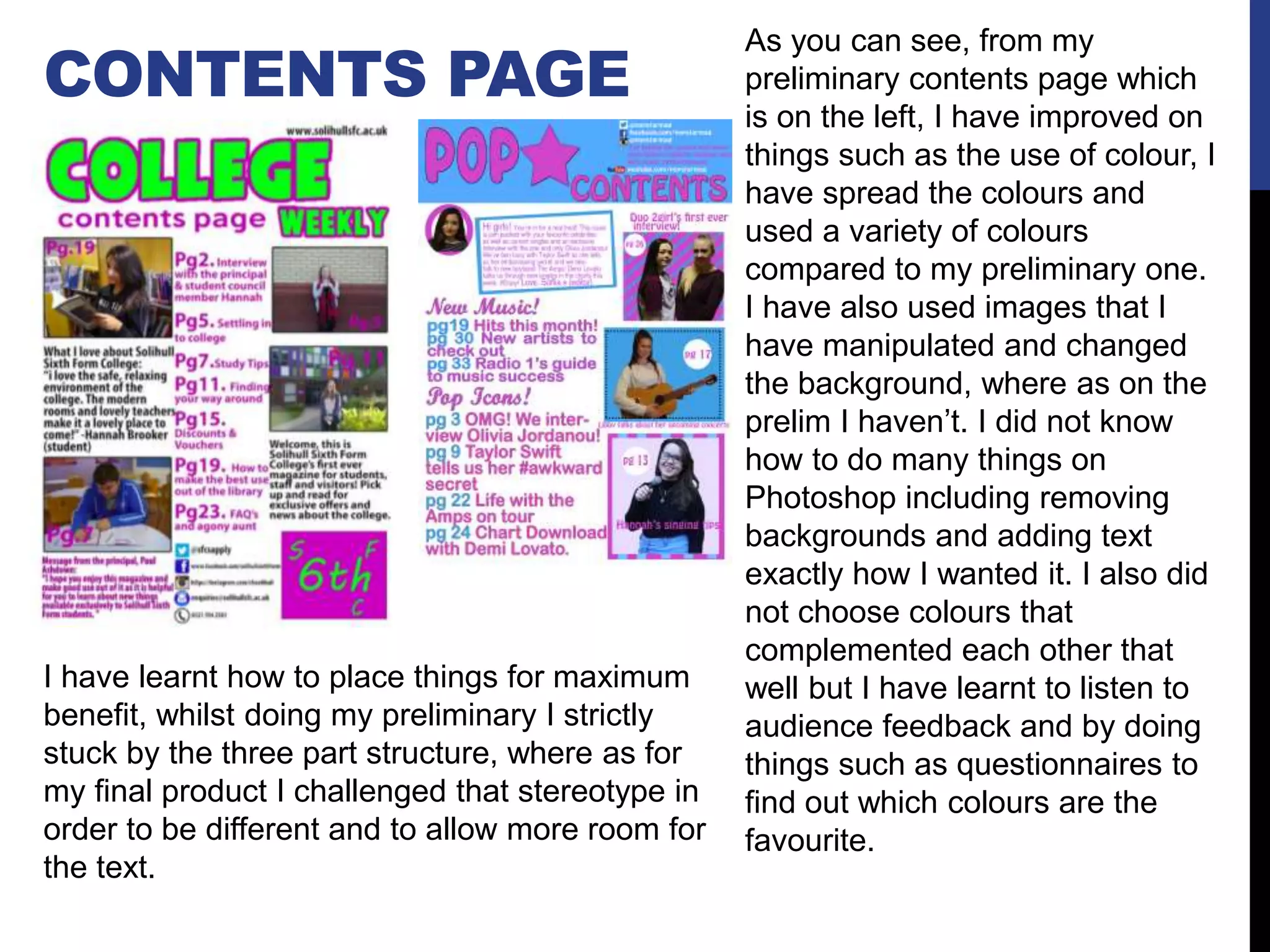
Q7) LOOKING BACK AT THE PRELIM
TASK, WHAT DO YOU FEEL YOU HAVE
LEARNT IN THE PROGRESSION FROM IT
TO THE FULL PRODUCT?
FRONT COVER PAGE
For my cover page, I did not know
how to remove the background and
therefore this is why the background is
not bright and is dull. I also added the
cover lines in more appropriate places
to make sure they weren’t covering
the main image too much, like the
preliminary one does. I have also
added more than one image on the
cover, as before I didn’t know how to
do this and it would not have applied
as well to a college magazine as it
does to a pop magazine. Also before I
did not know how to add borders and
different background etc. I have learnt
where to place things in order to get
the right effect, for example the logo
on the bottom right of my preliminary
cover does not necessarily look the
best there and I learnt that the
consumers usually look at the top half
of the magazine first and so the puff I
used on my final product was put on
the top half and also when magazines
are placed next to others, the right
side sticks out and would be the first
thing you see.
Also, another technique I learnt is to make
the space above the text smaller so the text
is more concise and does not take up too
much room. Also I have kept all my cover
lines the same colour on my cover page, as
from further research into music magazines,
this is what was common amongst other
magazines.
CONTENTS PAGE
As you can see, from my
preliminary contents page which
is on the left, I have improved on
things such as the use of colour, I
have spread the colours and
used a variety of colours
compared to my preliminary one.
I have also used images that I
have manipulated and changed
the background, where as on the
prelim I haven’t. I did not know
how to do many things on
Photoshop including removing
backgrounds and adding text
exactly how I wanted it. I also did
not choose colours that
complemented each other that
well but I have learnt to listen to
audience feedback and by doing
things such as questionnaires to
find out which colours are the
favourite.
I have learnt how to place things for maximum
benefit, whilst doing my preliminary I strictly
stuck by the three part structure, where as for
my final product I challenged that stereotype in
order to be different and to allow more room for
the text.
DOUBLE PG. SPREAD For my double page spread, I had
not done one for my preliminary
task and so went into doing this
with no practice. I had to rely on
research and previous existing
magazines to make sure it looked
like a double page spread. I had to
learn what the best format was to
display.
I have learnt also, to add smaller
images, as for my target audience
they like to see smaller images.
This was also something that was
prominent in other magazines of the
same genre.I also learnt how to use InDesign and as I
had not done a double page spread before
this was challenging at first, in order to get a
article style layout. I also learnt how to place
images and to get a dropcap at the
beginning of the article, which is a
convention for most magazines.
TERMINOLOGY – WORDS I HAVE LEARNT THAT I DID
NOT KNOW BEFORE.
Genre
Masthead
Connotation
Target
audience
Direct address
Main image
Coverlines
Branding
Denotation
Covermount
Puff
Dateline
Typography
Pug
Tag
Drop cap
House
Slug
Endmarker
Pull quote
Buzz quote
Strip/strapline
Selling line
DRAWN DRAFTS
I made lots of changes from my drawn drafts, for example the
background I had intended to have for my front cover page, I realised
it did not fit with my genre, or music at all. I kept the masthead the
same as this was relevant to my genre and stood out. I also changed
some stories on my contents page in order to make it more appealing
to the audience, I have learnt from other magazines that by using high
profile celebrity names, it would attract more people to my magazine
if there is already well known names. Furthermore, I have learnt that
having a covermount on the cover can lead to more sales of the
magazine and intrigues the audience. I have also learnt that by having
a note from the editor gives it a more personal touch. I kept my
double page spread relatively similar to the drawn draft. However, I
changed the headline as I found in other pop magazines such as Top
Of The Pops, more images and shapes were used instead of one
large title going across two pages and therefore I decided to do a
more comical title and font which made the article less serious and
more pleasing to the eye and in the end, more appealing for my target
audience. When doing the real product on the computer, something
that I did not take into consideration was the social media information
and I added this afterwards to my contents page.
RESEARCH
For the preliminary task, research was done for the type of
college magazines already exist and what to include. Where
as for my music magazine I did a lot more research into what
kind of things the audience would want to see and what is
currently popular. I have learnt about music, that lots of
music in the charts is the genre pop and pop magazines are
usually targeted at young females. I also carried out
questionnaires and focus groups in order to find out things
that I had not learnt from the preliminary task.
I have learnt to listen to this primary research as it is coming
from the target audience themselves and plays a vital role in
making sure that the magazine is suited to that audience.
This also ensures that the target audience would purchase
my magazine and gives tips to help make it more appealing.

Q7

  • 1.
    Q7) LOOKING BACKAT THE PRELIM TASK, WHAT DO YOU FEEL YOU HAVE LEARNT IN THE PROGRESSION FROM IT TO THE FULL PRODUCT?
  • 2.
    FRONT COVER PAGE Formy cover page, I did not know how to remove the background and therefore this is why the background is not bright and is dull. I also added the cover lines in more appropriate places to make sure they weren’t covering the main image too much, like the preliminary one does. I have also added more than one image on the cover, as before I didn’t know how to do this and it would not have applied as well to a college magazine as it does to a pop magazine. Also before I did not know how to add borders and different background etc. I have learnt where to place things in order to get the right effect, for example the logo on the bottom right of my preliminary cover does not necessarily look the best there and I learnt that the consumers usually look at the top half of the magazine first and so the puff I used on my final product was put on the top half and also when magazines are placed next to others, the right side sticks out and would be the first thing you see. Also, another technique I learnt is to make the space above the text smaller so the text is more concise and does not take up too much room. Also I have kept all my cover lines the same colour on my cover page, as from further research into music magazines, this is what was common amongst other magazines.
  • 3.
    CONTENTS PAGE As youcan see, from my preliminary contents page which is on the left, I have improved on things such as the use of colour, I have spread the colours and used a variety of colours compared to my preliminary one. I have also used images that I have manipulated and changed the background, where as on the prelim I haven’t. I did not know how to do many things on Photoshop including removing backgrounds and adding text exactly how I wanted it. I also did not choose colours that complemented each other that well but I have learnt to listen to audience feedback and by doing things such as questionnaires to find out which colours are the favourite. I have learnt how to place things for maximum benefit, whilst doing my preliminary I strictly stuck by the three part structure, where as for my final product I challenged that stereotype in order to be different and to allow more room for the text.
  • 4.
    DOUBLE PG. SPREADFor my double page spread, I had not done one for my preliminary task and so went into doing this with no practice. I had to rely on research and previous existing magazines to make sure it looked like a double page spread. I had to learn what the best format was to display. I have learnt also, to add smaller images, as for my target audience they like to see smaller images. This was also something that was prominent in other magazines of the same genre.I also learnt how to use InDesign and as I had not done a double page spread before this was challenging at first, in order to get a article style layout. I also learnt how to place images and to get a dropcap at the beginning of the article, which is a convention for most magazines.
  • 5.
    TERMINOLOGY – WORDSI HAVE LEARNT THAT I DID NOT KNOW BEFORE. Genre Masthead Connotation Target audience Direct address Main image Coverlines Branding Denotation Covermount Puff Dateline Typography Pug Tag Drop cap House Slug Endmarker Pull quote Buzz quote Strip/strapline Selling line
  • 6.
    DRAWN DRAFTS I madelots of changes from my drawn drafts, for example the background I had intended to have for my front cover page, I realised it did not fit with my genre, or music at all. I kept the masthead the same as this was relevant to my genre and stood out. I also changed some stories on my contents page in order to make it more appealing to the audience, I have learnt from other magazines that by using high profile celebrity names, it would attract more people to my magazine if there is already well known names. Furthermore, I have learnt that having a covermount on the cover can lead to more sales of the magazine and intrigues the audience. I have also learnt that by having a note from the editor gives it a more personal touch. I kept my double page spread relatively similar to the drawn draft. However, I changed the headline as I found in other pop magazines such as Top Of The Pops, more images and shapes were used instead of one large title going across two pages and therefore I decided to do a more comical title and font which made the article less serious and more pleasing to the eye and in the end, more appealing for my target audience. When doing the real product on the computer, something that I did not take into consideration was the social media information and I added this afterwards to my contents page.
  • 7.
    RESEARCH For the preliminarytask, research was done for the type of college magazines already exist and what to include. Where as for my music magazine I did a lot more research into what kind of things the audience would want to see and what is currently popular. I have learnt about music, that lots of music in the charts is the genre pop and pop magazines are usually targeted at young females. I also carried out questionnaires and focus groups in order to find out things that I had not learnt from the preliminary task. I have learnt to listen to this primary research as it is coming from the target audience themselves and plays a vital role in making sure that the magazine is suited to that audience. This also ensures that the target audience would purchase my magazine and gives tips to help make it more appealing.