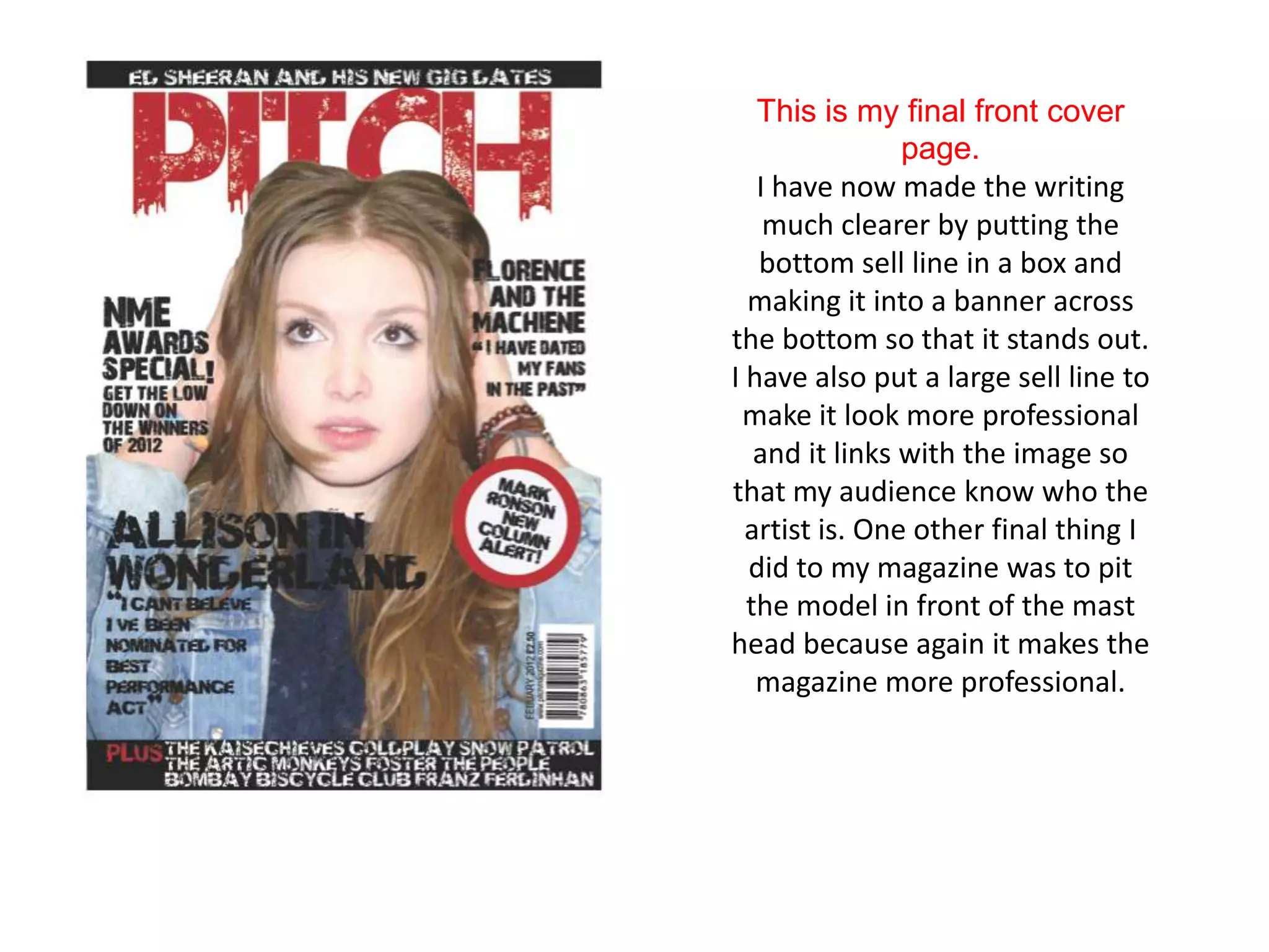
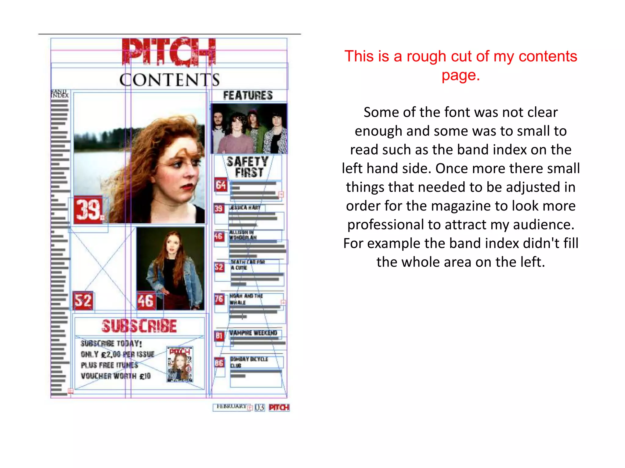
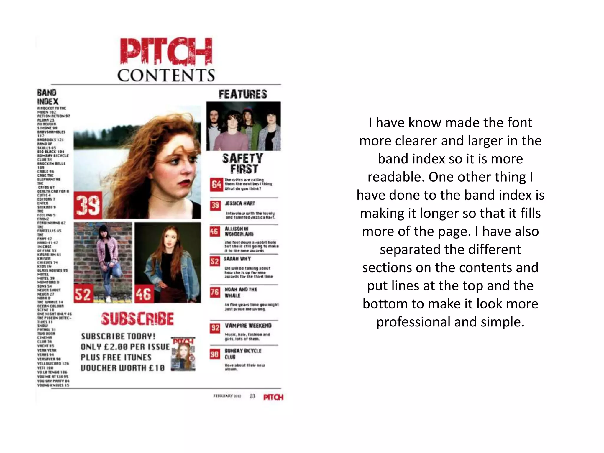
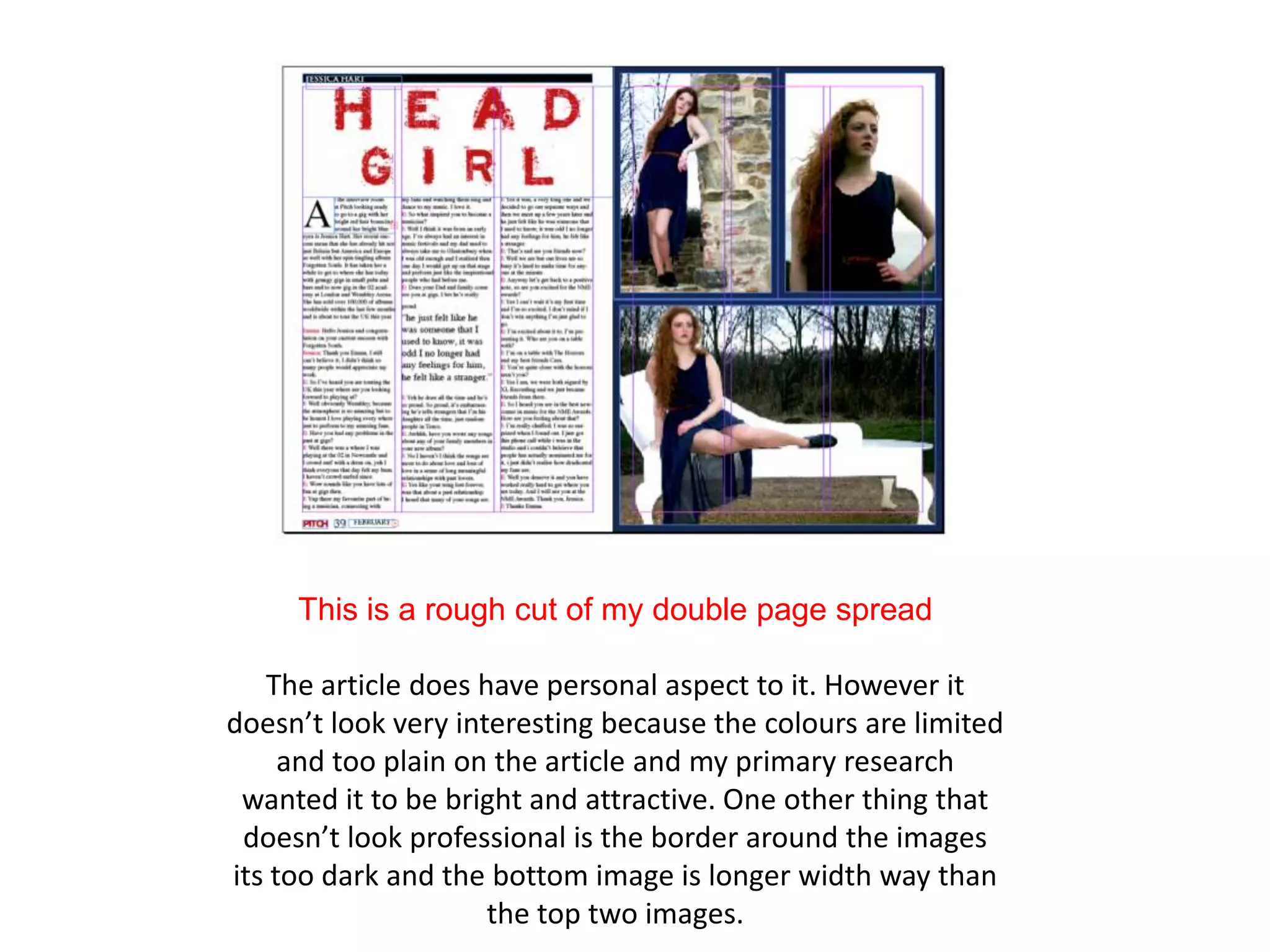
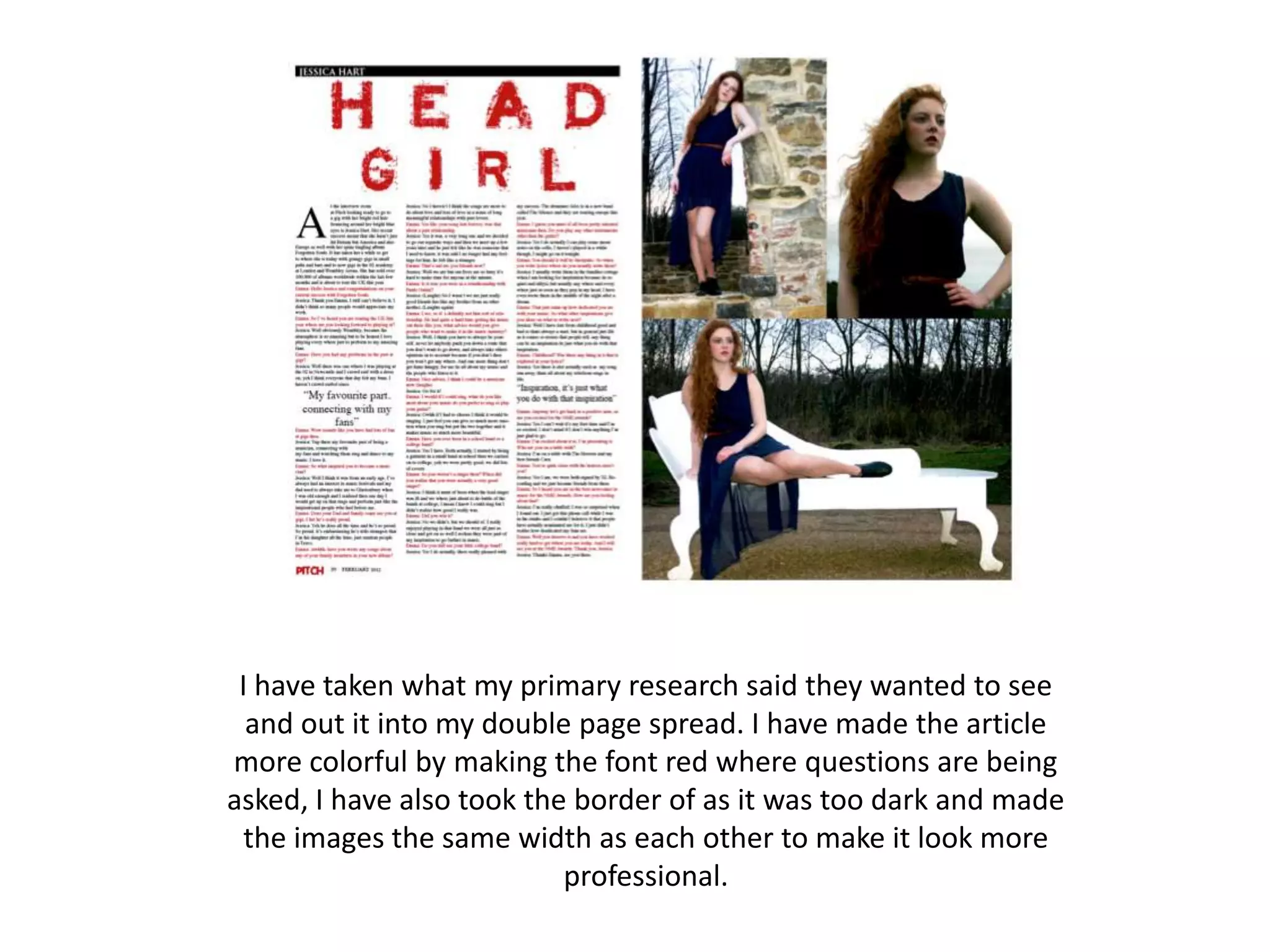
Changes to
Rough Cuts
This is my first rough cut.

I have since changed my front cover
because the text isn't clear enough,
   especially at the bottom of the
   magazine and it doesn’t look as
professional as there is a large gap in
  the magazine where an other sell
            line could go.
This is my final front cover
                page.
   I have now made the writing
    much clearer by putting the
   bottom sell line in a box and
  making it into a banner across
the bottom so that it stands out.
I have also put a large sell line to
 make it look more professional
   and it links with the image so
that my audience know who the
  artist is. One other final thing I
  did to my magazine was to pit
  the model in front of the mast
head because again it makes the
   magazine more professional.
This is a rough cut of my contents
              page.

    Some of the font was not clear
   enough and some was to small to
  read such as the band index on the
left hand side. Once more there small
 things that needed to be adjusted in
 order for the magazine to look more
 professional to attract my audience.
For example the band index didn't fill
      the whole area on the left.
I have know made the font
more clearer and larger in the
    band index so it is more
  readable. One other thing I
have done to the band index is
making it longer so that it fills
 more of the page. I have also
     separated the different
 sections on the contents and
  put lines at the top and the
 bottom to make it look more
    professional and simple.
This is a rough cut of my double page spread

   The article does have personal aspect to it. However it
doesn’t look very interesting because the colours are limited
     and too plain on the article and my primary research
 wanted it to be bright and attractive. One other thing that
 doesn’t look professional is the border around the images
its too dark and the bottom image is longer width way than
                     the top two images.
I have taken what my primary research said they wanted to see
  and out it into my double page spread. I have made the article
more colorful by making the font red where questions are being
asked, I have also took the border of as it was too dark and made
  the images the same width as each other to make it look more
                           professional.

Presentation slide share

  • 1.
  • 2.
    This is myfirst rough cut. I have since changed my front cover because the text isn't clear enough, especially at the bottom of the magazine and it doesn’t look as professional as there is a large gap in the magazine where an other sell line could go.
  • 3.
    This is myfinal front cover page. I have now made the writing much clearer by putting the bottom sell line in a box and making it into a banner across the bottom so that it stands out. I have also put a large sell line to make it look more professional and it links with the image so that my audience know who the artist is. One other final thing I did to my magazine was to pit the model in front of the mast head because again it makes the magazine more professional.
  • 4.
    This is arough cut of my contents page. Some of the font was not clear enough and some was to small to read such as the band index on the left hand side. Once more there small things that needed to be adjusted in order for the magazine to look more professional to attract my audience. For example the band index didn't fill the whole area on the left.
  • 5.
    I have knowmade the font more clearer and larger in the band index so it is more readable. One other thing I have done to the band index is making it longer so that it fills more of the page. I have also separated the different sections on the contents and put lines at the top and the bottom to make it look more professional and simple.
  • 6.
    This is arough cut of my double page spread The article does have personal aspect to it. However it doesn’t look very interesting because the colours are limited and too plain on the article and my primary research wanted it to be bright and attractive. One other thing that doesn’t look professional is the border around the images its too dark and the bottom image is longer width way than the top two images.
  • 7.
    I have takenwhat my primary research said they wanted to see and out it into my double page spread. I have made the article more colorful by making the font red where questions are being asked, I have also took the border of as it was too dark and made the images the same width as each other to make it look more professional.