Downloaded 35 times


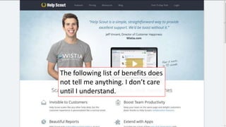


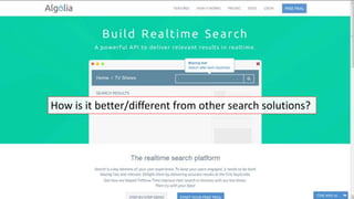
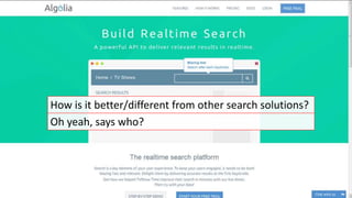

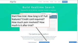

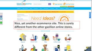
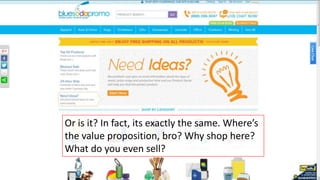


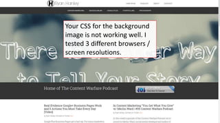
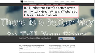

The document discusses the importance of effective lead magnets for accelerating email list building, emphasizing the need for value, emotional engagement, and clarity in presentation. It critiques common mistakes such as low contrast text, excessive jargon, and unclear calls-to-action that hinder engagement. The recommendations include focusing on specific benefits and using relevant visuals to enhance the appeal.


![FREE Tools to Better Headlines in Just Minutes [Bonus Infographic]](https://cdn.slidesharecdn.com/ss_thumbnails/blog-151110203829-lva1-app6892-thumbnail.jpg?width=640&height=640&fit=bounds)


![Four Questions Your Prospects Can't Help-But Answer [+ Cheat Sheet]](https://cdn.slidesharecdn.com/ss_thumbnails/four-questions-your-prospects-cant-help-but-answer-131211105834-phpapp02-thumbnail.jpg?width=640&height=640&fit=bounds)


![[Elite Camp 2016] Karsten Lund - Master the Moment of Decision](https://cdn.slidesharecdn.com/ss_thumbnails/03elitecamp-karstenlund-masterthemomentofdecision-160711081559-thumbnail.jpg?width=640&height=640&fit=bounds)
![[Elite Camp 2016] Craig Sullivan - Elite Camp Summary Session](https://cdn.slidesharecdn.com/ss_thumbnails/18elitecamp-craigsullivan-roundup-160708121125-thumbnail.jpg?width=640&height=640&fit=bounds)
![[Elite Camp 2016] Thomas Barker - From Zero to In-House Optimisation Superstars](https://cdn.slidesharecdn.com/ss_thumbnails/17elitecamp-thomasbarkerrbs-fromzerotoin-houseoptimisationsuperstars-160708120952-thumbnail.jpg?width=640&height=640&fit=bounds)
![[Elite Camp 2016] Yehoshua Coren - Strategic And Tactical Implementation And ...](https://cdn.slidesharecdn.com/ss_thumbnails/16elitecamp-yeoshacoren-strategicandtacticalimplementationandanalysistechniques-160708120812-thumbnail.jpg?width=640&height=640&fit=bounds)


