Downloaded 282 times
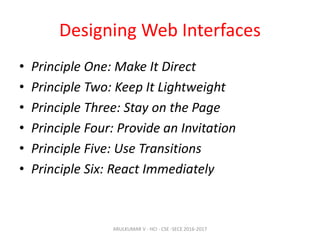


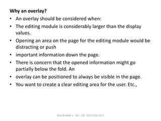


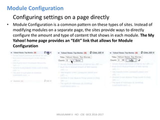

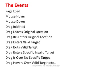
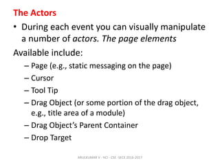
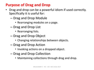
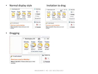
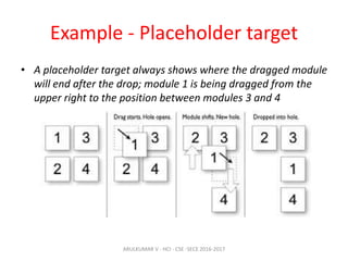
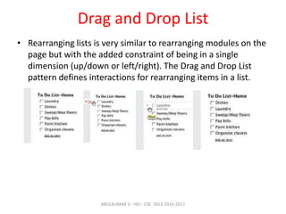


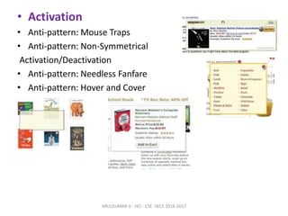

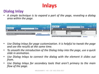

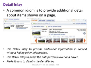
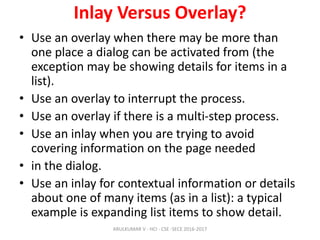


The document discusses principles and patterns for designing web interfaces, including making interactions direct, lightweight, and keeping users on the page. It covers various techniques for inline and overlay editing, direct selection of objects, drag and drop interactions, and using contextual tools near content to improve usability. The document provides examples and guidelines for implementing these patterns and principles in web design.