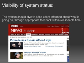
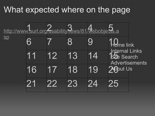
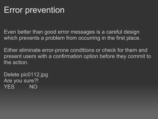
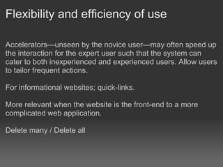
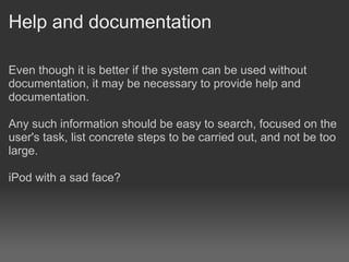
Web Design 3
        HCI
       Robert Clarkson
Soutern Institute of Technology
Human Computer Interaction

Attention to human-machine interaction is important, because
poorly designed human-machine interfaces can lead to many
unexpected problems.

A classic example of this is the Three Mile Island accident
where investigations concluded that the design of the human-
machine interface was at least partially responsible for the
disaster.
Nielsen's heuristics

Jakob Nielsen's heuristics are probably the most-used usability
heuristics for user interface design. Nielsen developed the
heuristics based on work together with Rolf Molich in 1990.

The final set of heuristics that are still used today were
released by Nielsen in 1994.

The heuristics as published in Nielsen's book Usability
Engineering
Visibility of system status:

The system should always keep users informed about what is
going on, through appropriate feedback within reasonable time.
Match between system and the real
world
The system should speak the user's language, with words,
phrases and concepts familiar to the user, rather than system-
oriented terms. Follow real-world conventions, making
information appear in a natural and logical order.
                                                      NOT
                                                      Arraylist
                                                      of
                                                      products

                                                      Procede
                                                      to
                                                      payment
                                                      gateway
User control and freedom

Users often choose system functions by mistake and will need
a clearly marked "emergency exit" to leave the unwanted state
without having to go through an extended dialogue. Support
undo and redo.

Already supported by the browser (to a point), back and
forward

Ensure navigation item consistency. The stars didn't move.
Consistency and standards

Users should not have to wonder whether different words,
situations, or actions mean the same thing. Follow platform
conventions.

Home = Take me to the first page of the site (index.html page)

others...
What expected where on the page

         1        2        3       4        5
http://www.surl.org/usabilitynews/81/webobjects.a
sp
         6        7        8       9        10 link
                                             Home
                                             Internal Links
         11       12       13      14       15 Search
                                             Site
                                             Advertisements
         16       17       18      19       20 Us
                                             About


         21       22       23      24       25
Error prevention

Even better than good error messages is a careful design
which prevents a problem from occurring in the first place.

Either eliminate error-prone conditions or check for them and
present users with a confirmation option before they commit to
the action.

Delete pic0112.jpg
Are you sure?!
YES        NO
Recognition rather than recall

Minimize the user's memory load by making objects, actions,
and options visible. The user should not have to remember
information from one part of the dialogue to another.
Instructions for use of the system should be visible or easily
retrievable whenever appropriate.
Flexibility and efficiency of use

Accelerators—unseen by the novice user—may often speed up
the interaction for the expert user such that the system can
cater to both inexperienced and experienced users. Allow users
to tailor frequent actions.

For informational websites; quick-links.

More relevant when the website is the front-end to a more
complicated web application.

Delete many / Delete all
Aesthetic and minimalist design

Dialogues should not contain information which is irrelevant or
rarely needed. Every extra unit of information in a dialogue
competes with the relevant units of information and diminishes
their relative visibility.

Deleting this file pic0110.jpg would result in the pointer to the
file contents removed from the disk and this then means that
you wouldn't be able to retrieve them easily without the help of
a computer professional. So are you sure that you want to do
this?
                      YES          NO

Cart, Help, Account
"See what's in your Shopping cart"
"Click here to get help"
Help users recognize, diagnose, and
recover from errors
Error messages should be expressed in plain language (no
codes), precisely indicate the problem, and constructively
suggest a solution.

ERROR 0x0323EF02323AB232

Enter Phone Number: 0210OOPS32

Error, the phone number you entered is not valid please enter
only numbers, and the '+' symbol.
404 Page Not Found
Help and documentation

Even though it is better if the system can be used without
documentation, it may be necessary to provide help and
documentation.

Any such information should be easy to search, focused on the
user's task, list concrete steps to be carried out, and not be too
large.

iPod with a sad face?
Help! http://www.apple.com/support/
User Expectations
Satisficing

Satisficing, a portmanteau "combining satisfy with suffice",is a
decision-making strategy that attempts to meet criteria for
adequacy, rather than to identify an optimal solution. -
Wikipedia

"A task is to sew a patch onto a pair of jeans. The best needle
to do the threading is a 4 inch long needle with a 3 millimeter
eye. This needle is hidden in a haystack along with 1000 other
needles varying in size from 1 inch to 6 inches. Satisficing
claims that the first needle that can sew on the patch is the one
that should be used. Spending time searching for that one
specific needle in the haystack is a waste of energy and
resources."
Don't make me think
                 (about anything other than the content)

Users are going to click on the thing that is nearest to whatever
they are looking for.

I need a phone number: i cant see one, so i look at the options,
there is a "contact us" link. I click that, then i see the number.

Ski field: I want to know how long the Greengates run is. I look
on the coronet peak page, i can't see it. i download the trial
map, i cant find it out there. I give up, and phone NZ ski.

The principle of good enough (for evolving systems) favours
quick-and-simple (but potentially extensible) designs over
elaborate systems designed by committees.
Testing

•   Testing one user is 100% better than testing none
•   Testing is an iterative process
•   Usability tests always produce useful results
•   A developer is unsuited to test his or her code
Website Challenge

Web design 3

  • 1.
    Web Design 3 HCI Robert Clarkson Soutern Institute of Technology
  • 2.
    Human Computer Interaction Attentionto human-machine interaction is important, because poorly designed human-machine interfaces can lead to many unexpected problems. A classic example of this is the Three Mile Island accident where investigations concluded that the design of the human- machine interface was at least partially responsible for the disaster.
  • 3.
    Nielsen's heuristics Jakob Nielsen'sheuristics are probably the most-used usability heuristics for user interface design. Nielsen developed the heuristics based on work together with Rolf Molich in 1990. The final set of heuristics that are still used today were released by Nielsen in 1994. The heuristics as published in Nielsen's book Usability Engineering
  • 4.
    Visibility of systemstatus: The system should always keep users informed about what is going on, through appropriate feedback within reasonable time.
  • 5.
    Match between systemand the real world The system should speak the user's language, with words, phrases and concepts familiar to the user, rather than system- oriented terms. Follow real-world conventions, making information appear in a natural and logical order. NOT Arraylist of products Procede to payment gateway
  • 6.
    User control andfreedom Users often choose system functions by mistake and will need a clearly marked "emergency exit" to leave the unwanted state without having to go through an extended dialogue. Support undo and redo. Already supported by the browser (to a point), back and forward Ensure navigation item consistency. The stars didn't move.
  • 7.
    Consistency and standards Usersshould not have to wonder whether different words, situations, or actions mean the same thing. Follow platform conventions. Home = Take me to the first page of the site (index.html page) others...
  • 8.
    What expected whereon the page 1 2 3 4 5 http://www.surl.org/usabilitynews/81/webobjects.a sp 6 7 8 9 10 link Home Internal Links 11 12 13 14 15 Search Site Advertisements 16 17 18 19 20 Us About 21 22 23 24 25
  • 9.
    Error prevention Even betterthan good error messages is a careful design which prevents a problem from occurring in the first place. Either eliminate error-prone conditions or check for them and present users with a confirmation option before they commit to the action. Delete pic0112.jpg Are you sure?! YES NO
  • 10.
    Recognition rather thanrecall Minimize the user's memory load by making objects, actions, and options visible. The user should not have to remember information from one part of the dialogue to another. Instructions for use of the system should be visible or easily retrievable whenever appropriate.
  • 11.
    Flexibility and efficiencyof use Accelerators—unseen by the novice user—may often speed up the interaction for the expert user such that the system can cater to both inexperienced and experienced users. Allow users to tailor frequent actions. For informational websites; quick-links. More relevant when the website is the front-end to a more complicated web application. Delete many / Delete all
  • 12.
    Aesthetic and minimalistdesign Dialogues should not contain information which is irrelevant or rarely needed. Every extra unit of information in a dialogue competes with the relevant units of information and diminishes their relative visibility. Deleting this file pic0110.jpg would result in the pointer to the file contents removed from the disk and this then means that you wouldn't be able to retrieve them easily without the help of a computer professional. So are you sure that you want to do this? YES NO Cart, Help, Account "See what's in your Shopping cart" "Click here to get help"
  • 13.
    Help users recognize,diagnose, and recover from errors Error messages should be expressed in plain language (no codes), precisely indicate the problem, and constructively suggest a solution. ERROR 0x0323EF02323AB232 Enter Phone Number: 0210OOPS32 Error, the phone number you entered is not valid please enter only numbers, and the '+' symbol.
  • 14.
  • 15.
    Help and documentation Eventhough it is better if the system can be used without documentation, it may be necessary to provide help and documentation. Any such information should be easy to search, focused on the user's task, list concrete steps to be carried out, and not be too large. iPod with a sad face?
  • 16.
  • 17.
  • 18.
    Satisficing Satisficing, a portmanteau"combining satisfy with suffice",is a decision-making strategy that attempts to meet criteria for adequacy, rather than to identify an optimal solution. - Wikipedia "A task is to sew a patch onto a pair of jeans. The best needle to do the threading is a 4 inch long needle with a 3 millimeter eye. This needle is hidden in a haystack along with 1000 other needles varying in size from 1 inch to 6 inches. Satisficing claims that the first needle that can sew on the patch is the one that should be used. Spending time searching for that one specific needle in the haystack is a waste of energy and resources."
  • 19.
    Don't make methink (about anything other than the content) Users are going to click on the thing that is nearest to whatever they are looking for. I need a phone number: i cant see one, so i look at the options, there is a "contact us" link. I click that, then i see the number. Ski field: I want to know how long the Greengates run is. I look on the coronet peak page, i can't see it. i download the trial map, i cant find it out there. I give up, and phone NZ ski. The principle of good enough (for evolving systems) favours quick-and-simple (but potentially extensible) designs over elaborate systems designed by committees.
  • 20.
    Testing • Testing one user is 100% better than testing none • Testing is an iterative process • Usability tests always produce useful results • A developer is unsuited to test his or her code
  • 21.

Editor's Notes

  • #8 search click on a thumbnail sitemap
  • #11 ok / cancel | tooltips
  • #19 Phonecall