This document discusses interface design for mobile devices. It covers topics like developing a mobile strategy, interface elements like context, messaging, look and feel, layout, color, typography, and graphics. For each element, it provides descriptions and examples. It discusses how context, user needs, and constraints should drive design. Elements like layout must work across device orientations. Color palettes and legible typography are also important. Graphics can communicate actions and supplement content. Overall, the document provides guidance on user-centered mobile interface design principles.
Developing a MobileStrategy
Rule #1: Forget What You Think You Know
Rule #2: Believe What You See, Not What You Read
Rule #3: Constraints Never Come First
Rule #4: Focus on Context, Goals, and Needs
Rule #5: You Can’t Support Everything
Rule #6: Don’t Convert, Create
Rule #7: Keep It Simple
3.
Topics covered :
1.Brief History of Mobile (Chapter - 1)
2. Mobility Ecosystem (Chapter - 2)
3. Types of Mobile Applications (Chapter - 6)
4. Mobile Information Architecture (Chapter - 7)
5. Mobile Design (Chapter - 8 )
6. Mobile 2.0 (Chapter -10 )
4.
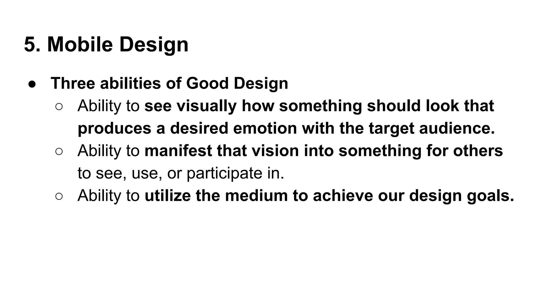
5. Mobile Design
●Three abilities of Good Design
○ Ability to see visually how something should look that
produces a desired emotion with the target audience.
○ Ability to manifest that vision into something for others
to see, use, or participate in.
○ Ability to utilize the medium to achieve our design goals.
5.
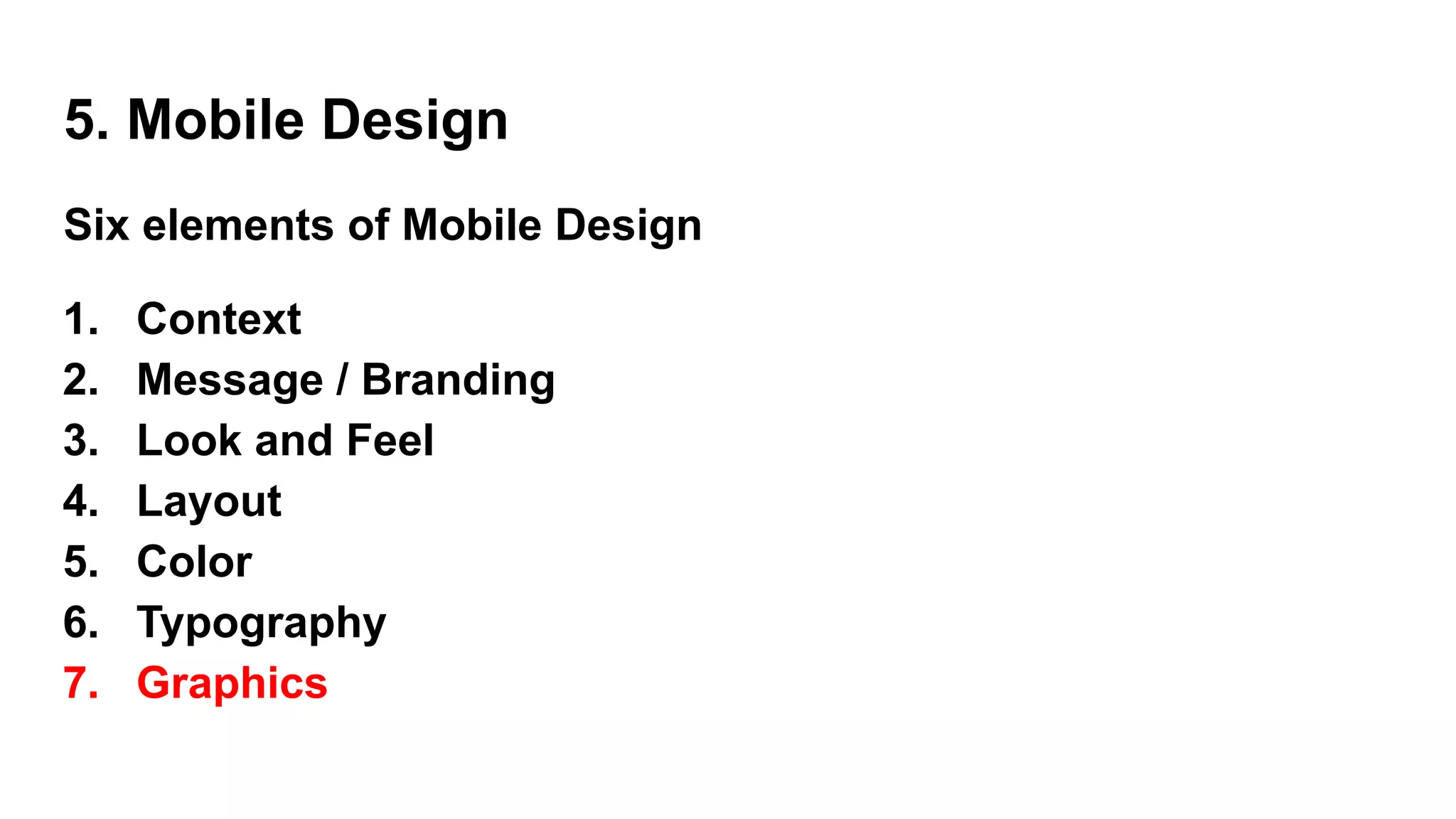
5. Mobile Design
Sixelements of Mobile Design
1. Context
2. Message / Branding
3. Look and Feel
4. Layout
5. Color
6. Typography
7. Graphics
6.
5. Mobile Design- Context (1)
● core to the mobile experience.
● It is the designers job to make sure that the user can figure out
how to address context using app.
● Some context based questions:
○ Who are the users? What do you know about them? What type
of behavior can you assume or predict about the users?
○ What is happening? What are the circumstances in which the
users will best absorb the content you intend to present?
7.
5. Mobile Design- Context (1)
● Some context based questions: (contd…)
○ When will they interact? Are they at home and have large
amounts of time? Are they at work where they have short periods
of time? Will they have idle periods of time while waiting for a
train, for example?
○ Where are the users? Are they in a public space or a private
space? Are they inside or outside? Is it day or is it night?
○ Why will they use your app? What value will they gain from your
content or services in their present situation?
8.
5. Mobile Design- Context (1)
● Some context based questions: (contd…)
○ How are they using their mobile device? Is it held in their hand
or in their pocket?
○ How are they holding it? Open or closed? Portrait or
landscape?
● Treat these questions as a checklist to the design from start to
finish.
● They can provide not only great inspiration for design challenges,
but justification for design decisions later.
9.
5. Mobile Design- Message / Branding (2)
● Message - the overall mental impression we create explicitly through
visual design.
● Branding
○ the impression company name and logo gives— essentially,
reputation.
○ serves to reinforce the message with authority, not deliver it.
○ In mobile, the opportunities for branding are limited, but the
need for messaging is great.
10.
5. Mobile Design- Message / Branding
● With such limited real estate, the users don’t care about brand, but
they will care about the messaging, asking themselves questions like,
“What can this do for me?” or “Why is this important to me?”
● The approach to the design will define that message and create
expectations.
● Sparse, minimalist design with lots of whitespace
○ tell the user to expect a focus on content.
● “heavy” design with use of dark colors and lots of graphics
○ tell the user to expect something more immersive
11.
5. Mobile Design- Message / Branding (2)
What is the message for each of these designs?
12.
5. Mobile Design- Look and Feel (3)
● used to describe appearance,
● used to evoke action—how the user will use an interface.
● Messaging is holistic, as the expectation the users will have about
how you will address their context.
● It is easy to confuse the two, because “feel” can be interpreted to
mean our emotional reaction to design and the role of
messaging.
● a style guide or pattern library is crucial,
○ maintaining consistency in the look and feel
○ reducing the need for each design decision to be justified
13.
5. Mobile Design- Look and Feel (3)
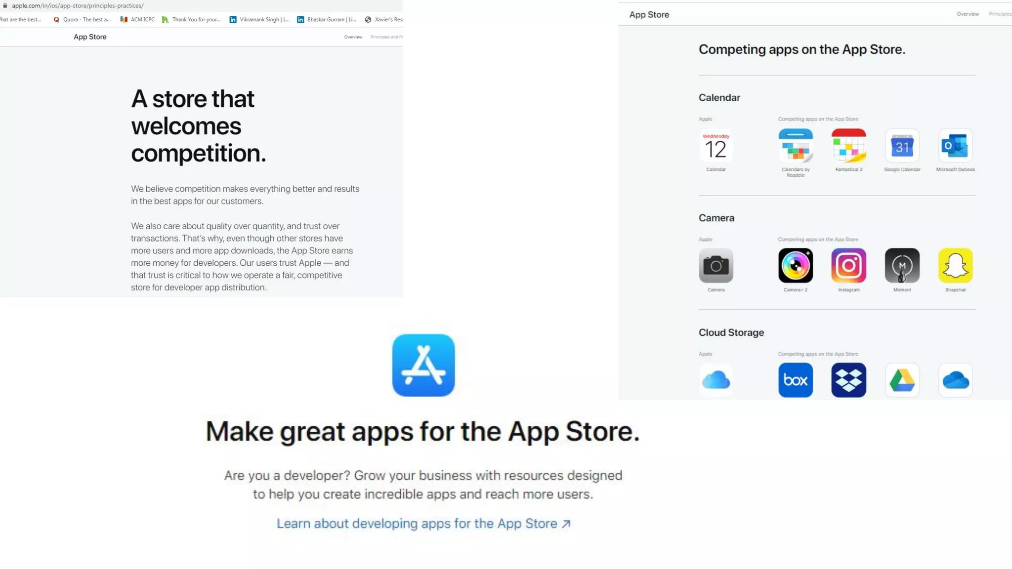
● Eg : Apple’s App Store successful
○ Apple includes a robust user interface tool that enables
developers to use prebuilt components, supported with
detailed Human Interface Guidelines (or HIG) of how to use
them, similar to a pattern library
○ a developer can just sit down and create an iPhone application
that looks like it came from Apple in a matter of minutes.
○ During the App Store submission process, Apple then ensures
that the developer uses these tools correctly according to the
HIG.
15.
5. Mobile Design- Look and Feel (3)
● Mobile designers → creative and remember the context.
● The modal context of the user
○ what device he is using should be considered during the design,
○ it will help to establish the user’s expectations of the
experience.
16.
Pattern Tap showsa
number of user interface
patterns that help to
establish look and feel
● an importantdesign element, because it is how the user will
visually process the page, but the structural and visual components
of layout often get merged together, creating confusion and making
design more difficult to produce.
● Creating mobile designs in an environment with multiple reviewers
is all about getting the right feedback at the right time.
● Mobile Designers job → to create a manifestation of a shared
vision.
● Layout is one of the elements you can present early on and discuss
independently.
5. Mobile Design - Layout (4)
● Different layoutsfor different devices
● There are two distinct types of navigation layouts : Touch & Scroll
○ Touch
■ literally point to where you want to go; therefore, navigation
can be anywhere on the screen.
■ See most of the primary actions or navigation areas living at
the bottom of the screen and secondary actions living at the
top of the screen, with the area in between serving as the
content area
○ Scroll.
5. Mobile Design - Layout (4)
● Different layoutsfor different devices
● There are two distinct types of navigation layouts : Touch & Scroll
○ Scroll.
■ D-pad is used to go left, right, up, or down.
■ the primary and often the secondary actions should live at
the top of the screen. This is so the user doesn’t have to press
down dozens of times to get to the important stuff.
■ One needs to make the choice of whether to display navigation
horizontally or vertically.
5. Mobile Design - Layout (4)
23.
Example layout ofa
scroll-based
application, where the
user had to press the
D-pad past
each link to scroll the
page
24.
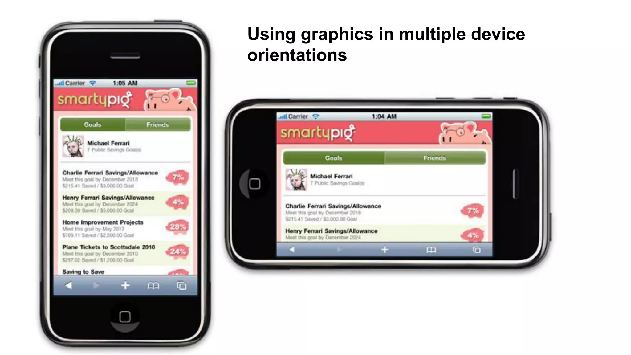
● Another layoutconsideration is how your design will scale as the
device orientation changes,
● Eg. if the device is rotated from portrait mode to landscape and vice
versa.
● This is typically described as either being
○ fixed
■ a set number of pixels wide),
○ fluid
■ having the ability to scale to the full width of the screen
regardless of the device orientation.
5. Mobile Design - Layout (4)
25.
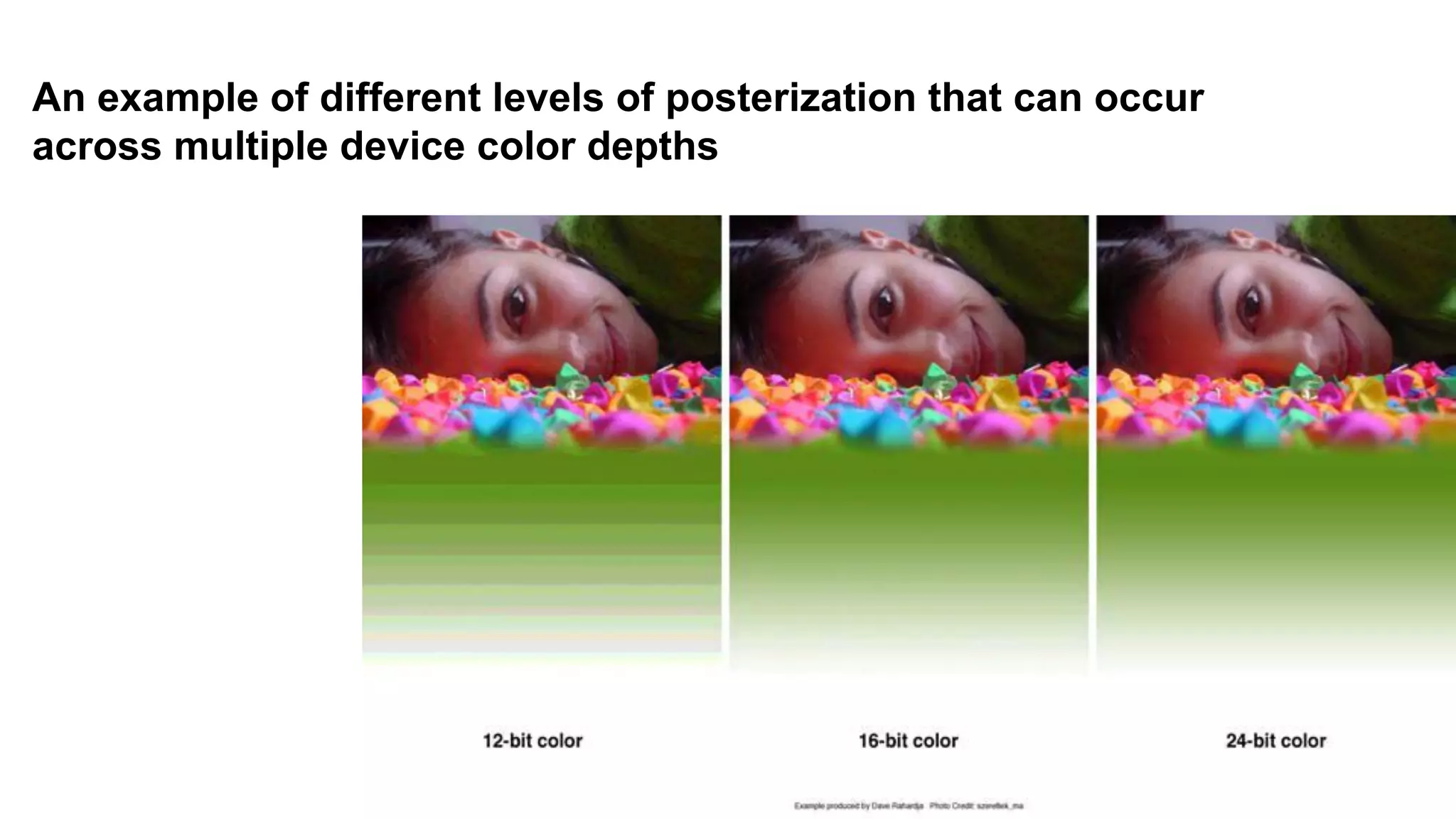
● The mostcommon obstacle when dealing with color
○ mobile screens,
■ which come in a number of different color or bit depths,
meaning the number of bits (binary digits) used to
represent the color of a single pixel in a bitmapped
image.
■ When complex designs are displayed on different mobile
devices, the limited color depth on one device can cause
banding, or unwanted posterization in the image.
● Different devices have different color depths.
5. Mobile Design - Color (5)
26.
An example ofdifferent levels of posterization that can occur
across multiple device color depths
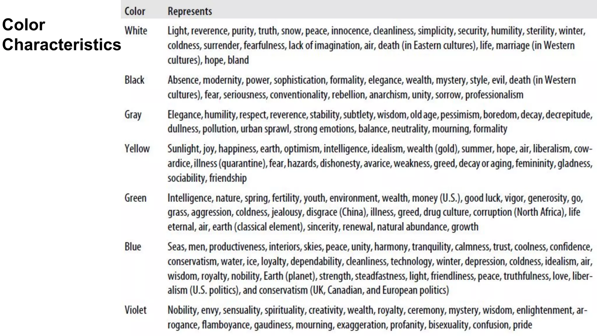
● People respondto different colors differently.
● Different colors produce different emotions in people.
● Thinking about the emotions that colors evoke in people is
an important aspect of mobile design
● Using the right colors can be useful for delivering the right
message and setting expectations.
● different colors can mean in different cultures. In some
cases, the color you use can have opposing meanings in
different cultures.
5. Mobile Design - Color (5)
● Color palettes
○useful for maintaining a consistent use of color
○ consist of a predefined number of colors to use
throughout the design.
○ Selecting what colors to use varies from designer to
designer, each having different techniques and strategies
for deciding on the colors.
○ Three basic ways to define a color palette:
■ Sequential
■ Adaptive
■ Inspired
5. Mobile Design - Color (5)
32.
● Color palettes
○Sequential
■ primary, secondary, and tertiary colors are used.
■ Often primary color is reserved as the “brand” color
or the color that most closely resembles the brand’s
meaning.
■ The secondary and tertiary colors are often
complementary colors that can be selected using a
color wheel.
5. Mobile Design - Color (5)
33.
● Color palettes
○Adaptive
■ leverages the most common colors present in a
supporting graphic or image.
■ used to make sure that colors are consistent with the
target mobile platform.
○ Inspired
■ created from the great pieces of design - online or offline, in
which a picture of the design might inspire us. Eg. From
an old poster in an alley, a business card etc...
■ Extract the colors from the source image, though we
should never ever use the source material in a design.
5. Mobile Design - Color (5)
34.
Adobe Kuler,
a sitethat
enables
designers to
share and use
different color
palettes
35.
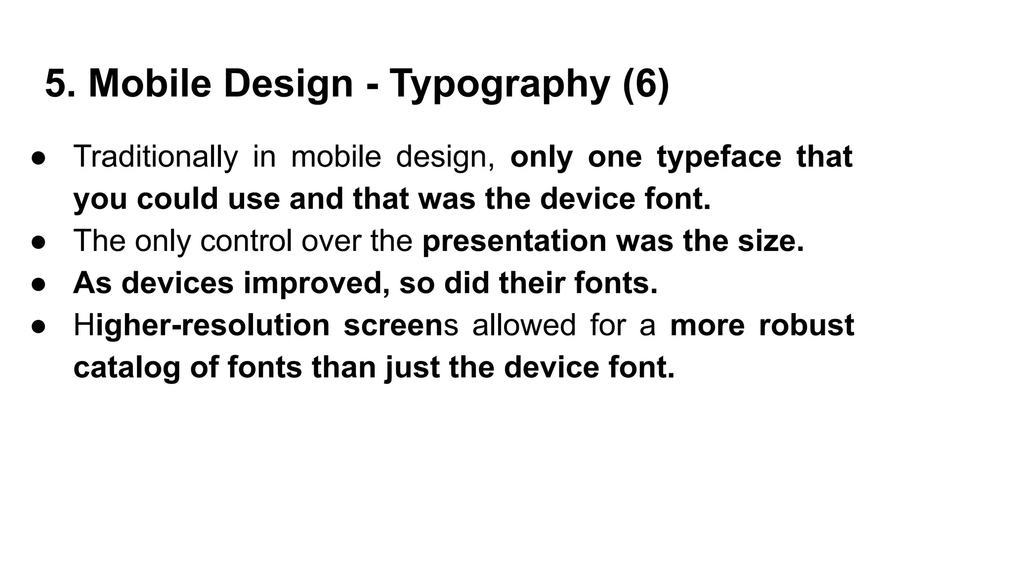
● Traditionally inmobile design, only one typeface that
you could use and that was the device font.
● The only control over the presentation was the size.
● As devices improved, so did their fonts.
● Higher-resolution screens allowed for a more robust
catalog of fonts than just the device font.
5. Mobile Design - Typography (6)
36.
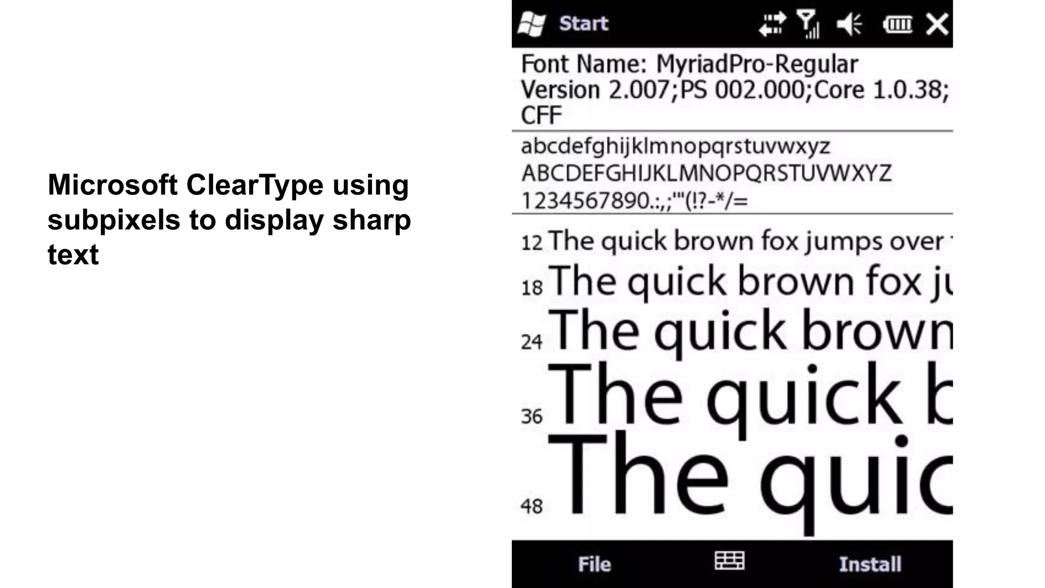
● Two basicapproaches to how type is rendered on mobile
screens
○ Subpixel-based screens
■ division of each pixel into a red, green, and blue (or
RGB) unit at a microscopic level, enabling a greater level of
anti aliasing for each font character or glyph.
5. Mobile Design - Typography (6)
Different ways text can
render on mobile
screens :
● Two basicapproaches to how type is rendered on mobile
screens
○ pixel density or pixels per inch (PPI).
■ to screens by either
● their actual physical dimensions
● their pixel dimensions,
● Resolution
■ determined by dividing the width of the display area in
pixels by the width of the display area in inches.
5. Mobile Design - Typography (6)
40.
● Type Options
○the limited choices available in mobile
design won’t come as a big surprise.
○ A few variations of serif, sans-serif, and
monospace fonts, and depending on the
platform, maybe a few custom fonts
○ So, stick with either the default device font,
or web-safe fonts—the basic serif variants
like Times New Roman and Georgia or
sans-serif typefaces like Helvetica, Arial, or
Verdana.
5. Mobile Design - Typography (6)
41.
● Font Replacement
○Ability to use typefaces that are not already loaded on the
device varies from model to model and chosen platform.
○ Some mobile web browsers support various forms of font
replacement; the two most common are sIFR and Cufon.
■ sIFR → Flash to replace HTML text with a Flash
representation of the text,(device has to support Flash)
■ Cufon → JavaScript and the canvas element draws the
glyphs in the browser (device needs to support both
JavaScript and the canvas element.)
5. Mobile Design - Typography (6)
42.
● Readability
○ theability to clearly follow lines of text with the eye
○ Six simple rules:
■ Use a high-contrast typeface
■ Use the right typeface
■ Provide decent leading or line spacing
■ Leave space on the right and left of each line; don’t crowd
the screen
■ Generously utilize headings
■ Use short paragraphs
5. Mobile Design - Typography (6)
● used toestablish or aid a visual experience.
● used to supplement the look and feel, or as content displayed
inline with the text.
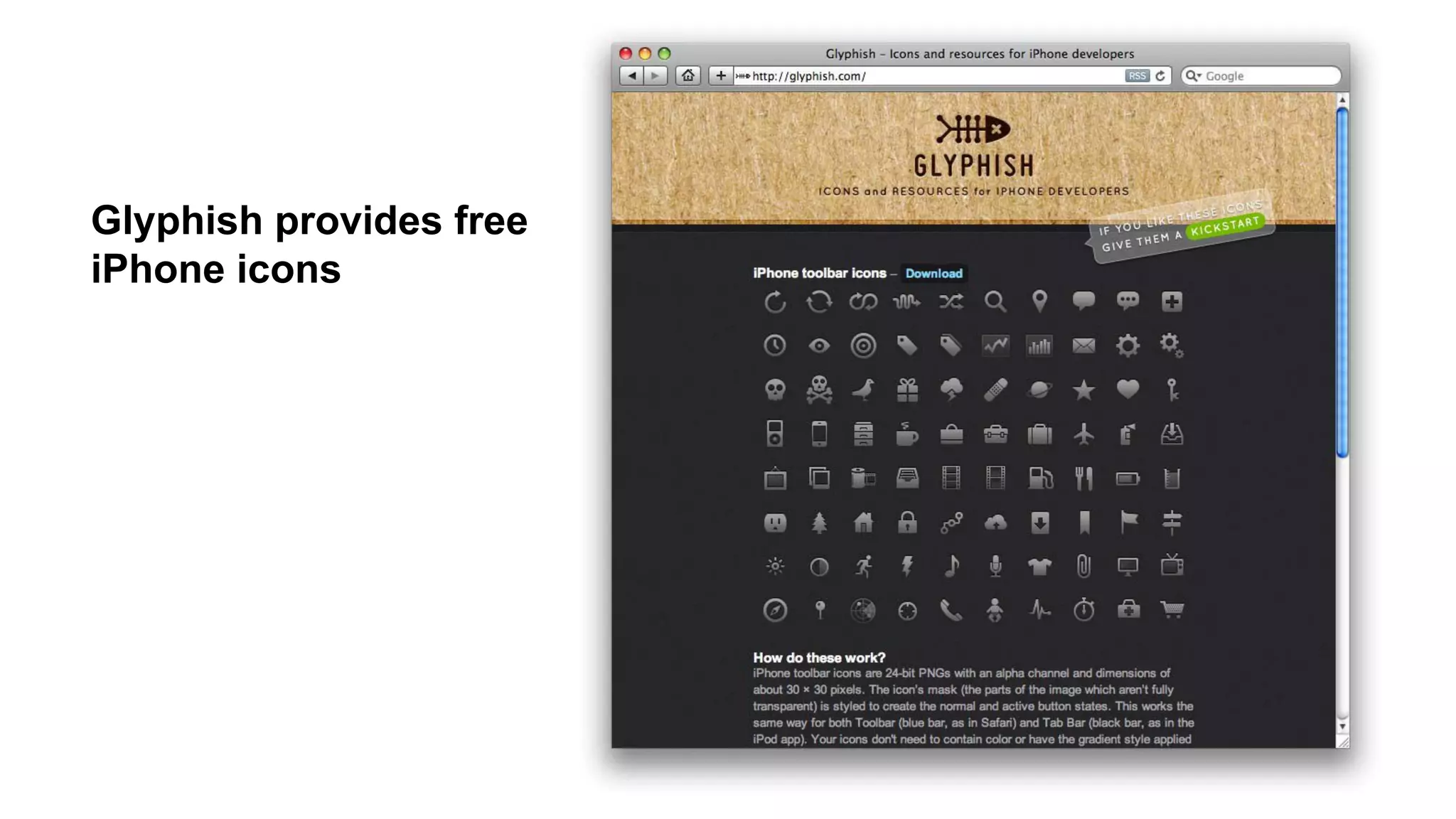
● Graphics Elements used in Mobile Design :
○ Iconography
■ to communicate ideas and actions to users in a constrained
visual space.
■ The challenge → meaning of the icon is clear to the user.
○ Photos and Images
■ used to add meaning to content, often by showing a
visual display of a concept, or to add meaning to a
design.
5. Mobile Design - Graphics (7)


![Driver Easy Pro Key 7.1.0.2641 Full Mac Crack Free Activated Download [2026]....](https://cdn.slidesharecdn.com/ss_thumbnails/software-251207185324-b2fb71b4-thumbnail.jpg?width=640&height=640&fit=bounds)
![Wondershare Filmora 15.0.11 Crack for Mac Key Full Download [Latest] pptx](https://cdn.slidesharecdn.com/ss_thumbnails/software-251207184836-1d16ba16-thumbnail.jpg?width=640&height=640&fit=bounds)
![iStat Menus 7.20 Crack for MacOS 2026 Full Version [Latest] pptx](https://cdn.slidesharecdn.com/ss_thumbnails/softwareoverview-251207191544-22b737dc-thumbnail.jpg?width=640&height=640&fit=bounds)


