Power BI dashboard design tips for beginners—learn how to create user-friendly, data-driven dashboards with real-world insights from Fusion Software Institute.
Dashboard Design Tipsfor
Power BI Beginners
Dashboards are crucial for business intelligence. They transform
complex data into clear, actionable insights. This presentation offers
tips for designing effective Power BI dashboards.
https://www.fusion-institute.com/dashboard-design-tips-for-power-bi-beginners
2.
The Power ofPower BI
Intuitive Interface
Easy drag-and-drop capabilities.
Excel Integration
Seamless collaboration with Microsoft Excel.
No Coding Needed
Create dynamic reports without extensive code.
Power BI is an industry standard. It helps users quickly produce high-quality, interactive reports. Its intuitive design makes it accessible for beginners.
3.
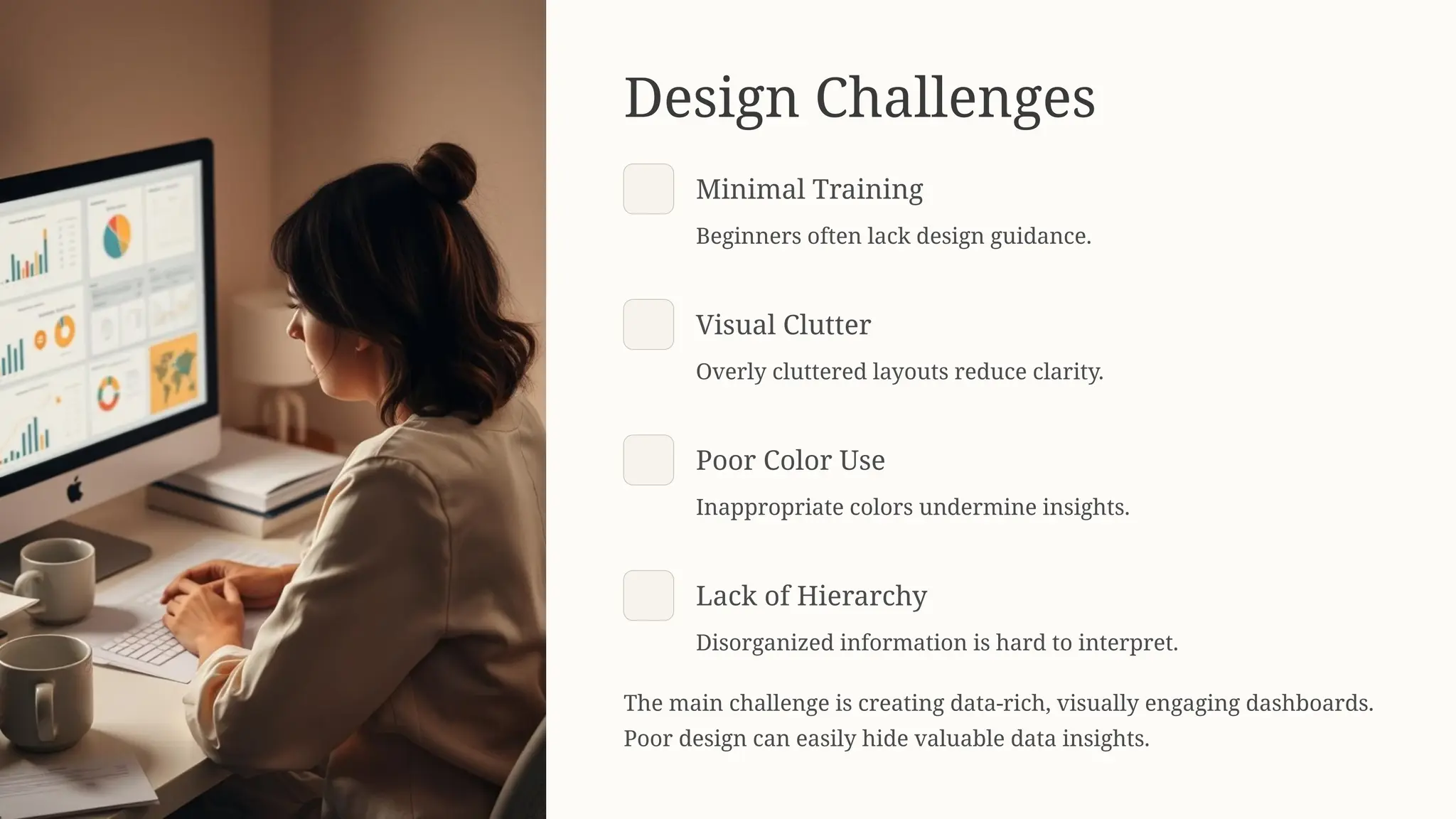
Design Challenges
Minimal Training
Beginnersoften lack design guidance.
Visual Clutter
Overly cluttered layouts reduce clarity.
Poor Color Use
Inappropriate colors undermine insights.
Lack of Hierarchy
Disorganized information is hard to interpret.
The main challenge is creating data-rich, visually engaging dashboards.
Poor design can easily hide valuable data insights.
4.
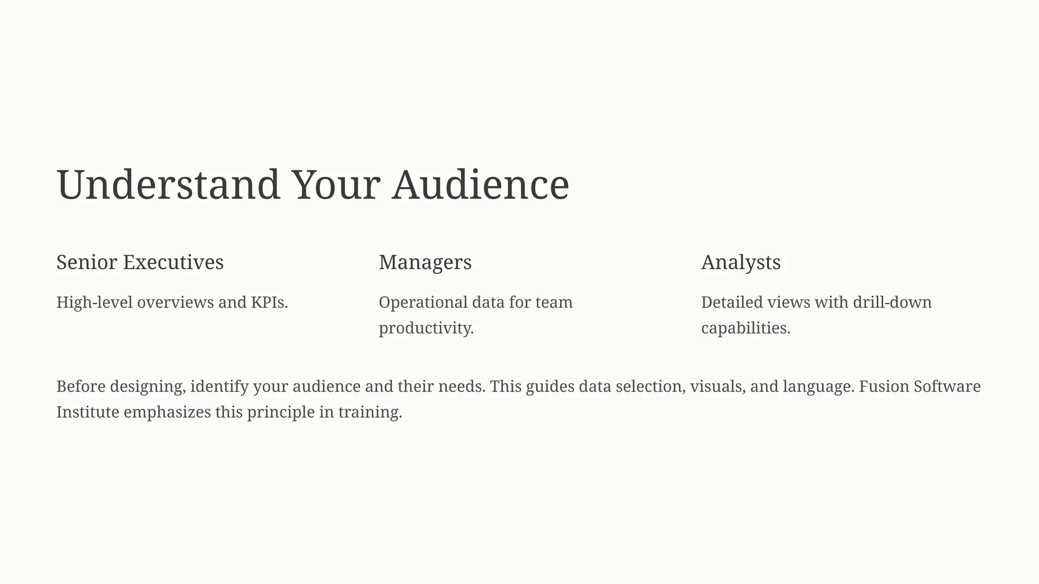
Understand Your Audience
SeniorExecutives
High-level overviews and KPIs.
Managers
Operational data for team
productivity.
Analysts
Detailed views with drill-down
capabilities.
Before designing, identify your audience and their needs. This guides data selection, visuals, and language. Fusion Software
Institute emphasizes this principle in training.
5.
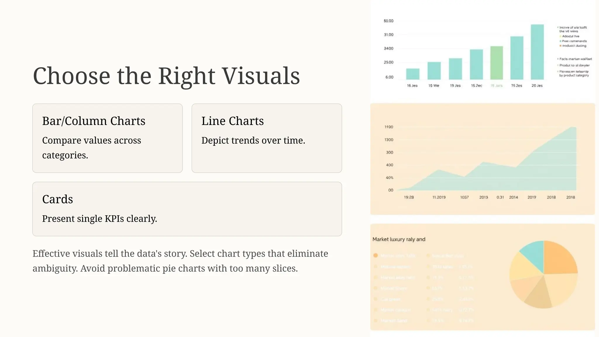
Choose the RightVisuals
Bar/Column Charts
Compare values across
categories.
Line Charts
Depict trends over time.
Cards
Present single KPIs clearly.
Effective visuals tell the data's story. Select chart types that eliminate
ambiguity. Avoid problematic pie charts with too many slices.
6.
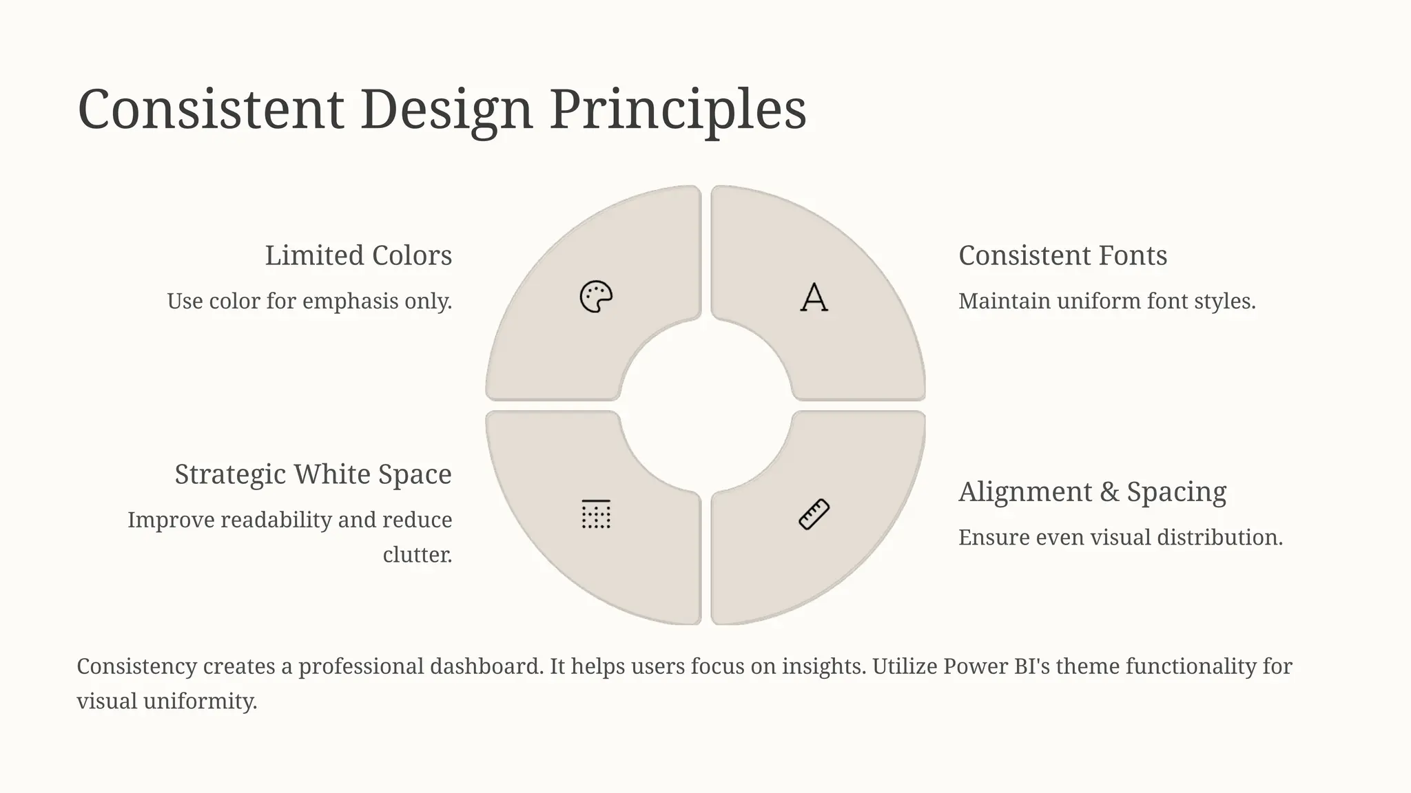
Consistent Design Principles
LimitedColors
Use color for emphasis only.
Consistent Fonts
Maintain uniform font styles.
Alignment & Spacing
Ensure even visual distribution.
Strategic White Space
Improve readability and reduce
clutter.
Consistency creates a professional dashboard. It helps users focus on insights. Utilize Power BI's theme functionality for
visual uniformity.
7.
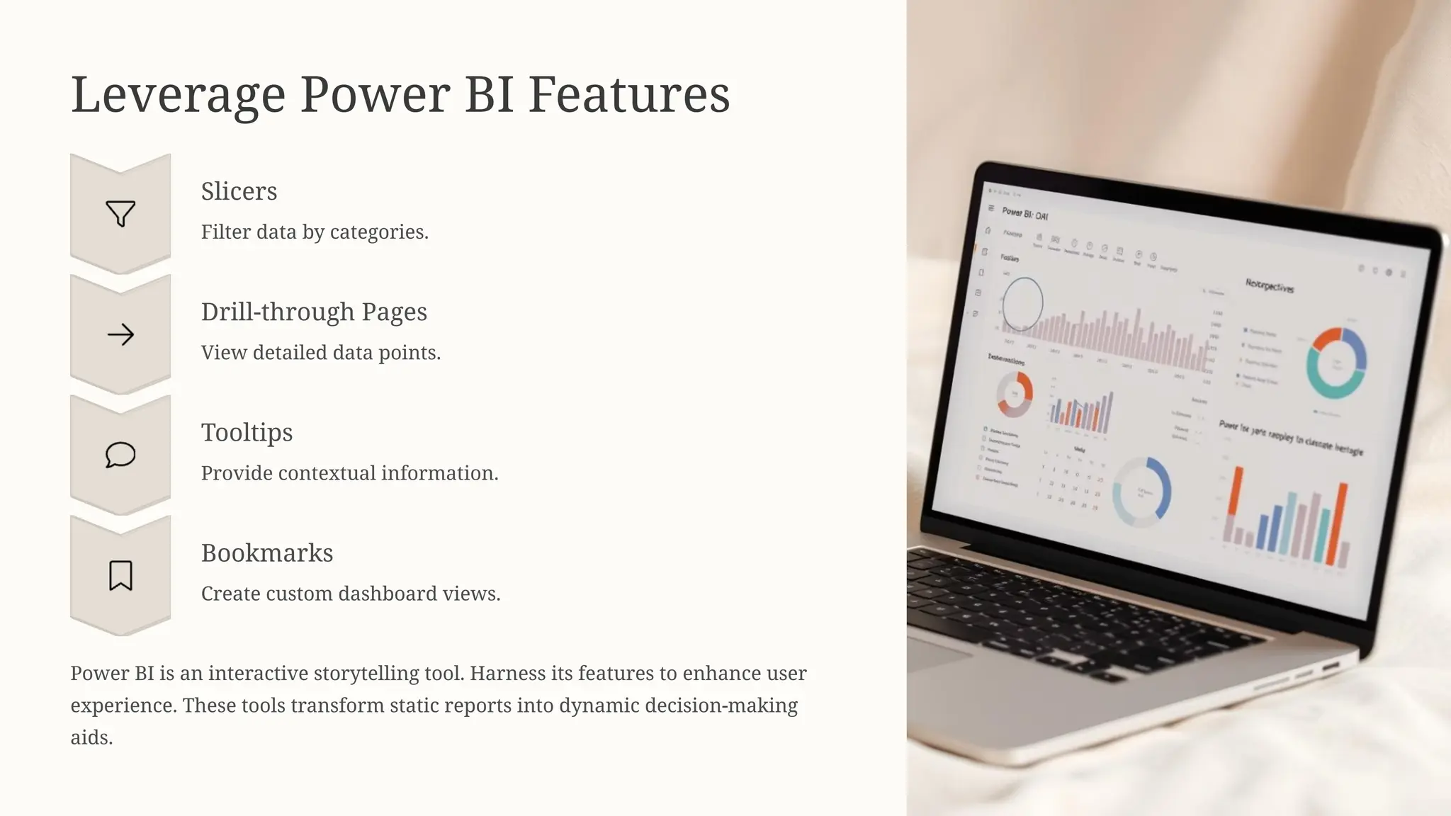
Leverage Power BIFeatures
Slicers
Filter data by categories.
Drill-through Pages
View detailed data points.
Tooltips
Provide contextual information.
Bookmarks
Create custom dashboard views.
Power BI is an interactive storytelling tool. Harness its features to enhance user
experience. These tools transform static reports into dynamic decision-making
aids.
8.
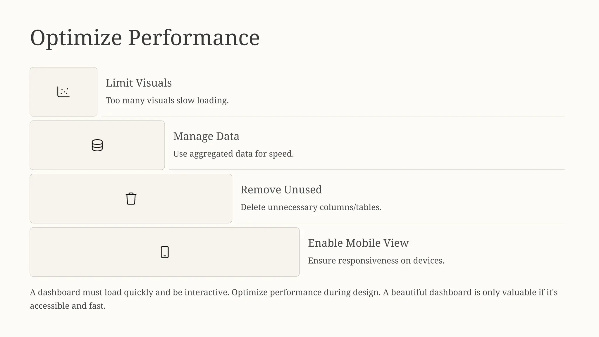
Optimize Performance
Limit Visuals
Toomany visuals slow loading.
Manage Data
Use aggregated data for speed.
Remove Unused
Delete unnecessary columns/tables.
Enable Mobile View
Ensure responsiveness on devices.
A dashboard must load quickly and be interactive. Optimize performance during design. A beautiful dashboard is only valuable if it's
accessible and fast.
9.
Learn from Real-WorldProjects
Practical experience is key to dashboard design. Fusion Software Institute offers hands-on training. Learners build real-world dashboards,
gaining confidence and technical skills.