Download to read offline


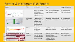

The document discusses the latest features and custom visuals available in Power BI as of September, along with a comprehensive overview of how to utilize them effectively. It covers various types of visuals, their functionality, limitations, and how to contribute to the data story gallery. Additionally, it provides resources for finding datasets and building custom visuals using the Power BI visual library on GitHub.