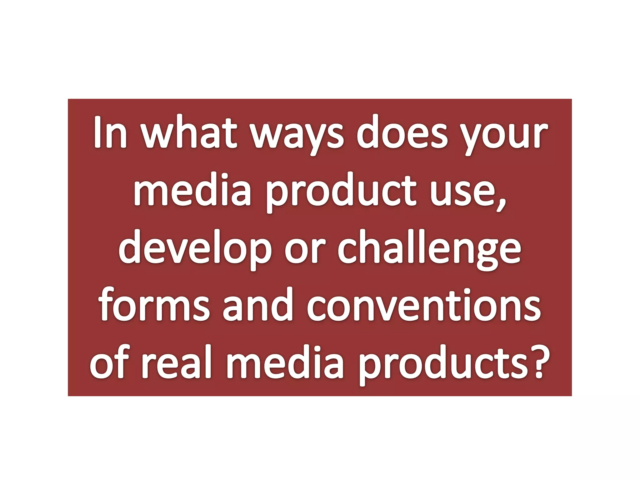
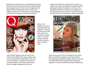
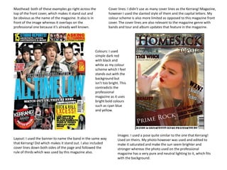
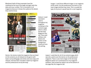
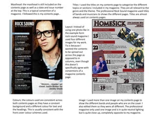
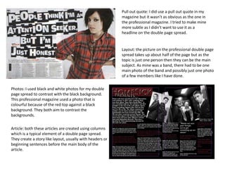
The document compares the layout, design elements, and conventions used in the student's magazine with a professional magazine. It finds that both magazines use mastheads at the top, cover lines down the sides, and images in the center following the rule of thirds. However, the professional magazine uses brighter colors while the student used simpler colors. The contents pages of both magazines include titles, images, and are consistently designed. Double page spreads in each include columns, photos, and stories about new albums. While not identical, the student followed many typical magazine conventions.
For the last part of my AS Media coursework I have to complete an evaluation. Here is question 1 in a Powerpoint format to discuss my own Music Magazine.
If you want to see my progress to the finished magazine cover, contents page and double page spread this is my blog: http://sgracewhitehead.blogspot.co.uk/
2137ad - Characters that live in Merindol and are at the center of main storiesluforfor
Kurgan is a russian expatriate that is secretly in love with Sonia Contado. Henry is a british soldier that took refuge in Merindol Colony in 2137ad. He is the lover of Sonia Contado.
2137ad Merindol Colony Interiors where refugee try to build a seemengly norm...luforfor
This are the interiors of the Merindol Colony in 2137ad after the Climate Change Collapse and the Apocalipse Wars. Merindol is a small Colony in the Italian Alps where there are around 4000 humans. The Colony values mainly around meritocracy and selection by effort.
The perfect Sundabet Slot mudah menang Promo new member Animated PDF for your conversation. Discover and Share the best GIFs on Tenor
Admin Ramah Cantik Aktif 24 Jam Nonstop siap melayani pemain member Sundabet login via apk sundabet rtp daftar slot gacor daftar
thGAP - BAbyss in Moderno!! Transgenic Human Germline Alternatives ProjectMarc Dusseiller Dusjagr
thGAP - Transgenic Human Germline Alternatives Project, presents an evening of input lectures, discussions and a performative workshop on artistic interventions for future scenarios of human genetic and inheritable modifications.
To begin our lecturers, Marc Dusseiller aka "dusjagr" and Rodrigo Martin Iglesias, will give an overview of their transdisciplinary practices, including the history of hackteria, a global network for sharing knowledge to involve artists in hands-on and Do-It-With-Others (DIWO) working with the lifesciences, and reflections on future scenarios from the 8-bit computer games of the 80ies to current real-world endeavous of genetically modifiying the human species.
We will then follow up with discussions and hands-on experiments on working with embryos, ovums, gametes, genetic materials from code to slime, in a creative and playful workshop setup, where all paticipant can collaborate on artistic interventions into the germline of a post-human future.
The Legacy of Breton In A New Age by Master Terrance LindallBBaez1
Brave Destiny 2003 for the Future for Technocratic Surrealmageddon Destiny for Andre Breton Legacy in Agenda 21 Technocratic Great Reset for Prison Planet Earth Galactica! The Prophecy of the Surreal Blasphemous Desires from the Paradise Lost Governments!
2. Masthead: My magazine uses a masthead along the top
of the front cover to spread across the middle, however
the Q magazine does not. But, a lot of magazines have
different forms of mastheads and the name of the
magazine wouldn’t fit in one corner so it was following
other brands of magazines and their conventions.
Image: The image that I used for my front cover is a
medium close up as it includes the shoulders, but the
photograph used on Q magazine is a close up. This
show that I did follow conventions of a magazine as
they typically use close up shots or medium close ups.
Its very rare they use long shots or medium long shots.
Colours: this
magazine uses very
few colours alike my
magazine. The red is
the same as we have
both used it for a
masthead. However
there is a contrast
between the blue
and the red which I
didn’t include in
mine.
Layout: Both magazines have the face of the
model in the middle of the page, and the cover
lines running down the sides. Both use the rule
of thirds, however my magazine has a banner
across the bottom and the name of the band
across the page as opposed to at the top.
Cover lines: my cover lines are relevant to my chosen
genre much like the magazine by Q. They are both
running down the edges of the page. My cover lines are
formatted differently compared to the professional
magazine, as mine are slanted and coloured differently.
3. Masthead: both of these examples go right across the
top of the front cover, which makes it stand out and
be obvious as the name of the magazine. It also is in
front of the image whereas it overlaps on the
professional one because it’s already well known.
Cover lines: I didn’t use as many cover lines as the Kerrang! Magazine,
however I used the slanted style of them and the capital letters. My
colour scheme is also more limited as opposed to this magazine front
cover. The cover lines are also relevant to the magazine genre with
bands and tour and album updates that feature in the magazine.
Colours: I used
simple dark red
with black and
white as my colour
scheme which I feel
stands out with the
background but
isn’t too bright. This
contradicts the
professional
magazine as it uses
bright bold colours
such as cyan blue
and yellow.
Layout: I used the banner to name the band in the same way
that Kerrang! Did which makes it stand out. I also included
cover lines down both sides of the page and followed the
rule of thirds which was used by this magazine also.
Images: I used a pose quite similar to the one that Kerrang!
Used on theirs. My photo however was used and edited to
make it saturated and make the sun seem brighter and
stronger whereas the photo used on the professional
magazine has a very pure and neutral lighting to it, which fits
with the background.
4. Masthead: Both of these examples have the
masthead at the top of the page and again with the
date and issue number. This is consistent in all
magazines because it shows the audience the details
they need to know.
Images: I used three different images in my magazine
of the artists. On the professional one there is one
main image and then two more. This is usually the
type of structure it would have for a real magazine.
Colours: I used
consistent
colours
throughout my
magazine
including on the
contents page
which is what
the Kerrang!
Magazine also
did. They used
yellows, and
blacks and
whites so the
background
stood out from
the writing.
Stories: the stories inside the magazine that are listed
on the contents are all relevant to the genre with
topics surrounding gigs and artists and new songs and
releases. All have been included in both my magazine
and the professional one by Kerrang!
Layout: I used titles for all of my contents page which
was also used to sort the stories on the professional
magazine. There is one main image on the Kerrang!
Magazine which isn’t conventional on my magazine.
However I did include the editors not at the bottom of
the page like this magazine did
5. Masthead: the masthead is still included on the
contents page as well as a date and issue number
at the top. This is a typical convention of a
magazine. I followed this is my contents page..
Titles: I used the titles on my contents page to categorize the different
topics or sections I included in my magazine. They are all relevant to the
genre and the theme. The professional Rock Sound magazine used titles
of bands and musicians to shows the different pages. Titles are almost
always used on contents pages.
Layout: Instead of
using one photo like in
the example form
rock sound magazine I
used four different
images for my work.
Tis is because I
wanted the contents
to be spread out
across the page as
opposed to in
columns, even though
this doesn’t
specifically agree with
conventions of a
magazine contents
page.
Colours: the colours used are consistent across
both contents pages as they have a constant
background and a different colour for text and
the headings. This is usually consistent with the
front cover colour schemes used.
Image: I used more than one image on my contents page to
show the different bands and people who are on the cover. I
also edited them so they were all different. The professional
magazine only used one image and is in quite neutral lighting
but is quite close up, completely opposite to my magazine.
6. Pull out quote: I did use a pull out quote in my
magazine but it wasn’t as obvious as the one in
the professional magazine. I tried to make mine
more subtle as I didn’t want to use it as a
headline on the double page spread.
Layout: the picture on the professional double page
spread takes up about half of the page but as the
topic is just one person then they can be the main
subject. As mine was a band, there had to be one
main photo of the band and possibly just one photo
of a few members like I have done.
Photos: I used black and white photos for my double
page spread to contrast with the black background.
This professional magazine used a photo that is
colourful because of the red top against a black
background. They both aim to contrast the
backgrounds.
Article: both these articles are created using columns
which is a typical element of a double page spread.
They create a story like layout, usually with headers or
beginning sentences before the main body of the
article.
7. Article: the article that is featured on both my
magazine and the professional one include stories
about their new album. They both talk about their
inspirations and how they became successful which is
a typical topic for a lot of main stories in magazines
Colours: I used the same colours as the magazine I
analysed because I think that the black and red and
white really make the information and text stand
out. I feel like the black helps to fit with the genre
and the rock theme as well as the red.
Photos: I used the same Black and White effect on my
magazine which I think went well with the theme of
my magazine. I think that the photos then look more
professional and more typical of a rock magazine.
Layout: my magazine the article takes up about three
quarters of the page whereas the photo takes up the
most space on the professional magazine. This
magazine has used a very short article however, which
doesn’t include an interview like mine does.