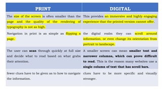
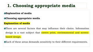
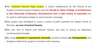
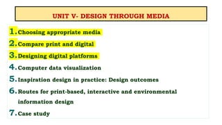
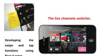
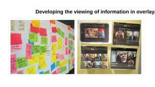
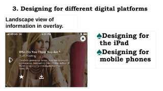
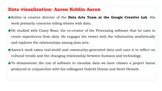
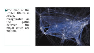
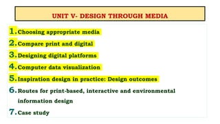
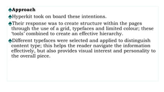
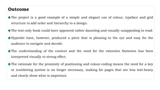
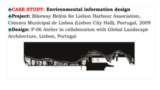
UNIT V
DESIGN THROUGH MEDIA
KONGU ENGINEERING COLLEGE
(AUTONOMOUS)
DEPARTMENT OF COMPUTER SCIENCE AND DESIGN
P.GOWSIKRAJA M.E., (Ph.D.,)
Assistant Professor
Department of Computer Science and Design
UNIT V- DESIGN THROUGH MEDIA
1.Choosing appropriate media
2.Compare print and digital
3.Designing digital platforms
4.Computer data visualization
5.Inspiration design in practice: Design outcomes
6.Routes for print-based, interactive and environmental
information design
7.Case study
♠Explanation of media
♠Choosing appropriate media
Explanation of media
♠There are several factors that may influence their choice. Information
design is a vast subject that covers print, environmental and screen-
based design.
♠Each of these areas demands sensitivity to their different requirements.
1. Choosing appropriate media
♠The Dis(solve) Natural Signs project, a studio collaboration by the School of Art
Graphic Communications Program and the Gerald D. Hines College of Architecture
at the University of Houston, demonstrates how a wide variety of materials can
be used in information design to communicate a message.
♠The project was developed to create a series of park amenities for Japhet Creek in
Houston, an area of natural beauty.
♠The aim was to inform and educate visitors, but also to convey an important
environmental message.
♠By using recycled or repurposed materials, several of which are biodegradable, the
designers imbued the project’s narrative with meaning.
The material chosen could be
used to reinforce the concept
of the design;
• It may be selected because
the design needs to be
durable, practical and
long-lasting or it may be
because the design has to
incorporate movement or
include some sort of
animation.
• To explores various media,
and discusses the reasons
why they might be selected
Choosing appropriate media
♠Knowing which media to select is a very important factor when designing.
♠Depending on the project, information may have to be conveyed across several platforms and
through various media, and in this case, you may have to provide numerous ways of delivering
the data through many different materials.
Example: The signage for Metropolitan Wharf in London by Mind Design.
♠The building is an iconic eight-storey Grade II-listed Victorian riverside warehouse.
♠It has recently been restored and now provides accommodation for offices.
♠Mind Design produced the signage and a customized font for the project. Since the development
is located on the embankment of the River Thames, studio founder Holger Jacobs and his
team came up with the idea of using driftwood for the tenants’ board.
♠The project was technically quite challenging. Driftwood had to be found in the right dimensions,
then cleaned and dried. The question of how to apply the lettering had to be carefully
considered.
♠Most of it was done with sandblasting, but some of it had to be manually enhanced with wood dye.
♠Each piece had to be drilled from the back and fitted with studs that clamped onto large
copper rails.
♠Each sign can be removed individually and exchanged if new tenants move in.
♠Certain pieces of driftwood had to be left blank so names could be added later.
♠The typeface was designed in collaboration with Neal Fletcher and matches the historic lettering on
the outside of the building.
♠ In order for the font to work practically, two versions were completed with subtle differences – one
for sandblasting and one for printing.
♠Creating signage for Metropolitan Wharf,
London, by Mind Design: Driftwood is
collected from the River Thames.
The pieces of driftwood are sorted and selected for use,
taking into consideration the length of the information to
be displayed.
The sequence of the pieces in
the display is chosen to be
both practical and
aesthetically pleasing.
♠Names are sandblasted onto the driftwood
and then painted to ensure maximum
legibility.
The finished signage.
♠It is important to note that the materials chosen for the design
were dictated by the overall concept and budget.
♠The choice of driftwood is sympathetic to the building’s heritage
and location.
♠Had the building not been by the riverside, the materials selected
could have been very different.
♠The overall finished product is both beautiful and functional.
♠It is produced in such a way that it can be updated over time with
minimal effort.
UNIT V- DESIGN THROUGH MEDIA
1.Choosing appropriate media
2.Compare print and digital
3.Designing digital platforms
4.Computer data visualization
5.Inspiration design in practice: Design outcomes
6.Routes for print-based, interactive and environmental
information design
7.Case study
PRINT DIGITAL
Transferring the printed medium onto a screen;
the navigation, quality and size of rendering and
interactivity
In a digital reading environment, we lose these
navigation cues; it’s easy to get disoriented and
not understand “where” one is in the issue”.
It is very easy to understand where you are,
front, middle or back.
lots of storytelling opportunities using a variety of
new tools such as video, audio, flipbooks,
slideshows, image pans, 360-degree panoramas
and hyperlinking text within the copy.
Many designers approach the layout on screen
the same way they do for print-based media.
It is easy to forget that the practice of reading on
screen is very different.
2. Compare print and digital
PRINT DIGITAL
The size of the screen is often smaller than the
page and the quality of the rendering of
typography is not as high.
This provides an immersive and highly engaging
experience that the printed version cannot offer.
Navigation in print is as simple as flipping a
page.
the digital realm they can scroll around
information, or even change its orientation from
portrait to landscape.
The user can scan through quickly at full size
and decide what to read based on what grabs
their attention.
A smaller screen can mean smaller text and
narrower columns, which can prove difficult
to read. This is the reason many websites use a
single column of text that has scroll bars.
fewer clues have to be given as to how to navigate
the information.
clues have to be more specific and visually
stronger.
♠The cover of Wired UK’s print edition.
Readability tests
suggest that
columns should
have around seven
to ten words per
line, or 50 to 70
characters.
• Cover of the same edition
designed for the iPad
version.
• You will notice that there is
less textual information on
display on this version.
• Also, serif or script typefaces
have been replaced by sans
serif fonts for maximum
UNIT V- DESIGN THROUGH MEDIA
1.Choosing appropriate media
2.Compare print and digital
3.Designing digital platforms
4.Computer data visualization
5.Inspiration design in practice: Design outcomes
6.Routes for print-based, interactive and environmental
information design
7.Case study
3. Designing digital platforms
♠These range from traditional screen delivery platforms such as
websites or television to mobile technology such as tablets and
smartphones.
♠All are of varying sizes and resolutions and will have particular
limitations that may require amendments during the design process.
♠ Designing for the iPad
♠ Designing for mobile phones
♠All digital technology uses a screen to display the information.
♠In the display screens on mobile phones and other digital devices are calibrated for
brightness, contrast, colour depth and resolution.
♠It can cause problems when rendering typography, as it will not appear as crisp as it
would in print, and also with colour, as different screens are calibrated in different
ways.
♠One of the biggest problems information designers face is how to retain quality and
parity when designing for multiple platforms. Most designers will design with
limitations in mind and adapt the content in line with the capabilities of thesoftware.
♠To illustrate this, we have chosen the BBC News app for the iPad and the BBC iPlayer
mobile app for iPhone and Android
♠BBC News iPad app, designed
by The Noble Union.
Designing for the iPad
♠How do you present textual news
information on a limited screen size and
allow someone the ability to select from
various news stories at will?
♠News on screen is not delivered the same
way it is in print. Users have become
information grazers, and rely on visual cues
on screen-based technology to guide them
through the content.
♠Having a limited view means information has
to be heavily edited and made engaging for
the viewer.
The BBC approached this problem when developing their news application for the iPad.
♠ Their goal was to produce an app that presented a new way to navigate and deliver media and text
content in a friendly, intuitive and usable way.
♠ The team identified two keywords – skim and dip – from which to design.
♠ A simple method was developed to allow users to navigate the news stories and be able to swap
between them with ease.
♠ A scrolling carousel navigation system was designed to enable the user to ‘skim and dip’.
♠ One way of helping users to navigate the carousel was to include thumbnail images for each story
to make the overall browsing experience a visual one.
♠ The screen has also been split to show the chosen story alongside others presented in a carousel.
♠ This allows users to tap stories on the home screen and have them appear instantly in the reading
pane.
♠BBC News iPad app: live page in portrait format.
BBC News iPad app: live page in
landscape format. Here the carousel
navigation is much larger, allowing more
choices to be included on the page for
the user.
Designing for mobile phones:
♠ Designing for a mobile phone screen can also be challenging, as the space available is even more limited.
How do you encourage an audience to watch TV programmes on their mobile device?
♠ In 2012 the BBC released its BBC iPlayer mobile app, having realized that more and more people were
choosing to watch television or listen to the radio on their mobile devices.
♠ The team tasked with designing this app, headed by senior designer Chris Elphick, identified several goals
when developing the platform.
♠ These were: to let the audience plan their daily viewing;
♠ To encourage the audience to explore more programmes;
♠ To consider the restrictions such as portrait and landscape orientations, screen size and gestural interaction.
♠ Since the iPlayer already existed online, it was important to retain the identity and usability of the original
platform.
♠One of the challenges was to understand the differences
between the mobile platforms for Android and iPhone.
♠Although both use gestures as navigation tools they can be
different. The team chose to keep the gestures simple and
universal.
♠The team explored several possibilities regarding landscape and
portrait orientation, trying to present as much information as
possible in a single view.
♠Research suggested that certain users preferred the simplicity of
a menu with fewer options.
♠In the landscape orientation, the view is changed to scroll
through like a picture gallery to try to overcome this problem.
♠to improve the live experience at ‘channel hopping, a system was devised to allow users to
browse channels while watching live TV, without leaving the playback; that way users could
peruse other content related to the programme.
♠several channel windows within the interface the information users can scroll through.
Developing the live hopping function
using Post-it notes (BBC1, BBC2,
BBC3).
BBC iPlayer mobile app, designed by a team headed by
Chris Elphick. Portrait and landscape views on the
iPhone.
The live channels switcher.
Developing the
swipe and tap
functions using
Developing the viewing of information in overlay.
Landscape view of
information in overlay.
♠Designing for
the iPad
♠Designing for
mobile phones
3. Designing for different digital platforms
UNIT V- DESIGN THROUGH MEDIA
1.Choosing appropriate media
2.Compare print and digital
3.Designing digital platforms
4.Computer data visualization
5.Inspiration design in practice: Design outcomes
6.Routes for print-based, interactive and environmental
information design
7.Case study
♠Data visualizer: Jer Thorp
♠Data visualization: Aaron Koblin
♠Exhibition design and design for the environment
4. Computer data visualization
♠There are several ways to visualize data; we are familiar with various categories
such as charts, diagrams, graphs, tables and maps.
♠The way in which a piece of data is presented depends on the data itself and what it
is meant to convey to an audience.
♠Many software tools such as Microsoft Word, Excel and Adobe Illustrator have
automated these functions.
♠These techniques are not always appropriate when presenting information, though,
and many information designers seek to interpret data in new and challenging ways.
♠As a result, some designers have begun to write specialist software to find new ways
to represent visualizing data.
♠Processing is one such piece of open-source software, originally developed by Casey Reas and
Ben Fry. The idea was to serve as a ‘software sketchbook’ and to teach computer programming
within a visual environment.
♠It has grown into a tool for creating visual images, animation and interactions.
♠The software works by writing single lines of code, adding them one line at a time.
♠By writing a line of code you may have a shape appear on screen; another line may control its
colour or movement or how it changes depending on the interaction with a mouse.
♠Several designers have used Processing to display data visually, which has resulted in both
screen-based and print outcomes.
Data visualizer: Jer Thorp
♠Jer Thorp is from Vancouver, Canada, and currently lives in New York. His award-
winning software-based practice explores the boundaries between art and science.
♠ In 2011 Thorp was commissioned by Popular Science magazine to produce an image
that visualized the archive of their publication.
♠The resulting graphic explored the use of different technical and cultural terms that
have been used since the magazine’s introduction 140 years ago.
♠The image uses a molecular chain to act as a focal point, using the decades to
cluster information. Within each cluster, an atom represents an issue and the number of
words in each issue determines the size of the atoms.
♠Around each atom histograms are placed that show the
frequency of terms used in each issue.
♠Jer used a custom tool built in the Processing software to plot
the frequency of the words and identify the ones that would be
the most interesting to use.
♠The software allowed him to generate artwork from the acquired
data and turn that into visuals that have been printed.
Data visualization of the Popular
Science magazine archive by Jer
Thorp, 2011.
The graphics visualize how
different technical and cultural
terms have come in and out of use
in the magazine since its
inception.
The finished piece in Popular
Science magazine.
♠In early versions Jer picked out
interesting words from all the available
choices and arranged them by year to
suggest a molecular structure.
Here, molecular structures have been
generated based on cover imagery and
word frequency and arranged in a
regimented grid structure.
Jer begins to arrange the
elements to mimic a
molecular DNA structure.
♠You can see the progression of
the design with the elements
now resembling what would
become the final outcome.
♠Here the various cultural
terms have been added along
with more detailed structure
and decade markers.
♠Jer says his working process is
‘riddled with dead ends, messy
errors and bad decisions – the
‘final’ product usually sits on
top of a mountain of iterations
that rarely see the light of day.’
♠ In this instance there were
134 images that came out of
the development of this
visualization: we have chosen
just a few.
Data visualization: Aaron Koblin Aaron
♠Koblin is creative director of the Data Arts Team at the Google Creative Lab. His
work primarily concerns telling stories with data.
♠He studied with Casey Reas, the co-creator of the Processing software that he uses to
create experiences from data. He engages the viewer with the information aesthetically
and explores the relationships among data sets.
♠Aaron’s work takes real-world and community-generated data and uses it to reflect on
cultural trends and the changing relationship between humans and technology.
♠To demonstrate the use of software to visualize data we have chosen a project Aaron
produced in conjunction with his colleagues Gabriel Dunne and Scott Hessels.
♠ This work was originally developed in 2006 as a series of experiments for the project Celestial
Mechanics at UCLA.
♠ Aaron later continued the project with Wired magazine. There can be 30,000 manmade
objects in the sky above us at any one time, including planes, helicopters, weather
balloons and other technology.
♠ Aaron used Processing to plot Federal Aviation Administration data to produce a piece of
animated information showing the paths of air traffic over North America.
♠ The piece shows a 24-hour period where the animated path of each plane is shown as a
coloured line. Within the piece there are 573 aeroplanes, each represented by a unique
colour.
♠ The software plots each plane’s journey from origin to destination.
♠ It serves to demonstrate the complex nature of the flight paths high above the ground.
♠The animation shows the time differences across the continent with air traffic ebbing and
flowing as one side of the country goes to sleep and the other wakes up.
♠The viewer can filter the information to view aircraft by model or type, low altitude or high
altitude, or ascending or descending paths.
♠This allows the viewer to see patterns emerge around population centres and the complexity of
directing air traffic at major cities.
♠Digital data visualization allows the designer to present information in real time and to interpret
a database that can constantly be updated.
♠The Processing software enables amendments to be made comparatively swiftly and easily
without having to reproduce the visual by hand. The designer sets the parameters and the code
provides the visuals.
Data visualization
of flight patterns
by Aaron Koblin,
2006.
Flight paths over
Atlanta, Georgia.
♠Flight paths over the north-east coast of
the United States, showing New York,
Philadelphia and Washington DC.
The tip of Florida is visible in this
image as flight paths over the
state are plotted.
♠The map of the
United States is
clearly
recognizable as
the paths
between the
major cities are
plotted.
Exhibition design and design for the environment
♠ There are many challenges to overcome when designing exhibitions. Storytelling is central to the
successful communication of content and ideas.
♠ A story is constructed using four elements: a narrative, a narrator, a path and a context.
When these elements are considered and combined successfully, your ‘story’ is complete.
♠ Breaking down a project into these four areas is very helpful; designing an exhibition can feel
daunting, and these elements provide a framework and structure for delivery. When an exhibition
is being planned, the commissioning body will have an idea of what message or information they
want to communicate to an audience, although at this point there is no narrative.
♠ A narrative is created when the information is considered and constructed by a designer and is
given a beginning, a middle and an end.
♠ This is the basic structure of a story; a narrator is then needed to tell the story.
♠ The narrator is the medium the designer selects to communicate the content of the story.
♠ This may be text-based, using motion graphics, interactive, 2D or 3D;
♠ most exhibitions utilize combinations of different media to communicate to their audience.
♠ There are some highly creative examples of the use of media to support the delivery of
content within exhibition design;
♠ one of the projects we are featuring (Science Storms; see opposite) is a good example of this.
The path of an exhibition is essentially its physical structure when translated into a three-
dimensional space;
♠The path would be used to determine what an audience would see/ experience and when; it is
the sequence in which the audience will experience the story.
♠ In most exhibitions you will not see the whole exhibit at once.
♠Content will be delivered in sections, and the exhibition designer will consider what, how, and
when you see the information. Exhibits may be presented in a timeline, with a physical
hierarchy to direct the audience from one place to another, or as themes, but whichever
method is used, the space must be logically and consistently organized so that the story
makes sense and is read in the right order.
♠Revealing information in stages, using a hierarchy method, ensures that the audience is not
overloaded with content. As with a story, the first stage should set the scene and entice the
audience to continue and discover what happens next.
♠ Offering information in this way is a key factor in the prolonged engagement of an audience within an
exhibition space. When considering all of these aspects of storytelling, it is important not to forget the context.
♠ Think about the context as the environment or space that surrounds the exhibition, the introduction of the
audience to the exhibit.
♠ How can this space help prepare the audience or introduce them to what they are about to experience? This
can set the mood and tone for the exhibition.
♠ It could provide snippets of information from the exhibition to engage the audience, or it may be lit in the
same way as the exhibition space itself; there are many ways one could do this and it is important to consider
how the viewer approaches the space.
♠ A good exhibition designer will use space, scale, hierarchy, media, materials and various technologies
to tell the story of a particular exhibit in a particular way. The content, the information being
presented, in conjunction with the target audience, will shape how that story is told.
♠Different stories require different treatments; a good exhibition designer will create and design
an experience appropriate to that story.
♠They will consider their audience and the overall goals of the exhibition; these may be to inform,
educate or inspire, for instance.
♠They will explore how best to achieve their goals using the tools at their disposal.
♠They will consider what the space or spaces they are dealing with are like, what materials they
will use, how durable the exhibits have to be, how much audience interaction is involved, what
technologies (and budget) are available, and how they can be used to help them achieve their
goal.
Science Storms, exhibition designed by Evidence Design
for the Museum of Science and Industry, Chicago.
Exhibition design: Science Storms
♠The example we are featuring here is the Science Storms exhibition created by Evidence Design
for the Museum of Science and Industry (MSI) in Chicago.
♠This exhibition is a great example of successful storytelling, with the message being driven and
communicated through creative and appropriate use of media, delivered in an inspiring, well-
designed environment to a specific audience.
♠The challenge put to Evidence Design was to create an exhibition to inspire middle-school
children to embrace the potential and excitement of the sciences.
♠How could an exhibition of physics and chemistry be brought to life so that the audience is
immersed, engaged, curious, excited and educated by the experience?
♠The subject matter of physics and chemistry is quite often a turn-off or many people, so the way
the story was told within the exhibition had to be inventive.
♠The space the designers were dealing with was also important and offered considerable
opportunities; it was 2,415 square metres (26,000 square feet) with a gallery height of 20m
(65ft).
♠This space allowed the designers to create exhibits at a large scale.
♠These were both dynamic and functional, acting as signposts to different areas of the exhibition,
breaking up the space and creating focal points that draw the audience into the exhibits.
♠They attracted attention first, then offered the opportunity for interaction, discovery and
exploration. The exhibition places the audience at the centre of the experience.
♠It offers the opportunity for hands-on experimentation,
investigating the science behind the phenomena through state-of-
the-art interactive media used within the exhibition.
♠Evidence Design explain that, ‘By doing as well as seeing, visitors
find themselves immersed in the adventure of experimental science
and in the imaginative and creative processes of scientists. Science
Storms aims to inspire a new generation of scientists through the
synthesis of compelling interactive exhibits, environmental media
and strong contextual storytelling.’
♠Creating Science Storms
Challenge : To re-envision the existing presentation of physics
and chemistry to achieve MSI’s core mission: to inspire and
motivate our children to achieve their full potential in the fields
of science, technology, medicine and engineering.
Solution:
♠ To transform the heart of the museum into a wondrous
laboratory where visitors interact with dynamic, large-scale
experiments that explore earth’s most powerful phenomena –
tornadoes, lightning, fire, tsunamis, sunlight, avalanches and
atoms in motion – and then, through hands-on
experimentation and interactive media, investigate the science
behind nature’s forces.
UNIT V- DESIGN THROUGH MEDIA
1.Choosing appropriate media
2.Compare print and digital
3.Designing digital platforms
4.Computer data visualization
5.Inspiration design in practice: Design outcomes
6.Routes for print-based, interactive and environmental
information design
7.Case study
♠Design outcomes print, interactive and environmental
♠Routes for print-based information design
♠Routes for interactive information design
♠Routes for environmental information design
5. Inspiration design in practice: Design outcomes
Design outcomes print, interactive and environmental:
Routes for print-based information design
♠Information design in print takes many forms.
♠It is often considered to be mainly charts and diagrams in books, a page in a newspaper is a form of
information design just as a printed sign in the city centre is.
♠We are surrounded by pieces of information every day in the form of printed matter: the books we
read; the printed bus timetable at the bus stop, and even the nutritional information on the
chocolate bar we eat.
♠we are not just talking about ink on paper. The very fabric of print can be used to explore and
explain a concept. The
♠medium can be part of the message communicated. Printed matter uses ink on a substrate or stock
to generate the image or design.
♠This could be offset lithography,
screen-printed, etched, laser-or die-
cut, embossed or debossed.
♠The stock itself can be opaque, semi-
translucent or completely
transparent.
♠Examples of innovative print design.
These discuss how to structure
information and also how to use the
medium itself as a way of enhancing
and communicating a message.
CASE STUDY: Print-based information design
♠Project: Culture and Climate Change: Recordings, book
produced for The Open University, UK, 2011
♠Design: Hyperkit, London
♠Hyperkit are a London-based design studio founded in 2001 by Kate Sclater and Tim Balaam.
They describe their work as ‘good-natured, useful design, often bringing together a love of
material, process and functionality’. Hyperkit produce work across a variety of platforms
including print, digital, exhibition and interiors. Here we feature a printed editorial outcome.
Overview
Culture and Climate Change: Recordings is a book produced for The Open
University, the largest distance learning university in the UK.
Kate Sclater describes the project: ‘The subject of this book is cultural responses to climate change.
The challenge of the brief was to create a publication that, whilst being made up solely of text, was visually
engaging.
It had to be clearly laid out and easy to read, but with a personality that reflected the nature of the content.’
The book contains a mix of essays, transcripts and information, with no images, only text. The largest
section of the book features transcripts of four discussions that took place between artists, academics,
producers and journalists.
Each discussion includes mention of various exhibitions, performances and publications, most of which
needed expanding upon through the use of fairly lengthy footnotes. The editors were keen to give the
footnotes a presence alongside the main text, not simply list them at the back of the volume.
♠Approach
♠Hyperkit took on board these intentions.
♠Their response was to create structure within the pages
through the use of a grid, typefaces and limited colour; these
‘tools’ combined to create an effective hierarchy.
♠Different typefaces were selected and applied to distinguish
content type; this helps the reader navigate the information
effectively, but also provides visual interest and personality to
the overall piece.
Outcome
♠The project is a good example of a simple and elegant use of colour, typeface and grid
structure to add order and hierarchy to a design.
♠The text-only book could have appeared rather daunting and visually unappealing to read.
♠Hyperkit have, however, produced a piece that is pleasing to the eye and easy for the
audience to navigate and decode.
♠The understanding of the content and the need for the extensive footnotes has been
interpreted visually to strong effect.
♠The rationale for the proximity of positioning and colour-coding means the need for a key
or numbering system is no longer necessary, making for pages that are less text-heavy
and clearly show what is important.
♠Design outcomes print, interactive and environmental
♠Routes for print-based information design
♠Routes for interactive information design
♠Routes for environmental information design
5. Inspiration design in practice: Design outcomes
Routes for interactive information design:
♠An interactive design requires the user to interact with the information presented.
♠By making choices the user is in control of the experience and not just a passive receiver.
♠The user is allowed to browse the material at their leisure in the order they choose and not follow
set routes.
♠The world we inhabit has become increasingly reliant on technology, and as a result we have
developed more familiarity with the design of interfaces.
♠For example, we are now accustomed to navigating information on a website in an order or
sequence to break down experiences into meaningful steps to input or receive data.
♠It is important to note that interactive information design is not just about computer technology,
however. Many perceive it as screen-based design including design for mobile phone apps or
websites
♠Although these are included in interactive design, we must remember that any kind of
interaction, even something as simple as moving, folding or revealing, can be classified as
interactive design, including items such as pop-up books.
♠The element of choice is very important, as it allows the user to have a personalized experience.
Many of us learn by doing, not by watching or listening.
♠The experience of interacting means the user will learn and retain the information in a
memorable way.
♠The case study featured overleaf (pp. 176–77) shows how information can be presented in an
engaging way without being too complicated. UK-based Studio Tonne designed a web interface
for users to select, play and download music.
CASE STUDY: Interactive information design
♠Project: Interactive website for Dan Rose Music, 2008
♠Design: Paul Farrington of Studio Tonne, Brighton, UK Paul Farrington, founder of
Studio Tonne, based in Brighton, UK, is well known for his playful and eclectic body of
interactive design work. The project presented here is an interactive website for Dan
Rose Music. Dan is a music consultant for the television and film industry.
♠Overview: In his briefing to Paul, Dan had recognized that radio and television are no
longer the only channels for introducing new music to fans. Social networking and
online file-sharing sites have had a huge influence on music sharing and as a tool for
marketing and distribution. Dan asked Paul to design a web-based application for
clients to connect to a music library via the internet. Usability was a key factor for the
site: he wanted a simple interface that didn’t require a lot of thought to use.
Colour wheel designed for the Dan Rose Music website by
Paul Farrington of Studio Tonne.
♠Approach Dan wanted a ‘sampler’ idea whereby clients could listen to examples of the music
without compromising the integrity and copyright of the artist.
♠Instead of listing tracks by artist or genre, Dan wanted the audience to experience the music
without any preconceived notions.
♠Dan felt that if you categorize by genre such as drum and bass or rock, it gives people an idea of
a sound even before they hear the music.
♠Paul had an interest in the condition synaesthesia, which he discussed with Dan.
♠This is a neurological condition where the stimulation of one sense can lead to involuntary
stimulation of another sense.
♠Phrases such as ‘loud shirt’, ‘bitter wind’ or ‘prickly laugh’ are examples of metaphors influenced
by synaesthetic experiences where the senses can become mixed up and amplified. Paul was
particularly interested in sound and colour synaesthesia.
♠As the title suggests, people with this condition have a unique relationship between sight and
sound.
♠The condition has been described as ‘something like fireworks’.
♠A voice, piece of music, or even ambient environmental sounds such as dogs barking can trigger
colour and firework shapes that arise, move around, and then fade when the sound ends.
♠Synaesthetes comment that sound often changes the perceived hue, brightness and directional
movement of a colour.
♠Most say that loud tones are brighter than soft tones, and that lower tones are darker than higher
tones.
Early design based on pipes rather than a wheel.
The presentation of the track information in development.
Early version of the wheel and interface
showing a radial grid structure and simple
media player timeline with play and pause
buttons.
Early versions of the wheel.
The user is presented with their own
colour wheel on logging into the
website.
The process of setting up your own music wheel on the site. The
black carrier shaper makes it clear that you are in the website’s
personal area.
Routes for environmental information design:
♠ Environmental design takes many factors into account. It is essential that the design is appropriate
for its function, its audience and also its location.
♠ The design must have longevity and the materials utilized need to be considered carefully.
♠ The design may need to have specialist craftspeople to construct the proposed project.
♠ The solution has to be user-friendly and durable. Distance and scale need to be taken into account.
♠ Legibility and readability can be huge factors too, along with what is achievable in the space or site.
The case studies chosen demonstrate two diverse and inventive approaches to producing
environmental signage and wayfinding.
♠ Adi Stern’s project for Design Museum Holon and Bikeway Belém in Portugal both consider, respond
to and reflect their surrounding environments within their solutions.
♠The projects are very different in their approach: one seeks to guide and create an
experience for its users with its playful use of typography and pictograms on a cycle
route; the other discreetly but effectively guides them through a space.
♠They both go beyond what we may consider a traditional or obvious approach and, one
could argue, they challenge the established conventions or ‘rules’ of information
design.
♠We believe they demonstrate concepts and applications that have successfully
understood the needs of the environment that contain them and the audience who will
use them.
♠CASE STUDY: Environmental information design
♠Project: Signage and wayfinding system for Design Museum
Holon, Tel Aviv, Israel, 2010
♠Design: Adi Stern Design, Tel Aviv, Israel Adi Stern is
principal at Adi Stern Design, based in Tel Aviv, Israel.
Adi explains the approach he took to tackling the complexities
of designing a signage and wayfinding system for the Design
Museum Holon in Tel Aviv.
Adi Stern’s wayfinding system at Design
Museum Holon, Tel Aviv, Israel.
Overview
The signage and wayfinding system of the Design
Museum Holon challenges common approaches by
using white arrows on white walls.
The arrows, which are primarily discernible because
of the shadow they cast, emerge from the museum
walls and are transformed from two-to three-
dimensional forms.
The shape of the arrows echo the flow and movement
of the Corten weathering steel bands that surround
the museum building, creating a unity of design
throughout the museum.
Approach: A major challenge in this project was to create a system that would be visible
and easy to use, while not competing with Ron Arad’s dynamic architecture.
♠The museum building is a very expressive and intensive edifice.
♠Its unique character and spirit was unmistakable from the very early stages of the
process.
♠It was clear to Adi that the signage and environmental graphics in and around it should
be as low-key as possible.
♠On one hand, the designers looked for a system that would harmonize with the
building. On the other hand, they clearly aimed at a system that would be functional
and therefore noticeable and easily understood.
♠Outcome: The solution for the wayfinding system is an unusual one.
♠The choice of the white arrows, which seem to emerge from the wall, goes against what
you might expect from an interior signage scheme.
♠Although this is a break from convention, the signage system is straightforward to use.
♠It is quiet and does not compete with the dramatic architecture of the building itself.
♠It is a clever, imaginative and highly original result that integrates seamlessly into the
interior space.
♠Most wayfinding is designed by its functionality, which can lead to outcomes that are
visually unattractive. On the other hand, to disregard functionality can bring about
systems that are impractical to use.
♠The scheme imposed at Design Museum Holon balances aesthetics and functionality, while
being sensitive to its environment. It is simple to navigate, using only a small number of decision
points and sub-destinations. This eliminates the need to use too much directional information,
keeping the signage clean and clear.
♠The design communicates the bare minimum that the user needs and is used only where
absolutely necessary to good effect.
♠The Society for Environmental Graphic Design jury remarked, ‘A simple idea is what makes this
graphic design so successful. The message is clear without distracting attention from the
museum exhibits. The fact that the arrows peel away from the wall in a way that has not been
done before allows them to become quiet sculptural pieces of art themselves.’
♠This project resulted in Adi being given the Tokyo Type Directors Club Award for his design.
♠CASE STUDY: Environmental information design
♠Project: Bikeway Belém for Lisbon Harbour Association,
Câmara Municipal de Lisboa (Lisbon City Hall), Portugal, 2009
♠Design: P-06 Atelier in collaboration with Global Landscape
Architecture, Lisbon, Portugal
♠Founded in 2006 and based in Lisbon, Portugal, P-06 Atelier are an
awardwinning firm specializing in communication and environmental design.
♠They collaborate with architects, urban designers, landscape designers and
engineers on projects and are renowned for producing inventive and challenging
solutions to projects with a bold and distinctive graphic style and approach.
♠We are featuring a project they designed and produced in collaboration with
Global Landscape Architecture. Bikeway Belém is a fascinating piece, as it is an
environmental wayfinding system that goes beyond pure functionality and
attempts something more immersive.
♠The Bikeway covers 7,326m (24,000ft) in the centre of Lisbon. It runs
alongside the River Tagus, and crosses a variety of urban spaces. It
directs cyclists but also provides its users with a graphic interpretation
that is inspired by and responds to its environment.
♠P-06 Atelier have created a scheme that demarks and defines a route
but also offers an experience for users as they travel. It is inventive,
visually and mentally stimulating, memorable and fun – a poetic
narrative. Founding partner Nuno Gusmão describes the project, its
ambitions, intentions and the challenges.
♠Overview: The objective was to define a new urban
environment, beyond the demands of a bikeway, in order to
improve this area along the river.
♠Alongside the cycle path the team also created a pedestrian
lane.
♠The defined path runs alongside a varied ensemble of already
paved industrial and historic spaces.
♠60 per cent of the route can be completed on the existing
asphalt paving, limestone, basalt or granite cobblestones;
these are all black and white.
Onomatopoeic intervention under the bridge.
Stencils made of metal; Alberto Caeiro’s poem about the river Tagus printed on a pier; a
pictogram of a fish indicates an existing fishing spot; crossing different urban and
historical points; white paint stencils.
Signage system and graphic interventions
invading doors and walls of abandoned
warehouses and stores.
Approach
P-06 Atelier wanted more than just a basic wayfinding system;
so the bikeway gives more than just directional and route
information for its users.
The project uses graphic interpretations that encourage users
further and further down the route.
♠ Outcome: The solution developed presented a number of challenges to the designers, such as
parked cars in the cycle lane, and periodic maintenance on pavements and other kinds of
construction works that would mean the graphics would need replacing.
♠ The designers realized that the non-industrial types of graphics and text wouldn’t survive with
constant transit infractions.
♠ The success of the route would depend on how this was overcome. Over established pavements,
mainly granite cobblestones, graphic ‘incisions’ were made in order to preserve the existing surface.
♠ These consisted of circles and polygons made of metal and filled with asphalt, onto which different
pictograms are drawn.
♠ The existing maintenance hole covers are also filled with asphalt, making an ever-lasting system of
signs. All the stencils used were made in metal, to allow for quick repair and maintenance,
undertaken by Lisbon City Hall.
Digital television noise.
♠Design outcomes print, interactive and environmental
♠Routes for print-based information design
♠Routes for interactive information design
♠Routes for environmental information design
5. Inspiration design in practice: Design outcomes
UNIT V- DESIGN THROUGH MEDIA
1.Choosing appropriate media
2.Compare print and digital
3.Designing digital platforms
4.Computer data visualization
5.Inspiration design in practice: Design outcomes
6.Routes for print-based, interactive and environmental
information design
7.Case study

UNIT V DESIGN THROUGH MEDIA-20CDE09-INFORMATION DESIGN

  • 1.
    UNIT V DESIGN THROUGHMEDIA KONGU ENGINEERING COLLEGE (AUTONOMOUS) DEPARTMENT OF COMPUTER SCIENCE AND DESIGN P.GOWSIKRAJA M.E., (Ph.D.,) Assistant Professor Department of Computer Science and Design
  • 2.
    UNIT V- DESIGNTHROUGH MEDIA 1.Choosing appropriate media 2.Compare print and digital 3.Designing digital platforms 4.Computer data visualization 5.Inspiration design in practice: Design outcomes 6.Routes for print-based, interactive and environmental information design 7.Case study
  • 3.
    ♠Explanation of media ♠Choosingappropriate media Explanation of media ♠There are several factors that may influence their choice. Information design is a vast subject that covers print, environmental and screen- based design. ♠Each of these areas demands sensitivity to their different requirements. 1. Choosing appropriate media
  • 4.
    ♠The Dis(solve) NaturalSigns project, a studio collaboration by the School of Art Graphic Communications Program and the Gerald D. Hines College of Architecture at the University of Houston, demonstrates how a wide variety of materials can be used in information design to communicate a message. ♠The project was developed to create a series of park amenities for Japhet Creek in Houston, an area of natural beauty. ♠The aim was to inform and educate visitors, but also to convey an important environmental message. ♠By using recycled or repurposed materials, several of which are biodegradable, the designers imbued the project’s narrative with meaning.
  • 6.
    The material chosencould be used to reinforce the concept of the design; • It may be selected because the design needs to be durable, practical and long-lasting or it may be because the design has to incorporate movement or include some sort of animation. • To explores various media, and discusses the reasons why they might be selected
  • 7.
    Choosing appropriate media ♠Knowingwhich media to select is a very important factor when designing. ♠Depending on the project, information may have to be conveyed across several platforms and through various media, and in this case, you may have to provide numerous ways of delivering the data through many different materials. Example: The signage for Metropolitan Wharf in London by Mind Design. ♠The building is an iconic eight-storey Grade II-listed Victorian riverside warehouse. ♠It has recently been restored and now provides accommodation for offices. ♠Mind Design produced the signage and a customized font for the project. Since the development is located on the embankment of the River Thames, studio founder Holger Jacobs and his team came up with the idea of using driftwood for the tenants’ board.
  • 8.
    ♠The project wastechnically quite challenging. Driftwood had to be found in the right dimensions, then cleaned and dried. The question of how to apply the lettering had to be carefully considered. ♠Most of it was done with sandblasting, but some of it had to be manually enhanced with wood dye. ♠Each piece had to be drilled from the back and fitted with studs that clamped onto large copper rails. ♠Each sign can be removed individually and exchanged if new tenants move in. ♠Certain pieces of driftwood had to be left blank so names could be added later. ♠The typeface was designed in collaboration with Neal Fletcher and matches the historic lettering on the outside of the building. ♠ In order for the font to work practically, two versions were completed with subtle differences – one for sandblasting and one for printing.
  • 9.
    ♠Creating signage forMetropolitan Wharf, London, by Mind Design: Driftwood is collected from the River Thames. The pieces of driftwood are sorted and selected for use, taking into consideration the length of the information to be displayed.
  • 10.
    The sequence ofthe pieces in the display is chosen to be both practical and aesthetically pleasing.
  • 11.
    ♠Names are sandblastedonto the driftwood and then painted to ensure maximum legibility. The finished signage.
  • 12.
    ♠It is importantto note that the materials chosen for the design were dictated by the overall concept and budget. ♠The choice of driftwood is sympathetic to the building’s heritage and location. ♠Had the building not been by the riverside, the materials selected could have been very different. ♠The overall finished product is both beautiful and functional. ♠It is produced in such a way that it can be updated over time with minimal effort.
  • 13.
    UNIT V- DESIGNTHROUGH MEDIA 1.Choosing appropriate media 2.Compare print and digital 3.Designing digital platforms 4.Computer data visualization 5.Inspiration design in practice: Design outcomes 6.Routes for print-based, interactive and environmental information design 7.Case study
  • 14.
    PRINT DIGITAL Transferring theprinted medium onto a screen; the navigation, quality and size of rendering and interactivity In a digital reading environment, we lose these navigation cues; it’s easy to get disoriented and not understand “where” one is in the issue”. It is very easy to understand where you are, front, middle or back. lots of storytelling opportunities using a variety of new tools such as video, audio, flipbooks, slideshows, image pans, 360-degree panoramas and hyperlinking text within the copy. Many designers approach the layout on screen the same way they do for print-based media. It is easy to forget that the practice of reading on screen is very different. 2. Compare print and digital
  • 15.
    PRINT DIGITAL The sizeof the screen is often smaller than the page and the quality of the rendering of typography is not as high. This provides an immersive and highly engaging experience that the printed version cannot offer. Navigation in print is as simple as flipping a page. the digital realm they can scroll around information, or even change its orientation from portrait to landscape. The user can scan through quickly at full size and decide what to read based on what grabs their attention. A smaller screen can mean smaller text and narrower columns, which can prove difficult to read. This is the reason many websites use a single column of text that has scroll bars. fewer clues have to be given as to how to navigate the information. clues have to be more specific and visually stronger.
  • 16.
    ♠The cover ofWired UK’s print edition. Readability tests suggest that columns should have around seven to ten words per line, or 50 to 70 characters.
  • 17.
    • Cover ofthe same edition designed for the iPad version. • You will notice that there is less textual information on display on this version. • Also, serif or script typefaces have been replaced by sans serif fonts for maximum
  • 18.
    UNIT V- DESIGNTHROUGH MEDIA 1.Choosing appropriate media 2.Compare print and digital 3.Designing digital platforms 4.Computer data visualization 5.Inspiration design in practice: Design outcomes 6.Routes for print-based, interactive and environmental information design 7.Case study
  • 19.
    3. Designing digitalplatforms ♠These range from traditional screen delivery platforms such as websites or television to mobile technology such as tablets and smartphones. ♠All are of varying sizes and resolutions and will have particular limitations that may require amendments during the design process. ♠ Designing for the iPad ♠ Designing for mobile phones
  • 20.
    ♠All digital technologyuses a screen to display the information. ♠In the display screens on mobile phones and other digital devices are calibrated for brightness, contrast, colour depth and resolution. ♠It can cause problems when rendering typography, as it will not appear as crisp as it would in print, and also with colour, as different screens are calibrated in different ways. ♠One of the biggest problems information designers face is how to retain quality and parity when designing for multiple platforms. Most designers will design with limitations in mind and adapt the content in line with the capabilities of thesoftware. ♠To illustrate this, we have chosen the BBC News app for the iPad and the BBC iPlayer mobile app for iPhone and Android
  • 21.
    ♠BBC News iPadapp, designed by The Noble Union. Designing for the iPad ♠How do you present textual news information on a limited screen size and allow someone the ability to select from various news stories at will? ♠News on screen is not delivered the same way it is in print. Users have become information grazers, and rely on visual cues on screen-based technology to guide them through the content. ♠Having a limited view means information has to be heavily edited and made engaging for the viewer.
  • 22.
    The BBC approachedthis problem when developing their news application for the iPad. ♠ Their goal was to produce an app that presented a new way to navigate and deliver media and text content in a friendly, intuitive and usable way. ♠ The team identified two keywords – skim and dip – from which to design. ♠ A simple method was developed to allow users to navigate the news stories and be able to swap between them with ease. ♠ A scrolling carousel navigation system was designed to enable the user to ‘skim and dip’. ♠ One way of helping users to navigate the carousel was to include thumbnail images for each story to make the overall browsing experience a visual one. ♠ The screen has also been split to show the chosen story alongside others presented in a carousel. ♠ This allows users to tap stories on the home screen and have them appear instantly in the reading pane.
  • 23.
    ♠BBC News iPadapp: live page in portrait format. BBC News iPad app: live page in landscape format. Here the carousel navigation is much larger, allowing more choices to be included on the page for the user.
  • 24.
    Designing for mobilephones: ♠ Designing for a mobile phone screen can also be challenging, as the space available is even more limited. How do you encourage an audience to watch TV programmes on their mobile device? ♠ In 2012 the BBC released its BBC iPlayer mobile app, having realized that more and more people were choosing to watch television or listen to the radio on their mobile devices. ♠ The team tasked with designing this app, headed by senior designer Chris Elphick, identified several goals when developing the platform. ♠ These were: to let the audience plan their daily viewing; ♠ To encourage the audience to explore more programmes; ♠ To consider the restrictions such as portrait and landscape orientations, screen size and gestural interaction. ♠ Since the iPlayer already existed online, it was important to retain the identity and usability of the original platform.
  • 25.
    ♠One of thechallenges was to understand the differences between the mobile platforms for Android and iPhone. ♠Although both use gestures as navigation tools they can be different. The team chose to keep the gestures simple and universal. ♠The team explored several possibilities regarding landscape and portrait orientation, trying to present as much information as possible in a single view. ♠Research suggested that certain users preferred the simplicity of a menu with fewer options. ♠In the landscape orientation, the view is changed to scroll through like a picture gallery to try to overcome this problem.
  • 26.
    ♠to improve thelive experience at ‘channel hopping, a system was devised to allow users to browse channels while watching live TV, without leaving the playback; that way users could peruse other content related to the programme. ♠several channel windows within the interface the information users can scroll through. Developing the live hopping function using Post-it notes (BBC1, BBC2, BBC3). BBC iPlayer mobile app, designed by a team headed by Chris Elphick. Portrait and landscape views on the iPhone.
  • 27.
    The live channelsswitcher. Developing the swipe and tap functions using
  • 28.
    Developing the viewingof information in overlay.
  • 29.
    Landscape view of informationin overlay. ♠Designing for the iPad ♠Designing for mobile phones 3. Designing for different digital platforms
  • 30.
    UNIT V- DESIGNTHROUGH MEDIA 1.Choosing appropriate media 2.Compare print and digital 3.Designing digital platforms 4.Computer data visualization 5.Inspiration design in practice: Design outcomes 6.Routes for print-based, interactive and environmental information design 7.Case study
  • 31.
    ♠Data visualizer: JerThorp ♠Data visualization: Aaron Koblin ♠Exhibition design and design for the environment 4. Computer data visualization
  • 32.
    ♠There are severalways to visualize data; we are familiar with various categories such as charts, diagrams, graphs, tables and maps. ♠The way in which a piece of data is presented depends on the data itself and what it is meant to convey to an audience. ♠Many software tools such as Microsoft Word, Excel and Adobe Illustrator have automated these functions. ♠These techniques are not always appropriate when presenting information, though, and many information designers seek to interpret data in new and challenging ways. ♠As a result, some designers have begun to write specialist software to find new ways to represent visualizing data.
  • 33.
    ♠Processing is onesuch piece of open-source software, originally developed by Casey Reas and Ben Fry. The idea was to serve as a ‘software sketchbook’ and to teach computer programming within a visual environment. ♠It has grown into a tool for creating visual images, animation and interactions. ♠The software works by writing single lines of code, adding them one line at a time. ♠By writing a line of code you may have a shape appear on screen; another line may control its colour or movement or how it changes depending on the interaction with a mouse. ♠Several designers have used Processing to display data visually, which has resulted in both screen-based and print outcomes.
  • 34.
    Data visualizer: JerThorp ♠Jer Thorp is from Vancouver, Canada, and currently lives in New York. His award- winning software-based practice explores the boundaries between art and science. ♠ In 2011 Thorp was commissioned by Popular Science magazine to produce an image that visualized the archive of their publication. ♠The resulting graphic explored the use of different technical and cultural terms that have been used since the magazine’s introduction 140 years ago. ♠The image uses a molecular chain to act as a focal point, using the decades to cluster information. Within each cluster, an atom represents an issue and the number of words in each issue determines the size of the atoms.
  • 35.
    ♠Around each atomhistograms are placed that show the frequency of terms used in each issue. ♠Jer used a custom tool built in the Processing software to plot the frequency of the words and identify the ones that would be the most interesting to use. ♠The software allowed him to generate artwork from the acquired data and turn that into visuals that have been printed.
  • 36.
    Data visualization ofthe Popular Science magazine archive by Jer Thorp, 2011. The graphics visualize how different technical and cultural terms have come in and out of use in the magazine since its inception. The finished piece in Popular Science magazine.
  • 37.
    ♠In early versionsJer picked out interesting words from all the available choices and arranged them by year to suggest a molecular structure. Here, molecular structures have been generated based on cover imagery and word frequency and arranged in a regimented grid structure.
  • 38.
    Jer begins toarrange the elements to mimic a molecular DNA structure.
  • 39.
    ♠You can seethe progression of the design with the elements now resembling what would become the final outcome. ♠Here the various cultural terms have been added along with more detailed structure and decade markers. ♠Jer says his working process is ‘riddled with dead ends, messy errors and bad decisions – the ‘final’ product usually sits on top of a mountain of iterations that rarely see the light of day.’ ♠ In this instance there were 134 images that came out of the development of this visualization: we have chosen just a few.
  • 40.
    Data visualization: AaronKoblin Aaron ♠Koblin is creative director of the Data Arts Team at the Google Creative Lab. His work primarily concerns telling stories with data. ♠He studied with Casey Reas, the co-creator of the Processing software that he uses to create experiences from data. He engages the viewer with the information aesthetically and explores the relationships among data sets. ♠Aaron’s work takes real-world and community-generated data and uses it to reflect on cultural trends and the changing relationship between humans and technology. ♠To demonstrate the use of software to visualize data we have chosen a project Aaron produced in conjunction with his colleagues Gabriel Dunne and Scott Hessels.
  • 41.
    ♠ This workwas originally developed in 2006 as a series of experiments for the project Celestial Mechanics at UCLA. ♠ Aaron later continued the project with Wired magazine. There can be 30,000 manmade objects in the sky above us at any one time, including planes, helicopters, weather balloons and other technology. ♠ Aaron used Processing to plot Federal Aviation Administration data to produce a piece of animated information showing the paths of air traffic over North America. ♠ The piece shows a 24-hour period where the animated path of each plane is shown as a coloured line. Within the piece there are 573 aeroplanes, each represented by a unique colour. ♠ The software plots each plane’s journey from origin to destination. ♠ It serves to demonstrate the complex nature of the flight paths high above the ground.
  • 42.
    ♠The animation showsthe time differences across the continent with air traffic ebbing and flowing as one side of the country goes to sleep and the other wakes up. ♠The viewer can filter the information to view aircraft by model or type, low altitude or high altitude, or ascending or descending paths. ♠This allows the viewer to see patterns emerge around population centres and the complexity of directing air traffic at major cities. ♠Digital data visualization allows the designer to present information in real time and to interpret a database that can constantly be updated. ♠The Processing software enables amendments to be made comparatively swiftly and easily without having to reproduce the visual by hand. The designer sets the parameters and the code provides the visuals.
  • 43.
    Data visualization of flightpatterns by Aaron Koblin, 2006. Flight paths over Atlanta, Georgia.
  • 44.
    ♠Flight paths overthe north-east coast of the United States, showing New York, Philadelphia and Washington DC. The tip of Florida is visible in this image as flight paths over the state are plotted.
  • 45.
    ♠The map ofthe United States is clearly recognizable as the paths between the major cities are plotted.
  • 46.
    Exhibition design anddesign for the environment ♠ There are many challenges to overcome when designing exhibitions. Storytelling is central to the successful communication of content and ideas. ♠ A story is constructed using four elements: a narrative, a narrator, a path and a context. When these elements are considered and combined successfully, your ‘story’ is complete. ♠ Breaking down a project into these four areas is very helpful; designing an exhibition can feel daunting, and these elements provide a framework and structure for delivery. When an exhibition is being planned, the commissioning body will have an idea of what message or information they want to communicate to an audience, although at this point there is no narrative. ♠ A narrative is created when the information is considered and constructed by a designer and is given a beginning, a middle and an end.
  • 47.
    ♠ This isthe basic structure of a story; a narrator is then needed to tell the story. ♠ The narrator is the medium the designer selects to communicate the content of the story. ♠ This may be text-based, using motion graphics, interactive, 2D or 3D; ♠ most exhibitions utilize combinations of different media to communicate to their audience. ♠ There are some highly creative examples of the use of media to support the delivery of content within exhibition design; ♠ one of the projects we are featuring (Science Storms; see opposite) is a good example of this. The path of an exhibition is essentially its physical structure when translated into a three- dimensional space;
  • 48.
    ♠The path wouldbe used to determine what an audience would see/ experience and when; it is the sequence in which the audience will experience the story. ♠ In most exhibitions you will not see the whole exhibit at once. ♠Content will be delivered in sections, and the exhibition designer will consider what, how, and when you see the information. Exhibits may be presented in a timeline, with a physical hierarchy to direct the audience from one place to another, or as themes, but whichever method is used, the space must be logically and consistently organized so that the story makes sense and is read in the right order. ♠Revealing information in stages, using a hierarchy method, ensures that the audience is not overloaded with content. As with a story, the first stage should set the scene and entice the audience to continue and discover what happens next.
  • 49.
    ♠ Offering informationin this way is a key factor in the prolonged engagement of an audience within an exhibition space. When considering all of these aspects of storytelling, it is important not to forget the context. ♠ Think about the context as the environment or space that surrounds the exhibition, the introduction of the audience to the exhibit. ♠ How can this space help prepare the audience or introduce them to what they are about to experience? This can set the mood and tone for the exhibition. ♠ It could provide snippets of information from the exhibition to engage the audience, or it may be lit in the same way as the exhibition space itself; there are many ways one could do this and it is important to consider how the viewer approaches the space. ♠ A good exhibition designer will use space, scale, hierarchy, media, materials and various technologies to tell the story of a particular exhibit in a particular way. The content, the information being presented, in conjunction with the target audience, will shape how that story is told.
  • 50.
    ♠Different stories requiredifferent treatments; a good exhibition designer will create and design an experience appropriate to that story. ♠They will consider their audience and the overall goals of the exhibition; these may be to inform, educate or inspire, for instance. ♠They will explore how best to achieve their goals using the tools at their disposal. ♠They will consider what the space or spaces they are dealing with are like, what materials they will use, how durable the exhibits have to be, how much audience interaction is involved, what technologies (and budget) are available, and how they can be used to help them achieve their goal.
  • 51.
    Science Storms, exhibitiondesigned by Evidence Design for the Museum of Science and Industry, Chicago.
  • 52.
    Exhibition design: ScienceStorms ♠The example we are featuring here is the Science Storms exhibition created by Evidence Design for the Museum of Science and Industry (MSI) in Chicago. ♠This exhibition is a great example of successful storytelling, with the message being driven and communicated through creative and appropriate use of media, delivered in an inspiring, well- designed environment to a specific audience. ♠The challenge put to Evidence Design was to create an exhibition to inspire middle-school children to embrace the potential and excitement of the sciences. ♠How could an exhibition of physics and chemistry be brought to life so that the audience is immersed, engaged, curious, excited and educated by the experience?
  • 53.
    ♠The subject matterof physics and chemistry is quite often a turn-off or many people, so the way the story was told within the exhibition had to be inventive. ♠The space the designers were dealing with was also important and offered considerable opportunities; it was 2,415 square metres (26,000 square feet) with a gallery height of 20m (65ft). ♠This space allowed the designers to create exhibits at a large scale. ♠These were both dynamic and functional, acting as signposts to different areas of the exhibition, breaking up the space and creating focal points that draw the audience into the exhibits. ♠They attracted attention first, then offered the opportunity for interaction, discovery and exploration. The exhibition places the audience at the centre of the experience.
  • 54.
    ♠It offers theopportunity for hands-on experimentation, investigating the science behind the phenomena through state-of- the-art interactive media used within the exhibition. ♠Evidence Design explain that, ‘By doing as well as seeing, visitors find themselves immersed in the adventure of experimental science and in the imaginative and creative processes of scientists. Science Storms aims to inspire a new generation of scientists through the synthesis of compelling interactive exhibits, environmental media and strong contextual storytelling.’
  • 55.
    ♠Creating Science Storms Challenge: To re-envision the existing presentation of physics and chemistry to achieve MSI’s core mission: to inspire and motivate our children to achieve their full potential in the fields of science, technology, medicine and engineering. Solution: ♠ To transform the heart of the museum into a wondrous laboratory where visitors interact with dynamic, large-scale experiments that explore earth’s most powerful phenomena – tornadoes, lightning, fire, tsunamis, sunlight, avalanches and atoms in motion – and then, through hands-on experimentation and interactive media, investigate the science behind nature’s forces.
  • 56.
    UNIT V- DESIGNTHROUGH MEDIA 1.Choosing appropriate media 2.Compare print and digital 3.Designing digital platforms 4.Computer data visualization 5.Inspiration design in practice: Design outcomes 6.Routes for print-based, interactive and environmental information design 7.Case study
  • 57.
    ♠Design outcomes print,interactive and environmental ♠Routes for print-based information design ♠Routes for interactive information design ♠Routes for environmental information design 5. Inspiration design in practice: Design outcomes
  • 58.
    Design outcomes print,interactive and environmental: Routes for print-based information design ♠Information design in print takes many forms. ♠It is often considered to be mainly charts and diagrams in books, a page in a newspaper is a form of information design just as a printed sign in the city centre is. ♠We are surrounded by pieces of information every day in the form of printed matter: the books we read; the printed bus timetable at the bus stop, and even the nutritional information on the chocolate bar we eat. ♠we are not just talking about ink on paper. The very fabric of print can be used to explore and explain a concept. The ♠medium can be part of the message communicated. Printed matter uses ink on a substrate or stock to generate the image or design.
  • 59.
    ♠This could beoffset lithography, screen-printed, etched, laser-or die- cut, embossed or debossed. ♠The stock itself can be opaque, semi- translucent or completely transparent. ♠Examples of innovative print design. These discuss how to structure information and also how to use the medium itself as a way of enhancing and communicating a message.
  • 60.
    CASE STUDY: Print-basedinformation design ♠Project: Culture and Climate Change: Recordings, book produced for The Open University, UK, 2011 ♠Design: Hyperkit, London ♠Hyperkit are a London-based design studio founded in 2001 by Kate Sclater and Tim Balaam. They describe their work as ‘good-natured, useful design, often bringing together a love of material, process and functionality’. Hyperkit produce work across a variety of platforms including print, digital, exhibition and interiors. Here we feature a printed editorial outcome.
  • 61.
    Overview Culture and ClimateChange: Recordings is a book produced for The Open University, the largest distance learning university in the UK. Kate Sclater describes the project: ‘The subject of this book is cultural responses to climate change. The challenge of the brief was to create a publication that, whilst being made up solely of text, was visually engaging. It had to be clearly laid out and easy to read, but with a personality that reflected the nature of the content.’ The book contains a mix of essays, transcripts and information, with no images, only text. The largest section of the book features transcripts of four discussions that took place between artists, academics, producers and journalists. Each discussion includes mention of various exhibitions, performances and publications, most of which needed expanding upon through the use of fairly lengthy footnotes. The editors were keen to give the footnotes a presence alongside the main text, not simply list them at the back of the volume.
  • 62.
    ♠Approach ♠Hyperkit took onboard these intentions. ♠Their response was to create structure within the pages through the use of a grid, typefaces and limited colour; these ‘tools’ combined to create an effective hierarchy. ♠Different typefaces were selected and applied to distinguish content type; this helps the reader navigate the information effectively, but also provides visual interest and personality to the overall piece.
  • 63.
    Outcome ♠The project isa good example of a simple and elegant use of colour, typeface and grid structure to add order and hierarchy to a design. ♠The text-only book could have appeared rather daunting and visually unappealing to read. ♠Hyperkit have, however, produced a piece that is pleasing to the eye and easy for the audience to navigate and decode. ♠The understanding of the content and the need for the extensive footnotes has been interpreted visually to strong effect. ♠The rationale for the proximity of positioning and colour-coding means the need for a key or numbering system is no longer necessary, making for pages that are less text-heavy and clearly show what is important.
  • 69.
    ♠Design outcomes print,interactive and environmental ♠Routes for print-based information design ♠Routes for interactive information design ♠Routes for environmental information design 5. Inspiration design in practice: Design outcomes
  • 70.
    Routes for interactiveinformation design: ♠An interactive design requires the user to interact with the information presented. ♠By making choices the user is in control of the experience and not just a passive receiver. ♠The user is allowed to browse the material at their leisure in the order they choose and not follow set routes. ♠The world we inhabit has become increasingly reliant on technology, and as a result we have developed more familiarity with the design of interfaces. ♠For example, we are now accustomed to navigating information on a website in an order or sequence to break down experiences into meaningful steps to input or receive data. ♠It is important to note that interactive information design is not just about computer technology, however. Many perceive it as screen-based design including design for mobile phone apps or websites
  • 71.
    ♠Although these areincluded in interactive design, we must remember that any kind of interaction, even something as simple as moving, folding or revealing, can be classified as interactive design, including items such as pop-up books. ♠The element of choice is very important, as it allows the user to have a personalized experience. Many of us learn by doing, not by watching or listening. ♠The experience of interacting means the user will learn and retain the information in a memorable way. ♠The case study featured overleaf (pp. 176–77) shows how information can be presented in an engaging way without being too complicated. UK-based Studio Tonne designed a web interface for users to select, play and download music.
  • 74.
    CASE STUDY: Interactiveinformation design ♠Project: Interactive website for Dan Rose Music, 2008 ♠Design: Paul Farrington of Studio Tonne, Brighton, UK Paul Farrington, founder of Studio Tonne, based in Brighton, UK, is well known for his playful and eclectic body of interactive design work. The project presented here is an interactive website for Dan Rose Music. Dan is a music consultant for the television and film industry. ♠Overview: In his briefing to Paul, Dan had recognized that radio and television are no longer the only channels for introducing new music to fans. Social networking and online file-sharing sites have had a huge influence on music sharing and as a tool for marketing and distribution. Dan asked Paul to design a web-based application for clients to connect to a music library via the internet. Usability was a key factor for the site: he wanted a simple interface that didn’t require a lot of thought to use.
  • 75.
    Colour wheel designedfor the Dan Rose Music website by Paul Farrington of Studio Tonne.
  • 76.
    ♠Approach Dan wanteda ‘sampler’ idea whereby clients could listen to examples of the music without compromising the integrity and copyright of the artist. ♠Instead of listing tracks by artist or genre, Dan wanted the audience to experience the music without any preconceived notions. ♠Dan felt that if you categorize by genre such as drum and bass or rock, it gives people an idea of a sound even before they hear the music. ♠Paul had an interest in the condition synaesthesia, which he discussed with Dan. ♠This is a neurological condition where the stimulation of one sense can lead to involuntary stimulation of another sense.
  • 77.
    ♠Phrases such as‘loud shirt’, ‘bitter wind’ or ‘prickly laugh’ are examples of metaphors influenced by synaesthetic experiences where the senses can become mixed up and amplified. Paul was particularly interested in sound and colour synaesthesia. ♠As the title suggests, people with this condition have a unique relationship between sight and sound. ♠The condition has been described as ‘something like fireworks’. ♠A voice, piece of music, or even ambient environmental sounds such as dogs barking can trigger colour and firework shapes that arise, move around, and then fade when the sound ends. ♠Synaesthetes comment that sound often changes the perceived hue, brightness and directional movement of a colour. ♠Most say that loud tones are brighter than soft tones, and that lower tones are darker than higher tones.
  • 78.
    Early design basedon pipes rather than a wheel. The presentation of the track information in development.
  • 79.
    Early version ofthe wheel and interface showing a radial grid structure and simple media player timeline with play and pause buttons. Early versions of the wheel.
  • 80.
    The user ispresented with their own colour wheel on logging into the website. The process of setting up your own music wheel on the site. The black carrier shaper makes it clear that you are in the website’s personal area.
  • 81.
    Routes for environmentalinformation design: ♠ Environmental design takes many factors into account. It is essential that the design is appropriate for its function, its audience and also its location. ♠ The design must have longevity and the materials utilized need to be considered carefully. ♠ The design may need to have specialist craftspeople to construct the proposed project. ♠ The solution has to be user-friendly and durable. Distance and scale need to be taken into account. ♠ Legibility and readability can be huge factors too, along with what is achievable in the space or site. The case studies chosen demonstrate two diverse and inventive approaches to producing environmental signage and wayfinding. ♠ Adi Stern’s project for Design Museum Holon and Bikeway Belém in Portugal both consider, respond to and reflect their surrounding environments within their solutions.
  • 82.
    ♠The projects arevery different in their approach: one seeks to guide and create an experience for its users with its playful use of typography and pictograms on a cycle route; the other discreetly but effectively guides them through a space. ♠They both go beyond what we may consider a traditional or obvious approach and, one could argue, they challenge the established conventions or ‘rules’ of information design. ♠We believe they demonstrate concepts and applications that have successfully understood the needs of the environment that contain them and the audience who will use them.
  • 83.
    ♠CASE STUDY: Environmentalinformation design ♠Project: Signage and wayfinding system for Design Museum Holon, Tel Aviv, Israel, 2010 ♠Design: Adi Stern Design, Tel Aviv, Israel Adi Stern is principal at Adi Stern Design, based in Tel Aviv, Israel. Adi explains the approach he took to tackling the complexities of designing a signage and wayfinding system for the Design Museum Holon in Tel Aviv.
  • 84.
    Adi Stern’s wayfindingsystem at Design Museum Holon, Tel Aviv, Israel. Overview The signage and wayfinding system of the Design Museum Holon challenges common approaches by using white arrows on white walls. The arrows, which are primarily discernible because of the shadow they cast, emerge from the museum walls and are transformed from two-to three- dimensional forms. The shape of the arrows echo the flow and movement of the Corten weathering steel bands that surround the museum building, creating a unity of design throughout the museum.
  • 86.
    Approach: A majorchallenge in this project was to create a system that would be visible and easy to use, while not competing with Ron Arad’s dynamic architecture. ♠The museum building is a very expressive and intensive edifice. ♠Its unique character and spirit was unmistakable from the very early stages of the process. ♠It was clear to Adi that the signage and environmental graphics in and around it should be as low-key as possible. ♠On one hand, the designers looked for a system that would harmonize with the building. On the other hand, they clearly aimed at a system that would be functional and therefore noticeable and easily understood.
  • 87.
    ♠Outcome: The solutionfor the wayfinding system is an unusual one. ♠The choice of the white arrows, which seem to emerge from the wall, goes against what you might expect from an interior signage scheme. ♠Although this is a break from convention, the signage system is straightforward to use. ♠It is quiet and does not compete with the dramatic architecture of the building itself. ♠It is a clever, imaginative and highly original result that integrates seamlessly into the interior space. ♠Most wayfinding is designed by its functionality, which can lead to outcomes that are visually unattractive. On the other hand, to disregard functionality can bring about systems that are impractical to use.
  • 88.
    ♠The scheme imposedat Design Museum Holon balances aesthetics and functionality, while being sensitive to its environment. It is simple to navigate, using only a small number of decision points and sub-destinations. This eliminates the need to use too much directional information, keeping the signage clean and clear. ♠The design communicates the bare minimum that the user needs and is used only where absolutely necessary to good effect. ♠The Society for Environmental Graphic Design jury remarked, ‘A simple idea is what makes this graphic design so successful. The message is clear without distracting attention from the museum exhibits. The fact that the arrows peel away from the wall in a way that has not been done before allows them to become quiet sculptural pieces of art themselves.’ ♠This project resulted in Adi being given the Tokyo Type Directors Club Award for his design.
  • 90.
    ♠CASE STUDY: Environmentalinformation design ♠Project: Bikeway Belém for Lisbon Harbour Association, Câmara Municipal de Lisboa (Lisbon City Hall), Portugal, 2009 ♠Design: P-06 Atelier in collaboration with Global Landscape Architecture, Lisbon, Portugal
  • 91.
    ♠Founded in 2006and based in Lisbon, Portugal, P-06 Atelier are an awardwinning firm specializing in communication and environmental design. ♠They collaborate with architects, urban designers, landscape designers and engineers on projects and are renowned for producing inventive and challenging solutions to projects with a bold and distinctive graphic style and approach. ♠We are featuring a project they designed and produced in collaboration with Global Landscape Architecture. Bikeway Belém is a fascinating piece, as it is an environmental wayfinding system that goes beyond pure functionality and attempts something more immersive.
  • 92.
    ♠The Bikeway covers7,326m (24,000ft) in the centre of Lisbon. It runs alongside the River Tagus, and crosses a variety of urban spaces. It directs cyclists but also provides its users with a graphic interpretation that is inspired by and responds to its environment. ♠P-06 Atelier have created a scheme that demarks and defines a route but also offers an experience for users as they travel. It is inventive, visually and mentally stimulating, memorable and fun – a poetic narrative. Founding partner Nuno Gusmão describes the project, its ambitions, intentions and the challenges.
  • 93.
    ♠Overview: The objectivewas to define a new urban environment, beyond the demands of a bikeway, in order to improve this area along the river. ♠Alongside the cycle path the team also created a pedestrian lane. ♠The defined path runs alongside a varied ensemble of already paved industrial and historic spaces. ♠60 per cent of the route can be completed on the existing asphalt paving, limestone, basalt or granite cobblestones; these are all black and white.
  • 95.
  • 96.
    Stencils made ofmetal; Alberto Caeiro’s poem about the river Tagus printed on a pier; a pictogram of a fish indicates an existing fishing spot; crossing different urban and historical points; white paint stencils.
  • 97.
    Signage system andgraphic interventions invading doors and walls of abandoned warehouses and stores. Approach P-06 Atelier wanted more than just a basic wayfinding system; so the bikeway gives more than just directional and route information for its users. The project uses graphic interpretations that encourage users further and further down the route.
  • 98.
    ♠ Outcome: Thesolution developed presented a number of challenges to the designers, such as parked cars in the cycle lane, and periodic maintenance on pavements and other kinds of construction works that would mean the graphics would need replacing. ♠ The designers realized that the non-industrial types of graphics and text wouldn’t survive with constant transit infractions. ♠ The success of the route would depend on how this was overcome. Over established pavements, mainly granite cobblestones, graphic ‘incisions’ were made in order to preserve the existing surface. ♠ These consisted of circles and polygons made of metal and filled with asphalt, onto which different pictograms are drawn. ♠ The existing maintenance hole covers are also filled with asphalt, making an ever-lasting system of signs. All the stencils used were made in metal, to allow for quick repair and maintenance, undertaken by Lisbon City Hall.
  • 99.
  • 100.
    ♠Design outcomes print,interactive and environmental ♠Routes for print-based information design ♠Routes for interactive information design ♠Routes for environmental information design 5. Inspiration design in practice: Design outcomes
  • 101.
    UNIT V- DESIGNTHROUGH MEDIA 1.Choosing appropriate media 2.Compare print and digital 3.Designing digital platforms 4.Computer data visualization 5.Inspiration design in practice: Design outcomes 6.Routes for print-based, interactive and environmental information design 7.Case study

Editor's Notes

  • #1 After you’ve done your research, it’s time to put your presentation together. The first step in the process is to introduce the topic. This is a great time to connect your topic to something that your audience can relate. In other words, why should they listen to all the information you will be sharing in your research presentation? What is in it for them? You may also want to include a graphic or image to grab their attention. Feel free to duplicate this slide by right-clicking on this slide in the slides pane to the left and select Duplicate Slide. The next step in your presentation is to state your claim or topic clearly. Your teacher may even call this your thesis. As you state your thesis, you may find that this layout is not the best layout for your claim or topic. You can change the layout by clicking the drop-down menu next to the Layout in the Slides menu section. You can choose Two Content, Comparison, or Picture with Caption. Note: A different layout might change the look of the icons on this page. You will also want to state your facts. You have done the research now share some of the interesting facts with your audience. Facts do not have to be boring; you can communicate facts in a variety of ways by going to the Insert Tab. In the Insert tab you can: Insert pictures from your computer or online. Add a chart Create some SmartArt Insert a variety of icons to help your facts come to life. Note: You can change the color of the icons by selecting the icon and then click on the Format tab and then Graphics Fill. From there, you will choose a color from the list or choose More Fill Colors to give you more options. Since this research presentation is a result of your hard work and searching, you want to make sure you support the claims or points in your presentation with facts from your research findings. Make sure you give the author proper credit for helping you share your ideas. If one of your sources has a video that is relevant to your topic, you can add the video as added support. Keep in mind the length of the video and the amount of time you have for your presentation. For a 5 minute speech, the video should be no longer than 30 seconds. Questions to consider: How will you state the author of the source? Will you need to cite the source on the slide? What are some ways you can engage your audience so they feel like they are a part of the presentation? Some ideas to consider is by taking a quick poll like: by a show of hands, how many of you think school uniforms are a way to cut down on bullying? Another suggestion is to have them hold up a certain number of fingers to see if they agree or disagree. Finally, you can share a story that the audience can relate to that makes them laugh. After all the applause, your audience may have some questions. Be prepared to answer some of their questions by making a list of questions you think they might ask. You may also want to share the presentation with them by providing the link to your presentation, if they want more information.