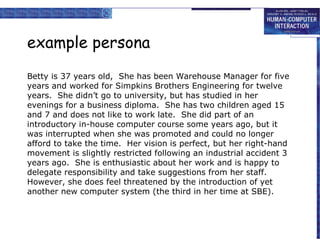
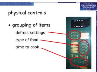
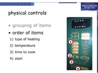
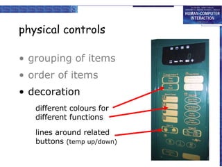
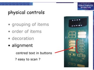
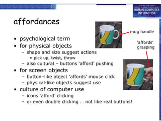
Download to read offline


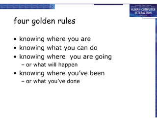

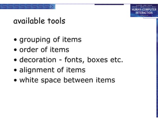

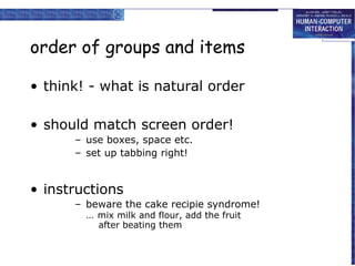
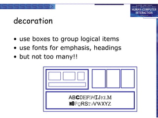
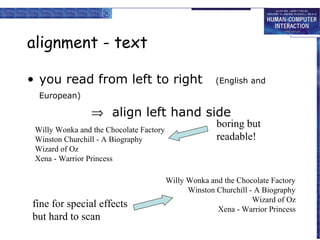
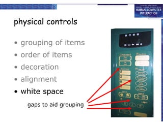

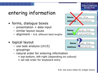
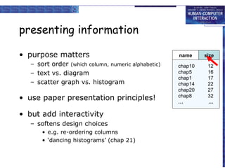


Here are the key points about presenting information on screens: - Purpose of information should guide presentation (e.g. sort order, text vs diagram) - Use principles from paper presentation but add interactivity - Balance aesthetics and utility - Pleasing to eye but also usable - Consistency in style - Consider internationalisation and localisation - Text, units, cultural conventions The overall goals are to effectively communicate information to users and support their tasks through thoughtful visual design. Both appearance and usability are important.