Download to read offline


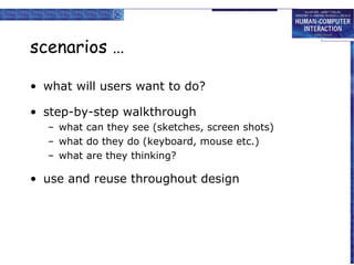


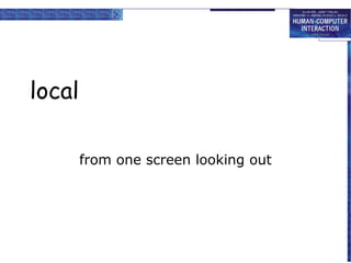


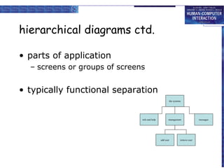


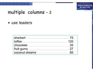
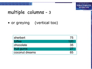

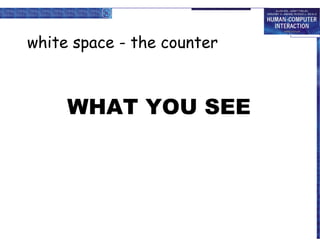


This document discusses interaction design basics including the design process, users, scenarios, navigation, and iteration. It covers understanding users through personas and cultural probes. Scenarios are described as stories that can be used throughout the design process. Navigation involves considering both local structure within screens and global structure across an entire system. Screen design principles like grouping, order, and use of white space are also mentioned.


![Hci [6]interaction design](https://cdn.slidesharecdn.com/ss_thumbnails/hci-6interactiondesign-140116110647-phpapp02-thumbnail.jpg?width=640&height=640&fit=bounds)