June 10, 202522CDX01-FUID-UNIT IV - MATERIAL DESIGN AND COMPONENT 1
KONGU ENGINEERING COLLEGE
(AUTONOMOUS)
DEPARTMENT OF COMPUTER SCIENCE AND DESIGN
22CDX01 - FUNDAMENTALS OF USER INTERACTIVE DESIGN
UNIT IV MATERIAL DESIGN AND COMPONENTS
P.GOWSIKRAJA M.E., (Ph.D.,)
Assistant Professor
Department of Computer Science and Design
2.
June 10, 202522CDX01-FUID-UNIT IV - MATERIAL DESIGN AND COMPONENT 2
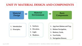
UNIT IV MATERIAL DESIGN AND COMPONENTS
Material
Design
1. Introduction
2. Principles.
Material
Environment
1. Surfaces.
2. Elevation.
3. Light.
4. Shadows.
Basic
Components
1. App bars Bottom and Top,
2. Bottom Navigation,
3. Buttons, Cards,
4. Text Fields,
5. Navigation Drawer,
3.
June 10, 20253
22CDX01-FUID-UNIT IV - MATERIAL DESIGN AND COMPONENT
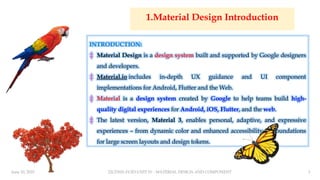
1.Material Design Introduction
INTRODUCTION:
‡ Material Design is a design system built and supported by Google designers
and developers.
‡ Material.io includes in-depth UX guidance and UI component
implementations for Android, Flutter and the Web.
‡ Material is a design system created by Google to help teams build high-
quality digital experiences for Android, iOS, Flutter, and the web.
‡ The latest version, Material 3, enables personal, adaptive, and expressive
experiences – from dynamic color and enhanced accessibility, to foundations
for large screen layouts and design tokens.
4.
June 10, 202522CDX01-FUID-UNIT IV - MATERIAL DESIGN AND COMPONENT 4
5.
June 10, 202522CDX01-FUID-UNIT IV - MATERIAL DESIGN AND COMPONENT 5
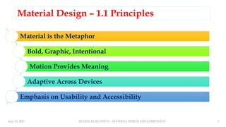
Material Design – 1.1 Principles
Material is the Metaphor
Bold, Graphic, Intentional
Motion Provides Meaning
Adaptive Across Devices
Emphasis on Usability and Accessibility
6.
June 10, 202522CDX01-FUID-UNIT IV - MATERIAL DESIGN AND COMPONENT 6
♣Material is the metaphor
Material Design is inspired by the physical world and its textures, including how they reflect light and
cast shadows. Material surfaces reimagine the mediums of paper and ink.
♣Bold, graphic, intentional
Material Design is guided by print design methods typography, grids, space, scale,
color, and imagery — to create hierarchy, meaning, and focus that immerse viewers in the experience.
♣ Motion provides meaning: Motion focuses attention & maintains continuity through subtle feedback and
coherent transitions. As elements appear on screen, they transform & reorganize the environment with
interactions generating new transformations.
7.
June 10, 202522CDX01-FUID-UNIT IV - MATERIAL DESIGN AND COMPONENT 7
Adaptive Across Devices: Designed to
scale across screen sizes &devices. Uses a
responsive grid system & adaptive UI
components.
Emphasis on Usability and Accessibility:
Everything should be easy to use and
accessible to all users, including those with
disabilities. Includes guidelines for
contrast, legibility, and touch targets.
8.
June 10, 202522CDX01-FUID-UNIT IV - MATERIAL DESIGN AND COMPONENT 8
UNIT IV MATERIAL DESIGN AND COMPONENTS
Material
Design
1. Introduction
2. Principles.
Material
Environment
1. Surfaces.
2. Elevation.
3. Light.
4. Shadows.
Basic
Components
1. App bars Bottom and Top,
2. Bottom Navigation,
3. Buttons, Cards,
4. Text Fields,
5. Navigation Drawer,
9.
June 10, 202522CDX01-FUID-UNIT IV - MATERIAL DESIGN AND COMPONENT 9
1.2 Material Environment
♣Surfaces
Material Design has three-dimensional qualities that
are reflected in its use of surfaces, depth, and shadows.
♣Elevation
Elevation is the relative distance between two surfaces
along the z-axis.
♣Light and Shadows
Material surfaces cast shadows when they obstruct
light sources.
10.
June 10, 202522CDX01-FUID-UNIT IV - MATERIAL DESIGN AND COMPONENT 10
2.1 Surface
♣Surface - Material Environment
♣Surface - Properties
♣Surface - Attributes
♣The physical world
♣ In the physical world, objects can be stacked or attached
to one another, but cannot pass through each other. They
cast shadows and reflect light.
♣ Material Design reflects these qualities in how surfaces are
displayed and move across the Material UI.
♣ Surfaces, and how they move in three dimensions, are
communicated in ways that resemble how they move in
the physical world.
♣ This spatial model can also be applied consistently across
apps.
11.
June 10, 202522CDX01-FUID-UNIT IV - MATERIAL DESIGN AND COMPONENT 11
Surface – Material Environment
Depth
♣Material Design UIs are displayed in an environment
that expresses three-dimensional (3D) space using
light, surfaces, and cast shadows
♣All elements in the Material environment move
horizontally, vertically, and at varying depths along
the z-axis.
♣Depth is depicted by placing elements at various points
along the positive z-axis extending towards the viewer.
♣On the web, the UI expresses 3D space by
manipulating the y-axis.
3D space with x, y, and z axes
12.
June 10, 202522CDX01-FUID-UNIT IV - MATERIAL DESIGN AND COMPONENT 12
Surface – Properties
1. Dimensions
2. Shadows
3. Resolution
4. Content
5. Physical Properties
6. Transforming Material
7. Movement
1. Dimensions: Material has varying x & y
dimensions (measured in dp) and a uniform
thickness (1dp).
13.
June 10, 202522CDX01-FUID-UNIT IV - MATERIAL DESIGN AND COMPONENT 13
2. Shadows
♣Material surfaces at different
elevations cast shadows.
♣Shadows show the elevation of
different Material surfaces.
1. Top view.
2. Isometric 3D view
showing the shadow cast
by light when the
material moves upwards
Shadows - Do
14.
June 10, 202522CDX01-FUID-UNIT IV - MATERIAL DESIGN AND COMPONENT 14
Shadows – Don’t
♣Don’t express shadows
without changing a
surface’s elevation.
1. Top view.
2. Isometric 3D view
depicts a shadow
using only color,
rather than light and
elevation.
15.
June 10, 202522CDX01-FUID-UNIT IV - MATERIAL DESIGN AND COMPONENT 15
3. Resolution: Material has infinite resolution.
16.
June 10, 202522CDX01-FUID-UNIT IV - MATERIAL DESIGN AND COMPONENT 16
4. Content
♣Content is displayed in
any shape and color on
Material.
♣Content does not add
thickness to Material.
♣Content is expressed
without being a separate
layer.
17.
June 10, 202522CDX01-FUID-UNIT IV - MATERIAL DESIGN AND COMPONENT 17
5. Physical properties
1. Material is solid. User input and interaction cannot pass through material.
2. Multiple Material elements cannot occupy the same point in space
simultaneously.
3. Material cannot pass through other Material. For example, one Material
surface cannot pass through another Material surface when changing elevation.
4. Material does not behave like a gas.
5. Material does not behave like a liquid or gel.
6. Material does not behave like a liquid.
18.
June 10, 202522CDX01-FUID-UNIT IV - MATERIAL DESIGN AND COMPONENT 18
1. Material is solid. User input and interaction cannot pass
through material.
19.
June 10, 202522CDX01-FUID-UNIT IV - MATERIAL DESIGN AND COMPONENT 19
2. Multiple Material elements cannot occupy the same
point in space simultaneously
20.
June 10, 202522CDX01-FUID-UNIT IV - MATERIAL DESIGN AND COMPONENT 20
3. Material cannot pass through other Material.
21.
June 10, 202522CDX01-FUID-UNIT IV - MATERIAL DESIGN AND COMPONENT 21
4. Material does not behave like a gas.
22.
June 10, 202522CDX01-FUID-UNIT IV - MATERIAL DESIGN AND COMPONENT 22
5. Material does not behave like a liquid or gel.
23.
June 10, 202522CDX01-FUID-UNIT IV - MATERIAL DESIGN AND COMPONENT 23
6. Material does not behave like a liquid
24.
June 10, 202522CDX01-FUID-UNIT IV - MATERIAL DESIGN AND COMPONENT 24
6. Transforming Material
1. Material can change shape.
2. Material can change opacity.
3. Material grows and shrinks only along its plane.
4. Material bends or folds within the depth of the UI.
5. Material surfaces can join together to become a single Material surface.
6. When split, Material can rejoin. For example, if you remove a portion
of Material from a surface, the surface will become whole again.
25.
June 10, 202522CDX01-FUID-UNIT IV - MATERIAL DESIGN AND COMPONENT 25
1. Material can change shape.
26.
June 10, 202522CDX01-FUID-UNIT IV - MATERIAL DESIGN AND COMPONENT 26
2. Material can change opacity
1. Material can change opacity uniformly across its entire surface.
2. Material can change opacity across a portion of its surface.
27.
June 10, 202522CDX01-FUID-UNIT IV - MATERIAL DESIGN AND COMPONENT 27
3. Material grows and shrinks only along its plane.
28.
June 10, 202522CDX01-FUID-UNIT IV - MATERIAL DESIGN AND COMPONENT 28
4. Material bends or folds within the depth of the UI.
Don’t: Material never bends or folds in ways that exceed the depth of the UI.
29.
June 10, 202522CDX01-FUID-UNIT IV - MATERIAL DESIGN AND COMPONENT 29
5. Material surfaces can join together to become a single Material surface.
30.
June 10, 202522CDX01-FUID-UNIT IV - MATERIAL DESIGN AND COMPONENT 30
6. When split, Material can rejoin.
31.
June 10, 202522CDX01-FUID-UNIT IV - MATERIAL DESIGN AND COMPONENT 31
Movement
1. Material can be spontaneously generated or dismissed
anywhere in the environment.
2. Material can move along any axis.
3. Material surfaces can coordinate their motion.
4. Material motion along the z-axis is typically a result of user
interaction.
32.
June 10, 202522CDX01-FUID-UNIT IV - MATERIAL DESIGN AND COMPONENT 32
1. Material can be spontaneously
generated or dismissed anywhere in the
environment.
2. Material can move along any axis.
33.
June 10, 202522CDX01-FUID-UNIT IV - MATERIAL DESIGN AND COMPONENT 33
3. Material surfaces can
coordinate their motion.
4. Material motion along the z-
axis is typically a result of user
interaction.
34.
June 10, 202522CDX01-FUID-UNIT IV - MATERIAL DESIGN AND COMPONENT 34
Surface - Attributes
♣Basic Material surface
♣ The basic Material surface is opaque white, with 1dp thickness, and casts a shadow.
♣ All UI elements in Material Design result from modifications to this surface.
♣Some surface attributes are:
♣ Behavior
♣ Composite surfaces
♣ Stretchable surfaces
♣ Surface positioning and movement (x/y)
♣ Surface opacity
♣ Scrim
35.
June 10, 202522CDX01-FUID-UNIT IV - MATERIAL DESIGN AND COMPONENT 35
Material Surface Behavior
♣Material surfaces can behave in certain ways:
1. Rigid surfaces remain the same size through all interactions.
2. Stretchable surfaces can grow or shrink along one or more edges up
to a size limit, then behave as rigid surfaces.
3. Pannable surfaces remain the same size throughout interactions.
They can display additional content upon scrolling within the area,
until reaching a content limit. When this limit is reached, they behave
as rigid surfaces in that scroll direction.
36.
June 10, 202522CDX01-FUID-UNIT IV - MATERIAL DESIGN AND COMPONENT 36
1. Rigid Surface 2. Stretchable Surface
37.
June 10, 202522CDX01-FUID-UNIT IV - MATERIAL DESIGN AND COMPONENT 37
3. Pannable Surface Composite surfaces
1. Surfaces can be divided into
areas which display different
types of behavior.
2. A card can stretch to display a
region that scrolls
independently of other card
content.
38.
June 10, 202522CDX01-FUID-UNIT IV - MATERIAL DESIGN AND COMPONENT 38
Composite surfaces – Example 1
1. Surfaces can be divided into areas which display different types of behavior.
A single surface can
contain multiple
pannable surfaces,
such as an
embedded map (1)
that pans
independently of a
scrollable list (2).
39.
June 10, 202522CDX01-FUID-UNIT IV - MATERIAL DESIGN AND COMPONENT 39
Composite surfaces – Example 2
2. A card can stretch to display a region that scrolls independently of other card content.
40.
June 10, 202522CDX01-FUID-UNIT IV - MATERIAL DESIGN AND COMPONENT 40
Stretchable surfaces
♣A stretchable surface can be stretched before reaching a limit, at which point the entire
surface becomes rigid.
♣Surfaces can stretch vertically, horizontally, or in both directions.
♣Typically, user interaction with a surface will stretch it in one direction.
♣ For example, tapping "more details" can cause a card to grow vertically and display additional content.
♣Stretchable surface
1. Material stretch direction can be exclusively vertical.
2. Material stretch direction can be exclusively horizontal.
3. Material stretch direction can be along both horizontal and vertical axes, either independently or
simultaneously.
41.
June 10, 202522CDX01-FUID-UNIT IV - MATERIAL DESIGN AND COMPONENT 41
1. Material stretch direction can be
exclusively vertical
2. Material stretch direction can be
exclusively horizontal.
42.
June 10, 202522CDX01-FUID-UNIT IV - MATERIAL DESIGN AND COMPONENT 42
3. Material stretch direction can be along both horizontal and vertical axes, either
independently or simultaneously.
43.
June 10, 202522CDX01-FUID-UNIT IV - MATERIAL DESIGN AND COMPONENT 43
Surface positioning and movement (x/y)
1. Surfaces can remain in a fixed position on the x- and y-axes, or can be
moveable in any direction.
2. Surface movement can be confined to a single axis, allow movement
along a single axis at a time, or allow movement along both axes
simultaneously.
3. Surfaces can move in any direction.
4. Surfaces can move independently of each other.
5. One surface’s movement can depend upon another’s movement.
44.
June 10, 202522CDX01-FUID-UNIT IV - MATERIAL DESIGN AND COMPONENT 44
1. Surfaces can remain in a
fixed position
2. Surface movement can be
confined to a single axis
45.
June 10, 202522CDX01-FUID-UNIT IV - MATERIAL DESIGN AND COMPONENT 45
3. Surfaces can move in any
direction
4. Surfaces can move independently of
each other
46.
June 10, 202522CDX01-FUID-UNIT IV - MATERIAL DESIGN AND COMPONENT 46
5. One surface’s movement can depend upon another’s movement.
47.
June 10, 202522CDX01-FUID-UNIT IV - MATERIAL DESIGN AND COMPONENT 47
Surface opacity
♣Material surfaces can be transparent, semi-transparent, or
opaque.
1. Content on transparent or semi-transparent surfaces may need a
background treatment to preserve legibility.
2. Don’t use transparent surfaces, as they have no opacity, making it
difficult to identify the surface on which content appears.
48.
June 10, 202522CDX01-FUID-UNIT IV - MATERIAL DESIGN AND COMPONENT 48
Surface opacity - Do and Don’t
Do Don’t
49.
June 10, 202522CDX01-FUID-UNIT IV - MATERIAL DESIGN AND COMPONENT 49
Scrim
♣Scrims are temporary treatments that can be applied to Material surfaces for the
purpose of making content on a surface less prominent. They help direct user
attention to other parts of the screen, away from the surface receiving a scrim.
♣Scrims can be applied in a variety of ways, including:
1. Darkening or lightening the surface and its content
2. Reducing the opacity of the surface and its content
♣ Multiple surfaces on a screen at a time can display scrims.
♣ Scrims can appear at any elevation, whether in the foreground or background.
50.
June 10, 202522CDX01-FUID-UNIT IV - MATERIAL DESIGN AND COMPONENT 50
Scrim - Example
51.
June 10, 202522CDX01-FUID-UNIT IV - MATERIAL DESIGN AND COMPONENT 51
UNIT IV MATERIAL DESIGN AND COMPONENTS
Material
Design
1. Introduction
2. Principles.
Material
Environment
1. Surfaces.
2. Elevation.
3. Light.
4. Shadows.
Basic
Components
1. App bars Bottom and Top,
2. Bottom Navigation,
3. Buttons, Cards,
4. Text Fields,
5. Navigation Drawer,
52.
June 10, 202522CDX01-FUID-UNIT IV - MATERIAL DESIGN AND COMPONENT 52
2.2 Elevation
Component elevation
values
1. Nav drawer: 16dp
2. App bar: 4dp
3. Card: 1dp to 8dp
4. FAB: 6dp
5. Button: 2dp to 8dp
6. Dialog: 24dp
• Elevation is the relative distance between two surfaces along the z-axis.
53.
June 10, 202522CDX01-FUID-UNIT IV - MATERIAL DESIGN AND COMPONENT 53
Measuring elevation
♣Elevation in Material Design is
measured as the distance between
Material surfaces.
♣The distance from the front of one
Material surface to the front of
another is measured along the z-axis
in density-independent pixels (dps)
and depicted (by default)
using shadows.
1. One surface at 1dp elevation and another surface at 8dp
elevation, as viewed from the front
2. The difference in elevation between the two surfaces is 7dp,
as viewed from the side
54.
June 10, 202522CDX01-FUID-UNIT IV - MATERIAL DESIGN AND COMPONENT 54
Measuring elevation - Example
Surfaces at the same elevation
can appear differently when other
surfaces are behind them.
1. Both surfaces A and B are at the
same 8dp elevation. They cast
different shadows because Surface
B is in front of another surface (C)
that already has elevation.
2. Elevation differences between
surfaces (A), (B), and (C), as viewed
from the side.
55.
June 10, 202522CDX01-FUID-UNIT IV - MATERIAL DESIGN AND COMPONENT 55
The elevation system
♣All Material Design surfaces, and components, have elevation values.
♣Surfaces at different elevations do the following:
♣ Allow surfaces to move in front of and behind other surfaces, such as content scrolling
behind app bars
♣ Reflect spatial relationships, such as how a floating action button’s shadow indicates it is
separate from a card collection
♣ Focus attention on the highest elevation, such as a dialog temporarily appearing in front of
other surfaces
♣Elevation can be depicted using shadows or other visual cues, such as surface fills
or opacities.
56.
June 10, 202522CDX01-FUID-UNIT IV - MATERIAL DESIGN AND COMPONENT 56
Material Design displays
elevation using shadows.
Different surface fills can be used to
express elevation instead of
shadows.
57.
June 10, 202522CDX01-FUID-UNIT IV - MATERIAL DESIGN AND COMPONENT 57
Opacity can be used to express
elevation instead of shadows.
♣Resting elevations are starting elevation values given to components
by default.
♣Example: all cards have the same resting elevations as each other. a
dialog has the same resting elevation as other dialogs.
♣Resting elevations vary based on the environment, platform/app.
♣The resting elevations on mobile are designed to provide visual cues,
like shadows, to indicate when components are interactive.
♣In contrast, resting elevations on desktop are shallower because other
cues, like hover states, communicate when a component is interactive.
♣Example: cards at 0dp elevation on desktop are outlined with a
stroke.
Resting elevation
58.
June 10, 202522CDX01-FUID-UNIT IV - MATERIAL DESIGN AND COMPONENT 58
Resting elevation – Example 1
1. Resting elevations on mobile for an app bar (A),
cards (B), and a floating action button (C), as viewed
from the front
2. The same components, as viewed from the side.
1. Resting elevations on desktop for an app bar
(A), floating action button (B), and cards (C), as
viewed from the front
2. The same components, as viewed from the
side
Resting elevation – Example 2
59.
June 10, 202522CDX01-FUID-UNIT IV - MATERIAL DESIGN AND COMPONENT 59
Changing elevation
Some components respond to user input with increases in elevation.
1. Upon user input, this button increases its elevation from 2dp to 8dp
2. The same component, as viewed from the side
60.
June 10, 202522CDX01-FUID-UNIT IV - MATERIAL DESIGN AND COMPONENT 60
Elevation interference
♣When a component moves between its resting elevation and dynamic
elevation offset, it shouldn't collide with other components.
♣To avoid these kinds of collisions, components can move out of the
way.
♣Example:
♣if increasing a card's elevation positions it to pass through a floating action
button, that button can disappear or move off-screen before the collision
occurs.
61.
June 10, 202522CDX01-FUID-UNIT IV - MATERIAL DESIGN AND COMPONENT 61
Elevation interference - Example
Temporarily reposition or remove components which might collide with transitioning components.
Front (1) and side (2) views of a card stream on a mobile device, demonstrating how a floating action
button (B) disappears when a card (A) is picked up.
62.
June 10, 202522CDX01-FUID-UNIT IV - MATERIAL DESIGN AND COMPONENT 62
Default elevations
Component Default elevation values (dp)
Dialog 24
Modal bottom sheet Modal side sheet 16
Navigation drawer 16
Floating action button (FAB - pressed) 12
Standard bottom sheet Standard side sheet 8
Bottom navigation bar 8
Bottom app bar 8
Menus and sub menus 8
Card (when picked up) 8
Contained button (pressed state) 8
Floating action button (FAB - resting elevation) Snackbar 6
Top app bar (scrolled state) 4
Top app bar (resting elevation) 0 or 4
Refresh indicator Search bar (scrolled state) 3
Contained button (resting elevation) 2
Search bar (resting elevation) 1
Card (resting elevation) 1
Switch 1
Text button 0
Standard side sheet 0
63.
June 10, 202522CDX01-FUID-UNIT IV - MATERIAL DESIGN AND COMPONENT 63
Cross-section diagram showing the resting elevation and dynamic elevation
offsets for multiple component
64.
June 10, 202522CDX01-FUID-UNIT IV - MATERIAL DESIGN AND COMPONENT 64
UNIT IV MATERIAL DESIGN AND COMPONENTS
Material
Design
1. Introduction
2. Principles.
Material
Environment
1. Surfaces.
2. Elevation.
3. Light.
4. Shadows.
Basic
Components
1. App bars Bottom and Top,
2. Bottom Navigation,
3. Buttons, Cards,
4. Text Fields,
5. Navigation Drawer,
65.
June 10, 202522CDX01-FUID-UNIT IV - MATERIAL DESIGN AND COMPONENT 65
2.3 Light and shadows
♣In the Material Design environment, virtual lights illuminate
the UI.
♣Key lights create sharper, directional shadows, called key
shadows.
♣Ambient light appears from all angles to create diffused, soft
shadows, called ambient shadows.
66.
June 10, 202522CDX01-FUID-UNIT IV - MATERIAL DESIGN AND COMPONENT 66
Light
and
shado
ws -
Exam
ples
67.
June 10, 202522CDX01-FUID-UNIT IV - MATERIAL DESIGN AND COMPONENT 67
Light sources
♣Shadows in the Material environment are cast by a key light and
ambient light.
♣In Android and iOS development, shadows occur when light sources
are blocked by Material surfaces at various positions along the z-axis.
♣On the web, shadows are depicted by manipulating the y-axis only.
♣The following example shows a card with an elevation of 6dp.
68.
June 10, 202522CDX01-FUID-UNIT IV - MATERIAL DESIGN AND COMPONENT 68
UNIT IV MATERIAL DESIGN AND COMPONENTS
Material
Design
1. Introduction
2. Principles.
Material
Environment
1. Surfaces.
2. Elevation.
3. Light.
4. Shadows.
Basic
Components
1. App bars Bottom and Top,
2. Bottom Navigation,
3. Buttons, Cards,
4. Text Fields,
5. Navigation Drawer,
69.
June 10, 202522CDX01-FUID-UNIT IV - MATERIAL DESIGN AND COMPONENT 69
Shadows
♣Shadows provide cues about depth, direction of movement, and
surface edges.
♣A surface’s shadow is determined by its elevation and
relationship to other surfaces.
♣Because shadows express the degree of elevation between
surfaces, they must be used consistently throughout your product.
70.
June 10, 202522CDX01-FUID-UNIT IV - MATERIAL DESIGN AND COMPONENT 70
71.
June 10, 202522CDX01-FUID-UNIT IV - MATERIAL DESIGN AND COMPONENT 71
UNIT IV MATERIAL DESIGN AND COMPONENTS
Material
Design
1. Introduction
2. Principles.
Material
Environment
1. Surfaces.
2. Elevation.
3. Light.
4. Shadows.
Basic
Components
1. App bars Bottom and Top,
2. Bottom Navigation,
3. Buttons, Cards,
4. Text Fields,
5. Navigation Drawer,
72.
June 10, 202522CDX01-FUID-UNIT IV - MATERIAL DESIGN AND COMPONENT 72
M3 - Material Components (categories)
♣Components are interactive building blocks for creating a user interface.
♣They can be organized into categories based on their purpose:
1. Action
2. Containment
3. Communication
4. Navigation
5. Selection
6. text input
3. Basic Material Components
73.
June 10, 202522CDX01-FUID-UNIT IV - MATERIAL DESIGN AND COMPONENT 73
Example Components
74.
June 10, 202522CDX01-FUID-UNIT IV - MATERIAL DESIGN AND COMPONENT 74
M3 - Material Components (states)
♣Material Components are interactive building
blocks for creating a user interface, and
include a built-in states system to
communicate
♣ focus, selection, activation,
♣ error, hover, press,
♣ drag, and disabled states.
♣Component libraries are available for Android
, iOS, Flutter, and the web.
Example States
75.
June 10, 202522CDX01-FUID-UNIT IV - MATERIAL DESIGN AND COMPONENT 75
1. Actions Components
♣Action components help people
achieve an aim.
♣Some Action Components are:
1. Common Buttons
2. Extended FAB Buttons
3. Floating Action Buttons (FAB)
4. Icon Buttons
5. Segmented Button
76.
June 10, 202522CDX01-FUID-UNIT IV - MATERIAL DESIGN AND COMPONENT 76
2. Containment Component
♣Some containment components are:
1. Bottom Sheets
2. Cards
3. Carousel
4. Dialogs
5. Divider
6. List
7. Side Sheets
8. Tooltips
Containment components hold information and actions – including other components like buttons,
menus, or chips.
77.
June 10, 202522CDX01-FUID-UNIT IV - MATERIAL DESIGN AND COMPONENT 77
Containment Component - Examples
78.
June 10, 202522CDX01-FUID-UNIT IV - MATERIAL DESIGN AND COMPONENT 78
3. Communication Component: it provide helpful information.
1. Badges
2. Progress Indicators
3. Snackbar
♣ Examples:
79.
June 10, 202522CDX01-FUID-UNIT IV - MATERIAL DESIGN AND COMPONENT 79
4. Navigation Components
♣Navigation components help people move through the UI.
1. Bottom App Bar
2. Navigation Bar
3. Navigation Drawer
4. Navigation Rail
5. Search
6. Tabs
7. Top App Bar
80.
June 10, 202522CDX01-FUID-UNIT IV - MATERIAL DESIGN AND COMPONENT 80
Navigation Components - Examples
81.
June 10, 202522CDX01-FUID-UNIT IV - MATERIAL DESIGN AND COMPONENT 81
5. Selection Component
♣Selection components let people specify choices.
1. Checkbox
2. Chips
3. Date Pickers
4. Menus
5. Radio Button
6. Sliders
7. Switch
8. Time Pickers
82.
June 10, 202522CDX01-FUID-UNIT IV - MATERIAL DESIGN AND COMPONENT 82
Selection Component - Examples
83.
June 10, 202522CDX01-FUID-UNIT IV - MATERIAL DESIGN AND COMPONENT 83
6. Text inputs component
♣Text input components let people enter and edit text.
♣Example: Text Fields
1. Bottom App bar
2. Top App bar
3. Bottom Navigation
4. Buttons
5. Cards
6. Text Fields
7. Navigation Drawer
Some Basic Design Components
84.
June 10, 202522CDX01-FUID-UNIT IV - MATERIAL DESIGN AND COMPONENT 84
UNIT IV MATERIAL DESIGN AND COMPONENTS
Material
Design
1. Introduction
2. Principles.
Material
Environment
1. Surfaces.
2. Elevation.
3. Light.
4. Shadows.
Basic
Components
1. App bars Bottom and Top,
2. Bottom Navigation,
3. Buttons, Cards,
4. Text Fields,
5. Navigation Drawer,
85.
June 10, 202522CDX01-FUID-UNIT IV - MATERIAL DESIGN AND COMPONENT 85
1.Bottom app bar
♣Bottom app bars display navigation and key
actions at the bottom of mobile and tablet screens.
♣Use bottom app bars to draw attention to
important actions.
♣Can contain up to four icon buttons and a floating
action button (FAB).
♣Bottom app bar layout and contents can change on
different screens of an app.
♣Easy to reach on a mobile device.
Bottom app bar with four icon
buttons and a FAB
86.
June 10, 202522CDX01-FUID-UNIT IV - MATERIAL DESIGN AND COMPONENT 86
Bottom App Bar – M2 vs M3
Bottom App Bar - Specs
87.
June 10, 202522CDX01-FUID-UNIT IV - MATERIAL DESIGN AND COMPONENT 87
Bottom app bar padding and
size measurements
Bottom App Bar - Tips
♣ Bottom app bars should be used for:
♣ Mobile devices only
♣ Screens with two to five actions
♣ Bottom app bars shouldn't be used for:
♣ Apps with a navigation bar
♣ Screens with one or no actions
88.
June 10, 202522CDX01-FUID-UNIT IV - MATERIAL DESIGN AND COMPONENT 88
Difference b/w Bottom App bar and Navigation Bar
♣Bottom app bars aren’t navigation bars.
♣Navigation bars provide access to destinations in an app.
♣whereas bottom app bars can contain both destinations and
actions.
89.
June 10, 202522CDX01-FUID-UNIT IV - MATERIAL DESIGN AND COMPONENT 89
2. Top app bar
♣Contains a title and actions
related to the current screen.
♣Four types: center-aligned,
small, medium, and large.
♣On scroll, apply a container fill
color to separate app bar from
body content.
♣Top app bars have the same
width as the device window.
Top App Bar - Types
90.
June 10, 202522CDX01-FUID-UNIT IV - MATERIAL DESIGN AND COMPONENT 90
Top App Bar – M2 vs M3
91.
June 10, 202522CDX01-FUID-UNIT IV - MATERIAL DESIGN AND COMPONENT 91
Top App Bar (Small) – Anatomy & Size
92.
June 10, 202522CDX01-FUID-UNIT IV - MATERIAL DESIGN AND COMPONENT 92
Top App Bar + Navigation Icon
♣Top app bars contain an optional
leading navigation icon. When it
appears in an app bar, it’s aligned on
the left of the bar.
♣The navigation icon can take any of
the following forms:
♣A menu icon, which opens a
navigation
♣A back arrow, which returns to the
previous screen
93.
June 10, 202522CDX01-FUID-UNIT IV - MATERIAL DESIGN AND COMPONENT 93
Bottom Navigation / Navigation Bar
♣Navigation bars let people switch between UI views on smaller devices.
♣Use navigation bars in compact layouts.
♣Can contain 3-5 destinations of equal importance.
♣Destinations don't change. They should be consistent across app screens.
♣Used to be named bottom navigation.
94.
June 10, 202522CDX01-FUID-UNIT IV - MATERIAL DESIGN AND COMPONENT 94
Navigation Bar - Specs
Navigation Bar - Size
95.
June 10, 202522CDX01-FUID-UNIT IV - MATERIAL DESIGN AND COMPONENT 95
Navigation Bar – Target and Margin Size
96.
June 10, 202522CDX01-FUID-UNIT IV - MATERIAL DESIGN AND COMPONENT 96
Navigation Bar - Configurations
97.
June 10, 202522CDX01-FUID-UNIT IV - MATERIAL DESIGN AND COMPONENT 97
Navigation Bar - Guidelines ♣Navigation bar destinations have
fixed positions. They don’t scroll
or move horizontally.
98.
June 10, 202522CDX01-FUID-UNIT IV - MATERIAL DESIGN AND COMPONENT 98
Navigation Bar - Guidelines
♣Don’t use multiple or low-contrast colors in a navigation bar, as they make it harder
for users to distinguish the active item and navigate to other destinations.
99.
June 10, 202522CDX01-FUID-UNIT IV - MATERIAL DESIGN AND COMPONENT 99
Navigation Bar - Guidelines
100.
June 10, 202522CDX01-FUID-UNIT IV - MATERIAL DESIGN AND COMPONENT 100
3. Buttons
♣Buttons let people take action and make choices with one tap.
♣Use different button types on the same screen to direct user
attention.
♣Nine types:
♣elevated, filled, filled tonal, outlined, text, icon, segmented, FAB,
extended FAB.
♣Each button has either high, medium, or low emphasis.
101.
June 10, 202522CDX01-FUID-UNIT IV - MATERIAL DESIGN AND COMPONENT 101
Buttons - Types
102.
June 10, 202522CDX01-FUID-UNIT IV - MATERIAL DESIGN AND COMPONENT 102
High Emphasis Buttons
Level of
emphasis
Compon
ent
Rationale
Example
actions
High
emphasis –
For the
primary,
most
important,
or most
common
action on a
screen
Extende
d FAB
The extended FAB’s wider format and text
label give it more visual prominence than a
FAB. It’s often used on larger screens where
a FAB would seem too small.
Create
Compose
New thread
New file
FAB
The FAB remains the default component for
a screen’s primary action. It comes in three
sizes: small FAB, FAB, and large FAB.
Create
Compose
Filled bu
tton
The filled button’s contrasting surface color
makes it the most prominent button after the
FAB. It’s used for final or unblocking actions
in a flow.
Save
Confirm
Done
103.
June 10, 202522CDX01-FUID-UNIT IV - MATERIAL DESIGN AND COMPONENT 103
Medium Emphasis Buttons
Level of
emphasis
Componen
t
Rationale
Example
actions
Medium
emphasis –
For important
actions that
don’t distract
from other
onscreen
elements
Filled tonal
button
Filled tonal buttons have a lighter background color and
darker label color, making them less visually prominent
than a regular, filled button. They’re still used for final or
unblocking actions in a flow, but do so with less
emphasis.
Save
Confirm
Done
Elevated b
utton
Elevated buttons are essentially filled buttons with a
lighter background color and a shadow. To prevent
shadow creep, only use them when absolutely necessary,
such as when the button requires visual separation from a
patterned background.
Reply
View all
Add to cart
Take out of
trash
Outlined b
utton
Use an outlined button for actions that need attention but
aren’t the primary action, such as See all or Add to cart.
This is also the button to use for giving someone the
opportunity to change their mind or escape a flow.
Reply
View all
Add to cart
Take out of
trash
104.
June 10, 202522CDX01-FUID-UNIT IV - MATERIAL DESIGN AND COMPONENT 104
Low Emphasis Buttons
Level of
emphasis
Compon
ent
Rationale
Example
actions
Low
emphasis –
For optional
or
supplementa
ry actions
with the
least amount
of
prominence
Text butt
on
Text buttons have less visual prominence, so should be
used for low emphasis actions, such as an alternative
option.
Learn more
View all
Change
account
Turn on
Segment
ed butto
n
Segmented buttons have more visual prominence than
a single icon button.
Left align /
Middle
align /
Right align
Icon butt
on
The most compact and subtle type of button, icon
buttons are used for optional supplementary actions
such as “Bookmark” or “Star.”
Add to
Favorites
Print
105.
June 10, 202522CDX01-FUID-UNIT IV - MATERIAL DESIGN AND COMPONENT 105
Common Buttons
♣Common buttons prompt most actions in a UI. It can contain an optional leading icon.
♣Five types: elevated, filled, filled tonal, outlined, and text. Keep labels concise and in
sentence-case. Containers have fully rounded corners and are wide enough to fit label text.
106.
June 10, 202522CDX01-FUID-UNIT IV - MATERIAL DESIGN AND COMPONENT 106
Buttons – M2 Vs M3
107.
June 10, 202522CDX01-FUID-UNIT IV - MATERIAL DESIGN AND COMPONENT 107
Elevated Button – Specs & Size ( Common to Filled, Filled Tonal, Outlined Buttons)
108.
June 10, 202522CDX01-FUID-UNIT IV - MATERIAL DESIGN AND COMPONENT 108
Text Button – Spec & Size
109.
June 10, 202522CDX01-FUID-UNIT IV - MATERIAL DESIGN AND COMPONENT 109
Buttons - Usage
♣Buttons communicate actions that users can take. They are
typically placed throughout your UI, in places like:
♣Dialogs
♣Modal windows
♣Forms
♣Cards
♣Toolbars
110.
June 10, 202522CDX01-FUID-UNIT IV - MATERIAL DESIGN AND COMPONENT 110
Buttons - Guidelines
111.
June 10, 202522CDX01-FUID-UNIT IV - MATERIAL DESIGN AND COMPONENT 111
Buttons - Guidelines
112.
June 10, 202522CDX01-FUID-UNIT IV - MATERIAL DESIGN AND COMPONENT 112
Buttons - Guidelines
113.
June 10, 202522CDX01-FUID-UNIT IV - MATERIAL DESIGN AND COMPONENT 113
Text Buttons – Usage.
♣Text button in a snackbar.
♣Text button against an image background.
♣Text button in a card.
♣Text buttons in a dialog.
114.
June 10, 202522CDX01-FUID-UNIT IV - MATERIAL DESIGN AND COMPONENT 114
FAB Button
♣Floating action buttons (FABs) help
people take primary actions.
♣Use a FAB for the most common or
important action on a screen.
♣Make sure the icon in a FAB is clear and
understandable.
♣FABs persist on the screen when
content is scrolling.
♣Three sizes: small FAB, FAB, large FAB.
115.
June 10, 202522CDX01-FUID-UNIT IV - MATERIAL DESIGN AND COMPONENT 115
FAB – M2 vs M3
FAB – Specs & Size
116.
June 10, 202522CDX01-FUID-UNIT IV - MATERIAL DESIGN AND COMPONENT 116
Small FAB - Size
Large FAB - Size
117.
June 10, 202522CDX01-FUID-UNIT IV - MATERIAL DESIGN AND COMPONENT 117
FAB - Guidelines
118.
June 10, 202522CDX01-FUID-UNIT IV - MATERIAL DESIGN AND COMPONENT 118
FAB - Guidelines
119.
June 10, 202522CDX01-FUID-UNIT IV - MATERIAL DESIGN AND COMPONENT 119
FAB (should use)
♣A FAB can trigger an action either on the current screen, or it can
perform an action that creates a new screen.
♣A FAB promotes an important, constructive action such as:
♣Create
♣Favorite
♣Share
♣Start a process
120.
June 10, 202522CDX01-FUID-UNIT IV - MATERIAL DESIGN AND COMPONENT 120
FAB (shouldn't use)
♣Avoid using a FAB for minor
or destructive actions, such
as:
♣ Archive or trash
♣ Alerts or errors
♣ Limited tasks like cutting text
♣ Controls better suited to a
toolbar (like controls to adjust
volume or font color)
121.
June 10, 202522CDX01-FUID-UNIT IV - MATERIAL DESIGN AND COMPONENT 121
Extended FAB
♣Extended floating action buttons (extended FABs) help people take primary actions.
♣Use an extended FAB for the most common or important action on a screen.
♣Contains both an icon and label text.
♣The most prominent type of button.
♣Use when a regular FAB (with just an icon) may not be clear.
122.
June 10, 202522CDX01-FUID-UNIT IV - MATERIAL DESIGN AND COMPONENT 122
Extended FAB - Specs
Extended FAB - Size
123.
June 10, 202522CDX01-FUID-UNIT IV - MATERIAL DESIGN AND COMPONENT 123
Icon Buttons
♣Icon buttons help people take minor actions with
one tap.
♣Icon buttons must use a system icon with a clear
meaning.
♣Two types: standard and contained.
♣On hover, display a tooltip describing the button’s
action (not the name of the icon).
♣Use outline-style icons to indicate an unselected
state, and filled-style icons for selected state.
124.
June 10, 202522CDX01-FUID-UNIT IV - MATERIAL DESIGN AND COMPONENT 124
Filled Icon Button – Specs & Size
125.
June 10, 202522CDX01-FUID-UNIT IV - MATERIAL DESIGN AND COMPONENT 125
Icon Buttons - Guidelines
♣Use filled icon buttons for high emphasis actions, such as turning off a microphone or camera.
♣Use a toggle icon button for actions like Raise hand in a video meeting. When selected, its visual emphasis
is greater than the medium-emphasis outlined button for the Overflow menu, but less than the high-
emphasis filled button for End call.
♣Use outlined icon buttons in cases that require a more emphasis than a standard icon button, but less than
a filled or tonal icon button. Here, outlined icon buttons indicate that more content is available.
126.
June 10, 202522CDX01-FUID-UNIT IV - MATERIAL DESIGN AND COMPONENT 126
Segmented Buttons
♣Segmented buttons help people select options, switch views, or sort elements.
♣Segmented buttons can contain icons, label text, or both.
♣Two types: single-select and multi-select.
♣Use for simple choices between two to five items (for more items or complex choices, use
chips).
127.
June 10, 202522CDX01-FUID-UNIT IV - MATERIAL DESIGN AND COMPONENT 127
Segmented Buttons - Specs
Segmented Buttons - Size
128.
June 10, 202522CDX01-FUID-UNIT IV - MATERIAL DESIGN AND COMPONENT 128
Segmented Buttons - Density
♣Density can be used in
denser UIs where space is
limited. Density is only
applied to the height.
♣Each step down in density
removes 4dp from the
height.
129.
June 10, 202522CDX01-FUID-UNIT IV - MATERIAL DESIGN AND COMPONENT 129
Segmented Buttons - Guidelines
130.
June 10, 202522CDX01-FUID-UNIT IV - MATERIAL DESIGN AND COMPONENT 130
Cards
♣Cards display content and actions about a single subject.
♣Use cards to contain related elements.
♣Three types: elevated, filled, outlined.
♣Contents can include anything from images to headlines, supporting text, buttons, and lists.
♣Can also contain other components.
♣Cards have flexible layouts and dimensions based on their contents.
131.
June 10, 202522CDX01-FUID-UNIT IV - MATERIAL DESIGN AND COMPONENT 131
Card Types - Specs
132.
June 10, 202522CDX01-FUID-UNIT IV - MATERIAL DESIGN AND COMPONENT 132
Cards - Anatomy Card - Size
133.
June 10, 202522CDX01-FUID-UNIT IV - MATERIAL DESIGN AND COMPONENT 133
Text Fields
♣Text fields let users enter text into a UI.
♣Make sure text fields look interactive.
♣Two types: filled and outlined.
♣The text field’s state (blank, with input,
error, etc) should be visible at a glance.
♣Keep labels and error messages brief
and easy to act on.
♣Text fields commonly appear in forms
and dialogs.
134.
June 10, 202522CDX01-FUID-UNIT IV - MATERIAL DESIGN AND COMPONENT 134
Text Fields – Specs & Size
135.
June 10, 202522CDX01-FUID-UNIT IV - MATERIAL DESIGN AND COMPONENT 135
Text Fields - Sample
136.
June 10, 202522CDX01-FUID-UNIT IV - MATERIAL DESIGN AND COMPONENT 136
Text Fields - Guidelines
137.
June 10, 202522CDX01-FUID-UNIT IV - MATERIAL DESIGN AND COMPONENT 137
Navigation Drawer
♣Navigation drawers let people switch between UI views on larger
devices.
♣Use navigation drawers in expanded layouts and modal navigation
drawers in compact and medium layouts.
♣Can be open or closed by default.
♣Two types: standard and modal.
♣Put the most frequent destinations at the top and group related
destinations together.
138.
June 10, 202522CDX01-FUID-UNIT IV - MATERIAL DESIGN AND COMPONENT 138
Navigation Drawer - Types
139.
June 10, 202522CDX01-FUID-UNIT IV - MATERIAL DESIGN AND COMPONENT 139
Navigation Drawer - Specs
140.
June 10, 202522CDX01-FUID-UNIT IV - MATERIAL DESIGN AND COMPONENT 140
Navigation Drawer (Standard) - Size
141.
June 10, 202522CDX01-FUID-UNIT IV - MATERIAL DESIGN AND COMPONENT 141
Navigation Drawer (Model) - Size
142.
June 10, 202522CDX01-FUID-UNIT IV - MATERIAL DESIGN AND COMPONENT 142
Standard & Model Navigation Bar - Sample
143.
June 10, 202522CDX01-FUID-UNIT IV - MATERIAL DESIGN AND COMPONENT 143
Human Interface Guidelines
♣The HIG contains guidance and best practices that can help
you design a great experience for any Apple platform.
♣iOS
♣iPadOS
♣macOS
♣tvOS
♣visionOS
♣watchOS
144.
June 10, 202522CDX01-FUID-UNIT IV - MATERIAL DESIGN AND COMPONENT 144
iOS
♣As you begin designing your app or game for iOS, start by understanding the following fundamental
device characteristics and patterns that distinguish the iOS experience.
♣ Display. iPhone has a medium-size, high-resolution display.
♣ Ergonomics. People generally hold their iPhone in one or both hands as they interact with it, switching between landscape
and portrait orientations as needed. While people are interacting with the device, their viewing distance tends to be no
more than a foot or two.
♣ Inputs. Multi-Touch gestures, onscreen keyboards, and voice control let people perform actions and accomplish
meaningful tasks while they’re on the go. In addition, people often want apps to use their personal data and input from the
device’s gyroscope and accelerometer, and they may also want to participate in spatial interactions.
♣ App interactions. Sometimes, people spend just a minute or two checking on event or social media updates, tracking data,
or sending messages. At other times, people can spend an hour or more browsing the web, playing games, or enjoying
media. People typically have multiple apps open at the same time, and they appreciate switching frequently among them.
♣ System features. iOS provides several features that help people interact with the system and their apps in familiar,
consistent ways.
145.
June 10, 202522CDX01-FUID-UNIT IV - MATERIAL DESIGN AND COMPONENT 145
Components for Apple Platform
♣8 categories of components
♣Content
♣Layout and organization
♣Menus and actions
♣Navigation and search
♣Presentation
♣Selection and input
♣Status
♣System experiences
146.
June 10, 202522CDX01-FUID-UNIT IV - MATERIAL DESIGN AND COMPONENT 146
147.
June 10, 202522CDX01-FUID-UNIT IV - MATERIAL DESIGN AND COMPONENT 147
148.
June 10, 202522CDX01-FUID-UNIT IV - MATERIAL DESIGN AND COMPONENT 148
149.
June 10, 202522CDX01-FUID-UNIT IV - MATERIAL DESIGN AND COMPONENT 149
150.
June 10, 202522CDX01-FUID-UNIT IV - MATERIAL DESIGN AND COMPONENT 150
151.
June 10, 202522CDX01-FUID-UNIT IV - MATERIAL DESIGN AND COMPONENT 151
152.
June 10, 202522CDX01-FUID-UNIT IV - MATERIAL DESIGN AND COMPONENT 152
153.
June 10, 202522CDX01-FUID-UNIT IV - MATERIAL DESIGN AND COMPONENT 153
154.
June 10, 202522CDX01-FUID-UNIT IV - MATERIAL DESIGN AND COMPONENT
Input Methods: The following
input methods are people use to control your
app or game and enter data.
♣Action button, Apple pencil and scribble
♣Digital crown, Eyes
♣Focus and Selection
♣Game Controllers, Gestures
♣Gyroscope and accelerometer
♣ Keyboards, Nearby Interactions
♣ Pointing Devices
♣ Remotes, Touch Bar
154


![UNIT II - UID FOR MOBILE GAMES[INTRODUCTION TO MOBILE GAME DESIGN]](https://cdn.slidesharecdn.com/ss_thumbnails/unitii-uidformobilegames-250816141151-57622714-thumbnail.jpg?width=640&height=640&fit=bounds)


