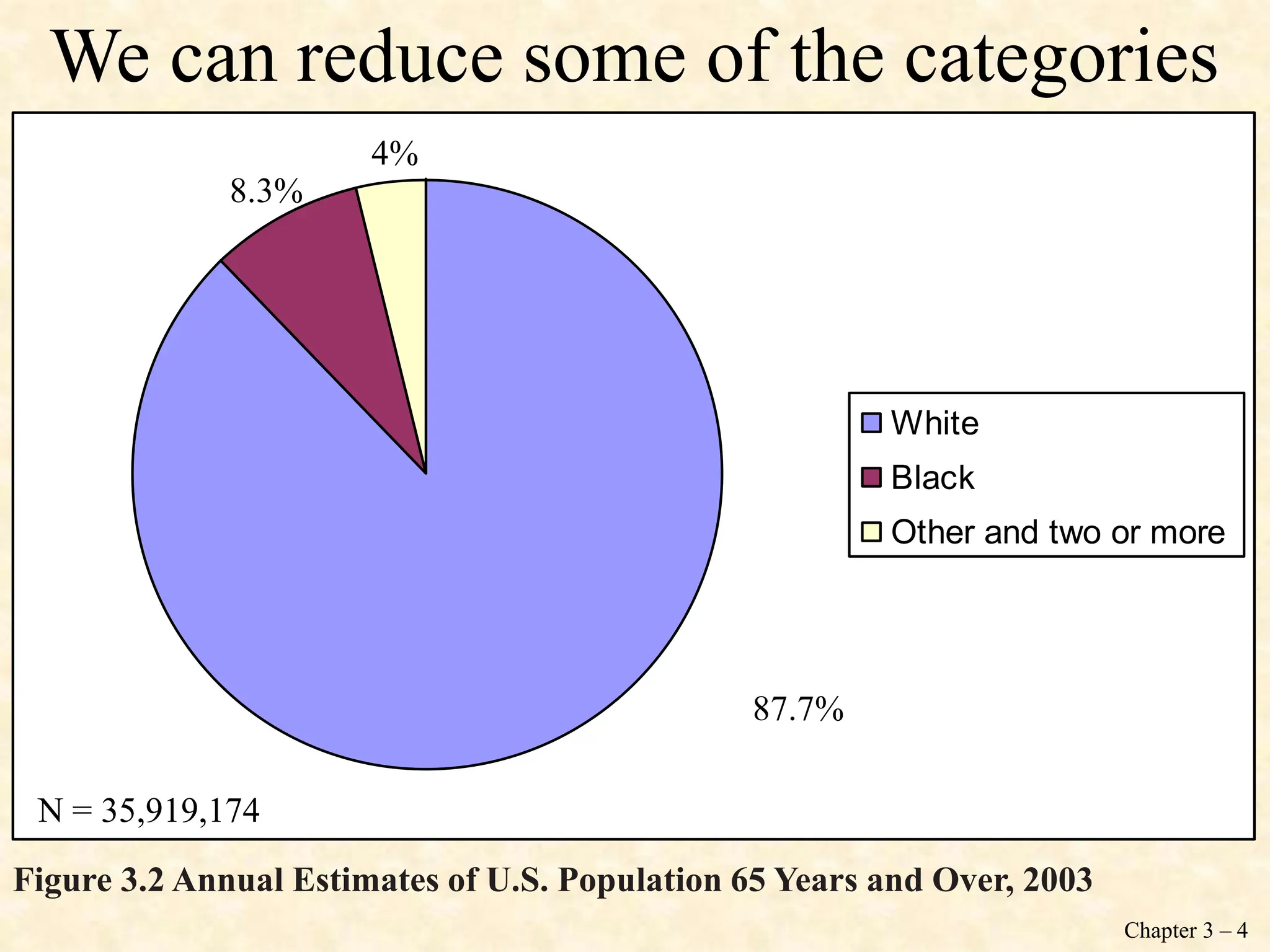
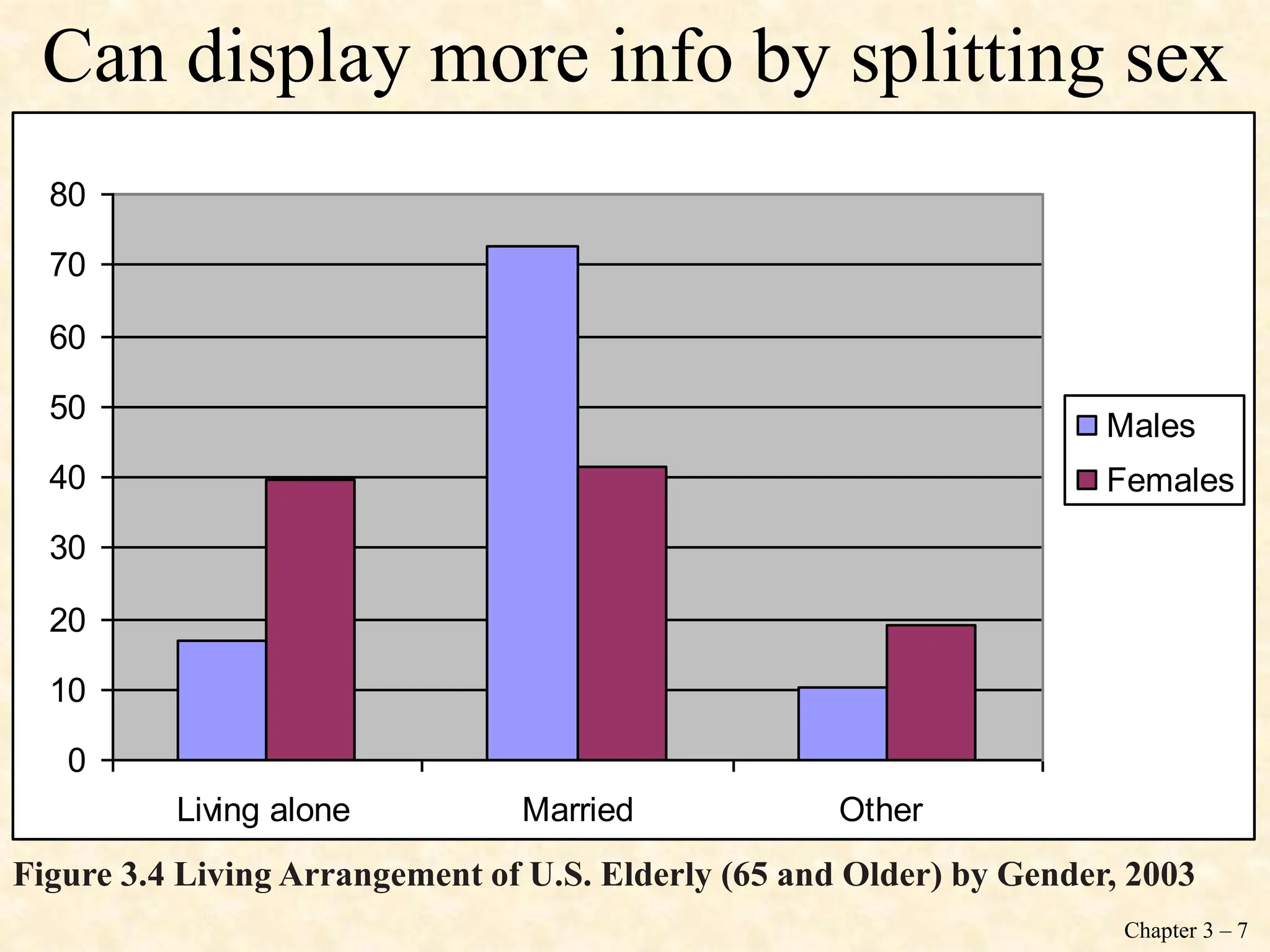
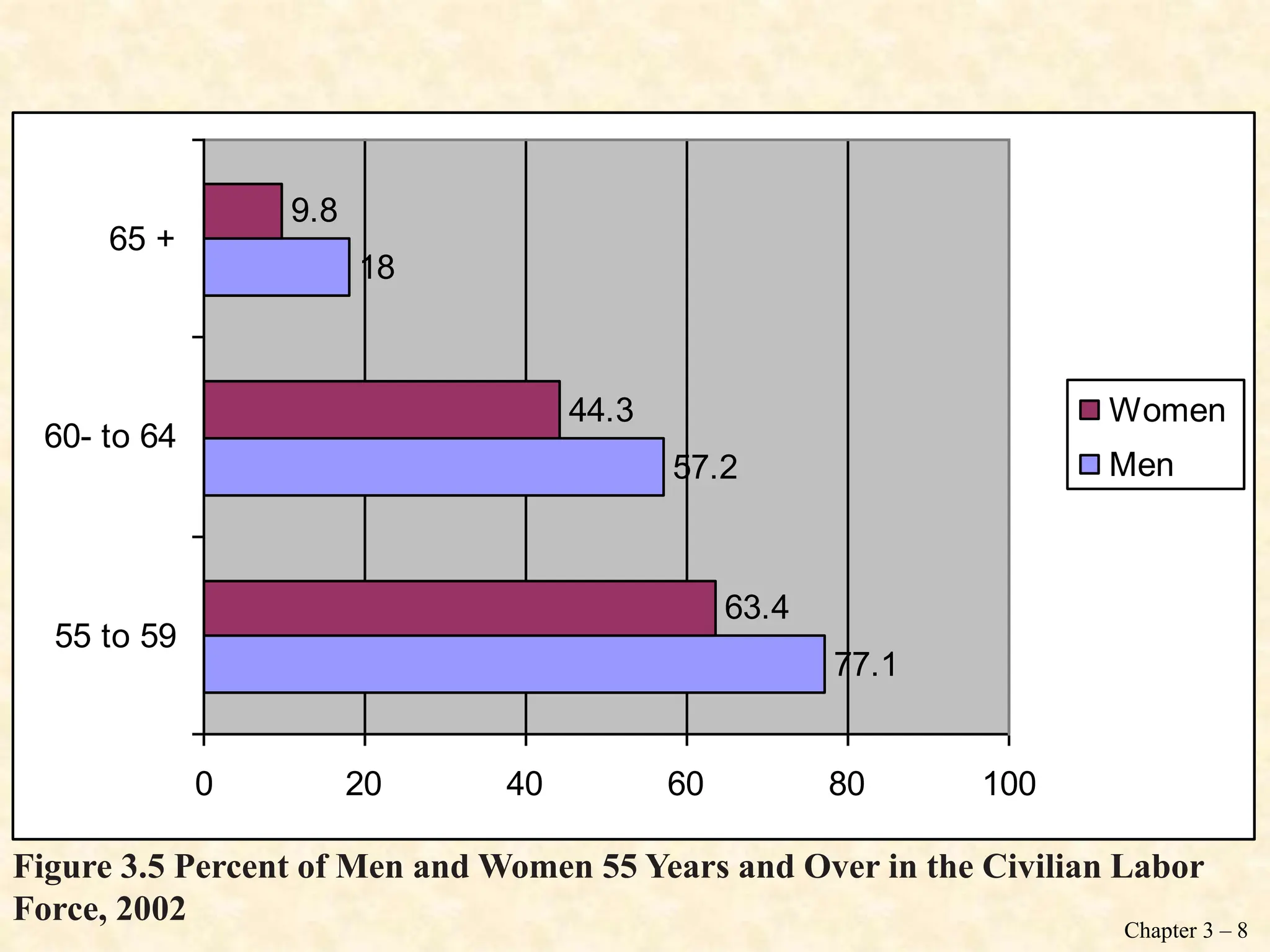
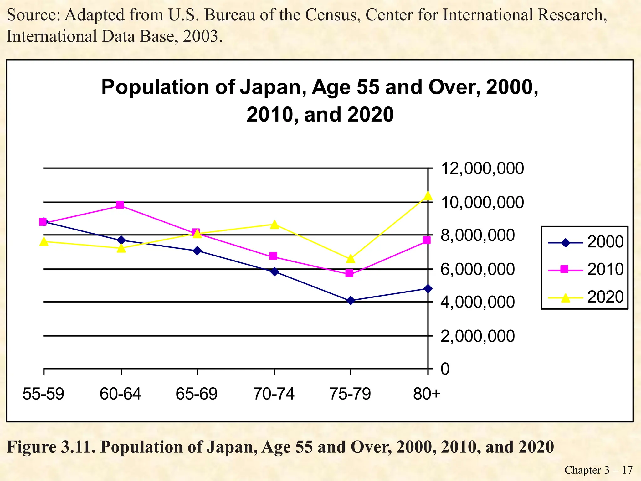
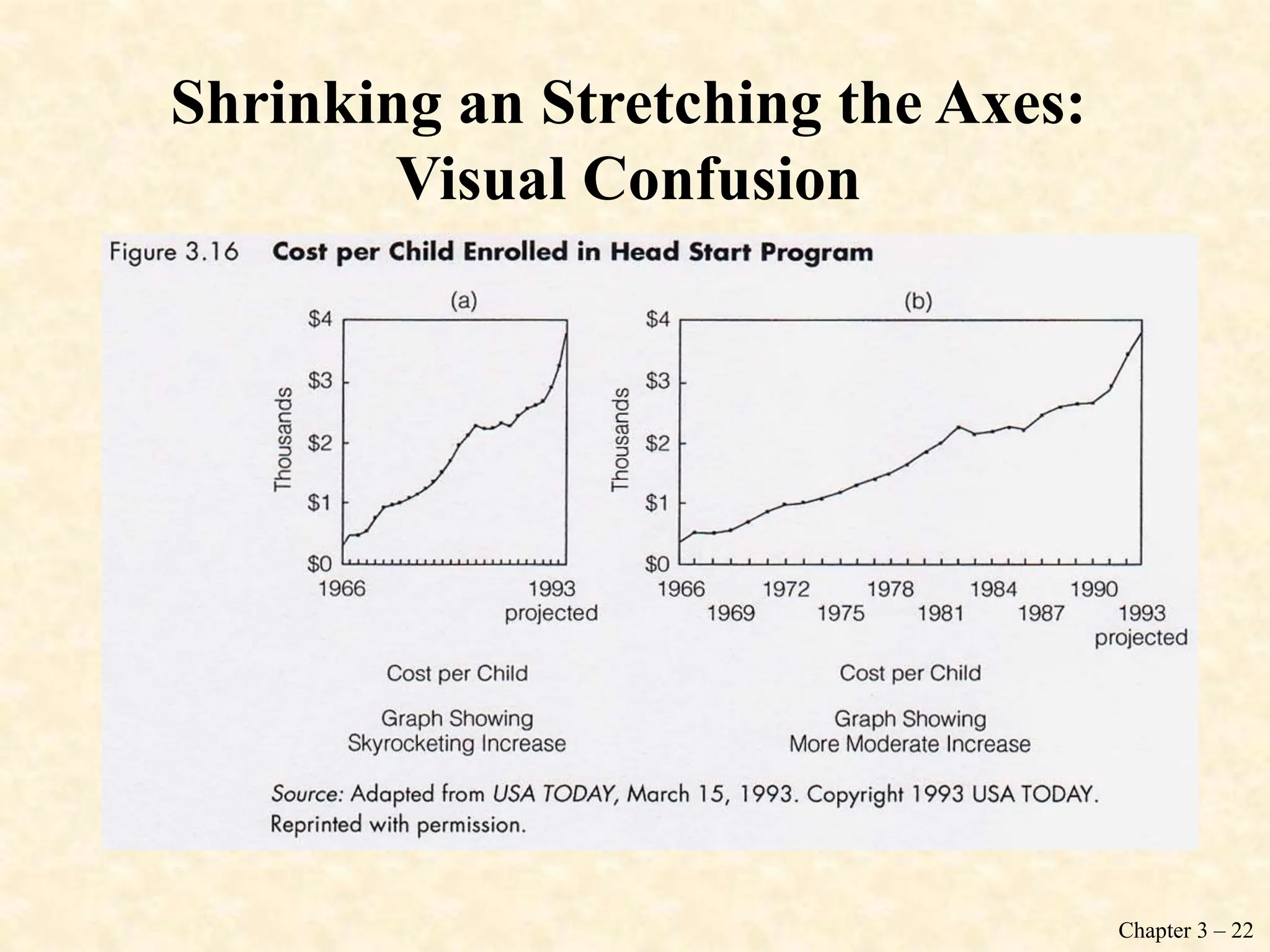
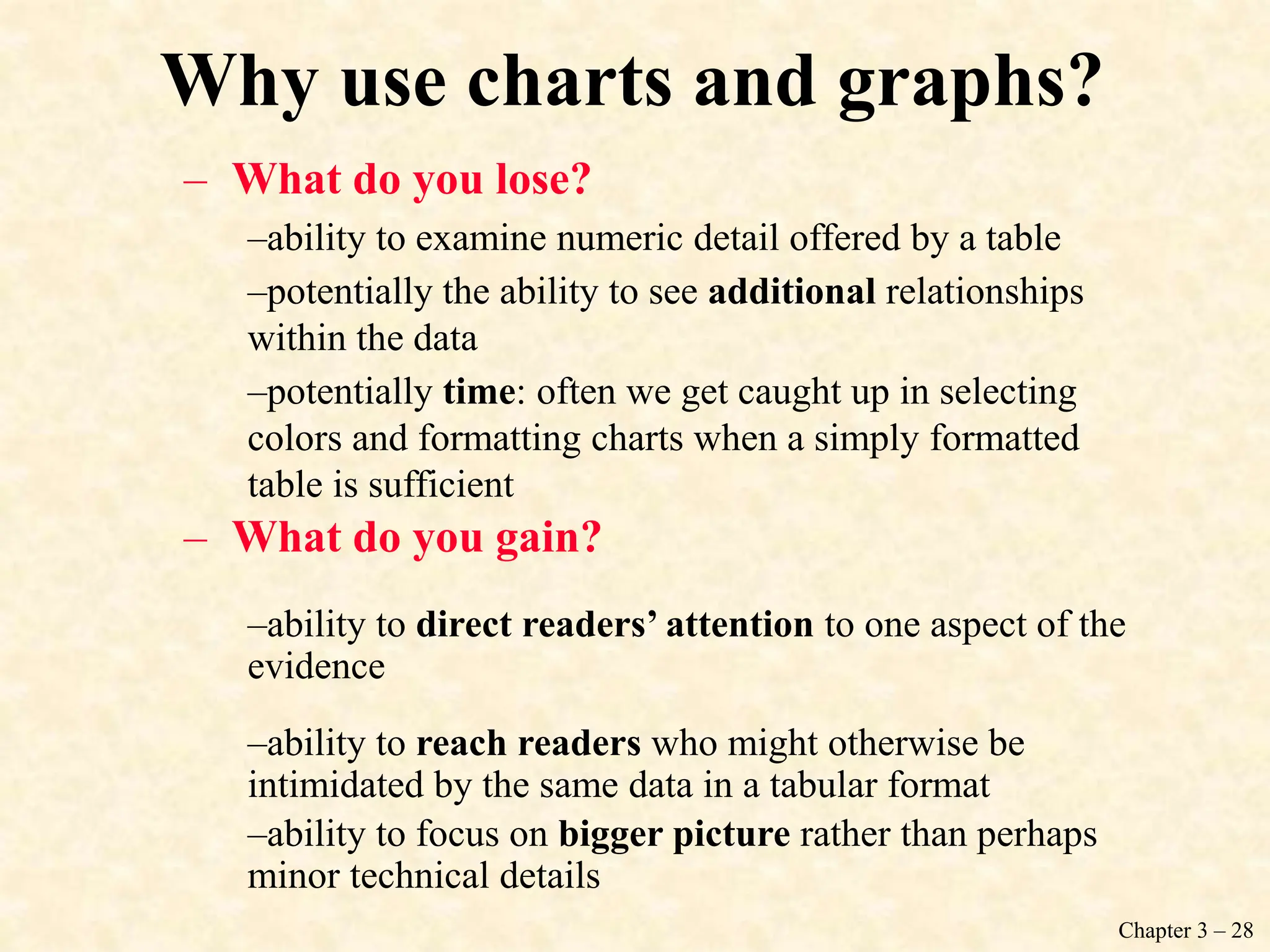
Call Girl In Pune ๐ Just CALL ME: 9352988975 ๐ Call Out Call Both With High p...
ย
UNIT II -Graphic Presentation of the research
1. Chapter 3 โ 1
Chapter 3: Graphic Presentation
โข The Pie Chart
โข The Bar Graph
โข The Statistical Map
โข The Histogram
โข Statistics in Practice
โข The Frequency Polygon
โข Times Series Charts
โข Distortions in Graphs
It is important to choose the appropriate graphs
to make statistical information coherent.
2. Chapter 3 โ 2
The Pie Chart: The Race and
Ethnicity of the Elderly
โข Pie chart: a graph showing the differences
in frequencies or percentages among
categories of a nominal or an ordinal
variable. The categories are displayed as
segments of a circle whose pieces add up to
100 percent of the total frequencies.
3. Chapter 3 โ 3
White
Black
American Indian
Asian
Pacific Islander
Two or more
87.7%
8.3%
2.8%
.5%
.8% .6%
N = 35,919,174
Too many categories can be messy!
Figure 3.1 Annual Estimates of U.S. Population 65 Years and Over by Race, 2003
4. Chapter 3 โ 4
White
Black
Other and two or more
87.7%
8.3%
4%
N = 35,919,174
We can reduce some of the categories
Figure 3.2 Annual Estimates of U.S. Population 65 Years and Over, 2003
5. Chapter 3 โ 5
The Bar Graph: The Living
Arrangements and Labor Force
Participation of the Elderly
โข Bar graph: a graph showing the differences
in frequencies or percentages among
categories of a nominal or an ordinal
variable. The categories are displayed as
rectangles of equal width with their height
proportional to the frequency or percentage
of the category.
6. Chapter 3 โ 6
0
10
20
30
40
50
60
70
80
Living alone Married Other
Series1
N=13,886,000
Figure 3.3 Living Arrangements of Males (65 and Older) in the United States, 2000
7. Chapter 3 โ 7
0
10
20
30
40
50
60
70
80
Living alone Married Other
Males
Females
Can display more info by splitting sex
Figure 3.4 Living Arrangement of U.S. Elderly (65 and Older) by Gender, 2003
8. Chapter 3 โ 8
77.1
57.2
18
63.4
44.3
9.8
0 20 40 60 80 100
55 to 59
60- to 64
65 +
Women
Men
Figure 3.5 Percent of Men and Women 55 Years and Over in the Civilian Labor
Force, 2002
9. Chapter 3 โ 9
The Statistical Map: The Geographic
Distribution of the Elderly
We can display dramatic geographical
changes in American society by using a
statistical map. Maps are especially useful
for describing geographical variations in
variables, such as population distribution,
voting patterns, crimes rates, or labor force
participation.
12. Chapter 3 โ 12
The Histogram
โข Histogram: a graph showing the differences
in frequencies or percentages among
categories of an interval-ratio variable.
The categories are displayed as contiguous
bars, with width proportional to the width of
the category and height proportional to the
frequency or percentage of that category.
13. Chapter 3 โ 13
0
5
10
15
20
25
30
65-69 70-74 75-79 80-84 85-89 90-94 95+
Figure 3.7 Age Distribution of U.S. Population 65 Years and Over, 2000
16. Chapter 3 โ 16
The Frequency Polygon
โข Frequency polygon: a graph showing the
differences in frequencies or percentages
among categories of an interval-ratio
variable. Points representing the
frequencies of each category are placed
above the midpoint of the category and are
jointed by a straight line.
17. Chapter 3 โ 17
Figure 3.11. Population of Japan, Age 55 and Over, 2000, 2010, and 2020
Population of Japan, Age 55 and Over, 2000,
2010, and 2020
0
2,000,000
4,000,000
6,000,000
8,000,000
10,000,000
12,000,000
55-59 60-64 65-69 70-74 75-79 80+
2000
2010
2020
Source: Adapted from U.S. Bureau of the Census, Center for International Research,
International Data Base, 2003.
18. Chapter 3 โ 18
Time Series Charts
โข Time series chart: a graph displaying
changes in a variables at different points
in time. It shows time (measured in units
such as years or months) on the horizontal
axis and the frequencies (percentages or
rates) of another variable on the vertical
axis.
19. Chapter 3 โ 19
Figure 3.12 Percentage of Total U. S. Population 65 Years and Over, 1900 to 2050
0
5
10
15
20
25
1900 1920 1940 1960 1980 2000 2020 2040 2060
Source: Federal Interagency Forum on Aging Related Statistics, Older Americans
2004: Key Indicators of Well Being, 2004.
20. Chapter 3 โ 20
Figure 3.13 Percentage Currently Divorced Among U.S. Population 65 Years and
Over, by Gender, 1960 to 2040
0
2
4
6
8
10
12
14
16
1960 1980 2000 2020 2040
Males
Females
Source: U.S. Bureau of the Census, โ65+ in America,โ Current Population Reports,
1996, Special Studies, P23-190, Table 6-1.
21. Chapter 3 โ 21
Distortions in Graphs
Graphs not only quickly inform us; they can
quickly deceive us. Because we are often
more interested in general impressions than
in detailed analyses of the numbers, we are
more vulnerable to being swayed by
distorted graphs.
โWhat are graphical distortions?
โHow can we recognize them?
22. Chapter 3 โ 22
Shrinking an Stretching the Axes:
Visual Confusion
23. Chapter 3 โ 23
Shrinking an Stretching the Axes:
Visual Confusion
25. Chapter 3 โ 25
Statistics in Practice
The following graphs are particularly
suitable for making comparisons among
groups:
- Bar chart
- Frequency polygon
- Time series chart
26. Chapter 3 โ 26
Figure 3.17 Percentage of College Graduates among People 55 years and over by
age and sex, 2002
31.1
23.3
20.8
21.5
14.7
11.8
0 10 20 30 40
55-64
65-74
85+
Women
Men
Source: Smith, 2003.
27. Chapter 3 โ 27
Figure 3.18 Years of School Completed in the United States by Race and Age, 2003
0
10
20
30
40
50
60
0 to 8 9 to 12 13 to
15
16+
all races 15-64
all races 65+
black alone
15-64
black alone
65+
Source: Stoops, Nicole. 2004. โEducational Attainment in the United States: 2003.โ
Current Population Reports, P20-550. Washington D.C.: U.S. Government Printing
Office.
28. Chapter 3 โ 28
Why use charts and graphs?
โ What do you lose?
โability to examine numeric detail offered by a table
โpotentially the ability to see additional relationships
within the data
โpotentially time: often we get caught up in selecting
colors and formatting charts when a simply formatted
table is sufficient
โ What do you gain?
โability to direct readersโ attention to one aspect of the
evidence
โability to reach readers who might otherwise be
intimidated by the same data in a tabular format
โability to focus on bigger picture rather than perhaps
minor technical details
Editor's Notes
The following two slides are applications of the histogram. They examine, by gender, age distribution patterns in the U.S. population for 1955 and 2010 (projected). Notice that in both figures, age groups are arranged along the vertical axis, whereas the frequencies (in millions of people) are along the horizontal axis. Each age group is classified by males on the left and females on the right. Because this type of histogram reflects age distribution by gender, it is also called an age-sex pyramid.
Probably the most common distortions in graphical representations occur when the distance along the vertical or horizontal axis is altered in relation to the other axis. Axes can be stretched or shrunk to create any desired result.
Another way to distort data with graphs is to use pictures to represent quantitative information. The problem with picture graphs is that the visual impression received is created by the pictureโs total area rather than by is height (the graphs we have discussed so far rely heavily on height).
This bar chart compares elderly males and females who live alone by age, gender, and race or Hispanic origin. It shows that that the percentage of elderly who live alone varies not only by age but also by both race and gender.
This frequency polygon compares years of school completed by black Americans age 25 to 64 and 65 years and older with that of all Americans in the same age groups.
We do this as an in-class exercise โ where they pair up and construct a chart based on a table from the text or handed out in class and then answer the two questions above.