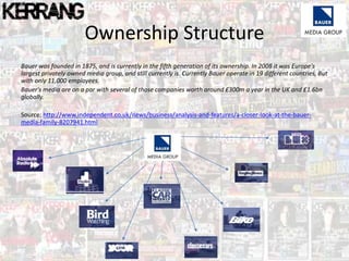
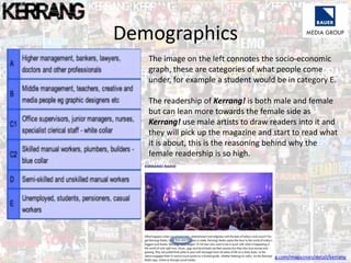
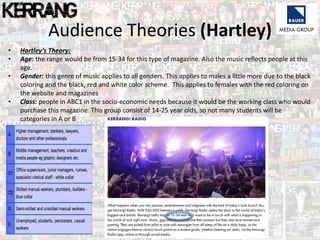
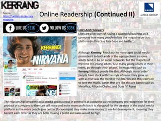
Bauer Media Group is one of the largest privately owned media companies in Europe. They produce magazines across many genres including music, lifestyle, and vehicles. Kerrang! is one of Bauer's magazines focused on rock music. It has been published since the 1980s and currently has a weekly readership of around 77,000 people. The target demographic for Kerrang! is 15-34 year olds, with a slightly higher male readership. Articles aim to inform and educate readers about their favorite bands through interviews, photos, and news. This builds connections between readers and musicians discussed in the magazine.