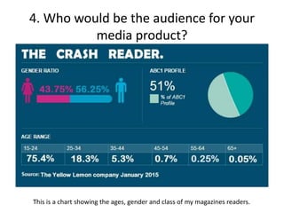
Media Evaluation
By Lewis Seton
1. In what ways does your media product use,
develop or challenge forms and conventions of
real media products?
My media product uses a minimal colour pallet to emphasise that the music is the
most important aspect of the magazine. Red, white and black are the main colours
used. Black and red are both colours associated with heavy rock/metal music, that is
why I have used them. It gets the audience to understand what kind of magazine they
are reading. The white used is a direct opposite of the black and shows clean or pure
things. This has been used as it best shows contrast between two different things.
The screenshot at the bottom of the page is of my contents page, it is evidence of the
colour pallet I have used. It is very minimal but still eye catching. The red and the
white show dramatic contrast between clean and bloody. This shows the style of my
genre very well as blood is closely related with the darker and more metal areas of
music.
Also on my contents page are highlighted articles. This
shows Crash regulars, this is a convention commonly
used within the magazine industry. Regulars help
committed readers identify where their favourite
things are. New album releases, the song of the month
and many other things are all highlighted like this.
These regulars are readers favourites and are the most
parts of the magazine, it also benefits the reader.
Pull quotes have not been used very much in my product, this is because the title of
the page should inform the reader of what the article is about. Adding pull quotes is
unnecessary and takes up space on the page. If the reader is interested in the content
then pull quotes should not be needed. My magazine focusses on quality content, this
is why I have chosen to challenge this convention.
The fonts used in my titles and article headings are of a gothic style. The convention to
use fonts that relate to the magazine style or content is widely used. This convention
is used to match the readers. The readers that read Crash are likely to like other gothic
and metal things. So the use of that style of font matches well and will appeal to the
reader. This is an example of a font used in my media product.
The writing style of my magazine is not incredibly formal. The audience that will be
reading my magazine will be primarily teenagers. This informal writing style will relate
with the audience a lot more than formal writing that may be found in classical music
magazines or newspapers. This is a convention I have chosen to stick to as I think that
it will attract more readers into my magazine.
Cover lines have been used on my front cover. This is a very important convention that
I have chosen to follow. I have chosen to follow this as it entices readers to read my
magazine. They will see a small snippet of an article and want to
find out more. I have chosen big bands/events to be on my cover
lines as to reach as many people within my audience as possible.
The layout that I have used for my magazine is very conventional
My double page spread interview uses columns to layout the text.
This layout is commonly used and many people will be familiar with it; columns are a
lot easier for people to read than a block of text. A large block of text
may discourage readers to read the article as they may think it to be
boring and very long. Columns help split up text into manageable
chunks as is therefore easier to read.
The masthead used in my magazine links in with the gothic font
theme. It is a large black title in a grunge style so it links in with thee style of the
magazine and attracts the audience that would like the content.
2. How does your media product represent
particular social groups?
Class
My magazine shows very little in the way of class. The genre I have covered mainly
includes acts that may have had a rough childhood that they write about in their
songs. This is the only major background that is included, but it is not shown. I have
chosen to not show class as it may send an incorrect message that class determines a
person. It does not, I do not want my audience to be discouraged because of their
background that they could not end up being like their idles. This is why I have chosen
to leave class as an un-prominent factor of the artists in my media product.
Ethnicity
In this genre there are very few different ethnic backgrounds. The majority of the
artists are English or American. There are a very limited number of bands outside of
these ethnicity's. I have tried to include some where possible. Coldrain are an Asian
band that are currently on tour with an artist within my magazine. I have talked a little
about Coldrain as I think it is important to try and cover as many areas as possible
within my media product.
This is a picture of Coldrain taken
from www.metalobsession.net
Age
My magazine contains photos of teenagers for the models. This doesn’t fully
correspond to my magazine genre. My music genre contains mainly 20-30 year old
performers; I did not have access to models of this age. Using instruments and poses, I
was able to artificially age my models to look like they would better suit the genre
within my media product.
Gender
In my music magazine I have not included any photography of women, although on
my contents page there is a band that has a female lead singer. This is the only female
to be in my magazine currently. This is because the genre of music that I am covering
has a very limited number of women. The genre is primarily male due to the violent
masculinity of the music. the music within this genre often includes deep, screaming
notes; those that are unable to be produced by women. Women are often seen as
innocent and vulnerable in society whilst men are more violent, noisy and aggressive,
so having women within the genre is uncommon. My audience research has indicated
nearly a 50/50 split between genders. For this reason I have tried to include a female
artist to appeal to all members within my audience.
The front cover of my media product shows a model holding a large
f guitar. This provokes phallic imagery. It shows off the masculinity of
d the guitar and the model that is holding in. It appeals to the male
d audience because of this.
F The masculinity of exclamation points can also be seen throughout
g my media product. This provokes emphasis and aggression.
3. What kind of media institution might
distribute your media product and why?
There are two main institutions that may distribute my magazine. These were Bauer
and Future PLC.
Future PLC produce a wide range of media products. They produce
products within the gaming, music, photography, technology and many
other markets. They have a lot of experience with media distribution.
However the music products that they distribute are not the same kind of genre as the
one that I have produced. This could open up opportunities for the company as they
have a gap in their market for it. Due to them not producing a media product like mine
they may be willing to take it on and distribute it. Although because of this, they may
be reluctant. It does not fit in with Future PLC’s style. This may cause issues as they
have no experience with dealing with a magazine of this style. Distribution is an
incredibly vital part of a magazine, it must be in the right hands with plenty of
experience. Future PLC often produce material aimed at a mature audience, this may
not fit in well with my content.
I do not think tat future PLC would be a viable distributer of my media product due to
the lack of knowledge and experience that they have with my genre of music.
Bauer would be the most appropriate company for my media product to be
distributed. They have experience with the genre of music that I have in my magazine.
They are responsible for many other music magazines as well as fashion, pop culture
and hobbies, such as gardening, in society. They distribute Kerrang!, the closest
competitor to my magazine. This could be an issue as they already have the rock genre
covered within Bauer. However with the success of Kerrang!, they may be able to
accommodate Crash. Kerrang! is produced weekly on a Wednesday. Crash is a monthly
magazine that does not yet have a day of the week that it will be released on. This
opens up much opportunity within Bauer. They do not have a monthly rock/grunge
magazine on sale. Crash could be released on a weekend to ensure that there is no
clash between the two magazines.
I think that Bauer would be the best institution to distribute my
media product due to their experience and success with Kerrang!
As long as my product does not come out at the same time of
week as Kerrang! Then I believe it will be very successful.
4. Who would be the audience for your
media product?
This is a chart showing the ages, gender and class of my magazines readers.
My average reader:
Eduardo is a 17 year old boy. He enjoys listening to music daily, up to around 3 hours a
day. He enjoys violent movies and heavy music. He enjoys going to as many concerts
as he can with his friends. He reads music magazines every couple of weeks to a
month. He likes Kerrang! But doesn’t feel it has enough promotions or artist
information.
Eduardo has a detached relationship with his parents and enjoys isolating himself,
playing video games and listening to music. He goes to college and socialises with
friends. He uses Facebook, Twitter and Snapchat on a daily basis. Music is used as an
escape and he wishes he could keep up to date with what his favourite artists are
doing and where they are touring.
Eduardo enjoys fashion and looking good. He likes Converse, Doc Martins, Ralph
Lauren and Pretty Green.
I produced a survey as market research. With producing my own music magazine I
needed to find out what people wanted from a music magazine. So I asked people
that I knew, and some that I didn’t know to take part in this survey. The majority of
them were the same age as me. Some of the questions were based on age, likes,
favourite bands and information about peoples current magazine buying habits.
The research that I carried out showed that my audience is a gender neutral one. It
showed that the primary age group were 15-24 year olds. This means that my
magazine must be aimed at teenagers of both genders. My magazine should be
relatable and have extras such as posters for my younger audience to enjoy.
5. How did you attract your audience?
I have used posters and interviews with bands to attract my audience. Through a
survey I found out that the two highest reasons a reader would buy a magazine was
because of the posters and interviews. I have used this to my advantage by listening to
the research. I have included interviews on the front cover of my magazine to instantly
captivate my audience.
I created some page plans to get an idea of how my magazine would look, I then asked
some of my potential audience for some feedback on them.
My audience said that
they liked the design.
They liked that the
magazine had one
main image on the
front focussing on one
person or band.
I listened to my
audience and kept the
main layout of the
front cover, only
changing where some
text was placed.
I did the same for my contents page.
CONTENTS
I got the same impression for the
contents page. It was overall well
liked. My audience appreciated the
fact that my contents page had
pictures that related to the text on
the page. They also liked the block
of text at the bottom. They said it
could be further information or a
editors note.
By carrying out this
research I was able to find
what my audience liked.
This meant that when it
came to creating my
magazine, I knew how to
attract readers efficiently.
It also gave me a very
good idea of what not to
do. This was helpful as I
don’t want to drive my
audience away.
6. What have you learnt about tech from the
process of constructing this product?
Whilst producing my magazine I have learnt a lot about different
technology's and computer programs.
These programs/pieces of technology include: Microsoft word,
Microsoft Powerpoint, Photoshop, canon cameras, survey monkey
and online blogging.
Photoshop
Whilst producing my magazine I have learnt how to use Photoshop efficiently to create
the styles that I want in my magazine. I have used Photoshop to create my front cover,
contents page and my double page spread in my media product. I have learnt that
Photoshop is an essential tool in most product design and that knowing how to use it
is a valuable skill. Photoshop can be used to get the best out of a picture and edit it to
make sure that everything in my magazine has perfect detail and will attract an even
larger audience.
Powerpoint
I have learnt that Powerpoint is a fantastic tool to use. It helps display all the
information that I have collected or need to share very well. It has certainly been very
useful within the making of this media product. I have learnt how to correctly edit and
crop photos to focus on the important information. I have also learnt how to produce
tables and other thing that help me display what information I have collected.
Blog
I have used an online blog for this media product. I have displayed
information, survey results and my magazine itself on there. It has
become a very useful tool as I am able to share things easily with anyone, anywhere in
the world. I am able to put phots, PowerPoints, text, word documents and much more
on the blog. It is incredibly useful for online sharing.
Survey Monkey
I have used a piece of online software called survey
monkey. It has been very useful as I was able to obtain a
wide range of audience research from people I knew as well as people I didn’t know.
The information gained has helped me produce the best media product possible using
real peoples ideas and opinions.
If it’s bad, it’s bad
I have learnt within the process of making this product that if something is bad, it
cannot be edited to make it good. Quality control is needed within the production of
this music magazine. Photos were taken with a high quality camera to produce the
best images possible. If an image was slightly blurred it would be difficult to edit it to
make it good. If an image taken was bad, I would retake it to produce something that
would be acceptable to go in my music magazine. If my product was to go out to the
public, it would be unwise to use blurry photos and uneven shots. Quality is
important, and no matter how much editing is done, it still will not be as good as if the
photo was retaken and done correctly.
7. Looking back at your preliminary task, what
do you feel you have learnt in the progression
from it to the full product?
When looking back at my preliminary task, I can
see that I have learnt much greater Photoshop
skills. On the first task, I used a very simple
method of editing a photo along different
coloured text. These skills are very simple and do
not give much effect upon a reader. I have learnt
to use colours and effects to my advantage a lot
more. This helps draw the user in and gets them
interested.
By doing the audience research carried out on
survey monkey, I have found out exactly what
readers want from this style of magazine and what
it should look like.
Camera work
I have learnt a lot about camera work between my preliminary task and now. I have
learnt a lot more about the poses that the models in my photos should be taking. The
poses should reflect the mood and relate to the audience. I have also learnt about
angles and lighting. My magazine uses images with medium amount of lighting. Due to
the gothic nature of the magazine, high lighting would be unwise as it would badly
contrast with the message my magazine is based on. Using props are very important, I
have chosen to use guitars as the most common prop that my models use. Guitars are
a large part of my music genre and they also provoke phallic, masculine imagery. This
is a very big part of my magazine.
Planning
I have learn a lot about planning with producing this magazine. I did not plan my
preliminary task and it did not turn out very well. I spent a lot of time producing page
plans for this task as well as planning what content was going to be in my magazine.
Doing this meant that my final medias product has turned out a lot better than my
preliminary task.
Conclusion
Overall, I believe that my music magazine has become a success. I have learnt many
skills along the way as well as mistakes that I have learnt from. I have come a long way
from my preliminary task up to this point.

Media product evaluation

  • 1.
  • 2.
    1. In whatways does your media product use, develop or challenge forms and conventions of real media products? My media product uses a minimal colour pallet to emphasise that the music is the most important aspect of the magazine. Red, white and black are the main colours used. Black and red are both colours associated with heavy rock/metal music, that is why I have used them. It gets the audience to understand what kind of magazine they are reading. The white used is a direct opposite of the black and shows clean or pure things. This has been used as it best shows contrast between two different things. The screenshot at the bottom of the page is of my contents page, it is evidence of the colour pallet I have used. It is very minimal but still eye catching. The red and the white show dramatic contrast between clean and bloody. This shows the style of my genre very well as blood is closely related with the darker and more metal areas of music. Also on my contents page are highlighted articles. This shows Crash regulars, this is a convention commonly used within the magazine industry. Regulars help committed readers identify where their favourite things are. New album releases, the song of the month and many other things are all highlighted like this. These regulars are readers favourites and are the most parts of the magazine, it also benefits the reader.
  • 3.
    Pull quotes havenot been used very much in my product, this is because the title of the page should inform the reader of what the article is about. Adding pull quotes is unnecessary and takes up space on the page. If the reader is interested in the content then pull quotes should not be needed. My magazine focusses on quality content, this is why I have chosen to challenge this convention. The fonts used in my titles and article headings are of a gothic style. The convention to use fonts that relate to the magazine style or content is widely used. This convention is used to match the readers. The readers that read Crash are likely to like other gothic and metal things. So the use of that style of font matches well and will appeal to the reader. This is an example of a font used in my media product. The writing style of my magazine is not incredibly formal. The audience that will be reading my magazine will be primarily teenagers. This informal writing style will relate with the audience a lot more than formal writing that may be found in classical music magazines or newspapers. This is a convention I have chosen to stick to as I think that it will attract more readers into my magazine.
  • 4.
    Cover lines havebeen used on my front cover. This is a very important convention that I have chosen to follow. I have chosen to follow this as it entices readers to read my magazine. They will see a small snippet of an article and want to find out more. I have chosen big bands/events to be on my cover lines as to reach as many people within my audience as possible. The layout that I have used for my magazine is very conventional My double page spread interview uses columns to layout the text. This layout is commonly used and many people will be familiar with it; columns are a lot easier for people to read than a block of text. A large block of text may discourage readers to read the article as they may think it to be boring and very long. Columns help split up text into manageable chunks as is therefore easier to read. The masthead used in my magazine links in with the gothic font theme. It is a large black title in a grunge style so it links in with thee style of the magazine and attracts the audience that would like the content.
  • 5.
    2. How doesyour media product represent particular social groups? Class My magazine shows very little in the way of class. The genre I have covered mainly includes acts that may have had a rough childhood that they write about in their songs. This is the only major background that is included, but it is not shown. I have chosen to not show class as it may send an incorrect message that class determines a person. It does not, I do not want my audience to be discouraged because of their background that they could not end up being like their idles. This is why I have chosen to leave class as an un-prominent factor of the artists in my media product.
  • 6.
    Ethnicity In this genrethere are very few different ethnic backgrounds. The majority of the artists are English or American. There are a very limited number of bands outside of these ethnicity's. I have tried to include some where possible. Coldrain are an Asian band that are currently on tour with an artist within my magazine. I have talked a little about Coldrain as I think it is important to try and cover as many areas as possible within my media product. This is a picture of Coldrain taken from www.metalobsession.net
  • 7.
    Age My magazine containsphotos of teenagers for the models. This doesn’t fully correspond to my magazine genre. My music genre contains mainly 20-30 year old performers; I did not have access to models of this age. Using instruments and poses, I was able to artificially age my models to look like they would better suit the genre within my media product.
  • 8.
    Gender In my musicmagazine I have not included any photography of women, although on my contents page there is a band that has a female lead singer. This is the only female to be in my magazine currently. This is because the genre of music that I am covering has a very limited number of women. The genre is primarily male due to the violent masculinity of the music. the music within this genre often includes deep, screaming notes; those that are unable to be produced by women. Women are often seen as innocent and vulnerable in society whilst men are more violent, noisy and aggressive, so having women within the genre is uncommon. My audience research has indicated nearly a 50/50 split between genders. For this reason I have tried to include a female artist to appeal to all members within my audience. The front cover of my media product shows a model holding a large f guitar. This provokes phallic imagery. It shows off the masculinity of d the guitar and the model that is holding in. It appeals to the male d audience because of this. F The masculinity of exclamation points can also be seen throughout g my media product. This provokes emphasis and aggression.
  • 9.
    3. What kindof media institution might distribute your media product and why? There are two main institutions that may distribute my magazine. These were Bauer and Future PLC. Future PLC produce a wide range of media products. They produce products within the gaming, music, photography, technology and many other markets. They have a lot of experience with media distribution. However the music products that they distribute are not the same kind of genre as the one that I have produced. This could open up opportunities for the company as they have a gap in their market for it. Due to them not producing a media product like mine they may be willing to take it on and distribute it. Although because of this, they may be reluctant. It does not fit in with Future PLC’s style. This may cause issues as they have no experience with dealing with a magazine of this style. Distribution is an incredibly vital part of a magazine, it must be in the right hands with plenty of experience. Future PLC often produce material aimed at a mature audience, this may not fit in well with my content. I do not think tat future PLC would be a viable distributer of my media product due to the lack of knowledge and experience that they have with my genre of music.
  • 10.
    Bauer would bethe most appropriate company for my media product to be distributed. They have experience with the genre of music that I have in my magazine. They are responsible for many other music magazines as well as fashion, pop culture and hobbies, such as gardening, in society. They distribute Kerrang!, the closest competitor to my magazine. This could be an issue as they already have the rock genre covered within Bauer. However with the success of Kerrang!, they may be able to accommodate Crash. Kerrang! is produced weekly on a Wednesday. Crash is a monthly magazine that does not yet have a day of the week that it will be released on. This opens up much opportunity within Bauer. They do not have a monthly rock/grunge magazine on sale. Crash could be released on a weekend to ensure that there is no clash between the two magazines. I think that Bauer would be the best institution to distribute my media product due to their experience and success with Kerrang! As long as my product does not come out at the same time of week as Kerrang! Then I believe it will be very successful.
  • 11.
    4. Who wouldbe the audience for your media product? This is a chart showing the ages, gender and class of my magazines readers.
  • 12.
    My average reader: Eduardois a 17 year old boy. He enjoys listening to music daily, up to around 3 hours a day. He enjoys violent movies and heavy music. He enjoys going to as many concerts as he can with his friends. He reads music magazines every couple of weeks to a month. He likes Kerrang! But doesn’t feel it has enough promotions or artist information. Eduardo has a detached relationship with his parents and enjoys isolating himself, playing video games and listening to music. He goes to college and socialises with friends. He uses Facebook, Twitter and Snapchat on a daily basis. Music is used as an escape and he wishes he could keep up to date with what his favourite artists are doing and where they are touring. Eduardo enjoys fashion and looking good. He likes Converse, Doc Martins, Ralph Lauren and Pretty Green.
  • 13.
    I produced asurvey as market research. With producing my own music magazine I needed to find out what people wanted from a music magazine. So I asked people that I knew, and some that I didn’t know to take part in this survey. The majority of them were the same age as me. Some of the questions were based on age, likes, favourite bands and information about peoples current magazine buying habits.
  • 14.
    The research thatI carried out showed that my audience is a gender neutral one. It showed that the primary age group were 15-24 year olds. This means that my magazine must be aimed at teenagers of both genders. My magazine should be relatable and have extras such as posters for my younger audience to enjoy.
  • 15.
    5. How didyou attract your audience? I have used posters and interviews with bands to attract my audience. Through a survey I found out that the two highest reasons a reader would buy a magazine was because of the posters and interviews. I have used this to my advantage by listening to the research. I have included interviews on the front cover of my magazine to instantly captivate my audience.
  • 16.
    I created somepage plans to get an idea of how my magazine would look, I then asked some of my potential audience for some feedback on them. My audience said that they liked the design. They liked that the magazine had one main image on the front focussing on one person or band. I listened to my audience and kept the main layout of the front cover, only changing where some text was placed.
  • 17.
    I did thesame for my contents page. CONTENTS I got the same impression for the contents page. It was overall well liked. My audience appreciated the fact that my contents page had pictures that related to the text on the page. They also liked the block of text at the bottom. They said it could be further information or a editors note. By carrying out this research I was able to find what my audience liked. This meant that when it came to creating my magazine, I knew how to attract readers efficiently. It also gave me a very good idea of what not to do. This was helpful as I don’t want to drive my audience away.
  • 18.
    6. What haveyou learnt about tech from the process of constructing this product? Whilst producing my magazine I have learnt a lot about different technology's and computer programs. These programs/pieces of technology include: Microsoft word, Microsoft Powerpoint, Photoshop, canon cameras, survey monkey and online blogging.
  • 19.
    Photoshop Whilst producing mymagazine I have learnt how to use Photoshop efficiently to create the styles that I want in my magazine. I have used Photoshop to create my front cover, contents page and my double page spread in my media product. I have learnt that Photoshop is an essential tool in most product design and that knowing how to use it is a valuable skill. Photoshop can be used to get the best out of a picture and edit it to make sure that everything in my magazine has perfect detail and will attract an even larger audience.
  • 20.
    Powerpoint I have learntthat Powerpoint is a fantastic tool to use. It helps display all the information that I have collected or need to share very well. It has certainly been very useful within the making of this media product. I have learnt how to correctly edit and crop photos to focus on the important information. I have also learnt how to produce tables and other thing that help me display what information I have collected.
  • 21.
    Blog I have usedan online blog for this media product. I have displayed information, survey results and my magazine itself on there. It has become a very useful tool as I am able to share things easily with anyone, anywhere in the world. I am able to put phots, PowerPoints, text, word documents and much more on the blog. It is incredibly useful for online sharing. Survey Monkey I have used a piece of online software called survey monkey. It has been very useful as I was able to obtain a wide range of audience research from people I knew as well as people I didn’t know. The information gained has helped me produce the best media product possible using real peoples ideas and opinions.
  • 22.
    If it’s bad,it’s bad I have learnt within the process of making this product that if something is bad, it cannot be edited to make it good. Quality control is needed within the production of this music magazine. Photos were taken with a high quality camera to produce the best images possible. If an image was slightly blurred it would be difficult to edit it to make it good. If an image taken was bad, I would retake it to produce something that would be acceptable to go in my music magazine. If my product was to go out to the public, it would be unwise to use blurry photos and uneven shots. Quality is important, and no matter how much editing is done, it still will not be as good as if the photo was retaken and done correctly.
  • 23.
    7. Looking backat your preliminary task, what do you feel you have learnt in the progression from it to the full product? When looking back at my preliminary task, I can see that I have learnt much greater Photoshop skills. On the first task, I used a very simple method of editing a photo along different coloured text. These skills are very simple and do not give much effect upon a reader. I have learnt to use colours and effects to my advantage a lot more. This helps draw the user in and gets them interested. By doing the audience research carried out on survey monkey, I have found out exactly what readers want from this style of magazine and what it should look like.
  • 24.
    Camera work I havelearnt a lot about camera work between my preliminary task and now. I have learnt a lot more about the poses that the models in my photos should be taking. The poses should reflect the mood and relate to the audience. I have also learnt about angles and lighting. My magazine uses images with medium amount of lighting. Due to the gothic nature of the magazine, high lighting would be unwise as it would badly contrast with the message my magazine is based on. Using props are very important, I have chosen to use guitars as the most common prop that my models use. Guitars are a large part of my music genre and they also provoke phallic, masculine imagery. This is a very big part of my magazine.
  • 25.
    Planning I have learna lot about planning with producing this magazine. I did not plan my preliminary task and it did not turn out very well. I spent a lot of time producing page plans for this task as well as planning what content was going to be in my magazine. Doing this meant that my final medias product has turned out a lot better than my preliminary task.
  • 26.
    Conclusion Overall, I believethat my music magazine has become a success. I have learnt many skills along the way as well as mistakes that I have learnt from. I have come a long way from my preliminary task up to this point.