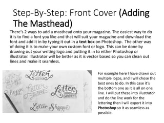
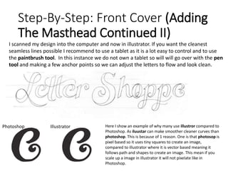
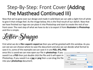
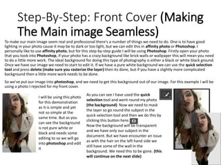
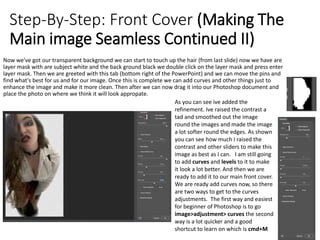
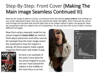
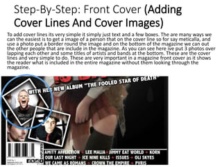
Step-By-Step: Front Cover (Overview)
After this step-by-step guide the
end product will look very similar to
this magazine I made previous to
making the step by step guide.
In the step-by-step guide it will
show you how to take the photo,
use certain tools, make the fonts
look aesthetically pleasing and
other things such as the barcode
and other detailed things needs to
make a magazine really stand out.
Now that we’ve covered what we
are going to do lets get straight into
it and make our front cover for our
magazine!
Step-By-Step: Front Cover (Creating The
Bases)
First we need to open our photoshop document. There's two ways to do this file new or cmd+N to create a
new document. After this is done we need to chose the size we want to make our magazine. Most typically its
A4 (2480pxx3508px) this is done by using the drop down and selecting “international paper "make sure the
resolution is on 300 DPI or the magazine wont look as clean and HD as it is. although this is already set by
photoshop. After this is done u will be greeted with a A4 white background. This is just the base layer so don’t
worry. There will be a padlock next to the layer this will make the layer rasterized and then we can change the
colour of our background. In the magazine I used I resulted to a midnight black background (pure black)
Double click the padlock and it will
turn into a layer so we can change
the colour
There is a couple of ways that we can change the colour of the layer the
easiest way to do it is press alt+backspace. If it doesn't’t do anything
press the X key and it should change from white to black (this is only if
you want a black or white background). The other way and the slightly
longer way is to double click on the layer and go to the option “colour
overlay” and then select the colour you are wanting.
Step-By-Step: Front Cover (Creating The
Barcode)
The barcode is one of the most technical and astatically complicated pieces to do as it, needs
to be correct and show the correct price when scanned, as if the price was different then it
will be classed as false advertising by the company. So the barcode needs to match the price.
Also the lines on the barcode need to be exactly the same height. The barcode below is my
barcode I used for my magazine. As you can see I have labeled the web address issue number,
and date of issue. I also included the social media logos and my magazine logo as well as
price. The
When making the black lines if the barcode I made one thin
black line and duplicated the layer (cmd+J) and controlled
the thickness of each bar individually. Make sure the last
and the first bar are slightly longer than the other lines.
Once these lines are created we need to add random
numbers. I used 4 text boxes so I can get the most accurate
spacing I wanted. I added the issue number the website
address and the date it was published. This needs to be on
the barcode as if its not there or if its on another piece of
the front cover people wont see it and get confused.
Adding price, the logo and the social media icons help fill up space in the barcode section.
The logo and price have to be there but the social networks are mainly there to fill up space
and make the area look more full.
Step-By-Step: Front Cover (Adding
The Masthead)
There's 2 ways to add a masthead onto your magazine. The easiest way to do
it is to find a font you like and that will suit your magazine and download the
font and add it in by typing it out in a text box on Photoshop. The other way
of doing it is to make your own custom font or logo. This can be done by
drawing out your writing logo and putting it in to either Photoshop or
illustrator. Illustrator will be better as it is vector based so you can clean out
lines and make it seamless.
For example here I have drawn out
multiple logos, and I will chose the
best ones to do. In this case it’s
the bottom one as it is all on one
line. I will put these into illustrator
and do the line work for the
lettering then I will export it into
Photoshop so it as seamless as
possible.
Step-By-Step: Front Cover (Adding
The Masthead Continued II)
I scanned my design into the computer and now in illustrator. If you want the cleanest
seamless lines possible I recommend to use a tablet as it is a lot easy to control and to use
the paintbrush tool. In this instance we do not own a tablet so will will go over with the pen
tool and making a few anchor points so we can adjust the letters to flow and look clean.
Photoshop Illustrator Here I show an example of why many use illustror compared to
Photoshop. As iluustar can make smoother cleaner curves than
photoshop. This is because of 1 reason. One is that photosop is
pixel based so it uses tiny squares to create an image,
compared to illustrator where it is vector based meaning it
follows path and shapes to create an image. This mean if you
scale up a image in illustrator it will not pixelate like in
Photoshop.
Step-By-Step: Front Cover (Adding
The Masthead Continued III)
Now that we've gone over our design and made it solid black we can add a slight hint of white
to give it that vintage feel. As the image below, this is the final result of our sketch. Now that
we have finished our logo we can place it into Photoshop and start to create the rest of our
front cover. The next step of what we have to do is to export it from illustrator to Photoshop
and this is simple.
First what we do is file> export> export as then you will be greeted with this window. As you
can see we can choose where to save the document and also we can decide what format to
save it in, some of the examples we can save it in are PSD, JPG, PNG
once this is saved we can now open our file in photoshop. If you
saved it as a PSD then just double click the file and it will open in
Photoshop, if you saved it as a jpg or png then u can drag the file
into your photoshop document.
Step-By-Step: Front Cover (Making
The Main image Seamless)
To make our main image seem real and professional there's a number of things we need to do. One is to have good
lighting in your photo cause it may be to dark or too light, but we can edit this in affinity photo or Photoshop. I
personally like to use affinity photo, but for this step-by-step guide I will be using Photoshop. Firstly open your photo
that you took into Photoshop, if your photo has a crazy background like brick walls or wallpaper this will mean you need
to do a little more work. The ideal background for doing this type of photography is either a black or white black ground.
Once we have our image we need to start to edit it. If we have a pure white background we can use the quick selection
tool and press delete (make sure you rasterize the layer) then its done, but if you have a slightly more complicated
background then a little more work needs to be done.
So we've put our image into photoshop, and we need to get this background out of our image. For this example I will be
using a photo I rejected for my front cover.
I will be using this photo
for this demonstration
as it is simple and yet
not so simple at the
same time. But as you
can see the background
is not pure white or
black and needs some
editing to so we will go
into photoshop and edit
it
As you can see I have used the quick
selection tool and went round my photo
(the background) Now we need to mask
the layer so go round the subject in the
quick selection tool and then we do this by
clicking this button here.
Now the background will be transparent
and we have only our subject in the
document. But we have encounter an issue
as with the hair on the left hand side we
still have some of the wall in the
background. We need this to be gone. (this
will continue on the next slide)
Step-By-Step: Front Cover (Making The
Main image Seamless Continued II)
Now we've got our transparent background we can start to touch up the hair (from last slide) now we have are
layer mask with are subject white and the back ground black we double click on the layer mask and press enter
layer mask. Then we are greeted with this tab (bottom right of the PowerPoint) and we can move the pins and
find what's best for us and for our image. Once this is complete we can add curves and other things just to
enhance the image and make it more clean. Then after we can now drag it into our Photoshop document and
place the photo on where we think it will look appropate.
As you can see ive added the
refinement. Ive raised the contrast a
tad and smoothed out the image
round the images and made the image
a lot softer round the edges. As shown
you can see how much I raised the
contrast and other sliders to make this
image as best as I can. I am still going
to add curves and levels to it to make
it look a lot better. And then we are
ready to add it to our main front cover.
We are ready add curves now, so there
are two ways to get to the curves
adjustments. The first way and easiest
for beginner of Photoshop is to go
image>adjustment> curves the second
way is a lot quicker and a good
shortcut to learn on which is cmd+M
Step-By-Step: Front Cover (Making The
Main image Seamless Continued III)
Now we are ready to add our curves, so continue from last said we press cmd+m and it brings up
our curves adjustment layer. Here we can control the darks and lights. Here I have set the curves
and it brings out the dark side and the light side of my subject which is what I am going for. Now
we are going to add our subject into our composition. As you see here the curves make a massive
different to images.
Now from using a example made for my
actual magazine (next slide) we need to
think about placement and other sources
for example how the main image covers
the masthead or how the subject is
posing. All these aspects make a good
magazine front cover and makes it pop.
So here is an example of
the work I have done for
my actual magazine as you
can see I have placed the
subject in the middle so
the main focus is on her.
Step-By-Step: Front Cover (Adding
Cover Lines And Cover Images)
To add cover lines its very simple it simply just text and a few boxes. The are many ways we
can the easiest is to get a image of a person that on the cover line so for say meticalla, and
use a photo put a border round the image and on the bottom of the magazine we can out
the other people that are include in the magazine. As you can see here ive put 3 photos over
lapping each other and some titles of artists and bands at the bottom. These are the cover
lines and very simple to do. These are very important in a magazine front cover as it shows
the reader what is included in the entire magazine without them looking through the
magazine.
Magazine Flat Plan
c o n t e n t s
advert
editorial
advert
headline
article
headline
headline
headline
headline
headline review review Next
issue
preview
H E A D L I N E D P S
article
article
headline
articlearticle
article article
article
article article
articlearticle
headline
article
D P S P O S T E R
headline
D P S P O S T E R
review
article
advert
Font Style
The font styles I will use is a heavy grungy looking font on
which it gives the impact of what kind of magazine it is.
Dead Sector: Flesh
Wound
DeadRiff: flesh
wound
Amplified: flesh wound
Dead Sector: the dark
DeadRiff: the dark
Amplified: the dark
Dead Sector: A Gothique Time
DeadRiff: A Gothique Time
Amplified: A Gothique Time
Final front page
Masthead: the masthead is the main title
for the magazine and it’s the most
recognizable. If the masthead wasn’t
there then no one would know who's
magazine it was.
Main Image: this connotes who the main article
is about. If the main image was someone else
and the main article was on someone this is
false advertising.
Strapline: quick line that will get the readers
attention, making them want to read onwards
Cover lines: this allows the reader to
know who else is in the magazine, like a
feature it allows the reader to easily
decide if they want to purchase them
magazine or not.
Barcode: it is placed like this because
it can allow more space to have the
cover lines.
Final DPS
Differentiated questions and answers:
different types of questions are asked about
various things the artist likes . To make the
interview more interesting.
Drop Capital:
this connotes
where to start
reading the
interview
Magazine Credits:
this connotes who the
photo is of and who
took it
Main title: shows
who the interview
is about
Main Image:
this connotes
who the main
article is about.
If the main
image was
someone else
and the main
article was on
someone this is
false
advertising.

Unit 30 Learning Objective 3

  • 2.
    Step-By-Step: Front Cover(Overview) After this step-by-step guide the end product will look very similar to this magazine I made previous to making the step by step guide. In the step-by-step guide it will show you how to take the photo, use certain tools, make the fonts look aesthetically pleasing and other things such as the barcode and other detailed things needs to make a magazine really stand out. Now that we’ve covered what we are going to do lets get straight into it and make our front cover for our magazine!
  • 3.
    Step-By-Step: Front Cover(Creating The Bases) First we need to open our photoshop document. There's two ways to do this file new or cmd+N to create a new document. After this is done we need to chose the size we want to make our magazine. Most typically its A4 (2480pxx3508px) this is done by using the drop down and selecting “international paper "make sure the resolution is on 300 DPI or the magazine wont look as clean and HD as it is. although this is already set by photoshop. After this is done u will be greeted with a A4 white background. This is just the base layer so don’t worry. There will be a padlock next to the layer this will make the layer rasterized and then we can change the colour of our background. In the magazine I used I resulted to a midnight black background (pure black) Double click the padlock and it will turn into a layer so we can change the colour There is a couple of ways that we can change the colour of the layer the easiest way to do it is press alt+backspace. If it doesn't’t do anything press the X key and it should change from white to black (this is only if you want a black or white background). The other way and the slightly longer way is to double click on the layer and go to the option “colour overlay” and then select the colour you are wanting.
  • 4.
    Step-By-Step: Front Cover(Creating The Barcode) The barcode is one of the most technical and astatically complicated pieces to do as it, needs to be correct and show the correct price when scanned, as if the price was different then it will be classed as false advertising by the company. So the barcode needs to match the price. Also the lines on the barcode need to be exactly the same height. The barcode below is my barcode I used for my magazine. As you can see I have labeled the web address issue number, and date of issue. I also included the social media logos and my magazine logo as well as price. The When making the black lines if the barcode I made one thin black line and duplicated the layer (cmd+J) and controlled the thickness of each bar individually. Make sure the last and the first bar are slightly longer than the other lines. Once these lines are created we need to add random numbers. I used 4 text boxes so I can get the most accurate spacing I wanted. I added the issue number the website address and the date it was published. This needs to be on the barcode as if its not there or if its on another piece of the front cover people wont see it and get confused. Adding price, the logo and the social media icons help fill up space in the barcode section. The logo and price have to be there but the social networks are mainly there to fill up space and make the area look more full.
  • 5.
    Step-By-Step: Front Cover(Adding The Masthead) There's 2 ways to add a masthead onto your magazine. The easiest way to do it is to find a font you like and that will suit your magazine and download the font and add it in by typing it out in a text box on Photoshop. The other way of doing it is to make your own custom font or logo. This can be done by drawing out your writing logo and putting it in to either Photoshop or illustrator. Illustrator will be better as it is vector based so you can clean out lines and make it seamless. For example here I have drawn out multiple logos, and I will chose the best ones to do. In this case it’s the bottom one as it is all on one line. I will put these into illustrator and do the line work for the lettering then I will export it into Photoshop so it as seamless as possible.
  • 6.
    Step-By-Step: Front Cover(Adding The Masthead Continued II) I scanned my design into the computer and now in illustrator. If you want the cleanest seamless lines possible I recommend to use a tablet as it is a lot easy to control and to use the paintbrush tool. In this instance we do not own a tablet so will will go over with the pen tool and making a few anchor points so we can adjust the letters to flow and look clean. Photoshop Illustrator Here I show an example of why many use illustror compared to Photoshop. As iluustar can make smoother cleaner curves than photoshop. This is because of 1 reason. One is that photosop is pixel based so it uses tiny squares to create an image, compared to illustrator where it is vector based meaning it follows path and shapes to create an image. This mean if you scale up a image in illustrator it will not pixelate like in Photoshop.
  • 7.
    Step-By-Step: Front Cover(Adding The Masthead Continued III) Now that we've gone over our design and made it solid black we can add a slight hint of white to give it that vintage feel. As the image below, this is the final result of our sketch. Now that we have finished our logo we can place it into Photoshop and start to create the rest of our front cover. The next step of what we have to do is to export it from illustrator to Photoshop and this is simple. First what we do is file> export> export as then you will be greeted with this window. As you can see we can choose where to save the document and also we can decide what format to save it in, some of the examples we can save it in are PSD, JPG, PNG once this is saved we can now open our file in photoshop. If you saved it as a PSD then just double click the file and it will open in Photoshop, if you saved it as a jpg or png then u can drag the file into your photoshop document.
  • 8.
    Step-By-Step: Front Cover(Making The Main image Seamless) To make our main image seem real and professional there's a number of things we need to do. One is to have good lighting in your photo cause it may be to dark or too light, but we can edit this in affinity photo or Photoshop. I personally like to use affinity photo, but for this step-by-step guide I will be using Photoshop. Firstly open your photo that you took into Photoshop, if your photo has a crazy background like brick walls or wallpaper this will mean you need to do a little more work. The ideal background for doing this type of photography is either a black or white black ground. Once we have our image we need to start to edit it. If we have a pure white background we can use the quick selection tool and press delete (make sure you rasterize the layer) then its done, but if you have a slightly more complicated background then a little more work needs to be done. So we've put our image into photoshop, and we need to get this background out of our image. For this example I will be using a photo I rejected for my front cover. I will be using this photo for this demonstration as it is simple and yet not so simple at the same time. But as you can see the background is not pure white or black and needs some editing to so we will go into photoshop and edit it As you can see I have used the quick selection tool and went round my photo (the background) Now we need to mask the layer so go round the subject in the quick selection tool and then we do this by clicking this button here. Now the background will be transparent and we have only our subject in the document. But we have encounter an issue as with the hair on the left hand side we still have some of the wall in the background. We need this to be gone. (this will continue on the next slide)
  • 9.
    Step-By-Step: Front Cover(Making The Main image Seamless Continued II) Now we've got our transparent background we can start to touch up the hair (from last slide) now we have are layer mask with are subject white and the back ground black we double click on the layer mask and press enter layer mask. Then we are greeted with this tab (bottom right of the PowerPoint) and we can move the pins and find what's best for us and for our image. Once this is complete we can add curves and other things just to enhance the image and make it more clean. Then after we can now drag it into our Photoshop document and place the photo on where we think it will look appropate. As you can see ive added the refinement. Ive raised the contrast a tad and smoothed out the image round the images and made the image a lot softer round the edges. As shown you can see how much I raised the contrast and other sliders to make this image as best as I can. I am still going to add curves and levels to it to make it look a lot better. And then we are ready to add it to our main front cover. We are ready add curves now, so there are two ways to get to the curves adjustments. The first way and easiest for beginner of Photoshop is to go image>adjustment> curves the second way is a lot quicker and a good shortcut to learn on which is cmd+M
  • 10.
    Step-By-Step: Front Cover(Making The Main image Seamless Continued III) Now we are ready to add our curves, so continue from last said we press cmd+m and it brings up our curves adjustment layer. Here we can control the darks and lights. Here I have set the curves and it brings out the dark side and the light side of my subject which is what I am going for. Now we are going to add our subject into our composition. As you see here the curves make a massive different to images. Now from using a example made for my actual magazine (next slide) we need to think about placement and other sources for example how the main image covers the masthead or how the subject is posing. All these aspects make a good magazine front cover and makes it pop. So here is an example of the work I have done for my actual magazine as you can see I have placed the subject in the middle so the main focus is on her.
  • 11.
    Step-By-Step: Front Cover(Adding Cover Lines And Cover Images) To add cover lines its very simple it simply just text and a few boxes. The are many ways we can the easiest is to get a image of a person that on the cover line so for say meticalla, and use a photo put a border round the image and on the bottom of the magazine we can out the other people that are include in the magazine. As you can see here ive put 3 photos over lapping each other and some titles of artists and bands at the bottom. These are the cover lines and very simple to do. These are very important in a magazine front cover as it shows the reader what is included in the entire magazine without them looking through the magazine.
  • 12.
    Magazine Flat Plan co n t e n t s advert editorial advert headline article headline headline headline headline headline review review Next issue preview H E A D L I N E D P S article article headline articlearticle article article article article article articlearticle headline article D P S P O S T E R headline D P S P O S T E R review article advert
  • 13.
    Font Style The fontstyles I will use is a heavy grungy looking font on which it gives the impact of what kind of magazine it is. Dead Sector: Flesh Wound DeadRiff: flesh wound Amplified: flesh wound Dead Sector: the dark DeadRiff: the dark Amplified: the dark Dead Sector: A Gothique Time DeadRiff: A Gothique Time Amplified: A Gothique Time
  • 14.
    Final front page Masthead:the masthead is the main title for the magazine and it’s the most recognizable. If the masthead wasn’t there then no one would know who's magazine it was. Main Image: this connotes who the main article is about. If the main image was someone else and the main article was on someone this is false advertising. Strapline: quick line that will get the readers attention, making them want to read onwards Cover lines: this allows the reader to know who else is in the magazine, like a feature it allows the reader to easily decide if they want to purchase them magazine or not. Barcode: it is placed like this because it can allow more space to have the cover lines.
  • 15.
    Final DPS Differentiated questionsand answers: different types of questions are asked about various things the artist likes . To make the interview more interesting. Drop Capital: this connotes where to start reading the interview Magazine Credits: this connotes who the photo is of and who took it Main title: shows who the interview is about Main Image: this connotes who the main article is about. If the main image was someone else and the main article was on someone this is false advertising.