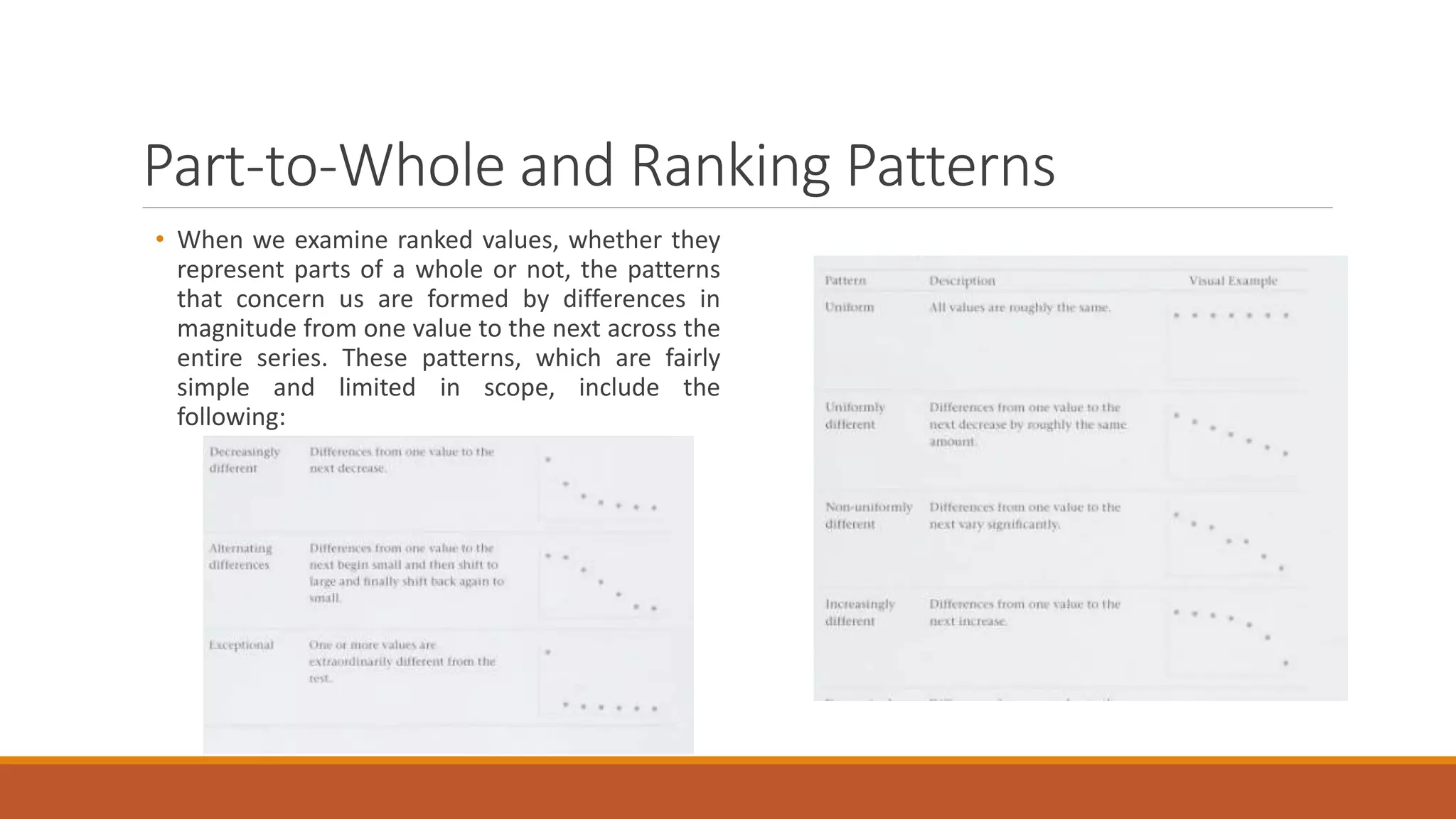
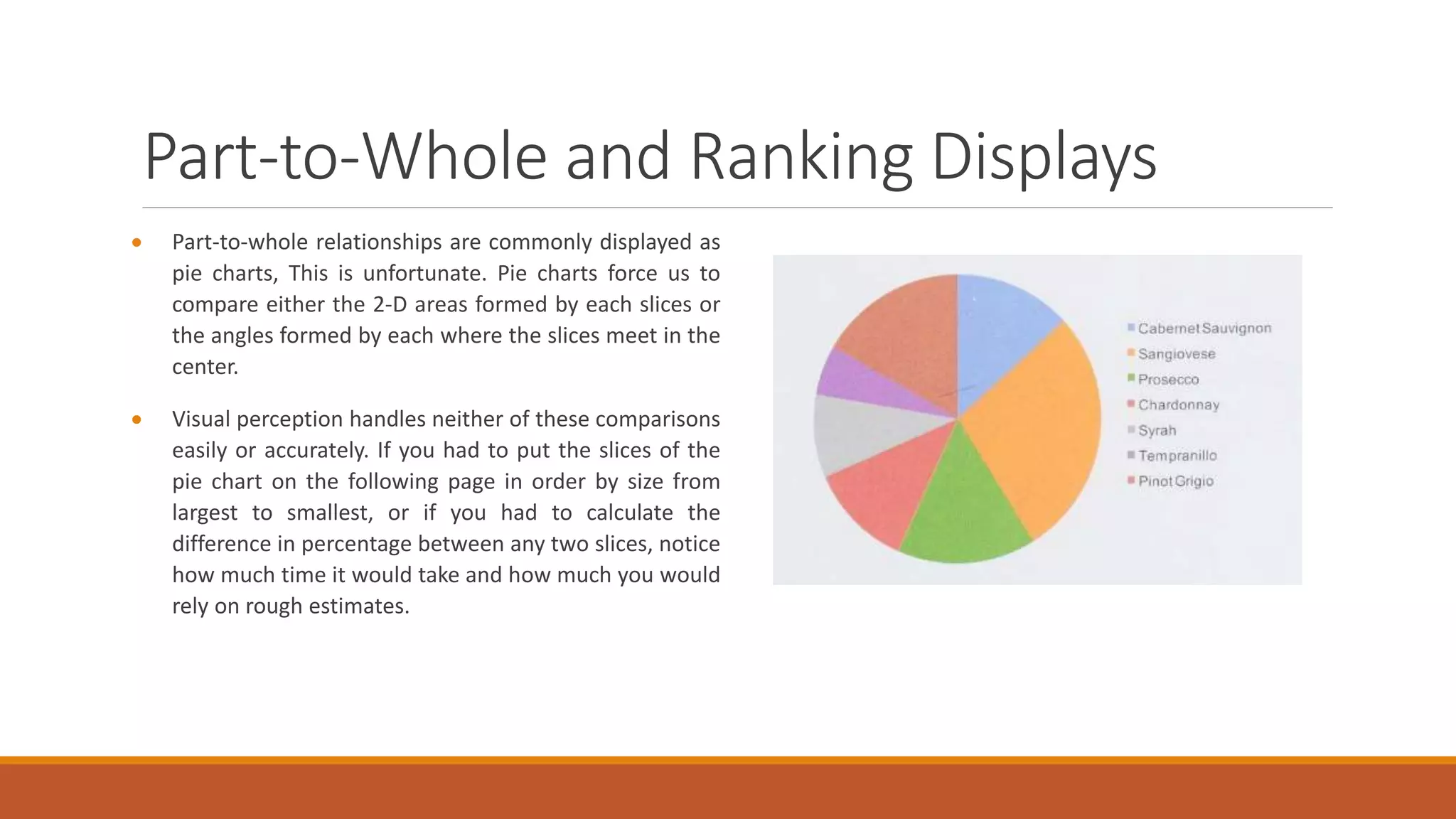
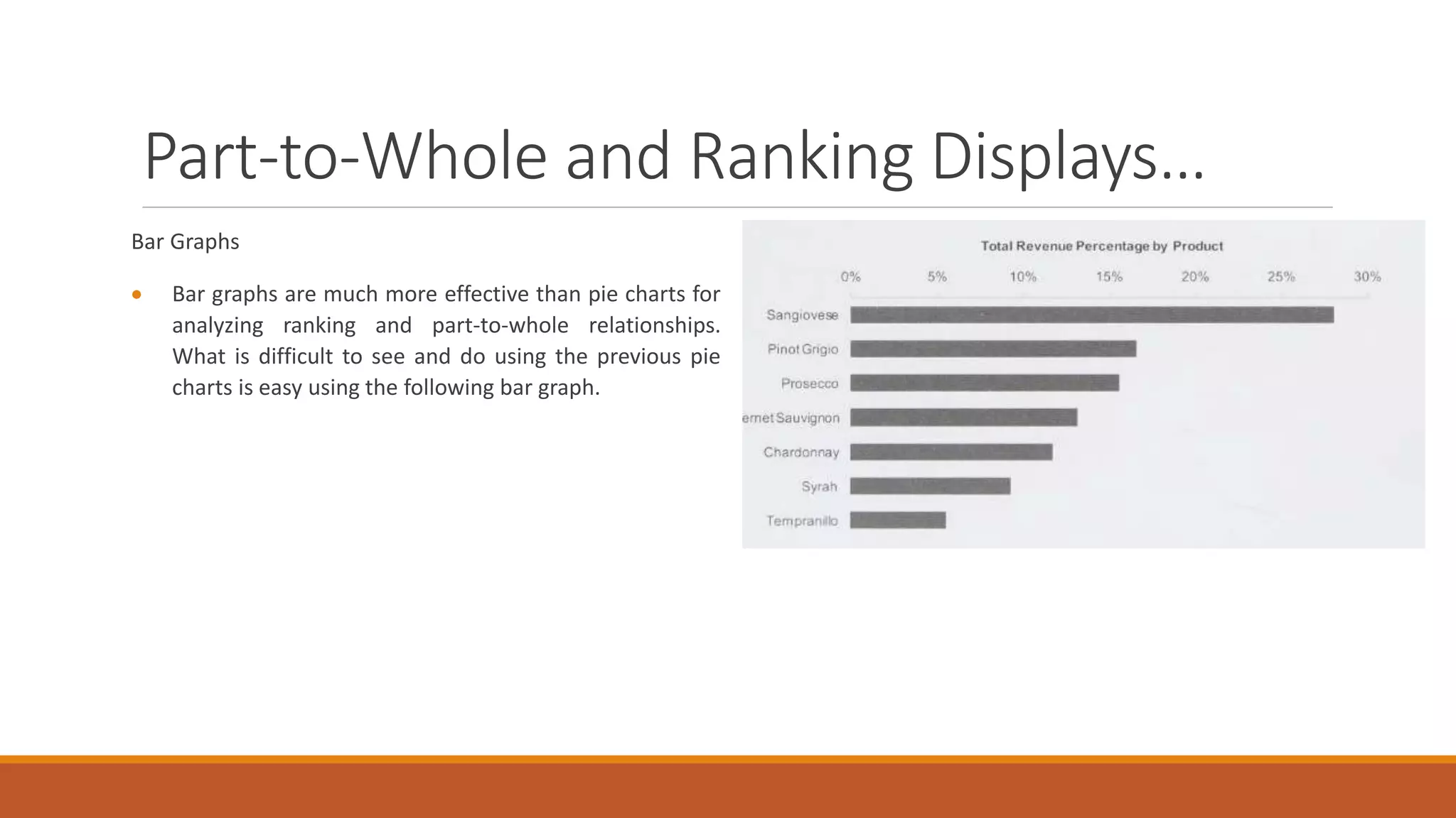
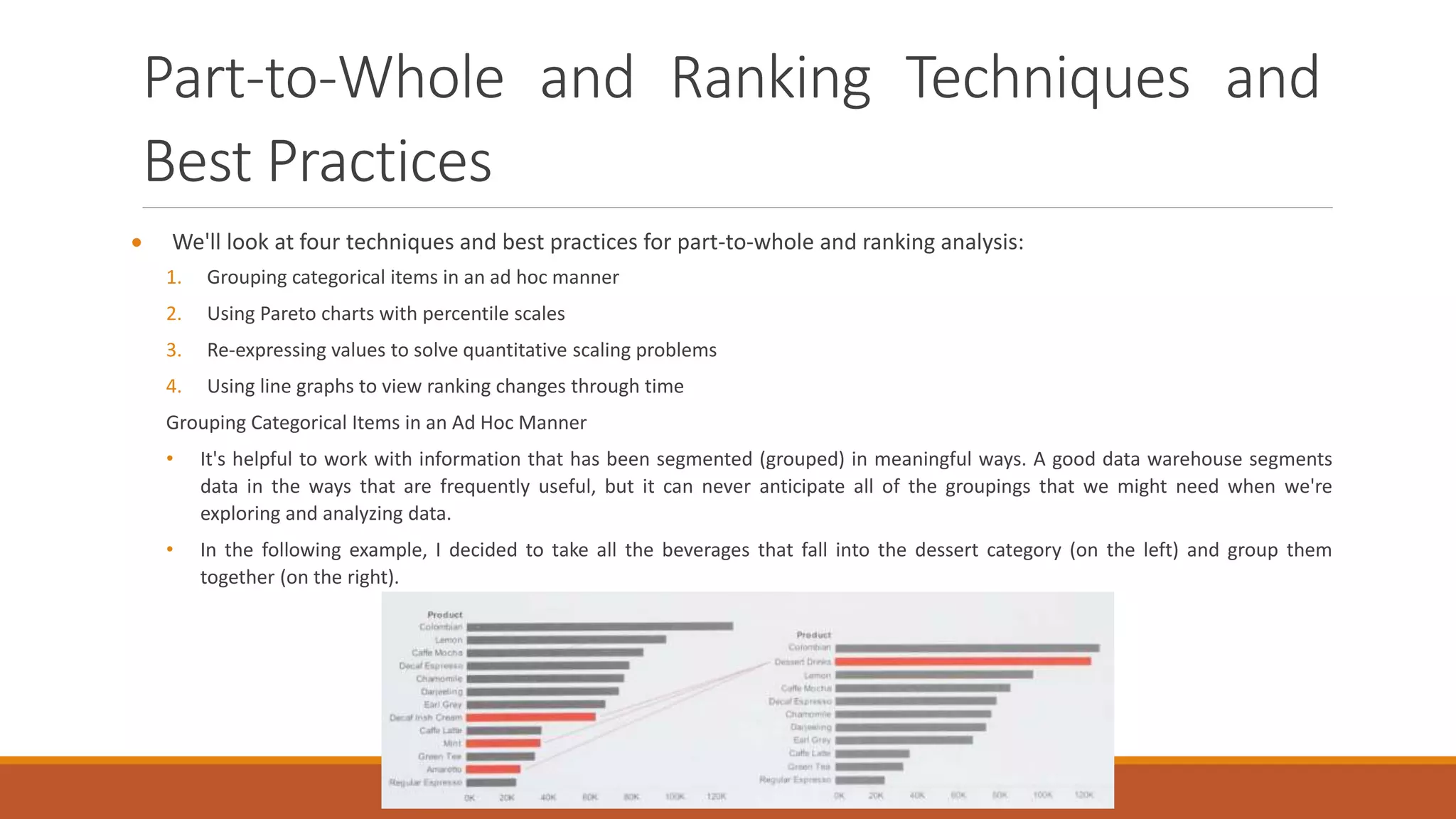
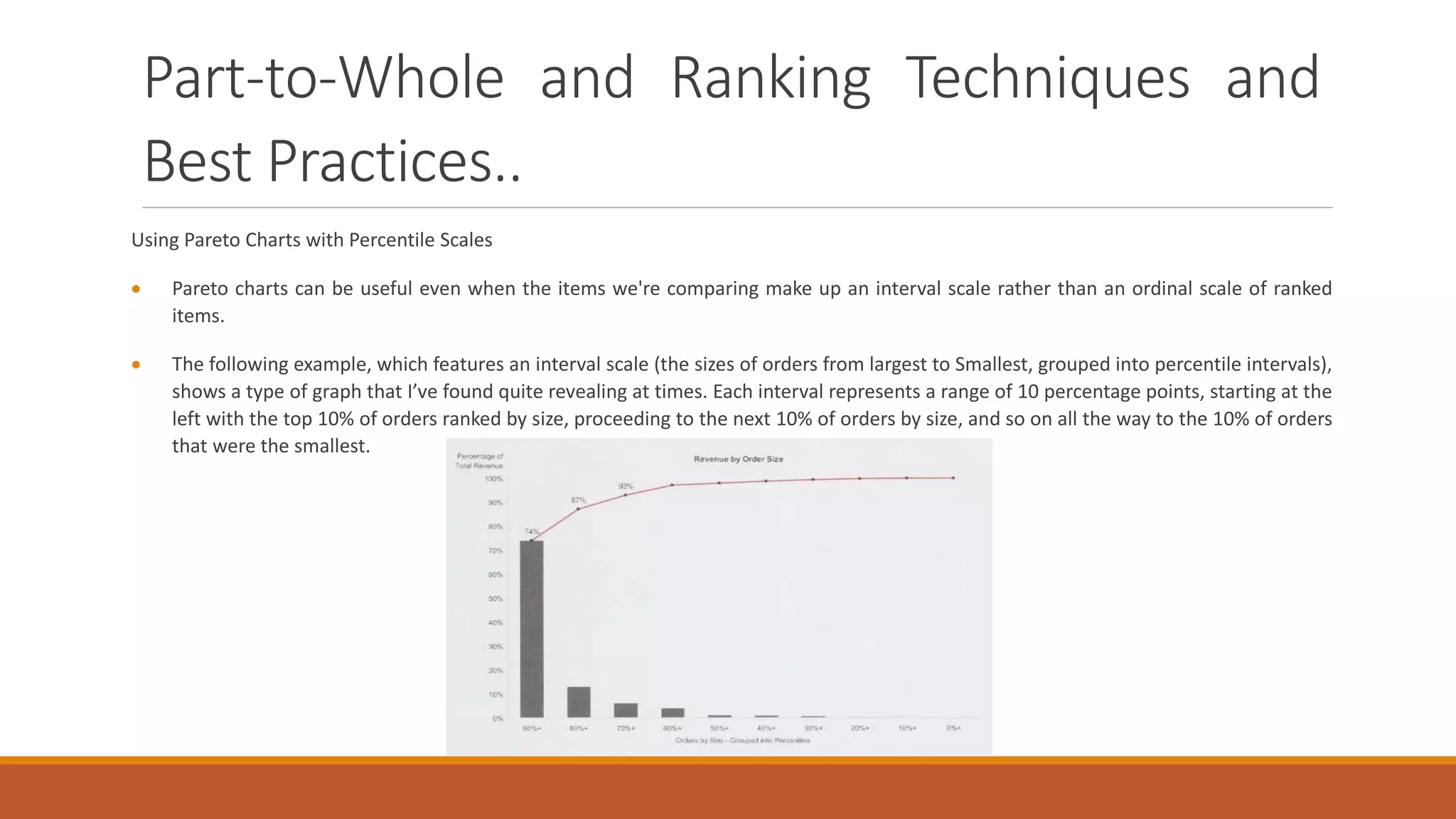
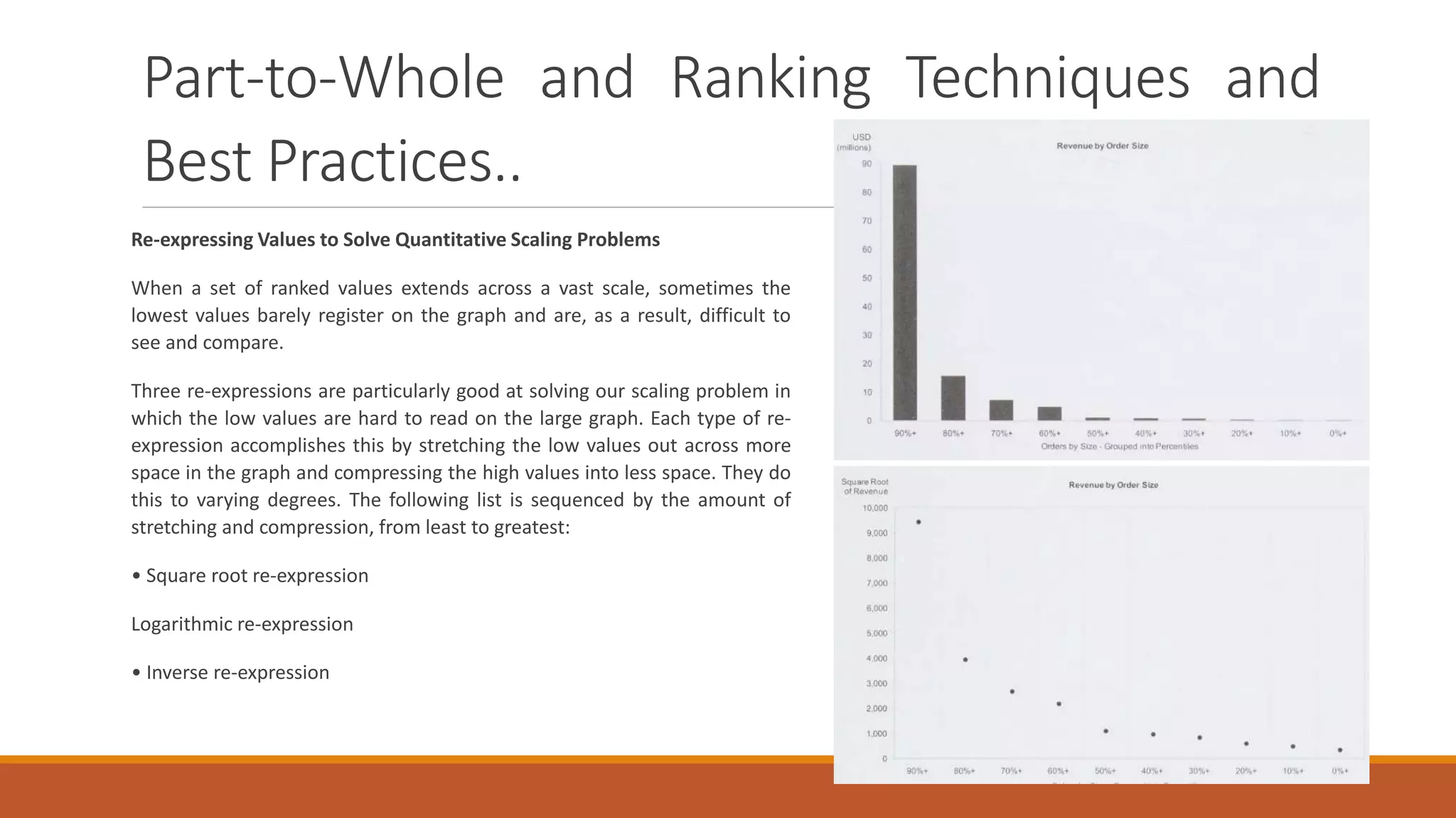
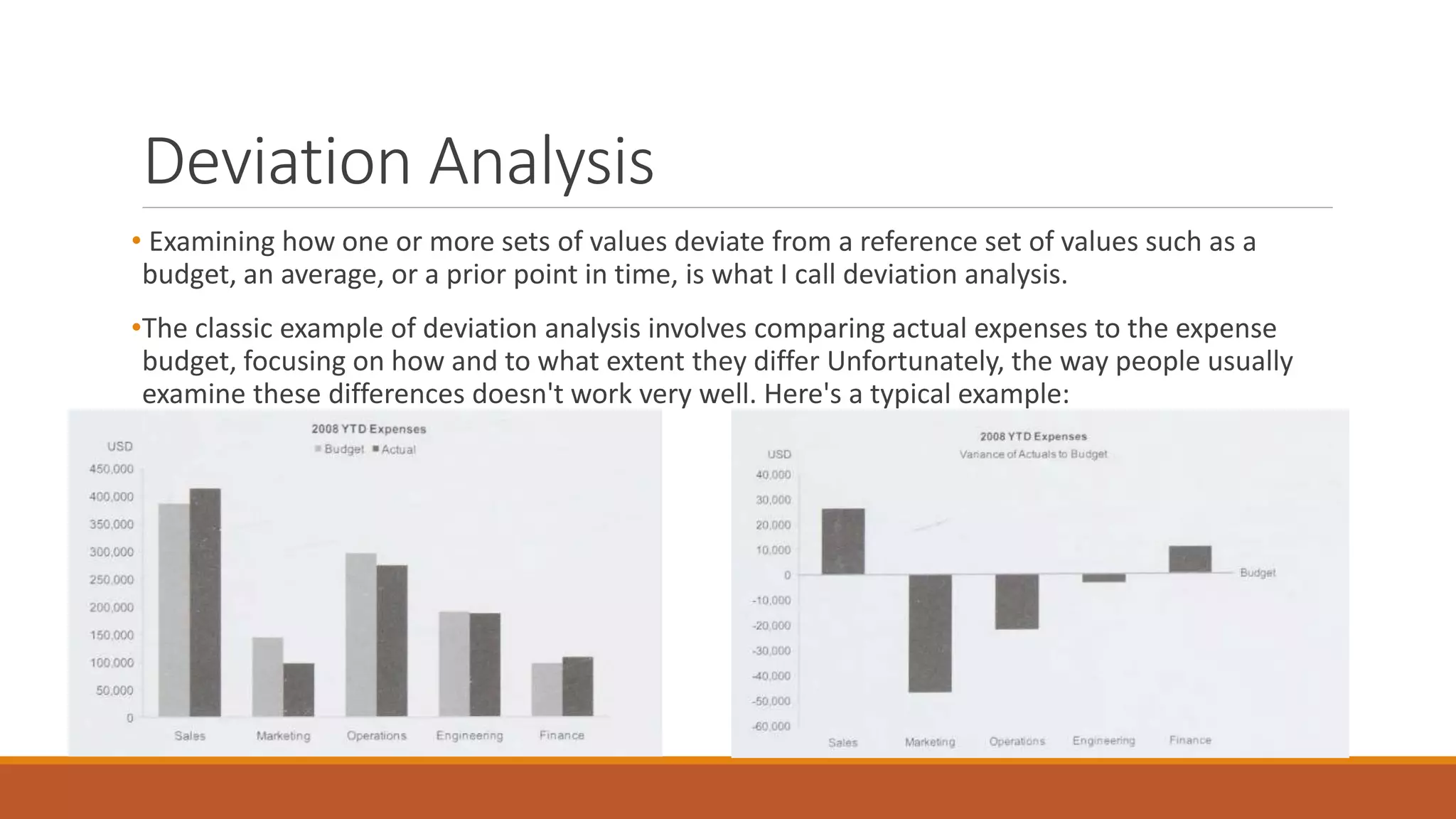
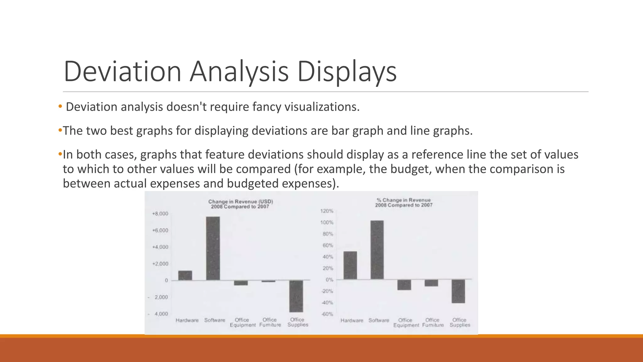
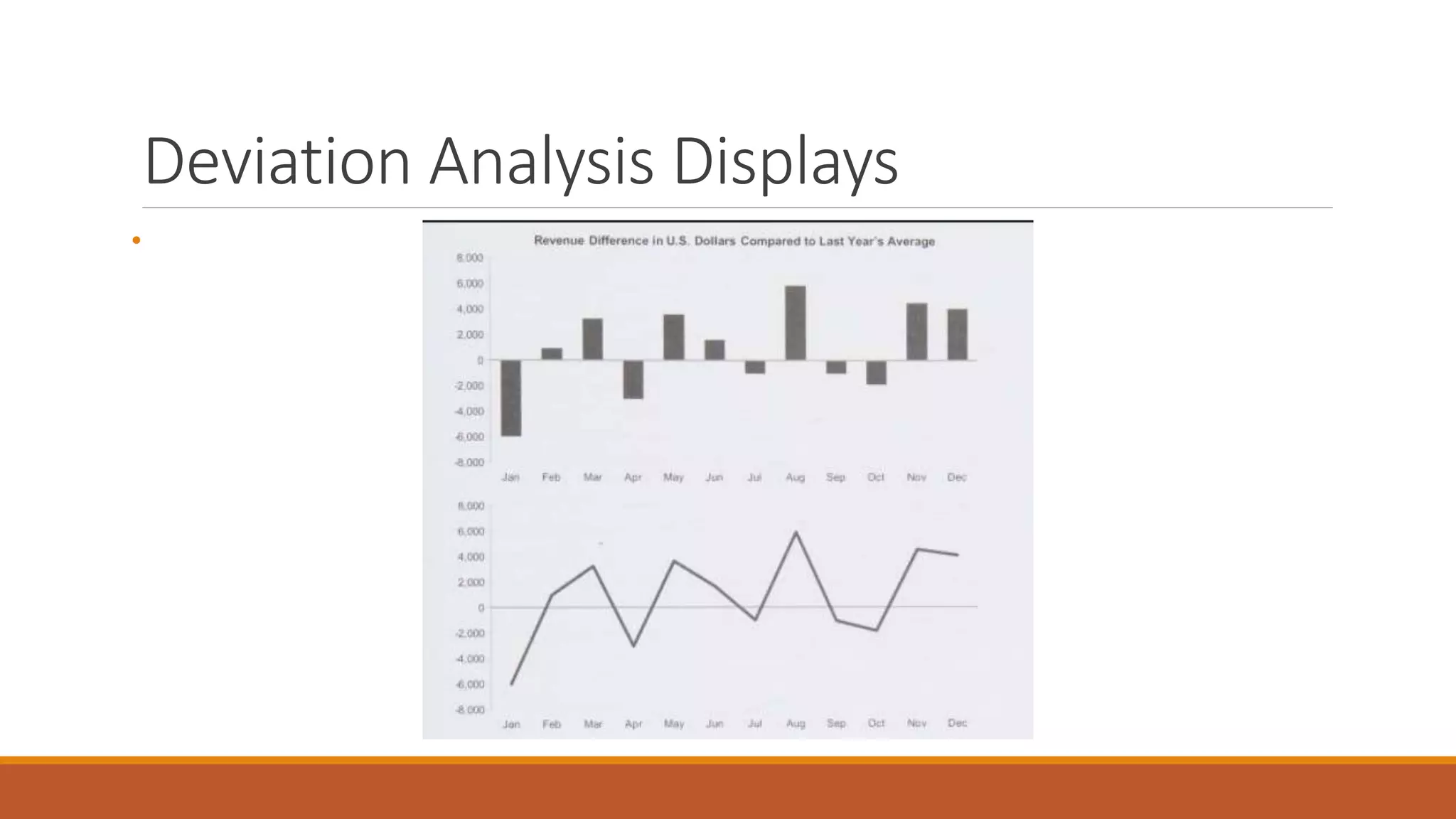
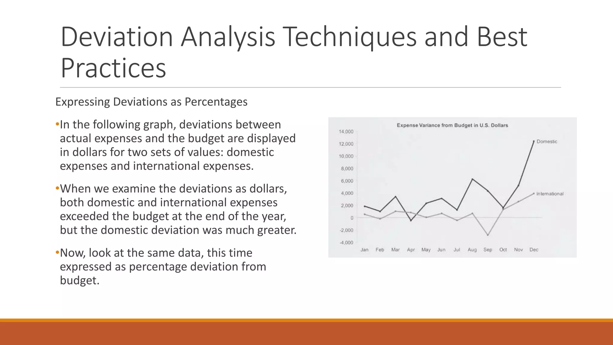
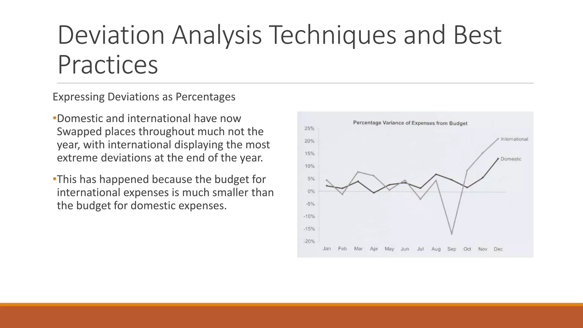
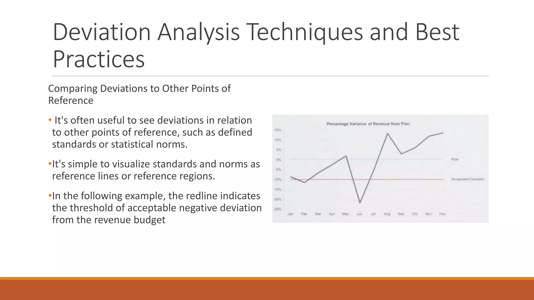
Unit 3: TIME-SERIES,
RANKING, AND
DEVIATION ANALYSIS
DR. V. NIRMALA
DEPARTMENT OF AI & DS
EASWARI ENGINEERING COLLEGE
Part-to-Whole and Ranking Analysis
Introduction
• Two of the most frequently performed and simplest types of analysis we do involve comparing parts of a whole and
ranking them by value.
• For instance when trying to make sense of total expenses (the whole), we often aggregate them by department (the
parts) to see how much each department adds to Overall expenses.
• Placing the departments in order based on expenses (from highest to lowest or vice versa), makes relative values
easier to compare. It’s remarkable how the minor act of sorting items by value simplifies the process of comparing
them.
• In the first example below, departments are arranged alphabetically, which forces us to rearrange them in our heads
to see how they rank-a difficult task because of the limits of working memory.
Part-to-Whole and Ranking Patterns
• When we examine ranked values, whether they
represent parts of a whole or not, the patterns
that concern us are formed by differences in
magnitude from one value to the next across the
entire series. These patterns, which are fairly
simple and limited in scope, include the
following:
Part-to-Whole and Ranking Displays
 Part-to-whole relationships are commonly displayed as
pie charts, This is unfortunate. Pie charts force us to
compare either the 2-D areas formed by each slices or
the angles formed by each where the slices meet in the
center.
 Visual perception handles neither of these comparisons
easily or accurately. If you had to put the slices of the
pie chart on the following page in order by size from
largest to smallest, or if you had to calculate the
difference in percentage between any two slices, notice
how much time it would take and how much you would
rely on rough estimates.
Part-to-Whole and Ranking Displays…
 Even when slices are labeled directly, we're still
disabled in our ability to estimate and compare their
sizes. You might be tempted to object, "This could be
solved by displaying the values as text next to each
slice," as illustrated below:
 But what's the point of using a graph-a visual
representation of the quantitative data-if we must rely
on printed values to make sense of it?
 If the graph doesn't reveal most of what we wish to see
directly and visually, without assistance from text, we
would be better off using the table
Part-to-Whole and Ranking Displays…
Bar Graphs
 Bar graphs are much more effective than pie charts for
analyzing ranking and part-to-whole relationships.
What is difficult to see and do using the previous pie
charts is easy using the following bar graph.
Part-to-Whole and Ranking Displays…
Dot Plots
 When all the values in a bar graph fall within a fairly
narrow range, and In the following graph, because all
the salaries are tightly grouped together between
S42,000 and S53,000, the differences between them
are harder to compare than they would be if these
values were spread across more space.
 We can't just narrow the scale to begin at 52,000,
because differences in the bars' lengths would no
longer accurately represent the differences in the
values. We can narrow the scale without creating this
problem, however, by switching to a dot plot. Here's
the same set of values with points in the form of a dot
plot:
Part-to-Whole and Ranking Techniques and
Best Practices
 We'll look at four techniques and best practices for part-to-whole and ranking analysis:
1. Grouping categorical items in an ad hoc manner
2. Using Pareto charts with percentile scales
3. Re-expressing values to solve quantitative scaling problems
4. Using line graphs to view ranking changes through time
Grouping Categorical Items in an Ad Hoc Manner
• It's helpful to work with information that has been segmented (grouped) in meaningful ways. A good data warehouse segments
data in the ways that are frequently useful, but it can never anticipate all of the groupings that we might need when we're
exploring and analyzing data.
• In the following example, I decided to take all the beverages that fall into the dessert category (on the left) and group them
together (on the right).
Part-to-Whole and Ranking Techniques and
Best Practices..
Using Pareto Charts with Percentile Scales
 Pareto charts can be useful even when the items we're comparing make up an interval scale rather than an ordinal scale of ranked
items.
 The following example, which features an interval scale (the sizes of orders from largest to Smallest, grouped into percentile intervals),
shows a type of graph that I’ve found quite revealing at times. Each interval represents a range of 10 percentage points, starting at the
left with the top 10% of orders ranked by size, proceeding to the next 10% of orders by size, and so on all the way to the 10% of orders
that were the smallest.
Part-to-Whole and Ranking Techniques and
Best Practices..
Re-expressing Values to Solve Quantitative Scaling Problems
When a set of ranked values extends across a vast scale, sometimes the
lowest values barely register on the graph and are, as a result, difficult to
see and compare.
Three re-expressions are particularly good at solving our scaling problem in
which the low values are hard to read on the large graph. Each type of re-
expression accomplishes this by stretching the low values out across more
space in the graph and compressing the high values into less space. They do
this to varying degrees. The following list is sequenced by the amount of
stretching and compression, from least to greatest:
• Square root re-expression
Logarithmic re-expression
• Inverse re-expression
Deviation Analysis
• Examining how one or more sets of values deviate from a reference set of values such as a
budget, an average, or a prior point in time, is what I call deviation analysis.
•The classic example of deviation analysis involves comparing actual expenses to the expense
budget, focusing on how and to what extent they differ Unfortunately, the way people usually
examine these differences doesn't work very well. Here's a typical example:
Deviation Analysis Displays
• Deviation analysis doesn't require fancy visualizations.
•The two best graphs for displaying deviations are bar graph and line graphs.
•In both cases, graphs that feature deviations should display as a reference line the set of values
to which to other values will be compared (for example, the budget, when the comparison is
between actual expenses and budgeted expenses).
Deviation Analysis Displays
•
Deviation Analysis Techniques and Best
Practices
Two practical techniques for squeezing the most from deviation analysis are worth knowing:
1. Expressing deviations as percentages
2. Comparing deviations to other points of reference
Expressing Deviations as Percentages
•In some of the examples that we've examined, deviations were expressed as percentages; in others,
deviations were expressed as units such as dollars or counts.
•It's important to recognize that expressing deviations as percentages versus other units of measure
can result in quite different pictures of what's going on. Both are useful, but we should know when to
use one rather than the other.
•One of the advantages of viewing deviations as percentages applies when comparing deviations of
more than one set of values because percentages normalize the data sets in a way that can make
comparisons easier.
Deviation Analysis Techniques and Best
Practices
Expressing Deviations as Percentages
•In the following graph, deviations between
actual expenses and the budget are displayed
in dollars for two sets of values: domestic
expenses and international expenses.
•When we examine the deviations as dollars,
both domestic and international expenses
exceeded the budget at the end of the year,
but the domestic deviation was much greater.
•Now, look at the same data, this time
expressed as percentage deviation from
budget.
Deviation Analysis Techniques and Best
Practices
Expressing Deviations as Percentages
•Domestic and international have now
Swapped places throughout much not the
year, with international displaying the most
extreme deviations at the end of the year.
•This has happened because the budget for
international expenses is much smaller than
the budget for domestic expenses.
Deviation Analysis Techniques and Best
Practices
Comparing Deviations to Other Points of
Reference
• It's often useful to see deviations in relation
to other points of reference, such as defined
standards or statistical norms.
•It's simple to visualize standards and norms as
reference lines or reference regions.
•In the following example, the redline indicates
the threshold of acceptable negative deviation
from the revenue budget

Unit 3 ppt.pptx

  • 1.
    Unit 3: TIME-SERIES, RANKING,AND DEVIATION ANALYSIS DR. V. NIRMALA DEPARTMENT OF AI & DS EASWARI ENGINEERING COLLEGE
  • 2.
    Part-to-Whole and RankingAnalysis Introduction • Two of the most frequently performed and simplest types of analysis we do involve comparing parts of a whole and ranking them by value. • For instance when trying to make sense of total expenses (the whole), we often aggregate them by department (the parts) to see how much each department adds to Overall expenses. • Placing the departments in order based on expenses (from highest to lowest or vice versa), makes relative values easier to compare. It’s remarkable how the minor act of sorting items by value simplifies the process of comparing them. • In the first example below, departments are arranged alphabetically, which forces us to rearrange them in our heads to see how they rank-a difficult task because of the limits of working memory.
  • 3.
    Part-to-Whole and RankingPatterns • When we examine ranked values, whether they represent parts of a whole or not, the patterns that concern us are formed by differences in magnitude from one value to the next across the entire series. These patterns, which are fairly simple and limited in scope, include the following:
  • 4.
    Part-to-Whole and RankingDisplays  Part-to-whole relationships are commonly displayed as pie charts, This is unfortunate. Pie charts force us to compare either the 2-D areas formed by each slices or the angles formed by each where the slices meet in the center.  Visual perception handles neither of these comparisons easily or accurately. If you had to put the slices of the pie chart on the following page in order by size from largest to smallest, or if you had to calculate the difference in percentage between any two slices, notice how much time it would take and how much you would rely on rough estimates.
  • 5.
    Part-to-Whole and RankingDisplays…  Even when slices are labeled directly, we're still disabled in our ability to estimate and compare their sizes. You might be tempted to object, "This could be solved by displaying the values as text next to each slice," as illustrated below:  But what's the point of using a graph-a visual representation of the quantitative data-if we must rely on printed values to make sense of it?  If the graph doesn't reveal most of what we wish to see directly and visually, without assistance from text, we would be better off using the table
  • 6.
    Part-to-Whole and RankingDisplays… Bar Graphs  Bar graphs are much more effective than pie charts for analyzing ranking and part-to-whole relationships. What is difficult to see and do using the previous pie charts is easy using the following bar graph.
  • 7.
    Part-to-Whole and RankingDisplays… Dot Plots  When all the values in a bar graph fall within a fairly narrow range, and In the following graph, because all the salaries are tightly grouped together between S42,000 and S53,000, the differences between them are harder to compare than they would be if these values were spread across more space.  We can't just narrow the scale to begin at 52,000, because differences in the bars' lengths would no longer accurately represent the differences in the values. We can narrow the scale without creating this problem, however, by switching to a dot plot. Here's the same set of values with points in the form of a dot plot:
  • 8.
    Part-to-Whole and RankingTechniques and Best Practices  We'll look at four techniques and best practices for part-to-whole and ranking analysis: 1. Grouping categorical items in an ad hoc manner 2. Using Pareto charts with percentile scales 3. Re-expressing values to solve quantitative scaling problems 4. Using line graphs to view ranking changes through time Grouping Categorical Items in an Ad Hoc Manner • It's helpful to work with information that has been segmented (grouped) in meaningful ways. A good data warehouse segments data in the ways that are frequently useful, but it can never anticipate all of the groupings that we might need when we're exploring and analyzing data. • In the following example, I decided to take all the beverages that fall into the dessert category (on the left) and group them together (on the right).
  • 9.
    Part-to-Whole and RankingTechniques and Best Practices.. Using Pareto Charts with Percentile Scales  Pareto charts can be useful even when the items we're comparing make up an interval scale rather than an ordinal scale of ranked items.  The following example, which features an interval scale (the sizes of orders from largest to Smallest, grouped into percentile intervals), shows a type of graph that I’ve found quite revealing at times. Each interval represents a range of 10 percentage points, starting at the left with the top 10% of orders ranked by size, proceeding to the next 10% of orders by size, and so on all the way to the 10% of orders that were the smallest.
  • 10.
    Part-to-Whole and RankingTechniques and Best Practices.. Re-expressing Values to Solve Quantitative Scaling Problems When a set of ranked values extends across a vast scale, sometimes the lowest values barely register on the graph and are, as a result, difficult to see and compare. Three re-expressions are particularly good at solving our scaling problem in which the low values are hard to read on the large graph. Each type of re- expression accomplishes this by stretching the low values out across more space in the graph and compressing the high values into less space. They do this to varying degrees. The following list is sequenced by the amount of stretching and compression, from least to greatest: • Square root re-expression Logarithmic re-expression • Inverse re-expression
  • 11.
    Deviation Analysis • Examininghow one or more sets of values deviate from a reference set of values such as a budget, an average, or a prior point in time, is what I call deviation analysis. •The classic example of deviation analysis involves comparing actual expenses to the expense budget, focusing on how and to what extent they differ Unfortunately, the way people usually examine these differences doesn't work very well. Here's a typical example:
  • 12.
    Deviation Analysis Displays •Deviation analysis doesn't require fancy visualizations. •The two best graphs for displaying deviations are bar graph and line graphs. •In both cases, graphs that feature deviations should display as a reference line the set of values to which to other values will be compared (for example, the budget, when the comparison is between actual expenses and budgeted expenses).
  • 13.
  • 14.
    Deviation Analysis Techniquesand Best Practices Two practical techniques for squeezing the most from deviation analysis are worth knowing: 1. Expressing deviations as percentages 2. Comparing deviations to other points of reference Expressing Deviations as Percentages •In some of the examples that we've examined, deviations were expressed as percentages; in others, deviations were expressed as units such as dollars or counts. •It's important to recognize that expressing deviations as percentages versus other units of measure can result in quite different pictures of what's going on. Both are useful, but we should know when to use one rather than the other. •One of the advantages of viewing deviations as percentages applies when comparing deviations of more than one set of values because percentages normalize the data sets in a way that can make comparisons easier.
  • 15.
    Deviation Analysis Techniquesand Best Practices Expressing Deviations as Percentages •In the following graph, deviations between actual expenses and the budget are displayed in dollars for two sets of values: domestic expenses and international expenses. •When we examine the deviations as dollars, both domestic and international expenses exceeded the budget at the end of the year, but the domestic deviation was much greater. •Now, look at the same data, this time expressed as percentage deviation from budget.
  • 16.
    Deviation Analysis Techniquesand Best Practices Expressing Deviations as Percentages •Domestic and international have now Swapped places throughout much not the year, with international displaying the most extreme deviations at the end of the year. •This has happened because the budget for international expenses is much smaller than the budget for domestic expenses.
  • 17.
    Deviation Analysis Techniquesand Best Practices Comparing Deviations to Other Points of Reference • It's often useful to see deviations in relation to other points of reference, such as defined standards or statistical norms. •It's simple to visualize standards and norms as reference lines or reference regions. •In the following example, the redline indicates the threshold of acceptable negative deviation from the revenue budget