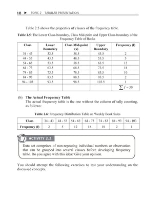
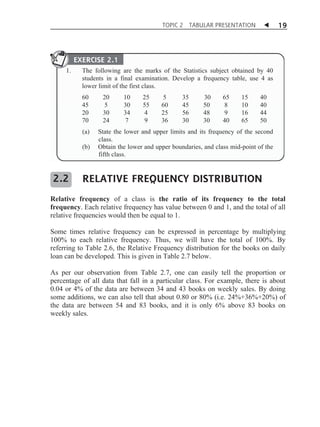
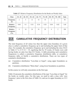
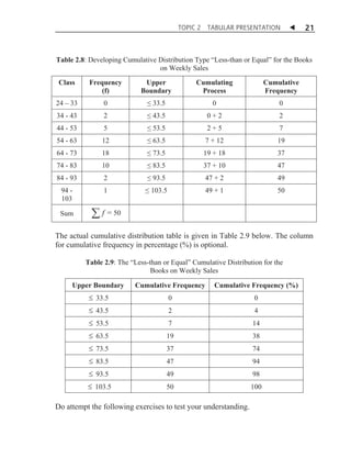
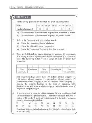
1. The document discusses different types of tabular presentations of data, including frequency distribution tables, relative frequency distribution tables, and cumulative frequency distribution tables.
2. It provides examples of how to construct each type of table using sample data on weekly book sales by a book store. Frequency tables involve grouping the data into classes and counting the frequency in each class.
3. Relative frequency tables show the proportion or percentage of the total data that falls into each class. Cumulative frequency tables show the running total frequency up to and including the upper limit of each class.
Classify data into Qualitative and Quantitative data.
Scales of Measurement in Statistics.
Nominal, Ordinal, Ratio and Interval
Prepare table or continuous frequency distribution.
lesson 3 presentation of data and frequency distributionNerz Baldres
This document provides an overview of key concepts for presenting data and constructing frequency distributions. It defines different methods for presenting data including textual, tabular, and graphical forms. Tabular methods include components like table headings and stubs. Graphical methods are shown like bar graphs, line graphs, and pie charts. Frequency distributions arrange data by class intervals and calculate frequencies. Terms are defined for range, class interval, and cumulative and relative frequency. Examples demonstrate how to construct frequency distributions and calculate cumulative and relative frequencies.
Taking of a measurement and the process of counting yield numbers that contain information. The objective of a person applying the tools of statistics to these numbers is to determine the nature of this information.
This task is made much easier if the numbers are organized and summarized.
Even quite small data sets are difficult to understand without some summarization. Statistical quantities such as the mean and variance can be extremely helpful in summarizing data but first we discuss tabular and graphical summaries.
There are several ways to present a statistical data like;
Frequency table
Simple bar diagrams
Multiple Bar Diagrams
Histogram
Frequency Polygon etc.
Steam and Leaf plots
Pie Charts
A frequency distribution is a tabular arrangement of data in which various items are arranged into classes or groups and the number of items falling in each class is stated.
The number of observations falling in a particular class is referred to as class frequency and is denoted by "f".
In frequency distribution all the values falling in a class are assumed to be equal to the midpoint of that class.
Data presented in the form of a frequency distribution is also called grouped data. A frequency distribution table contains a condensed summary of the original data.
There are two types of frequency distribution i) Simple Frequency distribution ) ii) Grouped Frequency distribution.
This document provides an overview of methods for presenting data, including textual, tabular, and graphical methods. It discusses topics such as ungrouped vs. grouped data, frequency distribution tables, stem-and-leaf plots, class boundaries, class midpoints, and class width. The objectives are to describe how to prepare a stem-and-leaf plot, describe data textually, construct a frequency distribution table, create graphs, and interpret graphs and tables. Examples are provided to illustrate these concepts and methods.
Presentation of Data and Frequency DistributionElain Cruz
The document discusses the key components of statistical tables including the table heading, body, stub, box head, footnotes, and source of data. It provides an example of a statistical table showing the enrolment profile of a college by subject with the number and percentage of students. The document also includes examples of different types of graphs that can be used to display statistical data like bar graphs, line graphs, pie charts, and pictographs.
This document discusses different methods for presenting data, including textual, tabular, and graphical presentations. Tabular presentations include frequency distribution tables that are ungrouped, grouped, simple, and complete. Graphical presentations include bar charts, histograms, frequency polygons, pie charts, and pictographs to visually depict quantitative data using bars, rectangles, lines, circles, or pictures. The examples provided demonstrate how to construct different types of tables and graphs for a set of sample data.
Here are the steps to solve this problem:
1. Prepare the frequency distribution table with the class intervals, frequencies, and calculate fX.
2. Find the mean (x) using the formula x = fX/f.
3. Calculate the deviations (X - x).
4. Square the deviations to get (X - x)2.
5. Multiply the frequencies and squared deviations to get f(X - x)2.
6. Calculate the variance using the formula σ2 = f(X - x)2 / (f - 1).
7. Take the square root of the variance to get the standard deviation.
8. The range is the difference between the upper
This document discusses frequency distributions and how to construct them from raw data. It provides examples of creating stem-and-leaf displays, frequency tables, relative frequency tables, and cumulative frequency tables from various data sets. Key concepts covered include class width, class boundaries, tallying data, and calculating relative frequencies and percentages. Overall, the document serves as a tutorial on how to organize and summarize data using various types of frequency distributions.
This document provides information about frequency distributions and constructing frequency distribution tables. It defines a frequency distribution as a representation of data in a tabular format showing the number of observations within intervals. It then outlines the general process for constructing a frequency table which includes determining the range, number of classes, class width, and recording the frequencies in a table. An example is provided of constructing a frequency table from data on the ages of 50 men who died from gunfire using 7 classes. Guidelines for constructing frequency tables are also listed.
The document discusses different methods for presenting data, including textual or narrative presentation, tabular presentation, and graphical presentation. It provides details on constructing frequency distribution tables, including identifying the range and number of classes, calculating class size, and tallying data. Frequency distribution tables show the distribution of data values and can include additional details like class marks, relative frequencies, and cumulative frequencies. Bar graphs are also discussed as a way to visually present the data in a frequency distribution table.
This document discusses key concepts in constructing a frequency distribution from raw data. It defines a frequency distribution as a tabular arrangement of data grouped into classes with the number of observations in each class stated. It describes how to determine the number of classes, class intervals, class limits, boundaries and midpoints to properly group the data. An example is provided to demonstrate how to construct a frequency distribution table from a set of raw plant height data by distributing the observations into the appropriate classes.
This document discusses measures of central tendency (mean, median, mode) and measures of spread (range, variance, standard deviation). It provides formulas and examples to calculate each measure. It also presents two problems, asking to calculate and compare various descriptive statistics for different data sets, such as milk yields from two cow herds and weaning weights of lambs from two breeds. A third problem asks to analyze and compare price data for rice from two markets.
This document discusses frequency distribution, which is a tabular arrangement that shows the frequency of different variable values. It organizes disorganized data into classes or intervals and summarizes the distribution. A frequency distribution specifies the class intervals or boundaries, class marks or midpoints, and class frequencies or number of observations in each interval. It is used to rank and organize data. The document then provides an example problem of constructing a frequency distribution table for the weights of 50 boys using 8 equal class intervals, and calculating the class boundaries and midpoints.
This section expands on frequency distributions by discussing additional features: midpoints, which are the averages of class limits; relative frequency, which shows what portion of the data falls in each class; and cumulative frequency, which is the running total of all previous classes' frequencies. It provides an example calculating these values for a given
The document provides instructions for organizing raw data into a frequency distribution table and describes different ways to represent the distribution graphically, including histograms, frequency polygons, and cumulative frequency curves. It explains how to calculate class intervals and frequencies from raw data and construct tables showing the distribution. It also discusses representing the same data through vertical bar graphs, line graphs connecting class points, and curves showing cumulative frequencies below given values.
2.1 frequency distributions, histograms, and related topicsleblance
The document discusses frequency distributions and related topics such as histograms and ogives. It explains how to construct a frequency table by determining classes, tallying data, calculating frequencies and relative frequencies, and finding class boundaries and midpoints. It then describes how to make histograms and relative frequency histograms based on the frequency table. Finally, it discusses different distribution shapes that histograms may take on such as mound-shaped, uniform, skewed, bimodal, and outliers, as well as how to make an ogive graph of cumulative frequencies.
1) The document discusses various measures of central tendency including mean, median, and mode for grouped and ungrouped data. It provides formulas to calculate mean, median, and mode for different data sets.
2) Formulas are given to find the mean, median, and mode of grouped data using class boundaries and frequencies. The direct method and assumed mean method for calculating the mean of grouped data are described.
3) Relationships between mean, median and mode are discussed. The document also covers topics like cumulative frequency, modal class, and finding measures of central tendency for discrete data series.
Excel tutorial for frequency distributionS.c. Chopra
This document provides a step-by-step tutorial for creating a frequency distribution table in Excel. It explains how to:
1. Prepare the data by naming columns and creating a "FreqDist" sheet.
2. Fill out a template table with parameters like number of observations, class interval, and minimum/maximum values.
3. Use formulas to determine values like class limits, frequencies, and cumulative percentages.
4. Copy formulas down to automatically generate the full distribution table.
The tutorial demonstrates an easy way to analyze numeric data sets in Excel by creating frequency distributions.
The median is the middle value when values are ordered from lowest to highest. It divides the data set such that half the values are lower than the median and half are higher. For an even number of values, the median is the average of the two middle values. The mode is the most frequently occurring value. It indicates the most common result. Both the median and mode are less influenced by outliers than the mean. They provide a more representative central value for skewed or irregularly distributed data sets.
This document discusses measures of central tendency including mean, median, and mode. It provides definitions and formulas for calculating these measures from individual data series, discrete series, and continuous series. For mean, it describes both direct and shortcut methods for different data types. For median, it explains how to calculate it from individual and discrete series when the number of observations is odd or even. For mode, it gives methods to determine the modal value from individual and discrete series through inspection or tallying frequencies. Examples of calculations are also included.
The document provides a summary of various machine learning algorithms and their key features:
- K-nearest neighbors is interpretable, handles small data well but not noise, with no automatic feature learning. Prediction and training are fast.
- Linear regression is interpretable, handles small data and irrelevant features well, with fast prediction and training but requires feature scaling.
- Decision trees are somewhat interpretable with average accuracy, handling small data and irrelevant features depending on algorithm. Prediction and training speed varies by algorithm.
- Random forests have less interpretability than decision trees but higher accuracy, handling small data and noise better depending on settings. Prediction and training speed varies.
- Neural networks generally have the lowest interpretability but can automatically
MEASURES OF DISPERSION OF UNGROUPED DATAMISS ESTHER
This document contains 7 math problems involving statistical concepts like range, interquartile range, mean, variance, standard deviation, box plots, stem-and-leaf diagrams, and manipulating data sets. The problems cover finding measures of central tendency and dispersion for various data sets, comparing data visually using box plots, determining how changing data values affects statistical properties, and justifying which measures of dispersion to use for a given data set.
This document summarizes Chapter 2 of a statistics textbook. It covers descriptive statistics including frequency distributions, graphs of distributions, measures of central tendency, variation, and position. Section 2.1 discusses constructing frequency distributions and graphs including histograms, polygons, relative histograms, and ogives. Examples are provided to demonstrate how to construct these graphs from sample data on internet usage times. Key steps include determining class widths, limits, frequencies, midpoints, boundaries, and plotting the graphs.
The document discusses the steps to construct a frequency distribution table (FDT):
1. Find the range and number of classes or intervals.
2. Estimate the class width and list the lower and upper class limits.
3. Tally the observations in each interval and record the frequencies.
It also describes how to calculate relative frequencies and cumulative frequencies to vary the FDT.
A frequency distribution arranges data into classes and shows the number of observations in each class. It displays grouped data with the class boundaries, midpoints, frequencies, and cumulative frequencies. To construct a frequency distribution, the number of classes is determined, the class interval size is calculated, and the data is distributed into the appropriate classes. The frequency distribution provides an organized summary of the data in a table.
This document discusses various methods for presenting data, including tabular form, arrays, simple tables, frequency distributions, and stem-and-leaf displays. It provides examples and tasks to practice each method. Specifically, it discusses how to construct frequency distributions and stem-and-leaf displays, including how to determine class limits, boundaries, widths, and marks. The goal is to organize and present data in a meaningful way that allows for easy interpretation and analysis.
This document discusses frequency distributions and methods for graphically presenting frequency distribution data. It defines a frequency distribution as a tabulation or grouping of data into categories showing the number of observations in each group. The document outlines the parts of a frequency table as class limits, class size, class boundaries, and class marks. It then provides steps for constructing a frequency distribution table from a set of data. Finally, it discusses histograms and frequency polygons as methods for graphically presenting frequency distribution data, and provides examples of how to construct these graphs in Excel.
The document discusses various methods for organizing and presenting quantitative data, including classification, tabulation, frequency distribution, and bar and pie charts. Classification involves sorting data into categories based on one or more criteria. Tabulation is the systematic arrangement of classified data into rows and columns. A frequency distribution shows how many observations fall into each class or category. Additional terms defined include class limits, boundaries, marks, and intervals which describe the ranges and separations of classes. Bar and pie charts are then introduced as visual ways to display categorical data, with an example using Titanic passenger data.
The document discusses organizing and presenting data through descriptive statistics. It covers types of data, constructing frequency distribution tables, calculating relative frequencies and percentages, and using graphical methods like bar graphs, pie charts, histograms and polygons to summarize categorical and quantitative data. Examples are provided to demonstrate how to organize data into frequency distributions and calculate relative frequencies to graph the results.
This document discusses methods for organizing and presenting data through frequency tables, distributions, and graphs. It covers creating frequency tables to organize qualitative and quantitative data. Frequency distributions group quantitative data into classes with class limits, frequencies, and midpoints. These distributions can be presented as histograms, frequency polygons, or cumulative frequency distributions. The document provides an example using data on vehicle selling prices to demonstrate constructing a frequency table and distribution, calculating relative frequencies, and graphing the results as a histogram.
stats_chap02_notes(L2,3,4) frequency distributionvisnuthemarvel06
This chapter discusses organizing and representing data graphically through frequency distributions, histograms, frequency polygons, and other graphs. It covers how to organize raw data into categorical and grouped frequency distributions by placing data into classes and recording frequencies. Histograms represent frequency distributions using vertical bars to show frequencies of classes, while frequency polygons use points and line segments to connect the midpoints of classes based on frequencies. The chapter objectives are to organize data using frequency distributions, represent distributions graphically, interpret stem-and-leaf plots, and interpret scatter plots for paired data.
This document discusses methods for summarizing data, including frequency distributions, measures of central tendency, and measures of dispersion. It provides examples and formulas for constructing frequency distributions and calculating the mean, median, mode, range, variance, and standard deviation. Key points covered include using frequency distributions to group data, calculating central tendency measures for grouped data, and methods for measuring dispersion both for raw data and grouped data.
This document discusses methods for organizing and presenting data through frequency tables, distributions, and graphs. It covers:
- Creating frequency tables to organize qualitative and quantitative data
- Presenting frequency tables as bar charts or pie charts
- Organizing quantitative data into a frequency distribution by grouping it into classes and counting observations in each class
- Graphically presenting frequency distributions as histograms, frequency polygons, or cumulative frequency distributions
This document discusses methods for organizing and presenting data through frequency tables, distributions, and graphs. It covers:
- Creating frequency tables to organize qualitative and quantitative data by grouping it into categories and counting observations in each.
- Presenting frequency tables visually through bar charts and pie charts.
- Forming frequency distributions by dividing a range of quantitative data into class intervals and counting observations in each.
- Graphically displaying frequency distributions through histograms, which use bars to show class frequencies, and frequency polygons, which connect class midpoints and frequencies with line segments.
#2 Classification and tabulation of dataKawita Bhatt
The placement of data in different homogenous groups formed on the basis of some characteristics or criteria is called classification. The Table is a systematic arrangement of data in rows and/or column. Here, few basic concepts of classification and tabulation such as class interval, variable, frequency, frequency distribution and cumulative frequency distribution have been explained in a nutshell. This presentation also deals with the basic guidelines for preparing a table. Any suggestion and query are welcomed please drop them in the comments.
This document discusses different types of graphs and distributions that can be used to organize and represent data. It explains frequency distributions, histograms, frequency polygons, ogives, relative frequency graphs, Pareto charts, time series graphs, pie charts, and stem-and-leaf plots. Rules for constructing frequency distributions and examples of each type of graph are provided.
This document discusses different types of graphs and distributions that can be used to organize and represent data. It covers frequency distributions, histograms, frequency polygons, ogives, relative frequency graphs, Pareto charts, time series graphs, pie charts, and stem-and-leaf plots. Rules for constructing frequency distributions are provided, such as having between 5-20 classes and equal class widths. Examples are given to illustrate each type of graph or distribution.
The document discusses methods for organizing and presenting both qualitative and quantitative data, including frequency tables, bar charts, pie charts, and different types of frequency distributions. It provides examples of how to construct a frequency table by determining the number of classes, class intervals, and class limits based on a set of data. It also describes how to create histograms, frequency polygons, and cumulative frequency distributions to graphically display a frequency distribution and highlights key terms such as class frequency, class interval, and relative frequency.
This document discusses key concepts in statistics including descriptive and inferential statistics, populations and samples, variables, and methods of collecting and presenting data. Specifically, it defines statistics, the two main types (descriptive and inferential), populations as all elements studied and samples as subsets of populations. It also outlines common variable types, methods of collecting data, different sampling techniques, how to construct frequency distributions and cumulative frequency distributions for qualitative and quantitative variables, and how to present data using bar charts and histograms.
The document discusses frequency distribution tables, including how to construct them from raw data by grouping data into classes of equal intervals and determining the frequency of observations within each class. Key aspects covered include determining class limits, boundaries, frequencies, widths, and cumulative frequencies. Examples are provided to demonstrate how to build a frequency distribution table and corresponding graphical representations like histograms, frequency polygons, and ogives from sets of data.
This document discusses frequency distribution and methods for presenting grouped data. It defines key terms like class interval, class frequency, and class midpoint. It also provides steps for constructing a frequency distribution, including determining the number of classes and class interval. Examples are given to illustrate a frequency distribution table, relative frequency distribution, and different types of graphs - histograms, frequency polygons, cumulative frequency curves, line graphs, bar charts and pie charts - that can be used to present grouped quantitative data.
Elevate Your Nonprofit's Online Presence_ A Guide to Effective SEO Strategies...TechSoup
Whether you're new to SEO or looking to refine your existing strategies, this webinar will provide you with actionable insights and practical tips to elevate your nonprofit's online presence.
Temple of Asclepius in Thrace. Excavation resultsKrassimira Luka
The temple and the sanctuary around were dedicated to Asklepios Zmidrenus. This name has been known since 1875 when an inscription dedicated to him was discovered in Rome. The inscription is dated in 227 AD and was left by soldiers originating from the city of Philippopolis (modern Plovdiv).
Level 3 NCEA - NZ: A Nation In the Making 1872 - 1900 SML.pptHenry Hollis
The History of NZ 1870-1900.
Making of a Nation.
From the NZ Wars to Liberals,
Richard Seddon, George Grey,
Social Laboratory, New Zealand,
Confiscations, Kotahitanga, Kingitanga, Parliament, Suffrage, Repudiation, Economic Change, Agriculture, Gold Mining, Timber, Flax, Sheep, Dairying,
A Visual Guide to 1 Samuel | A Tale of Two HeartsSteve Thomason
These slides walk through the story of 1 Samuel. Samuel is the last judge of Israel. The people reject God and want a king. Saul is anointed as the first king, but he is not a good king. David, the shepherd boy is anointed and Saul is envious of him. David shows honor while Saul continues to self destruct.
Andreas Schleicher presents PISA 2022 Volume III - Creative Thinking - 18 Jun...EduSkills OECD
Andreas Schleicher, Director of Education and Skills at the OECD presents at the launch of PISA 2022 Volume III - Creative Minds, Creative Schools on 18 June 2024.
Gender and Mental Health - Counselling and Family Therapy Applications and In...PsychoTech Services
A proprietary approach developed by bringing together the best of learning theories from Psychology, design principles from the world of visualization, and pedagogical methods from over a decade of training experience, that enables you to: Learn better, faster!
This presentation was provided by Rebecca Benner, Ph.D., of the American Society of Anesthesiologists, for the second session of NISO's 2024 Training Series "DEIA in the Scholarly Landscape." Session Two: 'Expanding Pathways to Publishing Careers,' was held June 13, 2024.
Philippine Edukasyong Pantahanan at Pangkabuhayan (EPP) CurriculumMJDuyan
(𝐓𝐋𝐄 𝟏𝟎𝟎) (𝐋𝐞𝐬𝐬𝐨𝐧 𝟏)-𝐏𝐫𝐞𝐥𝐢𝐦𝐬
𝐃𝐢𝐬𝐜𝐮𝐬𝐬 𝐭𝐡𝐞 𝐄𝐏𝐏 𝐂𝐮𝐫𝐫𝐢𝐜𝐮𝐥𝐮𝐦 𝐢𝐧 𝐭𝐡𝐞 𝐏𝐡𝐢𝐥𝐢𝐩𝐩𝐢𝐧𝐞𝐬:
- Understand the goals and objectives of the Edukasyong Pantahanan at Pangkabuhayan (EPP) curriculum, recognizing its importance in fostering practical life skills and values among students. Students will also be able to identify the key components and subjects covered, such as agriculture, home economics, industrial arts, and information and communication technology.
𝐄𝐱𝐩𝐥𝐚𝐢𝐧 𝐭𝐡𝐞 𝐍𝐚𝐭𝐮𝐫𝐞 𝐚𝐧𝐝 𝐒𝐜𝐨𝐩𝐞 𝐨𝐟 𝐚𝐧 𝐄𝐧𝐭𝐫𝐞𝐩𝐫𝐞𝐧𝐞𝐮𝐫:
-Define entrepreneurship, distinguishing it from general business activities by emphasizing its focus on innovation, risk-taking, and value creation. Students will describe the characteristics and traits of successful entrepreneurs, including their roles and responsibilities, and discuss the broader economic and social impacts of entrepreneurial activities on both local and global scales.
Leveraging Generative AI to Drive Nonprofit InnovationTechSoup
In this webinar, participants learned how to utilize Generative AI to streamline operations and elevate member engagement. Amazon Web Service experts provided a customer specific use cases and dived into low/no-code tools that are quick and easy to deploy through Amazon Web Service (AWS.)
Leveraging Generative AI to Drive Nonprofit Innovation
Topic 2 tabular presentation
1. Topic
X
2
Tabular
Presentation
LEARNING OUTCOMES
By the end of this topic, you should be able to:
1. Develop frequency distribution table;
2. Formulate relative frequency distribution table; and
3. Prepare cumulative frequency distribution table.
X
INTRODUCTION
You have been introduced to various types of data in Topic 1. In this topic, we
will learn how to present data in tabular form to help us to make a further study on
the property of data distribution namely Frequency Distribution Table, Relative
Frequency Distribution and Cumulative Frequency Distribution. This tabular
presentation is suitable for all types of data. The tabular form is much easier to
understand and for qualitative variable, one can make a quick comparison
between categorical values. Another advantage is that the information lost during
the tabular formation can be reduced.
2. 12 X
2.1
TOPIC 2
TABULAR PRESENTATION
FREQUENCY DISTRIBUTION TABLE
Table 2.1 below is an example of Frequency Distribution Table of qualitative
variable (ethnicity). The first row shows the categorical values of the variable and
the second row is the frequency of each categorical value. The second row tells us
how a total of 550 students are distributed with respect to the respected
categorical value. We can see that 245 students are Malays, 182 students are
Chinese and so on.
Table 2.1: Frequency Distribution of students by Ethnicity in School J.
Ethnic
Background
(x)
Malay
Chinese
Indian
Others
Total
Frequency (f)
245
182
84
39
550
Quantitative data involving large numbers may be divided into several nonoverlapping classes or intervals. The frequency of each class will be developed by
counting the data falling in each respective class.
Table 2.2 shows Frequency Distribution of monthly family income of student’s at
School J. The first row shows the group classes of the income, and the second row
is the frequency (the number of students) whose monthly family income falls for
each respective class of each categorical value. The second row again tells us how
the 550 students are distributed into the respective classes. There are 98 of the 550
students whose families have monthly income between RM0 – 1,000. There are
152 families having income in the interval 1,001-2,000 etc.
Table 2.2: Frequency Distribution of Family Income of Students at School J.
Monthly
Income (RM x)
0 - 1000
1001 2000
2001 3000
3001 4000
4001 5000
Total
Frequency (f)
98
152
100
180
20
550
(a)
Developing Frequency Distribution Table of Quantitative Data
Let us again examine Table 2.2. Each class consists of lower limit and upper
limit separated by a hyphen ‘-’. For example, the second class has a lower
limit RM1001, and upper limit RM2000, where as the fifth class has a lower
limit RM4001 and upper limit RM5000. By looking at the upper limit of a
3. TOPIC 2
TABULAR PRESENTATION
13
W
class and the lower limit of its following class, it is clear that there are no
two adjacent classes overlapping each other.
This property is very important in developing a frequency table, to avoid
double counting of any data when obtaining the frequency of each class.
Another property is any two adjacent classes are separated by a middle point
called class boundary. Thus, each class will also have a lower and an upper
boundary. Let us now develop Frequency Distribution Table of books sold
weekly by a book store given in Table 2.3 below.
Table 2.3: Number of Books Sold Weekly for 50 Weeks by a Book Store
35
65
65
70
74
75
70
62
50
62
65
66
78
70
45
62
60
80
72
52
68
72
47
55
55
55
95
70
55
68
66
85
68
60
82
60
66
90
56
80
62
70
40
48
75
80
68
72
75
75
ACTIVITY 2.1
Refer to Table 2.3. Are these data discrete or not? Justify your
answer.
(i)
The Number of Classes
The followings are some guides to determine the number of classes:
x
The total number of classes in a distribution table should not be too
little or too large or otherwise it will distort the original shape of
data distribution. Usually one can choose any number between 5
classes to 15 classes.
x
Depending on the size of the data, sometimes the distribution
becomes too flat if one chooses more than 15 classes, or become
too peak if we choose less than 5 classes.
x
However, the following empirical formula (2.1) can be used to
determine the approximate number of classes (K) for a given n
number of observations.
K | 1 3.3 log(n)
(2.1)
4. 14 X
TOPIC 2
TABULAR PRESENTATION
For the books on weekly sale, we have
K | 1 + 3.3 log (50) = 6.6
x
(ii)
As it is an approximation, one can choose any close integer to the
above value. In this example we would choose integer 6 as the
approximate number of classes.
Class Width and Class Limits
x
Class width can differ from one class to another. Usually, the same
class width for all classes is recommended when developing
frequency distribution table.
x
The following empirical formula (2.2) can be used to determine the
approximate class width;
Class Width
Data Range
Number of class( K )
(2.2)
(iii) Data Range
x
Range is the difference between the largest and smallest
observation values.
x
For the books on weekly sales as shown in Table 2.3, the class
width will be;
ClassWidth
largest number smallest number
K
95 35
10 books
6
x
Since the data is discrete, it is wise to choose a round figure fairly
close to the approximate value (if necessary).
x
For the above data, we choose 10 books as the class width or class
interval.
5. TOPIC 2
TABULAR PRESENTATION
W
15
(iv) Limits of Each Class
The simple rules below are noted when one seek class limits for each
class interval:
x
Identify the smallest as well as the largest data.
x
All data must be enclosed between the lower limit of the first class
and the upper limit of the final class.
x
The smallest data should be within the first class. Thus the lower
limit of the first class can be any number less than or equal the
smallest data.
x
In the case of the same class width for all classes, the lower limit of
a current class is equal to the lower limit of its previous class plus
class width. We can proceed this way to build up the entire classes
until all data are counted.
x
Tallying process is normally used to count data that falls in each
class, this count become the frequency of each class.
For the data books on weekly sales, let 34 be the lower limit of the first
class, then the lower limit of the second class is 44 (i.e. 34 + 10, the
lower limit of the first class is incremented by class width to obtain the
lower limit of the second class); and the lower limit of the third class
will be 54 and so on until we get the lower limit of the final class as 94
(i.e. 84+10).
On the other hand, the upper limit of the first class is 43 (just 1 unit less
than lower limit of the second class). We can build the upper limits of all
classes in the same manner. Eventually, we will have the classes as: 3443, 44-53, 54-63, 64-73, 74-83, 84-93, and 94-103. We notice that the
actual number of classes developed is 7 which is greater than the round up
integer of the original calculated value K.
(v)
Frequency of Each Class
The following process is recommended to determine the frequency of
each class:
x
The tally counting method is the easiest way to determine the
frequency of each class from the given set of data.
x
Begins with the first number in the data set, search which class the
number will fall, then strike “1 vertical bar or stroke” for that
6. 16 X
TOPIC 2
TABULAR PRESENTATION
particular class. If the second number would fall into the same
class, then we have the second stroke for that class, and so on.
x
Once we have four strokes for a class, the fifth stroke will be used
as a back-stroke to tie up the immediate first four strokes and make
one ‘bundle’. So one ‘bundle’ will comprise of 5 strokes
altogether.
x
The process of searching class for each data is continued until we
cover all data.
x
As one stroke to represent one data, therefore a bundle will
represent 5 data fall into the class.
x
By counting the bundles will make the counting process much
easier. There may be several ‘bundles’ and or strokes for a class.
x
The total number of strokes will be the frequency for that class.
x
The total frequency for all classes will then be equal to the total
number of data in the sample.
x
The counting process for books on weekly sales is given in Table
2.4 below:
Table 2.4: Frequency Distribution of Books on Weekly Sales
Class
Counting Tally
Frequency (f)
34 - 43
ll
2
44 - 53
llll
5
54 - 63
llll llll ll
12
64 - 73
llll llll llll lll
18
74 - 83
llll llll
10
84 - 93
ll
2
94 - 103
l
1
Sum
¦ f = 50
(vi) Class Boundaries and Class Mid-points
x
Any two adjacent classes are separated by a middle point called
class boundary. It is a mid-point between the lower limit of a class
and the upper limit of its previous class.
x
This separation will ensure the non-overlapping between any two
adjacent classes.
8. 18 X
TOPIC 2
TABULAR PRESENTATION
Table 2.5 shows the properties of classes of the frequency table.
Table 2.5: The Lower Class-boundary, Class Mid-point and Upper Class-boundary of the
Frequency Table of Books
Class
Lower
Boundary
33.5
43.5
53.5
63.5
73.5
83.5
93.5
34 - 43
44 - 53
54 - 63
64 - 73
74 - 83
84 - 93
94 - 103
Class Mid-point
(x)
38.5
48.5
58.5
68.5
78.5
88.5
98.5
Upper
Boundary
43.5
53.5
63.5
73.5
83.5
93.5
103.5
Frequency (f)
2
5
12
18
10
2
1
¦ f = 50
(b) The Actual Frequency Table
The actual frequency table is the one without the column of tally counting,
as follows:
Table 2.6: Frequency Distribution Table on Weekly Book Sales
Class
34 - 43
44 - 53
54 - 63
64 - 73
74 - 83
84 - 93
94 - 103
Frequency (f)
2
5
12
18
10
2
1
ACTIVITY 2.2
Data set comprises of non-repeating individual numbers or observation
that can be grouped into several classes before developing frequency
table. Do you agree with this idea? Give your opinion.
You should attempt the following exercises to test your understanding on the
discussed concepts.
9. TOPIC 2
TABULAR PRESENTATION
W
19
EXERCISE 2.1
1.
The following are the marks of the Statistics subject obtained by 40
students in a final examination. Develop a frequency table, use 4 as
lower limit of the first class.
60
45
20
70
(a)
(b)
2.2
20
5
30
24
10
30
34
7
25
55
4
9
5
60
25
36
35
45
56
30
30
50
48
30
65
8
9
40
15
10
16
65
40
40
44
50
State the lower and upper limits and its frequency of the second
class.
Obtain the lower and upper boundaries, and class mid-point of the
fifth class.
RELATIVE FREQUENCY DISTRIBUTION
Relative frequency of a class is the ratio of its frequency to the total
frequency. Each relative frequency has value between 0 and 1, and the total of all
relative frequencies would then be equal to 1.
Some times relative frequency can be expressed in percentage by multiplying
100% to each relative frequency. Thus, we will have the total of 100%. By
referring to Table 2.6, the Relative Frequency distribution for the books on daily
loan can be developed. This is given in Table 2.7 below.
As per our observation from Table 2.7, one can easily tell the proportion or
percentage of all data that fall in a particular class. For example, there is about
0.04 or 4% of the data are between 34 and 43 books on weekly sales. By doing
some additions, we can also tell that about 0.80 or 80% (i.e. 24%+36%+20%) of
the data are between 54 and 83 books, and it is only 6% above 83 books on
weekly sales.
10. 20 X
TOPIC 2
TABULAR PRESENTATION
Table 2.7: Relative Frequency Distribution for the Books on Weekly Sales
Class
34 - 43
44 - 53
54 - 63
64 - 73
74 - 83
84 - 93
94 - 103
Sum
Frequency
(f)
2
5
12
18
10
2
1
50
Relative
Frequency
0.04
0.1
0.24
0.36
0.20
0.04
0.02
1.00
Relative
Frequency
(%)
4
10
24
36
20
4
2
100
2.3
CUMULATIVE FREQUENCY DISTRIBUTION
The total frequency of all values less than the upper class boundary of a given
class is called a cumulative frequency up to and including the upper limit of that
class. For example, the cumulative frequency up to and including the class 54-63
in Table 2.7 is 2+5+12 = 19, signifying that by 19 weeks, 63 books were sold
having books on sales less than 63.5 books. A table presenting such cumulative
frequencies is called a cumulative frequency distribution table, or cumulative
frequency table, or briefly a cumulative distribution. There are two types of
cumulative distributions:
(a)
Cumulative distribution “Less-than or Equal”, using upper boundaries as
partition;
(b)
Cumulative distribution “More-than”, using lower boundaries as partition.
In this course we will only concentrate on the first type.
Table 2.8 presents the cumulative distribution of the type “Less-than or Equal” for
the books on weekly sales. For this type, we need to add a class with ‘zero
frequency’ prior to the first class of Table 2.6, and use its upper boundary as 33.5
books.
11. TOPIC 2
TABULAR PRESENTATION
W
21
Table 2.8: Developing Cumulative Distribution Type “Less-than or Equal” for the Books
on Weekly Sales
Class
Frequency
(f)
Upper
Boundary
Cumulating
Process
Cumulative
Frequency
24 – 33
0
” 33.5
0
0
34 - 43
2
” 43.5
0+2
2
44 - 53
5
” 53.5
2+5
7
54 - 63
12
” 63.5
7 + 12
19
64 - 73
18
” 73.5
19 + 18
37
74 - 83
10
” 83.5
37 + 10
47
84 - 93
2
” 93.5
47 + 2
49
94 103
1
” 103.5
49 + 1
50
Sum
¦ f = 50
The actual cumulative distribution table is given in Table 2.9 below. The column
for cumulative frequency in percentage (%) is optional.
Table 2.9: The “Less-than or Equal” Cumulative Distribution for the
Books on Weekly Sales
Upper Boundary
Cumulative Frequency
Cumulative Frequency (%)
d 33.5
0
0
d 43.5
2
4
d 53.5
7
14
d 63.5
19
38
d 73.5
37
74
d 83.5
47
94
d 93.5
49
98
d 103.5
50
100
Do attempt the following exercises to test your understanding.
12. 22 X
TOPIC 2
TABULAR PRESENTATION
EXERCISE 2.2
1.
The following questions are based on the given frequency table:
10 - 19
Number of students (f)
20 - 29
30 - 39
40 - 49
50 - 59
10
Marks
25
35
20
10
(a) Give the number of students that acquired not more than 29 marks.
(b) Give the number of students that acquired 30 or more marks.
2.
Refer to the frequency table given in Question 1,
(a) Obtain the class mid-points of all classes,
(b) Obtain the table of Relative Frequencies.
(c) Obtain the Cumulative frequency “less than or equal”.
3.
There are 1,000 students staying in university campus. All respondents
of a survey research regarding the degree of comfort of a residential
area. The following Likert Scale is given to them to gauge their
perception:
1
2
3
4
5
Very
comfortable
Comfortable
Fairly
comfortable
Un-comfortable
Very
Un-comfortable
The research findings shows that: 120 students choose category ‘1’,
180 students choose category ‘2’, 360 students choose category ‘3’,
240 students choose category ‘4’ and 100 students choose category ‘5’.
Display the research findings in the form of frequency table
distribution, as well as their relative frequency distribution in terms of
proportion and percentages.
4.
A teacher wants to know the effectiveness of the new teaching method
for mathematics at a primary school. The method has been delivered to
a class of 20 pupils. A test is given to the pupils at the end of semester.
The test marks are given below:
77
84
91
59
62
82
54
78
72
74
66
96
84
44
38
76
76
85
70
66
Develop a frequency distribution table. Let 35 marks be the lower limit
of the first class.
13. TOPIC 2
TABULAR PRESENTATION
W
23
x
The frequency distribution table, relative frequency distribution and
cumulative distribution are tabular presentation of the original raw data in a
form of a more meaningful interpretation.
x
The tabular presentation is also very useful when it is needed to have a
graphical presentation later on.