Downloaded 18 times


![Rapid Development Using Fashion
sencha app watch --fashion
[INF] Server started at port : 1841
[INF] Application available at http://localhost:1841](https://image.slidesharecdn.com/q5edbnjskatdi6ehkn9a-signature-a0f221d50696858fb688f0d98641f455dc4186839f4099b982e17204b9f17bec-poli-161205055358/85/SenchaCon-2016-Theming-the-Modern-Toolkit-Phil-Guerrant-8-320.jpg)


![UI Mixins
The structure of a UI mixin
// theme-neptune/sass/var/Button.scss
@mixin button-ui(
$ui: null,
$color: null,
$border-color: null
) {
$ui-suffix: ui-suffix($ui); // -#{$ui} OR empty string
.x-button#{$ui-suffix} { // .x-button[-ui]
color: $color;
border-color: $border-color;
}
}](https://image.slidesharecdn.com/q5edbnjskatdi6ehkn9a-signature-a0f221d50696858fb688f0d98641f455dc4186839f4099b982e17204b9f17bec-poli-161205055358/85/SenchaCon-2016-Theming-the-Modern-Toolkit-Phil-Guerrant-30-320.jpg)


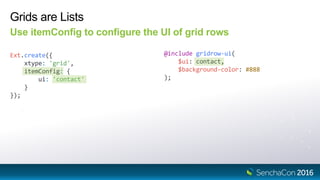
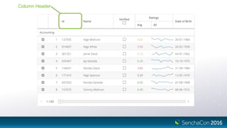
![Grid Column Header UI
Set the UI on the column config
Ext.create({
xtype: 'grid',
columns: [{
text: 'Name',
ui: 'contact'
}]
});
@include gridcolumn-ui(
$ui: contact,
$color: white,
$background-color: gray
);](https://image.slidesharecdn.com/q5edbnjskatdi6ehkn9a-signature-a0f221d50696858fb688f0d98641f455dc4186839f4099b982e17204b9f17bec-poli-161205055358/85/SenchaCon-2016-Theming-the-Modern-Toolkit-Phil-Guerrant-47-320.jpg)
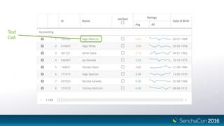
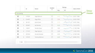
![Grid Cell UI
Use the “cell” config of the column
Ext.create({
xtype: 'grid',
columns: [{
text: 'Name',
cell: {
ui: 'contact'
}
}]
});
@include gridcell-ui(
$ui: contact,
$font-weight: bold
);](https://image.slidesharecdn.com/q5edbnjskatdi6ehkn9a-signature-a0f221d50696858fb688f0d98641f455dc4186839f4099b982e17204b9f17bec-poli-161205055358/85/SenchaCon-2016-Theming-the-Modern-Toolkit-Phil-Guerrant-49-320.jpg)
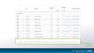
![Grid Paging Toolbar UI
Use the “toolbar” config of the Paging Toolbar plugin
Ext.create({
xtype: 'grid',
plugins: [{
type: 'pagingtoolbar',
toolbar: {
ui: 'contact'
}
}]
});
@include pagingtoolbar-ui(
$ui: contact,
$padding: 30px,
$background-color: #ddd
);](https://image.slidesharecdn.com/q5edbnjskatdi6ehkn9a-signature-a0f221d50696858fb688f0d98641f455dc4186839f4099b982e17204b9f17bec-poli-161205055358/85/SenchaCon-2016-Theming-the-Modern-Toolkit-Phil-Guerrant-51-320.jpg)


![Reference Elements
Should be named x-[name]-el
Ext.define('Ext.grid.column.Column', {
template: [{
reference: 'titleElement',
className: 'x-title-el'
}]
});](https://image.slidesharecdn.com/q5edbnjskatdi6ehkn9a-signature-a0f221d50696858fb688f0d98641f455dc4186839f4099b982e17204b9f17bec-poli-161205055358/85/SenchaCon-2016-Theming-the-Modern-Toolkit-Phil-Guerrant-66-320.jpg)

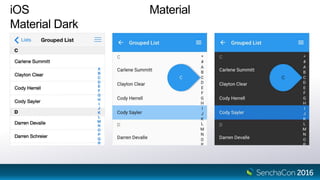


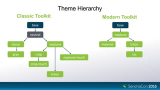
The document outlines the process of theming in Sencha, covering the distinction between apps and themes, application structure, and theme variables. It explains rapid development techniques, the use of UI mixins, and how to build and customize theme packages for shared styling across applications. Additionally, it discusses the configuration of different themes, including Material and iOS themes, and provides guidelines for selecting themes based on platform while detailing the CSS structure and inheritance principles.