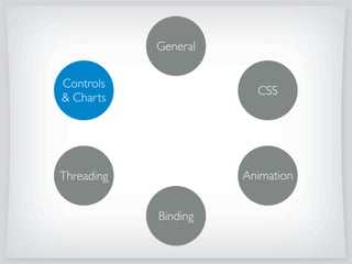
The document provides practical examples and tips for building rich clients using JavaFX 2.0, covering various aspects such as CSS styling, animation threading, and binding controls. It includes code snippets for creating user interface components like split panes, toolbars, and charts, along with discussing advanced features such as validation and progress indicators. Additionally, it demonstrates how to customize charts and implement user interactions through mouse events.


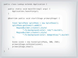
![public class Lookup extends Application {
public static void main(String[] args) {
Application.launch(args);
}
@Override public void start(Stage primaryStage) {
final SplitPane splitPane = new SplitPane();
splitPane.getItems().addAll(
RegionBuilder.create().style(
-fx-background-color: red;).build(),
RegionBuilder.create().style(
-fx-background-color: dodgerblue;).build()
);
Scene scene = new Scene(splitPane, 300, 250);
primaryStage.setScene(scene);
primaryStage.show();
}
}](https://image.slidesharecdn.com/praticalexperiencebuildingjavafxrichclients-170315042415/85/Practical-Experience-Building-JavaFX-Rich-Clients-7-320.jpg)
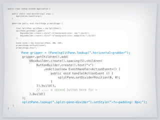
![public class Lookup extends Application {
public static void main(String[] args) {
Application.launch(args);
}
@Override public void start(Stage primaryStage) {
final SplitPane splitPane = new SplitPane();
splitPane.getItems().addAll(
RegionBuilder.create().style(-fx-background-color: red;).build(),
RegionBuilder.create().style(-fx-background-color: dodgerblue;).build()
);
Scene scene = new Scene(splitPane, 300, 250);
primaryStage.setScene(scene);
primaryStage.show();
Pane gripper = (Pane)splitPane.lookup(.horizontal-grabber);
gripper.getChildren().add(
VBoxBuilder.create().spacing(5).children(
ButtonBuilder.create().text()
.onAction(new EventHandlerActionEvent() {
public void handle(ActionEvent t) {
splitPane.setDividerPosition(0, 0);
}
}).build(),
// .... a second button here for
).build()
);
splitPane.lookup(.split-pane-divider).setStyle(-fx-padding: 8px;);
}
}](https://image.slidesharecdn.com/praticalexperiencebuildingjavafxrichclients-170315042415/85/Practical-Experience-Building-JavaFX-Rich-Clients-8-320.jpg)
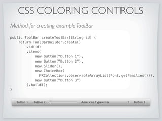
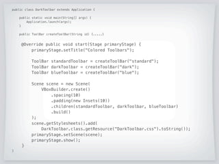
![public class DarkToolbar extends Application {
public static void main(String[] args) {
Application.launch(args);
}
public ToolBar createToolBar(String id) {.....}
@Override public void start(Stage primaryStage) {
primaryStage.setTitle(Colored Toolbars);
ToolBar standardToolbar = createToolBar(standard);
ToolBar darkToolbar = createToolBar(dark);
ToolBar blueToolbar = createToolBar(blue);
Scene scene = new Scene(
VBoxBuilder.create()
.spacing(10)
.padding(new Insets(10))
.children(standardToolbar, darkToolbar, blueToolbar)
.build()
);
scene.getStylesheets().add(
DarkToolbar.class.getResource(DarkToolbar.css).toString());
primaryStage.setScene(scene);
primaryStage.show();
}
}](https://image.slidesharecdn.com/praticalexperiencebuildingjavafxrichclients-170315042415/85/Practical-Experience-Building-JavaFX-Rich-Clients-17-320.jpg)
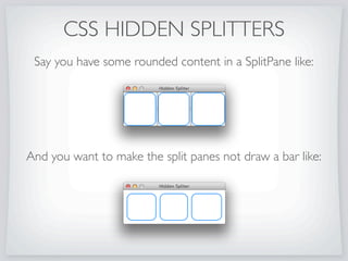
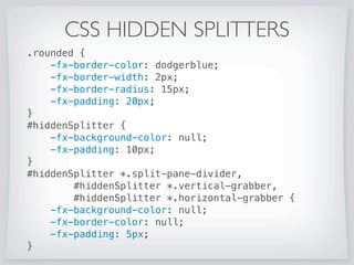
![public class HidingSplitPane extends Application {
public static void main(String[] args) {
Application.launch(args);
}
@Override public void start(Stage primaryStage) {
primaryStage.setTitle(Hidden Splitter);
final SplitPane splitPane = SplitPaneBuilder.create()
.id(hiddenSplitter)
.items(
RegionBuilder.create().styleClass(rounded).build(),
RegionBuilder.create().styleClass(rounded).build(),
RegionBuilder.create().styleClass(rounded).build()
).dividerPositions(new double[]{0.33,0.66})
.build();
Scene scene = new Scene(splitPane, 300, 100);
scene.getStylesheets().add(HidingSplitPane.class
.getResource(HidingSplitPane.css).toString());
primaryStage.setScene(scene);
primaryStage.show();
}
}](https://image.slidesharecdn.com/praticalexperiencebuildingjavafxrichclients-170315042415/85/Practical-Experience-Building-JavaFX-Rich-Clients-21-320.jpg)


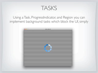


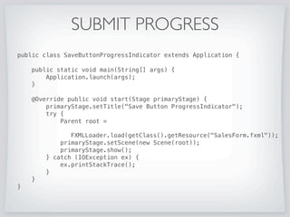
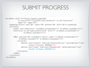
![SUBMIT PROGRESS
public class SaveButtonProgressIndicator extends Application {
public static void main(String[] args) {
Application.launch(args);
}
@Override public void start(Stage primaryStage) {
primaryStage.setTitle(Save Button ProgressIndicator);
try {
Parent root =
FXMLLoader.load(getClass().getResource(SalesForm.fxml));
primaryStage.setScene(new Scene(root));
primaryStage.show();
} catch (IOException ex) {
ex.printStackTrace();
}
}
}](https://image.slidesharecdn.com/praticalexperiencebuildingjavafxrichclients-170315042415/85/Practical-Experience-Building-JavaFX-Rich-Clients-50-320.jpg)
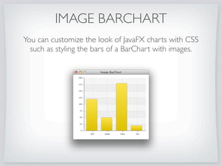
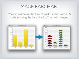

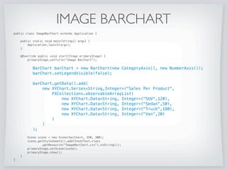
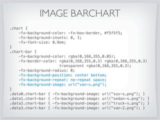
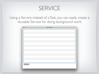
![IMAGE BARCHART
public class ImageBarChart extends Application {
public static void main(String[] args) {
Application.launch(args);
}
@Override public void start(Stage primaryStage) {
primaryStage.setTitle(Image BarChart);
BarChart barChart = new BarChart(new CategoryAxis(), new NumberAxis());
barChart.setLegendVisible(false);
barChart.getData().add(
new XYChart.SeriesString,Integer(Sales Per Product,
FXCollections.observableArrayList(
new XYChart.DataString, Integer(SUV,120),
new XYChart.DataString, Integer(Sedan,50),
new XYChart.DataString, Integer(Truck,180),
new XYChart.DataString, Integer(Van,20)
)
)
);
Scene scene = new Scene(barChart, 350, 300);
scene.getStylesheets().add(InsetText.class
.getResource(ImageBarChart.css).toString());
primaryStage.setScene(scene);
primaryStage.show();
}
}](https://image.slidesharecdn.com/praticalexperiencebuildingjavafxrichclients-170315042415/85/Practical-Experience-Building-JavaFX-Rich-Clients-56-320.jpg)

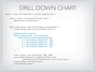

![DRILL DOWN CHART
public class DrilldownChart extends Application {
public static void main(String[] args) {
Application.launch(args);
}
@Override public void start(Stage primaryStage) {
primaryStage.setTitle(Drilldown Chart);
PieChart.Data A,B,C,D;
final PieChart pie = new PieChart(
FXCollections.observableArrayList(
A = new PieChart.Data(A, 20),
B = new PieChart.Data(B, 30),
C = new PieChart.Data(C, 10),
D = new PieChart.Data(D, 40)
)
);
Scene scene = new Scene(pie, 350, 300);
scene.getStylesheets().add(InsetText.class
.getResource(DrilldownChart.css).toString());
primaryStage.setScene(scene);
primaryStage.show();
}
}](https://image.slidesharecdn.com/praticalexperiencebuildingjavafxrichclients-170315042415/85/Practical-Experience-Building-JavaFX-Rich-Clients-60-320.jpg)
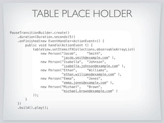
![DRILL DOWN CHART
public class DrilldownChart extends Application {
public static void main(String[] args) {
Application.launch(args);
}
@Override public void start(Stage primaryStage) {
primaryStage.setTitle(Drilldown Chart);
PieChart.Data A,B,C,D;
final PieChart pie = new PieChart(
FXCollections.observableArrayList(
A = new PieChart.Data(A, 20),
B = new PieChart.Data(B, 30),
C = new PieChart.Data(C, 10),
D = new PieChart.Data(D, 40)
)
);
A.getNode().setOnMouseClicked(new EventHandlerMouseEvent() {
public void handle(MouseEvent t) {
pie.setData(FXCollections.observableArrayList(
new PieChart.Data(a1, 7),
new PieChart.Data(a2, 2),
new PieChart.Data(a3, 5),
new PieChart.Data(a4, 3),
new PieChart.Data(a5, 2)
));
}
});
Scene scene = new Scene(pie, 350, 300);
scene.getStylesheets().add(InsetText.class
.getResource(DrilldownChart.css).toString());
primaryStage.setScene(scene);
primaryStage.show();
}
}](https://image.slidesharecdn.com/praticalexperiencebuildingjavafxrichclients-170315042415/85/Practical-Experience-Building-JavaFX-Rich-Clients-61-320.jpg)

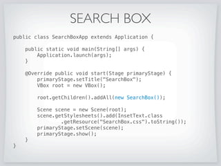
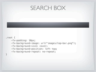
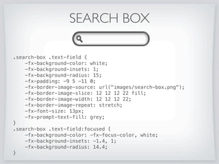
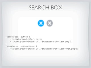
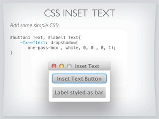
![SEARCH BOX
public class SearchBoxApp extends Application {
public static void main(String[] args) {
Application.launch(args);
}
@Override public void start(Stage primaryStage) {
primaryStage.setTitle(SearchBox);
VBox root = new VBox();
root.getChildren().addAll(new SearchBox());
Scene scene = new Scene(root);
scene.getStylesheets().add(InsetText.class
.getResource(SearchBox.css).toString());
primaryStage.setScene(scene);
primaryStage.show();
}
}](https://image.slidesharecdn.com/praticalexperiencebuildingjavafxrichclients-170315042415/85/Practical-Experience-Building-JavaFX-Rich-Clients-65-320.jpg)