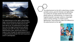
2. Who is the
client?
Canon is our client, the world's leading
imaging brand, specializing in making
cameras and the beauty of photography.
They want to be given the chance to help
people express their creativity through the
power of photography and imagination.
3. Canon Campaign
The campaign 'journey', is one that entails
creating an art, design or media towards
photography focusing on journeys, real or
emotional, those that are done over time or
changes in the world around us. This is what
Canon would like as an outcome for my
project.
4. What is the
purpose of
the company?
Canon want to be given the chance
to help people express
their creativity through the power of
photography and artistry.
Click to add text
5. Target Audience
Our target audience are
people aged 15-25, in hopes of
encouraging them to use
canon equipment, journeys
including school/college life or
going to work could be
relatable to people of those
ages considering most of them
are at that stage in their lives.
6. The advertisement on the right is advertising a
larger more professional camera that the owner
of the camera would most likely have to plan
their day to use. Its professional in more ways
than one, the slogan being hard and upfront,
playing in part with the colour scheme of the
advertisement, dark, natural cool colours. It
makes it clear through the advertisement that it
is targeted towards people that want to pursue a
career in photography.
The advertisement on the left is advertising a smaller,
portable camera, great for festivals and nights/days
out, perfect for younger people that tend to take
photos while out, spontaneously. It is shown to be
targeted towards a younger audience using bright
colours and fun writing, it is made to seem
lighthearted. These elements make it far different to
the advertisement on the right.
7. Practice for adverts.
Putting three photos I had taken in
different locations was proven easier
than expected. Having to
experiment with different blending
tools for the two street photos to
look less out of place behind the
bridge. Creating a sort of silhouette
with the bridge was important to
give the background the focus of the
end product, this was done using
the burn tool to create shadow. I
then created multiple different
coloured versions by changing
the colour hue and brightness.
8. Print
advert. To create a print advert look, we
changed each colour of the photo to
mask the original photo into looking
like a print advert that had been done
digitally. Vibrancy was important,
choosing bright colours that would
stand out. Each colour became a
layer, making it easier to fix or change
certain colours. This created an
animated and psychedelic look.
9. Canon logo
It was important that when we added the
canon logo, we made sure it was the official
colour. We didn’t edit or change the colour
of the logo or the font used to make the
original one. Because canon is our client it
meant we had to keep the logo visible and
placed somewhere the stood out enough
for the audience to know what the
advertisement was for.
13. I have learnt that artists have their own styles, each print advert
doing the same job of promoting while also looking as wildly
different from advertisements so similar to their own. Each advert
is created with an audience in mind, catering to them and what
they want to see rather than what the company wants.
14. What are your ideas for your print advert?
In my print advert I would like to portray journeys through
memories (already existing photos). Having my family looking
over a photo album, showing how they reflect on old
memories and the time that those photos represent, and
drawing over digitally with different choices of colour, shapes
and patterns. As the project is about journeys and creativity, I
think that this will allow the opportunity to promote canon
while also allowing for freedom of my own desire. The photo
itself will have a lack of colour, the drawings done over it
showing the feelings that go on in the photo while also giving
my advertisement a pop of colour.
15. Were there any codes and conventions you were going to follow or
challenge for this campaign and why?
Most canon advertisements follow a certain pattern. Including the
canon logo as well as a photo that focuses on the product they're
trying to sell, if it is a higher quality, professional camera, there will
be a photo on the advert that projects this. If they were trying to
sell a smaller, portable camera, things such as festivals or day trips
would be shown in the advertisement. I will be following these
codes and conventions.
16. Ideas on fonts, colour scheme, images and layout. You
should demonstrate that you have a variety of ideas and
how you have narrowed down that list to what you think is the best
idea.
I'd like to keep the main photo of the advertisement
dull colours if not colourless (black and white),
having the drawings I layer over top
be bright colours (pink, green, red, blue etc..). This
will state the contrast between past and present.
The photo will be taken from an over the shoulder
view, giving the idea of someone looking over at the
album in the persons hands.
At first, I had wanted to go through more
of a sad route with my project,
manipulating already existing photos.
However, after reconsidering the project, I
decided to change it to fit a
happier, emotional view.
17. Why do you think this would
be a successful print advert?
What is it's USP?
I think this would
be a successful print advert because
it is something that would be very
different whilst also being happy and emotional,
it also promotes the ideas of journey
through photography, meeting the brief. Its
USP would be the drawings I will layer over the
top of my photos.
18. How do you think your
print advert idea is right for
the client and their needs?
I think that my print advert is right for the client and
their needs because, as the project is about journeys
my plan to have people looking down at a photo
album is all about the memories those people once
had, the journey of growing old, things changing as
time goes on. It also portrays journeys in a positive
way.
19. How will it appeal and attract
the right audience?
My idea appeals and attracts the right audience
by creating a connection between how much
their lives will change overtime. As the age group
is 15-25 year olds, most of them are going
through big life changes such as college,
university, buying first houses and getting jobs.
For them it would most likely seem sentimental
to look back at old memories when times were
simpler, creating emotion between the advert
and the audience.