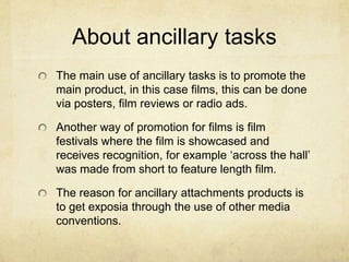
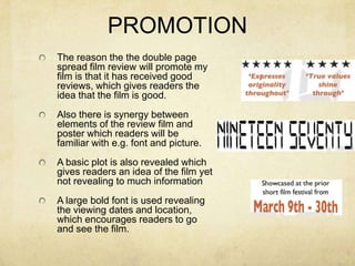
The document discusses ancillary tasks to promote a short film, including a double page film review and poster.
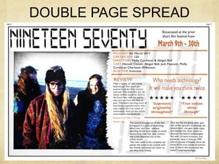
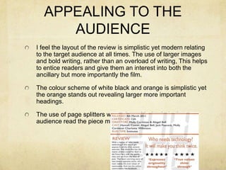
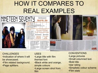
The review uses conventions like large images, bold titles, and columned text. It promotes the film through positive reviews and synergy with the poster. The informal style suits magazines like Empire.
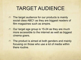
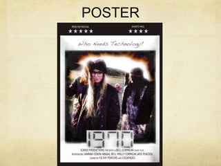
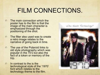
The poster targets 15-24 year olds with simplicity and a modern retro style matching the film. It draws the eye to the title using contrasting colors and emphasizes the main character. Connections to the film's themes of past/present and memory are made through the image and tagline.
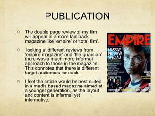
Feedback indicates the tasks effectively target the audience and promote the film through continuity and implied quality, while revealing just enough


![Critical evaluation[1]](https://cdn.slidesharecdn.com/ss_thumbnails/criticalevaluation1-100510110346-phpapp02-thumbnail.jpg?width=640&height=640&fit=bounds)
![Critical evaluation[1]](https://cdn.slidesharecdn.com/ss_thumbnails/criticalevaluation1-100510110032-phpapp01-thumbnail.jpg?width=640&height=640&fit=bounds)


![Critical evaluation[1]](https://cdn.slidesharecdn.com/ss_thumbnails/criticalevaluation1-100510093551-phpapp01-thumbnail.jpg?width=640&height=640&fit=bounds)


