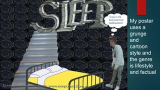
SlideShare a Scribd company logo
1 of 8
My poster
uses a
grunge
and
cartoon
style and
the genre
is lifestyle
and factual
A real poster campaign
Graphic styles used
• Modernism
• Pop art
The font used in this poster is Arial. The text is big and bold and goes with
the colour scheme of the poster.
HOPE is the title/ slogan for the poster it shows Barrack Obama’s face it
shows that their will be hope in this president
There isn't a lot of text on this poster because it would take away all the
meaning that they poster is trying to show we can see on this poster that the
clear message is hope.
The one and only dominant image is barrack Obama. He is the only figure
we see on the poster which makes us want to now why he is the figure for
hope
The logos on his blazer shows that he is running to be president. It also runs in
the colour theme of the poster.
The colour scheme is red, white and blue which is the colour on the American
flag. It is the same colour on the logo on his blazer it shows that he is running for
an American president
http://www.time-to-change.org.uk/
Navigation
When people first go onto the website we
are shown on central point which is the
big poster saying join time talk and if you
click on it navigates you to time talk sub
category below that there is a simple grid
system below that navigates you to
places that they are talking about.
If you click share the small things it
shows you the small grid system
below which shows you what you can
do and what the small things are this
system is very easy to find your way
around.
Personal stories is a different
layout to the rest of the
website. It has it own search
bar involved in it and you can
search different types of stories
easily than having to search for
it by scrolling down
There is a simple menu system above which helps you see the different
things that you can look at on the website. And above that there is a
search bar where you can look things up on the entire website
Structure and grid
The structure on this website is left to right, people read it in this composition because that is how
the website was made. The website uses the grid system through out of the website. A side bar is
used to show the different categories you can use in that section of the website. Below the grid
system is in different colours it makes the grid eye catching on the website and also having a grid
system make audience member that is reading it easier for them to read because it has its own box
and colour which makes it different from other things on the page. Also the grid system allows a
lot of sub categories this makes it easier to find what you are looking for on the page
Text and image choice
The text that is used is formal the text on this site is big they used this to make the audience look at particular
important things on the website. The text is in short paragraphs this means that the reader will not get bored with
reading things on the page because there isn't a lot of long paragraphs to read and also some of the texts are big
and bold and some are the normal size this is done so that there is variation
Type and typographic structure
The only font used in this website is Sans serif this font is a more formal font
than serif. They used this kind of font because they are talking about a serious
thing on their campaign website and if they used serif it might distract the
reader in what they are reading. The font size on this site varies for example
when they are trying to inform someone about an upcoming event the text is
bigger but if it is talking about information about mental health it is the normal
size text is
Dynamic content
The first screen shot shows people can share this site with people through Facebook, twitter and email.
People can also comment on this site through these social media sites. The site is updated every time
someone wants to share their stories or talk to other people that are going through the same thing. We can
see people sharing their stories and when someone uploads their story on the website it goes to the top of
the stories. It also includes their stories as well. The last print screen shows that their that there is an
embedded video on their website and there is also a link where people can watch more videos about mental
health. Having a video on the website means that the website is more interactive and interesting.
Use of hyperlinks, inline and anchor links
The first screen shot shows a menu
system that shows the key things
that are on the website for example
what the campaign website is
about. Next the about section
shows a side bar where people can
see what is on the page instead of
scrolling through all of the page.
Also when you click something on
the side bar it takes you to what it is
talking about. The third screen shot
shows share the small things and if
you click it shows where you can
add to the website the small the
things that can make people happy.
On the last print screen we see a
grid system being used and if
people out the cursor on top of one
of the sub categories then it will
navigate you onto another page

More Related Content

What's hot (20)

Task 5
Task 5Task 5
Task 5
 
Lo2
Lo2Lo2
Lo2
 
Vibe double page spread analysis
Vibe double page spread analysisVibe double page spread analysis
Vibe double page spread analysis
 
Last 3 mixed double page spreads
Last 3 mixed double page spreadsLast 3 mixed double page spreads
Last 3 mixed double page spreads
 
Front covermagbreakdown
Front covermagbreakdownFront covermagbreakdown
Front covermagbreakdown
 
Evaluation Question 1
Evaluation Question 1Evaluation Question 1
Evaluation Question 1
 
How did you attract/address your audience?
How did you attract/address your audience?How did you attract/address your audience?
How did you attract/address your audience?
 
mixed genre front pages
mixed genre front pagesmixed genre front pages
mixed genre front pages
 
Preliminary task and planning & research
Preliminary task and planning & research Preliminary task and planning & research
Preliminary task and planning & research
 
Three Magazine Double Page Spreads.
Three Magazine Double Page Spreads.Three Magazine Double Page Spreads.
Three Magazine Double Page Spreads.
 
Evaluation
Evaluation Evaluation
Evaluation
 
Primary Research
Primary Research Primary Research
Primary Research
 
Evaluation
EvaluationEvaluation
Evaluation
 
Mojo magazine
Mojo magazineMojo magazine
Mojo magazine
 
As media evaluation 7
As media evaluation 7 As media evaluation 7
As media evaluation 7
 
Evaluation Q5
Evaluation Q5Evaluation Q5
Evaluation Q5
 
Q5
Q5Q5
Q5
 
Proforma
ProformaProforma
Proforma
 
Proforma
ProformaProforma
Proforma
 
3 annotated contents pages.
3 annotated contents pages.3 annotated contents pages.
3 annotated contents pages.
 

Similar to Feautures of posters (20)

Task 3
Task 3Task 3
Task 3
 
UNIT 35 - LO2
UNIT 35 - LO2UNIT 35 - LO2
UNIT 35 - LO2
 
Task 2a
Task 2aTask 2a
Task 2a
 
Unit 35 - LO3
Unit 35 - LO3Unit 35 - LO3
Unit 35 - LO3
 
Unit 35 : LO3
Unit 35 : LO3Unit 35 : LO3
Unit 35 : LO3
 
Glamour website deconstruction
Glamour website deconstructionGlamour website deconstruction
Glamour website deconstruction
 
Gcse planning selection
Gcse planning selectionGcse planning selection
Gcse planning selection
 
Task 3
Task 3Task 3
Task 3
 
Website Production
Website ProductionWebsite Production
Website Production
 
Website production
Website productionWebsite production
Website production
 
Website production
Website productionWebsite production
Website production
 
Task 3
Task 3Task 3
Task 3
 
Media studies deconstruction newspaper website
Media studies deconstruction newspaper websiteMedia studies deconstruction newspaper website
Media studies deconstruction newspaper website
 
Website deconstructions
Website deconstructionsWebsite deconstructions
Website deconstructions
 
Unit 35
Unit 35Unit 35
Unit 35
 
Unit 35 : LO2
Unit 35 : LO2Unit 35 : LO2
Unit 35 : LO2
 
Unit 35 - LO2
Unit 35 - LO2Unit 35 - LO2
Unit 35 - LO2
 
Media studies deconstruction newspaper for website
Media studies deconstruction newspaper for websiteMedia studies deconstruction newspaper for website
Media studies deconstruction newspaper for website
 
Preliminary task
Preliminary taskPreliminary task
Preliminary task
 
Sophie Angus Unit 35 LO2
Sophie Angus Unit 35 LO2Sophie Angus Unit 35 LO2
Sophie Angus Unit 35 LO2
 

Recently uploaded

Jual Obat Aborsi Hongkong ( Asli No.1 ) 085657271886 Obat Penggugur Kandungan...
Jual Obat Aborsi Hongkong ( Asli No.1 ) 085657271886 Obat Penggugur Kandungan...Jual Obat Aborsi Hongkong ( Asli No.1 ) 085657271886 Obat Penggugur Kandungan...
Jual Obat Aborsi Hongkong ( Asli No.1 ) 085657271886 Obat Penggugur Kandungan...
ZurliaSoop
 
Seal of Good Local Governance (SGLG) 2024Final.pptx
Seal of Good Local Governance (SGLG) 2024Final.pptxSeal of Good Local Governance (SGLG) 2024Final.pptx
Seal of Good Local Governance (SGLG) 2024Final.pptx
negromaestrong
 
1029 - Danh muc Sach Giao Khoa 10 . pdf
1029 -  Danh muc Sach Giao Khoa 10 . pdf1029 -  Danh muc Sach Giao Khoa 10 . pdf
1029 - Danh muc Sach Giao Khoa 10 . pdf
QucHHunhnh
 
The basics of sentences session 3pptx.pptx
The basics of sentences session 3pptx.pptxThe basics of sentences session 3pptx.pptx
The basics of sentences session 3pptx.pptx
heathfieldcps1
 

Recently uploaded (20)

How to Create and Manage Wizard in Odoo 17
How to Create and Manage Wizard in Odoo 17How to Create and Manage Wizard in Odoo 17
How to Create and Manage Wizard in Odoo 17
 
Unit-IV- Pharma. Marketing Channels.pptx
Unit-IV- Pharma. Marketing Channels.pptxUnit-IV- Pharma. Marketing Channels.pptx
Unit-IV- Pharma. Marketing Channels.pptx
 
psychiatric nursing HISTORY COLLECTION .docx
psychiatric  nursing HISTORY  COLLECTION  .docxpsychiatric  nursing HISTORY  COLLECTION  .docx
psychiatric nursing HISTORY COLLECTION .docx
 
ICT Role in 21st Century Education & its Challenges.pptx
ICT Role in 21st Century Education & its Challenges.pptxICT Role in 21st Century Education & its Challenges.pptx
ICT Role in 21st Century Education & its Challenges.pptx
 
Jual Obat Aborsi Hongkong ( Asli No.1 ) 085657271886 Obat Penggugur Kandungan...
Jual Obat Aborsi Hongkong ( Asli No.1 ) 085657271886 Obat Penggugur Kandungan...Jual Obat Aborsi Hongkong ( Asli No.1 ) 085657271886 Obat Penggugur Kandungan...
Jual Obat Aborsi Hongkong ( Asli No.1 ) 085657271886 Obat Penggugur Kandungan...
 
SOC 101 Demonstration of Learning Presentation
SOC 101 Demonstration of Learning PresentationSOC 101 Demonstration of Learning Presentation
SOC 101 Demonstration of Learning Presentation
 
Seal of Good Local Governance (SGLG) 2024Final.pptx
Seal of Good Local Governance (SGLG) 2024Final.pptxSeal of Good Local Governance (SGLG) 2024Final.pptx
Seal of Good Local Governance (SGLG) 2024Final.pptx
 
Application orientated numerical on hev.ppt
Application orientated numerical on hev.pptApplication orientated numerical on hev.ppt
Application orientated numerical on hev.ppt
 
How to Manage Global Discount in Odoo 17 POS
How to Manage Global Discount in Odoo 17 POSHow to Manage Global Discount in Odoo 17 POS
How to Manage Global Discount in Odoo 17 POS
 
Sociology 101 Demonstration of Learning Exhibit
Sociology 101 Demonstration of Learning ExhibitSociology 101 Demonstration of Learning Exhibit
Sociology 101 Demonstration of Learning Exhibit
 
Kodo Millet PPT made by Ghanshyam bairwa college of Agriculture kumher bhara...
Kodo Millet  PPT made by Ghanshyam bairwa college of Agriculture kumher bhara...Kodo Millet  PPT made by Ghanshyam bairwa college of Agriculture kumher bhara...
Kodo Millet PPT made by Ghanshyam bairwa college of Agriculture kumher bhara...
 
1029 - Danh muc Sach Giao Khoa 10 . pdf
1029 -  Danh muc Sach Giao Khoa 10 . pdf1029 -  Danh muc Sach Giao Khoa 10 . pdf
1029 - Danh muc Sach Giao Khoa 10 . pdf
 
Understanding Accommodations and Modifications
Understanding  Accommodations and ModificationsUnderstanding  Accommodations and Modifications
Understanding Accommodations and Modifications
 
Holdier Curriculum Vitae (April 2024).pdf
Holdier Curriculum Vitae (April 2024).pdfHoldier Curriculum Vitae (April 2024).pdf
Holdier Curriculum Vitae (April 2024).pdf
 
This PowerPoint helps students to consider the concept of infinity.
This PowerPoint helps students to consider the concept of infinity.This PowerPoint helps students to consider the concept of infinity.
This PowerPoint helps students to consider the concept of infinity.
 
Third Battle of Panipat detailed notes.pptx
Third Battle of Panipat detailed notes.pptxThird Battle of Panipat detailed notes.pptx
Third Battle of Panipat detailed notes.pptx
 
Unit-V; Pricing (Pharma Marketing Management).pptx
Unit-V; Pricing (Pharma Marketing Management).pptxUnit-V; Pricing (Pharma Marketing Management).pptx
Unit-V; Pricing (Pharma Marketing Management).pptx
 
How to Give a Domain for a Field in Odoo 17
How to Give a Domain for a Field in Odoo 17How to Give a Domain for a Field in Odoo 17
How to Give a Domain for a Field in Odoo 17
 
The basics of sentences session 3pptx.pptx
The basics of sentences session 3pptx.pptxThe basics of sentences session 3pptx.pptx
The basics of sentences session 3pptx.pptx
 
Basic Civil Engineering first year Notes- Chapter 4 Building.pptx
Basic Civil Engineering first year Notes- Chapter 4 Building.pptxBasic Civil Engineering first year Notes- Chapter 4 Building.pptx
Basic Civil Engineering first year Notes- Chapter 4 Building.pptx
 

Feautures of posters

  • 1. My poster uses a grunge and cartoon style and the genre is lifestyle and factual
  • 2. A real poster campaign Graphic styles used • Modernism • Pop art The font used in this poster is Arial. The text is big and bold and goes with the colour scheme of the poster. HOPE is the title/ slogan for the poster it shows Barrack Obama’s face it shows that their will be hope in this president There isn't a lot of text on this poster because it would take away all the meaning that they poster is trying to show we can see on this poster that the clear message is hope. The one and only dominant image is barrack Obama. He is the only figure we see on the poster which makes us want to now why he is the figure for hope The logos on his blazer shows that he is running to be president. It also runs in the colour theme of the poster. The colour scheme is red, white and blue which is the colour on the American flag. It is the same colour on the logo on his blazer it shows that he is running for an American president
  • 4. Navigation When people first go onto the website we are shown on central point which is the big poster saying join time talk and if you click on it navigates you to time talk sub category below that there is a simple grid system below that navigates you to places that they are talking about. If you click share the small things it shows you the small grid system below which shows you what you can do and what the small things are this system is very easy to find your way around. Personal stories is a different layout to the rest of the website. It has it own search bar involved in it and you can search different types of stories easily than having to search for it by scrolling down There is a simple menu system above which helps you see the different things that you can look at on the website. And above that there is a search bar where you can look things up on the entire website
  • 5. Structure and grid The structure on this website is left to right, people read it in this composition because that is how the website was made. The website uses the grid system through out of the website. A side bar is used to show the different categories you can use in that section of the website. Below the grid system is in different colours it makes the grid eye catching on the website and also having a grid system make audience member that is reading it easier for them to read because it has its own box and colour which makes it different from other things on the page. Also the grid system allows a lot of sub categories this makes it easier to find what you are looking for on the page
  • 6. Text and image choice The text that is used is formal the text on this site is big they used this to make the audience look at particular important things on the website. The text is in short paragraphs this means that the reader will not get bored with reading things on the page because there isn't a lot of long paragraphs to read and also some of the texts are big and bold and some are the normal size this is done so that there is variation Type and typographic structure The only font used in this website is Sans serif this font is a more formal font than serif. They used this kind of font because they are talking about a serious thing on their campaign website and if they used serif it might distract the reader in what they are reading. The font size on this site varies for example when they are trying to inform someone about an upcoming event the text is bigger but if it is talking about information about mental health it is the normal size text is
  • 7. Dynamic content The first screen shot shows people can share this site with people through Facebook, twitter and email. People can also comment on this site through these social media sites. The site is updated every time someone wants to share their stories or talk to other people that are going through the same thing. We can see people sharing their stories and when someone uploads their story on the website it goes to the top of the stories. It also includes their stories as well. The last print screen shows that their that there is an embedded video on their website and there is also a link where people can watch more videos about mental health. Having a video on the website means that the website is more interactive and interesting.
  • 8. Use of hyperlinks, inline and anchor links The first screen shot shows a menu system that shows the key things that are on the website for example what the campaign website is about. Next the about section shows a side bar where people can see what is on the page instead of scrolling through all of the page. Also when you click something on the side bar it takes you to what it is talking about. The third screen shot shows share the small things and if you click it shows where you can add to the website the small the things that can make people happy. On the last print screen we see a grid system being used and if people out the cursor on top of one of the sub categories then it will navigate you onto another page