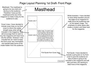
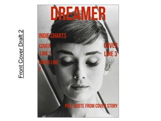
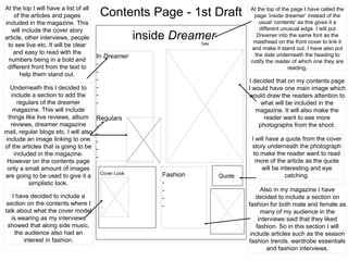
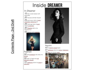
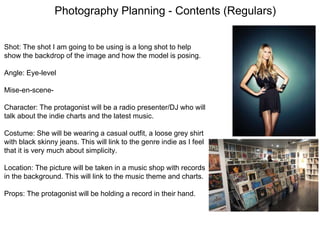
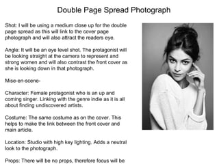
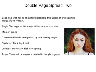
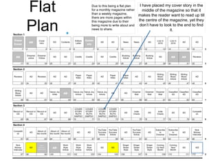
SlideShare a Scribd company logo
Planning
Magazine Name: Dreamer
Name of magazine: Dreamer
- I chose the name dreamer for my magazine because I felt that when the reader
opened my magazine they would be transported into a fantasy or illusion. The
definition for dreamer is ‘a visionary and an idealist’ which I think links back to the
genre of my magazine which is indie as it is all about being independent and thinking
about the future and the new things to come.
Genre Of Music: Indie
- Despite pop being the most popular genre in my survey, I decided to make my
magazine an indie magazine. I chose this because at the moment the majority of
magazines out their are already pop magazines.Therefore by bringing a new type
of magazine into the shops, this may attract a new and different audience.
Cover Price: £2.85
- I decided to make the cost of the magazine £2.85 as I think it is a fairly low price
making it available to a larger variety of people. Also in my survey the majority of
people said that they would buy a magazine for that price. However I didn't put the
price too low as I am aiming it at a slightly older age group. As a slightly older
audience are more likely to be in work.
Issue Frequency: Monthly
-Publishing the magazine every month will mean that I have more information and
articles to write compared to weekly magazines. Choosing to publish it once every
month and not any longer will help to reader to remember to buy it every month.
Many popular magazines like MOJO are also released monthly proving that it is
popular.
Reader Profile:
Reader Profile: The average reader of Dreamer is a
female aged between 13 and 16 years old as 77.14% are
this age shown in my survey. This is shown in my survey
as 91.43% are girls. She loves to socialise with friends
and family and feels passionate about music. At the
weekends she either likes to spend time with her friends
or go shopping in shops like TopShop. However she also
likes to shop online on websites like ASOS. She generally
gets all of her music from the brand Spotify. She also likes
a variety of social media platforms such as Twitter,
Facebook, Instagram and Skype. Her favourite music
genres are pop (37.14%) and indie (31.43%). Her
favourite magazine to buy is Q magazine (45.71%).
Mission Statement
Dreamer will be taking a very minimalistic and modern
approach to up and coming artists in the music industry.
Having a very simple theme will widen the variety of people
buying our magazine, opening it up to both genders and
different age groups. We will aim our magazine at ages
ranging from teenagers to young adults providing them with
information about up and coming artists. The genre of the
magazine will mainly be indie and acoustic artists but we will
ensure that we keep a variety of different artists involved in
our magazine. However our main focus will be to promote
new and on the rise artists in the music business. The
monthly additions of the magazine will each include articles
exclusive to the magazine and information which has been
sourced from a reliable source. Our readers will be able to
wander through our magazine, exploring alternative bands
and singers and gaining knowledge of originally unknown
artists.
Bebas Neue by Dharma Type-
I really like this font because it is really bold and clear meaning people
will easily see it. The font is also quite formal and is gender neutral
making it available to all audiences. It is also in capitals making it
stand out even more.
Code by Matthew Welch-
I think this font would suite the magazine because it is very
modern and clear. However compared to the first font this one
isn't in bold writing making it stand out less. If this was placed
over an image it would risk not standing out very much. If I placed
this font onto a white boarder, this font would work well.
Bebas Kai by Dharma Type-
I like that this font is similar to the first one, but the letters are more
spaced apart. This makes the title clearer and stand out to the
viewers. It will also emphasise the white space on the page which I
will be including on my magazine cover. I think this font looks
modern and unto date linking to how the magazine is all about new
and upcoming music.
Kenzo Regular-
I think that this has a slightly less formal tone to it compared to
the font above as the letter ‘R’ in this font is curved giving it a
more natural look. I also like that there is more white space
around this font emphasise the clean and modern theme of the
magazine.
Amethyst-
This font works really well because it is very minimalistic and
simple yet is quite intricate. I like it because it is quite different from
my other fonts linking to how the genre of my magazine is Indie
and Indie is all about being different and breaking the stereotypes.
Fonts: Headlines
Font: Body Text
Apple Garamond - I think this font this font would work well for the
content of my magazine because it is very easy on the eye for the
reader. Yet it is also very stylish and modern linking with the very
simplistic theme of the magazine.
Big Caslon - Compared to the ‘Times’ font, I feel
that this font is a lot less harsh on the eye and is
softer. Yet, this font is still very bold making it easier
to read and helping it to stand out on the page.
Despite being softer, this font is still very crisp and
modern which fits with the theme of my magazine.
Times - I really like this font because it is very
minimalistic and simple yet effective. This font is
very easy to read for the viewer. Having the body
text a very simple font will avoid it having to
compete for attention with the headline and keeps
the reader moving along the page. This font is also a
lot bolder than the first font helping to keep the
readers attention and making it easier for them to
read.
Despite not being a music magazine, I gained
inspiration from Vogue magazine. Vogue uses a font
called Savoy which is very modern, stylish and crisp
which is the sort of thing I am going for in my
magazine. The font is also very easy on the eye for
the audience making it slightly easier read long bodies
of text.
Colour Scheme Ideas
I really like this colour scheme as the colours are very muted
and simplistic giving it very formal, smart look. I also like this
colour scheme as it is very gender mutual as I want my
magazine to generally appeal to both genders. I will have the
background in a cream colour with the text a light grey slightly
brown colour.
I think this colour scheme would also work well as they are not all
beige colours meaning the blue will bring some colour into the pages
of the magazine. I would use the grey colour as the text font on the
double page spread with the cream colour as the background.
Despite there being some slightly brighter colours they are all still
very neutral and simplistic.
I really like this set of colours together however I do feel that these
are slightly darker than I was intending. Generally I would use the
lighter colour for the background, the brighter colour for the main
heading/title and the darkest colour for text on the page. I think the
light grey colour would work really well for the background as it is
slightly different to the usual white.
I like that these colours are very neutral but include a nice variety of
diverse colours that are quite contrasting. I would use the lightest
cream colour for the background colour and the darkest colour for
the text on the page. This would help the text to stand out as they
are contrasting. I really like the theme of neutral colours as it gives it
a fresh, clean and modern look to the page.
Page Layout Planning 1st Draft- Front Page
Masthead
Pull Quote from Cover story
Cover Line 1
White boarders- I have decided
to have white boarders around
the edge of my magazine to
really focus the audiences eye
on the splash image. The
emphasis on white space also
create a modern and clean look
for the magazine.
Masthead- The masthead is
going to be very bold and
obvious to the audience.
Therefore I have put the
masthead at the top of the
magazine to make it easy for the
audience to see.
Pull Quote: I have decided to
include a pull quote on my front
cover to give the audience an
idea of what is going to be
included in the magazine and will
also pull them into wanting to
read more of the magazine.
Cover Line 2
Cover Lines- I have decided to
include cover lines on my front
cover to inform the reader
straight away what will be
included in the magazine. This
will encourage them to want to
buy the magazine and read more
into the articles. However I only
included two as I want to keep
the front cover very minimalistic
and wanted keep some of the
inside hidden from the audience.
Price & Date
Splash Image: The splash image
will be a medium close up of the
cover artists face, she will either
have her head facing down with
her hair draped around her face or
she will hold strong eye contact
with the camera. This will be the
only image on the page as I want it
to be the main focus on the page.
FrontCoverDraft2
Contents Page - 1st Draft
inside DreamerDate
In Dreamer
-
-
-
-
-
-
Regulars
-
-
-
-
-
Cover Look
QuoteFashion
-
-
-
-
I decided that on my contents page
I would have one main image which
would draw the readers attention to
what will be included in the
magazine. It will also make the
reader want to see more
photographs from the shoot.
I will have a quote from the cover
story underneath the photograph
to make the reader want to read
more of the article as the quote
will be interesting and eye
catching.
At the top I will have a list of all
of the articles and pages
included in the magazine. This
will include the cover story
article, other interviews, people
to see live etc. It will be clear
and easy to read with the
numbers being in a bold and
different front from the text to
help them stand out.
Underneath this I decided to
include a section to add the
regulars of the dreamer
magazine. This will include
things like live reviews, album
reviews, dreamer magazine
mail, regular blogs etc. I will also
include an image linking to one
of the articles that is going to be
included in the magazine.
However on the contents page
only a small amount of images
are going to be used to give it a
simplistic look.
I have decided to include a
section on the contents where I
talk about what the cover model
is wearing as my interviews
showed that along side music,
the audience also had an
interest in fashion.
Also in my magazine I have
decided to include a section on
fashion for both male and female as
many of my audience in the
interviews said that they liked
fashion. So in this section I will
include articles such as the season
fashion trends, wardrobe essentials
and fashion interviews.
At the top of the page I have called the
page ‘inside dreamer’ instead of the
usual ‘contents’ as this gives it a
different unusual edge. I will put
Dreamer into the same font as the
masthead on the front cover to link it
and make it stand out. I have also put
the date underneath the heading to
notify the reader of which one they are
reading.
ContentsPage-2ndDraft
Splash Image: The splash image
will cover the whole of the page
making the picture stand out to the
reader. The image will also slightly
run over onto the next page creating
contrast. The image will be in black
and white which will also create
more contrast between the white
page and the grey of the image. It
will be a medium close up of the
protagonist.
Lorem ipsum dolor sit
amet, consectetur
adipiscing elit. Donec
viverra elementum
sollicitudin. Proin in
magna aliquet,
ullamcorper nunc in,
faucibus dolor.
Suspendisse a ipsum nisi.
Duis quis sapien nec velit
accumsan tristique ac ac
lacus. Interdum et
malesuada fames ac ante
ipsum primis in faucibus.
Cum sociis natoque
penatibus et magnis dis
parturient montes,
nascetur ridiculus mus.
Nunc interdum
scelerisque nisi, non
semper tellus pharetra at.
Proin est augue,
scelerisque venenatis
lobortis quis, bibendum
ac dolor. Phasellus
tempus nibh vel turpis
posuere, eu fringilla urna
sagittis. Aenean vel
sapien sem.ridiculus mus.
Nunc interdum
scelerisque nisi, non
semper tellus pharetra at.
Proin est augue,
scelerisque venenatis
lobortis quis, bibendum
ac dolor. Phasellus
tempus nibh vel turpis
Lorem ipsum dolor sit
amet, consectetur
adipiscing elit. Donec
viverra elementum
sollicitudin. Proin in
magna aliquet,
ullamcorper nunc in,
faucibus dolor.
Suspendisse a ipsum nisi.
Duis quis sapien nec velit
accumsan tristique ac ac
lacus. Interdum et
malesuada fames ac ante
ipsum primis in faucibus.
“This will
be a
quote”Proin est
augue, scelerisque
venenatis lobortis quis,
bibendum ac dolor.
Phasellus tempus nibh
vel turpis posuere, eu
fringilla urna sagittis.
Aenean vel sapien sem.
Duis quis sapien nec velit
accumsan tristique ac ac
lacus. Interdum et
malesuada fames ac ante
ipsum primis in faucibus.
Cum sociis natoque
penatibus et magnis dis
parturient montes,
nascetur ridiculus mus.
Nunc interdum
Lorem ipsum dolor sit
amet, consectetur
adipiscing elit. Donec
viverra elementum
sollicitudin. Proin in
magna aliquet,
ullamcorper nunc in,
faucibus dolor.
Suspendisse a ipsum nisi.
Duis quis sapien nec velit
accumsan tristique ac ac
lacus. Interdum et
malesuada fames ac ante
ipsum primis in faucibus.
Cum sociis natoque
penatibus et magnis dis
parturient montes,
nascetur ridiculus mus.
Nunc interdum
scelerisque nisi, non
semper tellus pharetra at.
Proin est augue,
scelerisque venenatis
lobortis quis, bibendum
ac dolor. Phasellus
tempus nibh vel turpis
posuere, eu fringilla urna
sagittis. Aenean vel
sapien sem.
I will be having three columns of text on the right hand page. I
will also have even, clear spacing between each column to
make it easy to read and make the text stand out. At the
beginning of the interview there will be an introduction to tell
the reader about the protagonist. The text will then go onto
interviewing the protagonist about their musical career.
There will be very few images on the right hand page
as the main focus will be on the splash image on the
left. However I will be including one picture amongst
the text to help slightly break the text up. But this image
will be in black and white, therefore contrasting the
splash image on the page.
Within the text I will be including a pull quote in bold,
larger font. This will help to break up the text and will
also catch the readers eye. By catching the readers
eye this will draw them into wanting to read more of the
article.
I will make the first letter in the
article larger than the rest of the
font. This will help to draw the
readers attention to where the
article starts and get them to start
reading it.
Photography Planning - Front Cover
Shot: I have chosen a medium close up because I think that it will be
more likely to catch the buyers eye when looking for it the shelf. Also
shows the audience who is going to be in the magazine.
Angle: Eye level
Mise-en-scene: The protagonist will be wearing very neutral,
simplistic clothes with very light makeup to give a fresh and modern
look.
Character: A female protagonist who is an up and coming singer.
This links with it being an indie magazine as it is all about
undiscovered singers.
Costume: The protagonist will be wearing a black blouse with very
minimal amounts of makeup. Her hair will be down and draped
around her face creating a very natural feel.
Location: The photograph will be shot in the studio with a white
background. There will be high key lighting to really aluminate and
emphasise the features on her face.
Props: There will be no props as I want the focus to all be on the
Photography Planning - Contents Main
Image
Shot: For this image I will be using a medium long shot of the front
cover protagonist. This will help to provide a variety of different shots
as the font cover will be medium close up. Using a medium long
shot will also give the reader more of an idea of what the female
protagonist looks like.
Angle: Slightly low angle shot, but mainly eye level.
Mise-en-scene: Protagonist wearing same outfit as she is on the
cover except she will be wearing a large hat to add a new element to
the photograph.
Character: A female protagonist who is an up and coming singer.
Therefore linking in with the indie themed magazine.
Costume: The same as she is wearing on the front cover yet she will
be wearing a floppy black hat.
Location: In the studio with a white background. There will be high
key lighting, especially on her face to aluminate her features.
Props: A floppy hat. This will add a new dimension to the
photographs.
Photography Planning - Contents (Fashion)
Shot: Long shot
Angle: Eye level
Mise-en-scene: There will be a female protagonist who is an up
and coming indie artist. She will be stood leaning against a wall
wearing indie style clothes.
Costume- The protagonist will be wearing a turtle neck top with
black jeans and a bomber jacket. She will also be wearing
simple black boots, a handbag and aviator sunglasses. This is
fashionable yet still in her own style.
Location: It will be in an urban location with a old style wall as a
back drop for the photograph. I will also be using natural
lighting.
Props: Handbag and sunglasses.
Photography Planning - Contents (Regulars)
Shot: The shot I am going to be using is a long shot to help
show the backdrop of the image and how the model is posing.
Angle: Eye-level
Mise-en-scene-
Character: The protagonist will be a radio presenter/DJ who will
talk about the indie charts and the latest music.
Costume: She will be wearing a casual outfit, a loose grey shirt
with black skinny jeans. This will link to the genre indie as I feel
that it is very much about simplicity.
Location: The picture will be taken in a music shop with records
in the background. This will link to the music theme and charts.
Props: The protagonist will be holding a record in their hand.
Double Page Spread Photograph
Shot: I will be using a medium close up for the double
page spread as this will link to the cover page
photograph and will also attract the readers eye.
Angle: It will be an eye level shot. The protagonist will
be looking straight at the camera to represent and
strong women and will also contrast the front cover as
she is looking down in that photograph.
Mise-en-scene-
Character: Female protagonist who is an up and
coming singer. Linking with the genre indie as it is all
about finding undiscovered artists.
Costume: The same costume as on the cover. This
helps to make the link between the front cover and
main article.
Location: Studio with high key lighting. Adds a neutral
look to the photograph.
Props: There will be no props, therefore focus will be
Double Page Spread Two
Shot: The shot will be an extreme close up, this will be an eye catching
image within the text.
Angle: The angle of the image will be an eye level shot.
Mise-en-scene-
Character: Female protagonist, up and coming singer.
Costume: Black, light shirt.
Location: Studio with high key lighting
Props: There will be no props needed in this photograph.
I have placed my cover story in the
middle of the magazine so that it
makes the reader want to read up till
the centre of the magazine, yet they
don’t have to look to the end to find
it.
Due to this being a flat plan
for a monthly magazine rather
than a weekly magazine,
there are more pages within
this magazine due to their
being more to write about and
news to share.
Flat
Plan

More Related Content

What's hot

Unit 30- LO2
Unit 30- LO2Unit 30- LO2
Unit 30- LO2
lewis269
 
Unit 30 - LO2
Unit 30 - LO2Unit 30 - LO2
Unit 30 - LO2
AshleyPeterBowers
 
Exam q 1
Exam q 1Exam q 1
Exam q 1
india smith
 
1st Magazine Analysis
1st Magazine Analysis1st Magazine Analysis
1st Magazine Analysisguest640b1a
 
Evaluation media
Evaluation mediaEvaluation media
Evaluation media
chirstohper
 
Evaluation
EvaluationEvaluation
Evaluation
willsutton8
 
Evaluation final
Evaluation finalEvaluation final
Evaluation final
willsutton8
 
Unit 30 - LO2
Unit 30 - LO2Unit 30 - LO2
Unit 30 - LO2
zoetoulson
 
Generationpresentation
GenerationpresentationGenerationpresentation
GenerationpresentationBeckie Wickham
 
Powerpoint research
Powerpoint researchPowerpoint research
Powerpoint researchashesz
 
Magazine resarch powerp 2 final
Magazine resarch powerp 2 finalMagazine resarch powerp 2 final
Magazine resarch powerp 2 final
Jessica Smith
 
Magazine resarch powerp 2
Magazine resarch powerp 2Magazine resarch powerp 2
Magazine resarch powerp 2
Jessica Smith
 
Evaluation one
Evaluation oneEvaluation one
Evaluation one
elliott-b
 
1st Magazine Analysis
1st Magazine Analysis1st Magazine Analysis
1st Magazine Analysisguest640b1a
 
Factual research pro forma 1
Factual research pro forma 1Factual research pro forma 1
Factual research pro forma 1
OliverColeman12345
 
1st Magazine Analysis
1st Magazine Analysis1st Magazine Analysis
1st Magazine Analysisguest640b1a
 

What's hot (16)

Unit 30- LO2
Unit 30- LO2Unit 30- LO2
Unit 30- LO2
 
Unit 30 - LO2
Unit 30 - LO2Unit 30 - LO2
Unit 30 - LO2
 
Exam q 1
Exam q 1Exam q 1
Exam q 1
 
1st Magazine Analysis
1st Magazine Analysis1st Magazine Analysis
1st Magazine Analysis
 
Evaluation media
Evaluation mediaEvaluation media
Evaluation media
 
Evaluation
EvaluationEvaluation
Evaluation
 
Evaluation final
Evaluation finalEvaluation final
Evaluation final
 
Unit 30 - LO2
Unit 30 - LO2Unit 30 - LO2
Unit 30 - LO2
 
Generationpresentation
GenerationpresentationGenerationpresentation
Generationpresentation
 
Powerpoint research
Powerpoint researchPowerpoint research
Powerpoint research
 
Magazine resarch powerp 2 final
Magazine resarch powerp 2 finalMagazine resarch powerp 2 final
Magazine resarch powerp 2 final
 
Magazine resarch powerp 2
Magazine resarch powerp 2Magazine resarch powerp 2
Magazine resarch powerp 2
 
Evaluation one
Evaluation oneEvaluation one
Evaluation one
 
1st Magazine Analysis
1st Magazine Analysis1st Magazine Analysis
1st Magazine Analysis
 
Factual research pro forma 1
Factual research pro forma 1Factual research pro forma 1
Factual research pro forma 1
 
1st Magazine Analysis
1st Magazine Analysis1st Magazine Analysis
1st Magazine Analysis
 

Viewers also liked

Survey Monkey Analysis - Audience Research
Survey Monkey Analysis - Audience Research Survey Monkey Analysis - Audience Research
Survey Monkey Analysis - Audience Research
LucyBennett10
 
Further Magazine Research
Further Magazine ResearchFurther Magazine Research
Further Magazine Research
LucyBennett10
 
Preliminary A2 coursework ideas
Preliminary A2 coursework ideasPreliminary A2 coursework ideas
Preliminary A2 coursework ideas
Cara Wilson
 
Evaluation - Question One
Evaluation - Question One Evaluation - Question One
Evaluation - Question One
LucyBennett10
 
Evaluation - Question Two
Evaluation - Question TwoEvaluation - Question Two
Evaluation - Question Two
LucyBennett10
 
Market research
Market researchMarket research
Market research
LucyBennett10
 
TEXTUAL ANALYSIS - TOWN CALLED MALICE
TEXTUAL ANALYSIS - TOWN CALLED MALICETEXTUAL ANALYSIS - TOWN CALLED MALICE
TEXTUAL ANALYSIS - TOWN CALLED MALICE
abbfarmery
 
Evaluation - Question Three
Evaluation - Question Three Evaluation - Question Three
Evaluation - Question Three
LucyBennett10
 
Props, Costumes, Locations and Equipment
Props, Costumes, Locations and Equipment Props, Costumes, Locations and Equipment
Props, Costumes, Locations and Equipment
LucyBennett10
 
Digipak Research
Digipak Research Digipak Research
Digipak Research
LucyBennett10
 
Survey analysis - Audience Research
Survey analysis - Audience ResearchSurvey analysis - Audience Research
Survey analysis - Audience Research
LucyBennett10
 
Proposal
ProposalProposal
Proposal
LucyBennett10
 
A2 coursework ideas
A2 coursework ideasA2 coursework ideas
A2 coursework ideas
LucyBennett10
 
Organising Magazine Cover
Organising Magazine CoverOrganising Magazine Cover
Organising Magazine Cover
LucyBennett10
 
Casting For Video
Casting For VideoCasting For Video
Casting For Video
LucyBennett10
 
Evaluation - Question Four
Evaluation - Question Four Evaluation - Question Four
Evaluation - Question Four
LucyBennett10
 

Viewers also liked (16)

Survey Monkey Analysis - Audience Research
Survey Monkey Analysis - Audience Research Survey Monkey Analysis - Audience Research
Survey Monkey Analysis - Audience Research
 
Further Magazine Research
Further Magazine ResearchFurther Magazine Research
Further Magazine Research
 
Preliminary A2 coursework ideas
Preliminary A2 coursework ideasPreliminary A2 coursework ideas
Preliminary A2 coursework ideas
 
Evaluation - Question One
Evaluation - Question One Evaluation - Question One
Evaluation - Question One
 
Evaluation - Question Two
Evaluation - Question TwoEvaluation - Question Two
Evaluation - Question Two
 
Market research
Market researchMarket research
Market research
 
TEXTUAL ANALYSIS - TOWN CALLED MALICE
TEXTUAL ANALYSIS - TOWN CALLED MALICETEXTUAL ANALYSIS - TOWN CALLED MALICE
TEXTUAL ANALYSIS - TOWN CALLED MALICE
 
Evaluation - Question Three
Evaluation - Question Three Evaluation - Question Three
Evaluation - Question Three
 
Props, Costumes, Locations and Equipment
Props, Costumes, Locations and Equipment Props, Costumes, Locations and Equipment
Props, Costumes, Locations and Equipment
 
Digipak Research
Digipak Research Digipak Research
Digipak Research
 
Survey analysis - Audience Research
Survey analysis - Audience ResearchSurvey analysis - Audience Research
Survey analysis - Audience Research
 
Proposal
ProposalProposal
Proposal
 
A2 coursework ideas
A2 coursework ideasA2 coursework ideas
A2 coursework ideas
 
Organising Magazine Cover
Organising Magazine CoverOrganising Magazine Cover
Organising Magazine Cover
 
Casting For Video
Casting For VideoCasting For Video
Casting For Video
 
Evaluation - Question Four
Evaluation - Question Four Evaluation - Question Four
Evaluation - Question Four
 

Similar to Media Studies Planning

Pitch 2
Pitch 2Pitch 2
Pitch 2
Karis Hays
 
Unit 30 - LO2
Unit 30 - LO2Unit 30 - LO2
Unit 30 - LO2
AshleyPeterBowers
 
Pitch
Pitch Pitch
Pitch
Karis Hays
 
Task 5
Task 5Task 5
Task 5
asmediac14
 
Task 5
Task 5Task 5
Task 5
asmediac14
 
Draft proposal
Draft proposalDraft proposal
Draft proposal
ChloeBakerMedia
 
Planning 2
Planning 2Planning 2
Planning 2
amyrobb7
 
Evaluation 1
Evaluation 1 Evaluation 1
Evaluation 1
sekjfbeksjlk as
 
Planning 2
Planning 2Planning 2
Planning 2
amyrobb7
 
Planning: mood board and flat plan
Planning: mood board and flat planPlanning: mood board and flat plan
Planning: mood board and flat plan
amyrobb7
 
Stylesheets
StylesheetsStylesheets
Stylesheets
TonishaMedia
 
Stylesheets
StylesheetsStylesheets
Stylesheets
TonishaMedia
 
Unit 13 p2 power point
Unit 13   p2 power pointUnit 13   p2 power point
Unit 13 p2 power point
sonujohny
 
Unit 13 p2 power point
Unit 13   p2 power pointUnit 13   p2 power point
Unit 13 p2 power point
sonujohny
 
Planning most recent final x2
Planning most recent final x2Planning most recent final x2
Planning most recent final x2
EmilyPlenty
 
Unit 13 - LO3
Unit 13 - LO3Unit 13 - LO3
Unit 13 - LO3
zoetoulson
 
Unit 13 LO3
Unit 13  LO3Unit 13  LO3
Unit 13 LO3
zoetoulson
 
Stylesheet
Stylesheet Stylesheet
Stylesheet
Noahmaury101
 
Pitch and planning
Pitch and planningPitch and planning
Pitch and planning
Elliotte Jordan
 

Similar to Media Studies Planning (20)

Pitch 2
Pitch 2Pitch 2
Pitch 2
 
Unit 30 - LO2
Unit 30 - LO2Unit 30 - LO2
Unit 30 - LO2
 
Pitch
Pitch Pitch
Pitch
 
Task 5
Task 5Task 5
Task 5
 
Task 5
Task 5Task 5
Task 5
 
Draft proposal
Draft proposalDraft proposal
Draft proposal
 
One.
One.One.
One.
 
Planning 2
Planning 2Planning 2
Planning 2
 
Evaluation 1
Evaluation 1 Evaluation 1
Evaluation 1
 
Planning 2
Planning 2Planning 2
Planning 2
 
Planning: mood board and flat plan
Planning: mood board and flat planPlanning: mood board and flat plan
Planning: mood board and flat plan
 
Stylesheets
StylesheetsStylesheets
Stylesheets
 
Stylesheets
StylesheetsStylesheets
Stylesheets
 
Unit 13 p2 power point
Unit 13   p2 power pointUnit 13   p2 power point
Unit 13 p2 power point
 
Unit 13 p2 power point
Unit 13   p2 power pointUnit 13   p2 power point
Unit 13 p2 power point
 
Planning most recent final x2
Planning most recent final x2Planning most recent final x2
Planning most recent final x2
 
Unit 13 - LO3
Unit 13 - LO3Unit 13 - LO3
Unit 13 - LO3
 
Unit 13 LO3
Unit 13  LO3Unit 13  LO3
Unit 13 LO3
 
Stylesheet
Stylesheet Stylesheet
Stylesheet
 
Pitch and planning
Pitch and planningPitch and planning
Pitch and planning
 

Recently uploaded

The French Revolution Class 9 Study Material pdf free download
The French Revolution Class 9 Study Material pdf free downloadThe French Revolution Class 9 Study Material pdf free download
The French Revolution Class 9 Study Material pdf free download
Vivekanand Anglo Vedic Academy
 
How to Create Map Views in the Odoo 17 ERP
How to Create Map Views in the Odoo 17 ERPHow to Create Map Views in the Odoo 17 ERP
How to Create Map Views in the Odoo 17 ERP
Celine George
 
GIÁO ÁN DẠY THÊM (KẾ HOẠCH BÀI BUỔI 2) - TIẾNG ANH 8 GLOBAL SUCCESS (2 CỘT) N...
GIÁO ÁN DẠY THÊM (KẾ HOẠCH BÀI BUỔI 2) - TIẾNG ANH 8 GLOBAL SUCCESS (2 CỘT) N...GIÁO ÁN DẠY THÊM (KẾ HOẠCH BÀI BUỔI 2) - TIẾNG ANH 8 GLOBAL SUCCESS (2 CỘT) N...
GIÁO ÁN DẠY THÊM (KẾ HOẠCH BÀI BUỔI 2) - TIẾNG ANH 8 GLOBAL SUCCESS (2 CỘT) N...
Nguyen Thanh Tu Collection
 
Fish and Chips - have they had their chips
Fish and Chips - have they had their chipsFish and Chips - have they had their chips
Fish and Chips - have they had their chips
GeoBlogs
 
Palestine last event orientationfvgnh .pptx
Palestine last event orientationfvgnh .pptxPalestine last event orientationfvgnh .pptx
Palestine last event orientationfvgnh .pptx
RaedMohamed3
 
Overview on Edible Vaccine: Pros & Cons with Mechanism
Overview on Edible Vaccine: Pros & Cons with MechanismOverview on Edible Vaccine: Pros & Cons with Mechanism
Overview on Edible Vaccine: Pros & Cons with Mechanism
DeeptiGupta154
 
Thesis Statement for students diagnonsed withADHD.ppt
Thesis Statement for students diagnonsed withADHD.pptThesis Statement for students diagnonsed withADHD.ppt
Thesis Statement for students diagnonsed withADHD.ppt
EverAndrsGuerraGuerr
 
Language Across the Curriculm LAC B.Ed.
Language Across the  Curriculm LAC B.Ed.Language Across the  Curriculm LAC B.Ed.
Language Across the Curriculm LAC B.Ed.
Atul Kumar Singh
 
Sha'Carri Richardson Presentation 202345
Sha'Carri Richardson Presentation 202345Sha'Carri Richardson Presentation 202345
Sha'Carri Richardson Presentation 202345
beazzy04
 
Operation Blue Star - Saka Neela Tara
Operation Blue Star   -  Saka Neela TaraOperation Blue Star   -  Saka Neela Tara
Operation Blue Star - Saka Neela Tara
Balvir Singh
 
Home assignment II on Spectroscopy 2024 Answers.pdf
Home assignment II on Spectroscopy 2024 Answers.pdfHome assignment II on Spectroscopy 2024 Answers.pdf
Home assignment II on Spectroscopy 2024 Answers.pdf
Tamralipta Mahavidyalaya
 
aaaaaaaaaaaaaaaaaaaaaaaaaaaaaaaaaaaaaaaaaaaaaaaaaaaaaaa
aaaaaaaaaaaaaaaaaaaaaaaaaaaaaaaaaaaaaaaaaaaaaaaaaaaaaaaaaaaaaaaaaaaaaaaaaaaaaaaaaaaaaaaaaaaaaaaaaaaaaaaaaaaaaa
aaaaaaaaaaaaaaaaaaaaaaaaaaaaaaaaaaaaaaaaaaaaaaaaaaaaaaa
siemaillard
 
Students, digital devices and success - Andreas Schleicher - 27 May 2024..pptx
Students, digital devices and success - Andreas Schleicher - 27 May 2024..pptxStudents, digital devices and success - Andreas Schleicher - 27 May 2024..pptx
Students, digital devices and success - Andreas Schleicher - 27 May 2024..pptx
EduSkills OECD
 
Synthetic Fiber Construction in lab .pptx
Synthetic Fiber Construction in lab .pptxSynthetic Fiber Construction in lab .pptx
Synthetic Fiber Construction in lab .pptx
Pavel ( NSTU)
 
PART A. Introduction to Costumer Service
PART A. Introduction to Costumer ServicePART A. Introduction to Costumer Service
PART A. Introduction to Costumer Service
PedroFerreira53928
 
Basic phrases for greeting and assisting costumers
Basic phrases for greeting and assisting costumersBasic phrases for greeting and assisting costumers
Basic phrases for greeting and assisting costumers
PedroFerreira53928
 
special B.ed 2nd year old paper_20240531.pdf
special B.ed 2nd year old paper_20240531.pdfspecial B.ed 2nd year old paper_20240531.pdf
special B.ed 2nd year old paper_20240531.pdf
Special education needs
 
aaaaaaaaaaaaaaaaaaaaaaaaaaaaaaaaaaaaaaaaa
aaaaaaaaaaaaaaaaaaaaaaaaaaaaaaaaaaaaaaaaaaaaaaaaaaaaaaaaaaaaaaaaaaaaaaaaaaaaaaaaaa
aaaaaaaaaaaaaaaaaaaaaaaaaaaaaaaaaaaaaaaaa
siemaillard
 
The geography of Taylor Swift - some ideas
The geography of Taylor Swift - some ideasThe geography of Taylor Swift - some ideas
The geography of Taylor Swift - some ideas
GeoBlogs
 
ESC Beyond Borders _From EU to You_ InfoPack general.pdf
ESC Beyond Borders _From EU to You_ InfoPack general.pdfESC Beyond Borders _From EU to You_ InfoPack general.pdf
ESC Beyond Borders _From EU to You_ InfoPack general.pdf
Fundacja Rozwoju Społeczeństwa Przedsiębiorczego
 

Recently uploaded (20)

The French Revolution Class 9 Study Material pdf free download
The French Revolution Class 9 Study Material pdf free downloadThe French Revolution Class 9 Study Material pdf free download
The French Revolution Class 9 Study Material pdf free download
 
How to Create Map Views in the Odoo 17 ERP
How to Create Map Views in the Odoo 17 ERPHow to Create Map Views in the Odoo 17 ERP
How to Create Map Views in the Odoo 17 ERP
 
GIÁO ÁN DẠY THÊM (KẾ HOẠCH BÀI BUỔI 2) - TIẾNG ANH 8 GLOBAL SUCCESS (2 CỘT) N...
GIÁO ÁN DẠY THÊM (KẾ HOẠCH BÀI BUỔI 2) - TIẾNG ANH 8 GLOBAL SUCCESS (2 CỘT) N...GIÁO ÁN DẠY THÊM (KẾ HOẠCH BÀI BUỔI 2) - TIẾNG ANH 8 GLOBAL SUCCESS (2 CỘT) N...
GIÁO ÁN DẠY THÊM (KẾ HOẠCH BÀI BUỔI 2) - TIẾNG ANH 8 GLOBAL SUCCESS (2 CỘT) N...
 
Fish and Chips - have they had their chips
Fish and Chips - have they had their chipsFish and Chips - have they had their chips
Fish and Chips - have they had their chips
 
Palestine last event orientationfvgnh .pptx
Palestine last event orientationfvgnh .pptxPalestine last event orientationfvgnh .pptx
Palestine last event orientationfvgnh .pptx
 
Overview on Edible Vaccine: Pros & Cons with Mechanism
Overview on Edible Vaccine: Pros & Cons with MechanismOverview on Edible Vaccine: Pros & Cons with Mechanism
Overview on Edible Vaccine: Pros & Cons with Mechanism
 
Thesis Statement for students diagnonsed withADHD.ppt
Thesis Statement for students diagnonsed withADHD.pptThesis Statement for students diagnonsed withADHD.ppt
Thesis Statement for students diagnonsed withADHD.ppt
 
Language Across the Curriculm LAC B.Ed.
Language Across the  Curriculm LAC B.Ed.Language Across the  Curriculm LAC B.Ed.
Language Across the Curriculm LAC B.Ed.
 
Sha'Carri Richardson Presentation 202345
Sha'Carri Richardson Presentation 202345Sha'Carri Richardson Presentation 202345
Sha'Carri Richardson Presentation 202345
 
Operation Blue Star - Saka Neela Tara
Operation Blue Star   -  Saka Neela TaraOperation Blue Star   -  Saka Neela Tara
Operation Blue Star - Saka Neela Tara
 
Home assignment II on Spectroscopy 2024 Answers.pdf
Home assignment II on Spectroscopy 2024 Answers.pdfHome assignment II on Spectroscopy 2024 Answers.pdf
Home assignment II on Spectroscopy 2024 Answers.pdf
 
aaaaaaaaaaaaaaaaaaaaaaaaaaaaaaaaaaaaaaaaaaaaaaaaaaaaaaa
aaaaaaaaaaaaaaaaaaaaaaaaaaaaaaaaaaaaaaaaaaaaaaaaaaaaaaaaaaaaaaaaaaaaaaaaaaaaaaaaaaaaaaaaaaaaaaaaaaaaaaaaaaaaaa
aaaaaaaaaaaaaaaaaaaaaaaaaaaaaaaaaaaaaaaaaaaaaaaaaaaaaaa
 
Students, digital devices and success - Andreas Schleicher - 27 May 2024..pptx
Students, digital devices and success - Andreas Schleicher - 27 May 2024..pptxStudents, digital devices and success - Andreas Schleicher - 27 May 2024..pptx
Students, digital devices and success - Andreas Schleicher - 27 May 2024..pptx
 
Synthetic Fiber Construction in lab .pptx
Synthetic Fiber Construction in lab .pptxSynthetic Fiber Construction in lab .pptx
Synthetic Fiber Construction in lab .pptx
 
PART A. Introduction to Costumer Service
PART A. Introduction to Costumer ServicePART A. Introduction to Costumer Service
PART A. Introduction to Costumer Service
 
Basic phrases for greeting and assisting costumers
Basic phrases for greeting and assisting costumersBasic phrases for greeting and assisting costumers
Basic phrases for greeting and assisting costumers
 
special B.ed 2nd year old paper_20240531.pdf
special B.ed 2nd year old paper_20240531.pdfspecial B.ed 2nd year old paper_20240531.pdf
special B.ed 2nd year old paper_20240531.pdf
 
aaaaaaaaaaaaaaaaaaaaaaaaaaaaaaaaaaaaaaaaa
aaaaaaaaaaaaaaaaaaaaaaaaaaaaaaaaaaaaaaaaaaaaaaaaaaaaaaaaaaaaaaaaaaaaaaaaaaaaaaaaaa
aaaaaaaaaaaaaaaaaaaaaaaaaaaaaaaaaaaaaaaaa
 
The geography of Taylor Swift - some ideas
The geography of Taylor Swift - some ideasThe geography of Taylor Swift - some ideas
The geography of Taylor Swift - some ideas
 
ESC Beyond Borders _From EU to You_ InfoPack general.pdf
ESC Beyond Borders _From EU to You_ InfoPack general.pdfESC Beyond Borders _From EU to You_ InfoPack general.pdf
ESC Beyond Borders _From EU to You_ InfoPack general.pdf
 

Media Studies Planning

  • 2. Name of magazine: Dreamer - I chose the name dreamer for my magazine because I felt that when the reader opened my magazine they would be transported into a fantasy or illusion. The definition for dreamer is ‘a visionary and an idealist’ which I think links back to the genre of my magazine which is indie as it is all about being independent and thinking about the future and the new things to come. Genre Of Music: Indie - Despite pop being the most popular genre in my survey, I decided to make my magazine an indie magazine. I chose this because at the moment the majority of magazines out their are already pop magazines.Therefore by bringing a new type of magazine into the shops, this may attract a new and different audience. Cover Price: £2.85 - I decided to make the cost of the magazine £2.85 as I think it is a fairly low price making it available to a larger variety of people. Also in my survey the majority of people said that they would buy a magazine for that price. However I didn't put the price too low as I am aiming it at a slightly older age group. As a slightly older audience are more likely to be in work. Issue Frequency: Monthly -Publishing the magazine every month will mean that I have more information and articles to write compared to weekly magazines. Choosing to publish it once every month and not any longer will help to reader to remember to buy it every month. Many popular magazines like MOJO are also released monthly proving that it is popular.
  • 3. Reader Profile: Reader Profile: The average reader of Dreamer is a female aged between 13 and 16 years old as 77.14% are this age shown in my survey. This is shown in my survey as 91.43% are girls. She loves to socialise with friends and family and feels passionate about music. At the weekends she either likes to spend time with her friends or go shopping in shops like TopShop. However she also likes to shop online on websites like ASOS. She generally gets all of her music from the brand Spotify. She also likes a variety of social media platforms such as Twitter, Facebook, Instagram and Skype. Her favourite music genres are pop (37.14%) and indie (31.43%). Her favourite magazine to buy is Q magazine (45.71%).
  • 4. Mission Statement Dreamer will be taking a very minimalistic and modern approach to up and coming artists in the music industry. Having a very simple theme will widen the variety of people buying our magazine, opening it up to both genders and different age groups. We will aim our magazine at ages ranging from teenagers to young adults providing them with information about up and coming artists. The genre of the magazine will mainly be indie and acoustic artists but we will ensure that we keep a variety of different artists involved in our magazine. However our main focus will be to promote new and on the rise artists in the music business. The monthly additions of the magazine will each include articles exclusive to the magazine and information which has been sourced from a reliable source. Our readers will be able to wander through our magazine, exploring alternative bands and singers and gaining knowledge of originally unknown artists.
  • 5. Bebas Neue by Dharma Type- I really like this font because it is really bold and clear meaning people will easily see it. The font is also quite formal and is gender neutral making it available to all audiences. It is also in capitals making it stand out even more. Code by Matthew Welch- I think this font would suite the magazine because it is very modern and clear. However compared to the first font this one isn't in bold writing making it stand out less. If this was placed over an image it would risk not standing out very much. If I placed this font onto a white boarder, this font would work well. Bebas Kai by Dharma Type- I like that this font is similar to the first one, but the letters are more spaced apart. This makes the title clearer and stand out to the viewers. It will also emphasise the white space on the page which I will be including on my magazine cover. I think this font looks modern and unto date linking to how the magazine is all about new and upcoming music. Kenzo Regular- I think that this has a slightly less formal tone to it compared to the font above as the letter ‘R’ in this font is curved giving it a more natural look. I also like that there is more white space around this font emphasise the clean and modern theme of the magazine. Amethyst- This font works really well because it is very minimalistic and simple yet is quite intricate. I like it because it is quite different from my other fonts linking to how the genre of my magazine is Indie and Indie is all about being different and breaking the stereotypes. Fonts: Headlines
  • 6. Font: Body Text Apple Garamond - I think this font this font would work well for the content of my magazine because it is very easy on the eye for the reader. Yet it is also very stylish and modern linking with the very simplistic theme of the magazine. Big Caslon - Compared to the ‘Times’ font, I feel that this font is a lot less harsh on the eye and is softer. Yet, this font is still very bold making it easier to read and helping it to stand out on the page. Despite being softer, this font is still very crisp and modern which fits with the theme of my magazine. Times - I really like this font because it is very minimalistic and simple yet effective. This font is very easy to read for the viewer. Having the body text a very simple font will avoid it having to compete for attention with the headline and keeps the reader moving along the page. This font is also a lot bolder than the first font helping to keep the readers attention and making it easier for them to read. Despite not being a music magazine, I gained inspiration from Vogue magazine. Vogue uses a font called Savoy which is very modern, stylish and crisp which is the sort of thing I am going for in my magazine. The font is also very easy on the eye for the audience making it slightly easier read long bodies of text.
  • 7. Colour Scheme Ideas I really like this colour scheme as the colours are very muted and simplistic giving it very formal, smart look. I also like this colour scheme as it is very gender mutual as I want my magazine to generally appeal to both genders. I will have the background in a cream colour with the text a light grey slightly brown colour. I think this colour scheme would also work well as they are not all beige colours meaning the blue will bring some colour into the pages of the magazine. I would use the grey colour as the text font on the double page spread with the cream colour as the background. Despite there being some slightly brighter colours they are all still very neutral and simplistic. I really like this set of colours together however I do feel that these are slightly darker than I was intending. Generally I would use the lighter colour for the background, the brighter colour for the main heading/title and the darkest colour for text on the page. I think the light grey colour would work really well for the background as it is slightly different to the usual white. I like that these colours are very neutral but include a nice variety of diverse colours that are quite contrasting. I would use the lightest cream colour for the background colour and the darkest colour for the text on the page. This would help the text to stand out as they are contrasting. I really like the theme of neutral colours as it gives it a fresh, clean and modern look to the page.
  • 8. Page Layout Planning 1st Draft- Front Page Masthead Pull Quote from Cover story Cover Line 1 White boarders- I have decided to have white boarders around the edge of my magazine to really focus the audiences eye on the splash image. The emphasis on white space also create a modern and clean look for the magazine. Masthead- The masthead is going to be very bold and obvious to the audience. Therefore I have put the masthead at the top of the magazine to make it easy for the audience to see. Pull Quote: I have decided to include a pull quote on my front cover to give the audience an idea of what is going to be included in the magazine and will also pull them into wanting to read more of the magazine. Cover Line 2 Cover Lines- I have decided to include cover lines on my front cover to inform the reader straight away what will be included in the magazine. This will encourage them to want to buy the magazine and read more into the articles. However I only included two as I want to keep the front cover very minimalistic and wanted keep some of the inside hidden from the audience. Price & Date Splash Image: The splash image will be a medium close up of the cover artists face, she will either have her head facing down with her hair draped around her face or she will hold strong eye contact with the camera. This will be the only image on the page as I want it to be the main focus on the page.
  • 10. Contents Page - 1st Draft inside DreamerDate In Dreamer - - - - - - Regulars - - - - - Cover Look QuoteFashion - - - - I decided that on my contents page I would have one main image which would draw the readers attention to what will be included in the magazine. It will also make the reader want to see more photographs from the shoot. I will have a quote from the cover story underneath the photograph to make the reader want to read more of the article as the quote will be interesting and eye catching. At the top I will have a list of all of the articles and pages included in the magazine. This will include the cover story article, other interviews, people to see live etc. It will be clear and easy to read with the numbers being in a bold and different front from the text to help them stand out. Underneath this I decided to include a section to add the regulars of the dreamer magazine. This will include things like live reviews, album reviews, dreamer magazine mail, regular blogs etc. I will also include an image linking to one of the articles that is going to be included in the magazine. However on the contents page only a small amount of images are going to be used to give it a simplistic look. I have decided to include a section on the contents where I talk about what the cover model is wearing as my interviews showed that along side music, the audience also had an interest in fashion. Also in my magazine I have decided to include a section on fashion for both male and female as many of my audience in the interviews said that they liked fashion. So in this section I will include articles such as the season fashion trends, wardrobe essentials and fashion interviews. At the top of the page I have called the page ‘inside dreamer’ instead of the usual ‘contents’ as this gives it a different unusual edge. I will put Dreamer into the same font as the masthead on the front cover to link it and make it stand out. I have also put the date underneath the heading to notify the reader of which one they are reading.
  • 12. Splash Image: The splash image will cover the whole of the page making the picture stand out to the reader. The image will also slightly run over onto the next page creating contrast. The image will be in black and white which will also create more contrast between the white page and the grey of the image. It will be a medium close up of the protagonist. Lorem ipsum dolor sit amet, consectetur adipiscing elit. Donec viverra elementum sollicitudin. Proin in magna aliquet, ullamcorper nunc in, faucibus dolor. Suspendisse a ipsum nisi. Duis quis sapien nec velit accumsan tristique ac ac lacus. Interdum et malesuada fames ac ante ipsum primis in faucibus. Cum sociis natoque penatibus et magnis dis parturient montes, nascetur ridiculus mus. Nunc interdum scelerisque nisi, non semper tellus pharetra at. Proin est augue, scelerisque venenatis lobortis quis, bibendum ac dolor. Phasellus tempus nibh vel turpis posuere, eu fringilla urna sagittis. Aenean vel sapien sem.ridiculus mus. Nunc interdum scelerisque nisi, non semper tellus pharetra at. Proin est augue, scelerisque venenatis lobortis quis, bibendum ac dolor. Phasellus tempus nibh vel turpis Lorem ipsum dolor sit amet, consectetur adipiscing elit. Donec viverra elementum sollicitudin. Proin in magna aliquet, ullamcorper nunc in, faucibus dolor. Suspendisse a ipsum nisi. Duis quis sapien nec velit accumsan tristique ac ac lacus. Interdum et malesuada fames ac ante ipsum primis in faucibus. “This will be a quote”Proin est augue, scelerisque venenatis lobortis quis, bibendum ac dolor. Phasellus tempus nibh vel turpis posuere, eu fringilla urna sagittis. Aenean vel sapien sem. Duis quis sapien nec velit accumsan tristique ac ac lacus. Interdum et malesuada fames ac ante ipsum primis in faucibus. Cum sociis natoque penatibus et magnis dis parturient montes, nascetur ridiculus mus. Nunc interdum Lorem ipsum dolor sit amet, consectetur adipiscing elit. Donec viverra elementum sollicitudin. Proin in magna aliquet, ullamcorper nunc in, faucibus dolor. Suspendisse a ipsum nisi. Duis quis sapien nec velit accumsan tristique ac ac lacus. Interdum et malesuada fames ac ante ipsum primis in faucibus. Cum sociis natoque penatibus et magnis dis parturient montes, nascetur ridiculus mus. Nunc interdum scelerisque nisi, non semper tellus pharetra at. Proin est augue, scelerisque venenatis lobortis quis, bibendum ac dolor. Phasellus tempus nibh vel turpis posuere, eu fringilla urna sagittis. Aenean vel sapien sem. I will be having three columns of text on the right hand page. I will also have even, clear spacing between each column to make it easy to read and make the text stand out. At the beginning of the interview there will be an introduction to tell the reader about the protagonist. The text will then go onto interviewing the protagonist about their musical career. There will be very few images on the right hand page as the main focus will be on the splash image on the left. However I will be including one picture amongst the text to help slightly break the text up. But this image will be in black and white, therefore contrasting the splash image on the page. Within the text I will be including a pull quote in bold, larger font. This will help to break up the text and will also catch the readers eye. By catching the readers eye this will draw them into wanting to read more of the article. I will make the first letter in the article larger than the rest of the font. This will help to draw the readers attention to where the article starts and get them to start reading it.
  • 13. Photography Planning - Front Cover Shot: I have chosen a medium close up because I think that it will be more likely to catch the buyers eye when looking for it the shelf. Also shows the audience who is going to be in the magazine. Angle: Eye level Mise-en-scene: The protagonist will be wearing very neutral, simplistic clothes with very light makeup to give a fresh and modern look. Character: A female protagonist who is an up and coming singer. This links with it being an indie magazine as it is all about undiscovered singers. Costume: The protagonist will be wearing a black blouse with very minimal amounts of makeup. Her hair will be down and draped around her face creating a very natural feel. Location: The photograph will be shot in the studio with a white background. There will be high key lighting to really aluminate and emphasise the features on her face. Props: There will be no props as I want the focus to all be on the
  • 14. Photography Planning - Contents Main Image Shot: For this image I will be using a medium long shot of the front cover protagonist. This will help to provide a variety of different shots as the font cover will be medium close up. Using a medium long shot will also give the reader more of an idea of what the female protagonist looks like. Angle: Slightly low angle shot, but mainly eye level. Mise-en-scene: Protagonist wearing same outfit as she is on the cover except she will be wearing a large hat to add a new element to the photograph. Character: A female protagonist who is an up and coming singer. Therefore linking in with the indie themed magazine. Costume: The same as she is wearing on the front cover yet she will be wearing a floppy black hat. Location: In the studio with a white background. There will be high key lighting, especially on her face to aluminate her features. Props: A floppy hat. This will add a new dimension to the photographs.
  • 15. Photography Planning - Contents (Fashion) Shot: Long shot Angle: Eye level Mise-en-scene: There will be a female protagonist who is an up and coming indie artist. She will be stood leaning against a wall wearing indie style clothes. Costume- The protagonist will be wearing a turtle neck top with black jeans and a bomber jacket. She will also be wearing simple black boots, a handbag and aviator sunglasses. This is fashionable yet still in her own style. Location: It will be in an urban location with a old style wall as a back drop for the photograph. I will also be using natural lighting. Props: Handbag and sunglasses.
  • 16. Photography Planning - Contents (Regulars) Shot: The shot I am going to be using is a long shot to help show the backdrop of the image and how the model is posing. Angle: Eye-level Mise-en-scene- Character: The protagonist will be a radio presenter/DJ who will talk about the indie charts and the latest music. Costume: She will be wearing a casual outfit, a loose grey shirt with black skinny jeans. This will link to the genre indie as I feel that it is very much about simplicity. Location: The picture will be taken in a music shop with records in the background. This will link to the music theme and charts. Props: The protagonist will be holding a record in their hand.
  • 17. Double Page Spread Photograph Shot: I will be using a medium close up for the double page spread as this will link to the cover page photograph and will also attract the readers eye. Angle: It will be an eye level shot. The protagonist will be looking straight at the camera to represent and strong women and will also contrast the front cover as she is looking down in that photograph. Mise-en-scene- Character: Female protagonist who is an up and coming singer. Linking with the genre indie as it is all about finding undiscovered artists. Costume: The same costume as on the cover. This helps to make the link between the front cover and main article. Location: Studio with high key lighting. Adds a neutral look to the photograph. Props: There will be no props, therefore focus will be
  • 18. Double Page Spread Two Shot: The shot will be an extreme close up, this will be an eye catching image within the text. Angle: The angle of the image will be an eye level shot. Mise-en-scene- Character: Female protagonist, up and coming singer. Costume: Black, light shirt. Location: Studio with high key lighting Props: There will be no props needed in this photograph.
  • 19. I have placed my cover story in the middle of the magazine so that it makes the reader want to read up till the centre of the magazine, yet they don’t have to look to the end to find it. Due to this being a flat plan for a monthly magazine rather than a weekly magazine, there are more pages within this magazine due to their being more to write about and news to share. Flat Plan