This document discusses conventions and techniques used in artist and band websites. It provides examples and analyses of different website designs. Key points include:
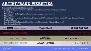
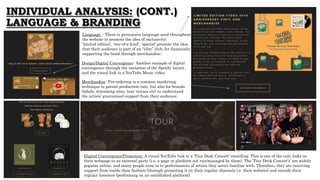
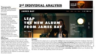
1) Artist websites typically feature menus for merchandise, music, tour dates, and newsletter signup. Graphics and typography are important for branding recognition.
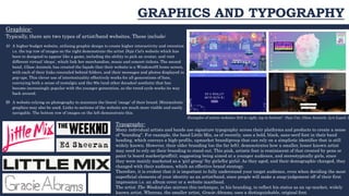
2) Websites utilize various designs - some with intricate graphics for interactivity, others focusing on photography. Typography plays a role in conveying an artist's image.
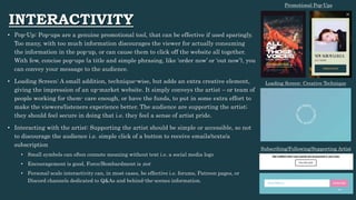
3) Elements like pop-ups, loading screens, and ways to interact with artists can enhance the user experience if implemented properly. Language, branding, and digital convergence are also important design considerations.