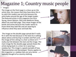
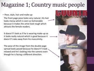
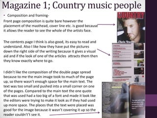
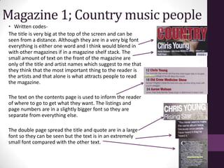
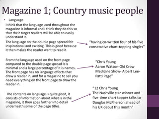
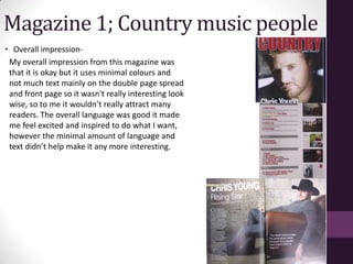
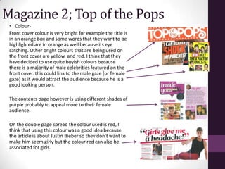
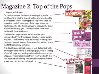
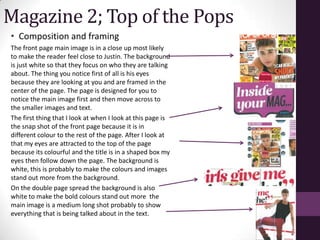
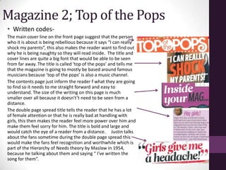
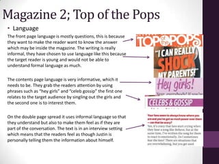
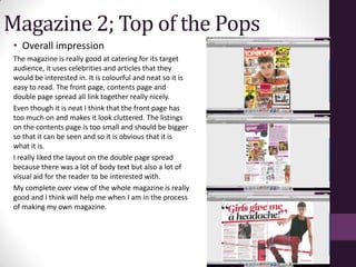
SlideShare a Scribd company logo
Textual Analysis
                  Darby
   Country and Top of the Pops magazine
Country Music People Mag
Circulation-
Readership information-
Mission statement-


Reader profile-


Publishers- Kickin cuts limited

I have tried to contact the magazine by sending an email.
However I haven't received a reply from them with their media
pack.
Magazine 1- Country music people
• Colour-
The masthead colour is red, this may be
because red is associated with passion and
determination and they want the colour of
the masthead to link with the person on the
front cover.
A lot of the colours used throughout the
double page spread is browns and blue’s
and I think this is because these are the
typical colours associated with the folk and
country genre, they are very natural and
earthy colours that link well with the folk
music genre.
Magazine 1- Country music people
Layout and Design-
 The layout and design on the front cover is very
 simple. The first thing that attracts the readers
 attention is the main image, I think this is
 because it is a close up shot of an artists face
 so its eye catching. The masthead is where it
 would normally be on a magazine, at the top of
 the page. There is only one cover line which is
 of the artists name, its places at the bottom of
 the page. Underneath the main cover line
 there is a sub cover line of other artists and
 bands that are featured in the issue.

 The contents page layout is pictures of the
 articles in the magazine down the right side of
 the page. Then the page number and what the
 article is about is down the left side of the
 page.
The double page spread is laid out over six
pages however I am focusing on the first two
pages. In the background there is one image
spread across both of the pages with most of
his body on the right page. They have done
this so that there is space for writing on the
left page. The title and sub titles are at the top
of the left page because its easy to read and is
normally associated with being placed here.
They have placed a quote on the right page, I
think they have done this to try and make the
page look less bare. The overall layout and
design of the double page spread to me is far
to bare and simple it doesn’t, and because it is
so bare I dont think it will attract many
readers. I would have a lot more text on the
double page spread to make it looks better.
Magazine 1; Country music people
• Images-
 The image on the front page is a close up on the
 artists face, the reason that they have done this is
 to catch the readers eye and also because the
 artist looks around the age of the target reader.
 The featured artists in this magazine are Chris
 Young, Aaron Watson, Old Crow Medicine Show,
 Albert Lee and Patti page. They show images of the
 bands and artists because the reader wants to
 know what they look like and are wearing to
 influence what they wear and look like.

  The image on the double page spread don’t really
 fit in with the text because in the texts he is talking
 about advice and touring in London and Paris and
 the image of him sitting in a chair so there isn't
 really any link between the text and the image. The
 main image for the double page spread shows the
 artists laying back in a chair, he is wearing a
 cowboy hat. This image is a good example of how
 ‘Representation and Stereotypes’ theory applies to
 this magazine i.e. cowboy hats are very stereo
 typically thought of as country clothing.
Magazine 1; Country music people
• Pose, style, hair and make up-
 The front page pose looks very natural. His hair
 looks messy which is seen as fashionable
 because it makes the artist look rough which
 attracts the female readers.

 It doesn't’t look as if he is wearing make-up so
 it looks really natural which is good because it
 doesn't’t rake away from his masculinity.

 The pose of the image from the double page
 spread looks posed because he doesn't’t look
 relaxed and he’s looking into the camera even
 though he is facing a different direction.
Magazine 1; Country music people
• Composition and framing-
Front page composition is quite bare however the
placement of the masthead, cover line etc. is good because
it allows the reader to see the whole of the artists face.

The contents page I think is also good, its easy to read and
understand. Also I like how they have put the pictures
down the right side of the writing because it gives a visual
aid and if the look of one of the articles attracts them then
they know exactly where to go.

I didn’t like the composition of the double page spread
because to me the main image took to much of the page
up, so there wasn’t enough space for the main text. The
text was too small and pushed into a small corner on one
of the pages. Compared to the main text the one quote
that was used had a too big of a font and made it look like
the editors were trying to make it look as if they had used
up more space. The places that the text were placed was
good for the image because it wasn’t covering it up so the
reader couldn't’t see it.
Magazine 1; Country music people
 • Written codes-
 The title is very big at the top of the screen and can be
 seen from a distance. Although they are in a very big font
 everything is either one word and I think would blend in
 with other magazines if in a magazine shelf stack. The
 small amount of text on the front of the magazine are
 only of the title and artist names which suggest to me that
 they think that the most important thing to the reader is
 the artists and that alone is what attracts people to read
 the magazine.

 The text on the contents page is used to inform the reader
 of where to go to get what they want. The listings and
 page numbers are in a slightly bigger font so they are
 separate from everything else.

 The double page spread the title and quote are in a large
 font so they can be seen but the text is in an extremely
 small font compared with the other text.
Magazine 1; Country music people
• Language-
 I think that the language used throughout the
 magazine is informal and I think they do this so
 that their target readers will be able to easily
 understand it.
 The language on the double page spread felt        “having co-written four of his five
 inspirational and exciting. This is good because   consecutive chart-topping singles”
 it then makes the reader want to read it.

 From the language used on the front page
                                                       “Chris Young
 compared to the double page spread it is
 minimal and a large percentage of it is names.        Aaron Watson-Old Crow
 The front page has no language effects that           Medicine Show- Albert Lee-
 draw a reader in, and for a magazine to sell you      Patti Page”
 need everything on the front page to draw the
 reader in.
                                                      “12 Chris Young
  The contents on language is quite good, it          The Nashville star winner and
 consists of information about what is in the         five-time chart topper talks to
 magazine, it then goes further into detail           Douglas McPherson ahead of
 underneath some of the page titles.                  his UK debut this month”
Magazine 1; Country music people
• Overall impression-
 My overall impression from this magazine was
 that it is okay but it uses minimal colours and
 not much text mainly on the double page spread
 and front page so it wasn't really interesting look
 wise, so to me it wouldn’t really attract many
 readers. The overall language was good it made
 me feel excited and inspired to do what I want,
 however the minimal amount of language and
 text didn’t help make it any more interesting.
Top of the pops magazine
  Circulation-
  Readership information-
  Mission statement-


  Reader profile-


  Publishers-
Magazine 2; Top of the Pops
 • Colour-
 Front cover colour is very bright for example the title is
 in an orange box and some words that they want to be
 highlighted are in orange as well because its eye
 catching. Other bright colours that are being used on
 the front cover are yellow and red. I think that they
 have decided to use quite boyish colours because
 there is a majority of male celebrities featured on the
 front cover. this could link to the male gaze (or female
 gaze) as it would attract the audience because he is a
 good looking person.

 The contents page however is using different shades of
 purple probably to appeal more to their female
 audience.

 On the double page spread the colour used is red, I
 think that using this colour was a good idea because
 the article is about Justin Bieber so they don’t want to
 make him seem girly but the colour red can also be
 associated for girls.
Magazine 2; Top of the Pops
 • Layout and design-
 On the front cover the layout is very typical, in the
 masthead there is the title, strap line and insert and is
 placed at the top of the magazine. The cover lines are
 placed on the left hand side of the page, these are
 easily seen. the title font is very girly because the target
 audience is mostly girls. The layout uses the rule of
 thirds with the main image.
 The contents page colours are a lot more girly
 compared with the front cover, they have used purple
 and pink. The font they have decided to use for part of
 the page makes it look as if someone has written it, and
 the font is also very feminine.
 The double page spread colour is red. Its laid out with
 an image on the whole of the right page, title at the top
 of the left page and writing and smaller images on the
 left page. The smaller image fits in really well with the
 text because it is talking about his relationship and the
 image is of him and his girlfriend.
Magazine 2; Top of the Pops
• Images-
The main image on the front page represents the typical idol boy of
the target readers. Justin Bieber is featured on the front cover, this
may be due to recent events during his life or because he is very
popular celebrity to the target reader. I wouldn't’t really say that
the image reflects the contents, I would have to say that the image
is to make the target audience buy the magazine. Using Justin in the
main images classes as Laura Mulvey’s theory of the male gaze
where she says the main purpose of that person being there is for
them to be ‘looked at’.

On the contents page the images are not as interesting a the ones in
the rest of the magazine but still connect to the target reader. There
are images of dolls of celebrities and topless boys.

The images on the double page spread vary, the main image is of
Justin Bieber rocking back on his chair. The image is a good one to
use because it makes him look a little rebellious where he is leaning
back, sitting the wrong way, wearing chains and a tank top that
shows off his ‘muscles’, the first paragraph of the text is talking
about his muscles, the representation and stereotype theory by
Branstone and Stafford applies here because they are using the bad
boy celebrity stereotype to make the female readers like him more.
This image would is ideal for the target reader because it tells them
a little about him. There is also a smaller image of Justin with his
girlfriend in the center of the text, this is there because it links in
with the text and gives the reader a visual of what they are talking
about.
Magazine 2; Top of the Pops
 • Pose, style, hair and make-up
 On the front page the main image looks staged because its not in a
 natural setting and he is looking right into the camera. The impression
 the image leaves on the reader is that they are being questioned
 because he’s looking straight into the readers eyes with his eyebrows
 raised so it looks as if he is asking the question that is the over line.
 His hair is in a quaff like it usually is, they have done his hair like this
 because it is in style at the moment and shows that Justin is trendy.
 The smaller images on the page mostly look natural because they are
 not taken in a studio and are not pulling a pose.
 The contents page photographs of celebrities all look really natural
 because they have either been taken with out the person knowing
 because they are not looking at the camera or have been taken by
 themselves. Their pose also shows they’re very natural because they
 are just smiling. It doesn’t look as if they have had their hair specially
 done because it’s a little messy.
 On double page spread the main image is staged because it is in a
 studio, I also think this because his hair and pose looks too perfect
 and to make the girl readers love him more. He is also looking into
 the camera again. The smaller image is natural because they are in
 the street and they haven't had their hair and make up done.
Magazine 2; Top of the Pops
• Composition and framing
The front page main image is in a close up most likely
to make the reader feel close to Justin. The background
is just white so that they focus on who they are talking
about. The thing you notice first of all is his eyes
because they are looking at you and are framed in the
center of the page. The page is designed for you to
notice the main image first and then move across to
the smaller images and text.
The first thing that I look at when I look at this page is
the snap shot of the front page because it is in
different colour to the rest of the page. After I look at
that my eyes are attracted to the top of the page
because its colourful and the title is in a shaped box my
eyes then follow down the page. The background is
white, this is probably to make the colours and images
stand out more from the background.
On the double page spread the background is also
white to make the bold colours stand out more the
main image is a medium long shot probably to show
everything that is being talked about in the text.
Magazine 2; Top of the Pops
• Written codes-
The main cover line on the front page suggest that the person
who it is about is being rebellious because it says “I can really
shock my parents”, this also makes the reader want to find out
why he is being naughty so they will read inside. The title and
cover lines are quite a big font that would be able to be seen
from far away. The title is called ‘top of the pops’ and tells me
that the magazine is going to mostly be based around famous
musicians because ‘top of the pops’ is also a music channel.
The contents page just inform the reader f what they are going
to find so it needs to me straight forward and easy to
understand. The size of the writing on this page is much
smaller over all because it doesn't’t need to be seen from a
distance.
The double page spread title tells the reader that he has a lot
of female attention or that he is really bad at handling with
girls, this then makes the reader feel more power over him and
make them feel sorry for him. The title is bold and large and
would catch the eye of a reader from a distance. Justin talks
about the fans sometime during the double page spread this
would make the fans feel recognition and worthwhile which is
part of the Hierarchy of Needs theory by Maslow in 1954,
because he talking about them and saying “ I've written the
song for them”.
Magazine 2; Top of the Pops
• Language
The front page language is mostly questions, this is because
they want to make the reader want to know the answer
which may be inside the magazine. The writing is really
informal, they have chosen to use language like this because
the target reader is young and would not be able to
understand formal language as much.

The contents page language is very informative, which it
needs to be. They grab the readers attention by using
phrases such as “hey girls” and “celeb gossip” the first one
relates to the target audience by singling out the girls and
the second one is to interest them.

On the double page spread it uses informal language so that
they understand but also to make them feel as if they are
part of the conversation. The text is in an interview setting
which means that the readers feel as though Justin is
personally telling them the information about himself.
Magazine 2; Top of the Pops
 • Overall impression
 The magazine is really good at catering for its target
 audience, it uses celebrities and articles that they
 would be interested in. It is colourful and neat so it is
 easy to read. The front page, contents page and
 double page spread all link together really nicely.
 Even though it is neat I think that the front page has
 too much on and makes it look cluttered. The listings
 on the contents page is too small and should be bigger
 so that it can be seen and so it is obvious that it is
 what it is.
 I really liked the layout on the double page spread
 because there was a lot of body text but also a lot of
 visual aid for the reader to be interested with.
 My complete over view of the whole magazine is really
 good and I think will help me when I am in the process
 of making my own magazine.

More Related Content

What's hot

Unit 14 L01
Unit 14 L01Unit 14 L01
Unit 14 L01
willbekker3013
 
Evaluation1 media
Evaluation1 mediaEvaluation1 media
Evaluation1 mediakatytierney
 
Evaluation of my music magazine ‘volume’
Evaluation of my music magazine ‘volume’Evaluation of my music magazine ‘volume’
Evaluation of my music magazine ‘volume’
Jessie Nelson
 
Evaluation complete
Evaluation completeEvaluation complete
Evaluation completeMaxGourley
 
Question one 1 presentation
 Question one 1 presentation Question one 1 presentation
Question one 1 presentation
ChrisAMedia
 
Evaluation question 1
Evaluation question 1Evaluation question 1
Evaluation question 1Beth Ivison
 
Evaluation finished
Evaluation finishedEvaluation finished
Evaluation finishedMaxGourley
 
Question 1 in what ways does your
Question 1   in what ways does yourQuestion 1   in what ways does your
Question 1 in what ways does yourgeckolover123
 
Evaluation Of AS Music Magazine
Evaluation Of AS Music MagazineEvaluation Of AS Music Magazine
Evaluation Of AS Music Magazinelilykimngo
 
Evaluation of AS Music Magazine
Evaluation of AS Music MagazineEvaluation of AS Music Magazine
Evaluation of AS Music Magazinelilykimngo
 
Evaluation Of AS Music Magazine
Evaluation Of AS Music MagazineEvaluation Of AS Music Magazine
Evaluation Of AS Music Magazinelilykimngo
 

What's hot (17)

Question 1
Question 1Question 1
Question 1
 
Unit 14 L01
Unit 14 L01Unit 14 L01
Unit 14 L01
 
Draft layout
Draft layoutDraft layout
Draft layout
 
Evaluation1 media
Evaluation1 mediaEvaluation1 media
Evaluation1 media
 
Evaluation of my music magazine ‘volume’
Evaluation of my music magazine ‘volume’Evaluation of my music magazine ‘volume’
Evaluation of my music magazine ‘volume’
 
Evaluation
EvaluationEvaluation
Evaluation
 
Evaluation complete
Evaluation completeEvaluation complete
Evaluation complete
 
Evaluation
EvaluationEvaluation
Evaluation
 
Question one 1 presentation
 Question one 1 presentation Question one 1 presentation
Question one 1 presentation
 
Evaluation
EvaluationEvaluation
Evaluation
 
Evaluation question 1
Evaluation question 1Evaluation question 1
Evaluation question 1
 
Evaluation copy
Evaluation copyEvaluation copy
Evaluation copy
 
Evaluation finished
Evaluation finishedEvaluation finished
Evaluation finished
 
Question 1 in what ways does your
Question 1   in what ways does yourQuestion 1   in what ways does your
Question 1 in what ways does your
 
Evaluation Of AS Music Magazine
Evaluation Of AS Music MagazineEvaluation Of AS Music Magazine
Evaluation Of AS Music Magazine
 
Evaluation of AS Music Magazine
Evaluation of AS Music MagazineEvaluation of AS Music Magazine
Evaluation of AS Music Magazine
 
Evaluation Of AS Music Magazine
Evaluation Of AS Music MagazineEvaluation Of AS Music Magazine
Evaluation Of AS Music Magazine
 

Viewers also liked

Evidencias fotograficas
Evidencias fotograficasEvidencias fotograficas
Evidencias fotograficasdgra_09
 
Developmental diary 2
Developmental diary 2Developmental diary 2
Developmental diary 2DarbySavage
 
Voxopop
VoxopopVoxopop
Reyes
ReyesReyes
ReyesG0RG1
 
Developmental diary 3
Developmental diary 3Developmental diary 3
Developmental diary 3DarbySavage
 
Message 7 ways to accelerate any message
Message 7 ways to accelerate any messageMessage 7 ways to accelerate any message
Message 7 ways to accelerate any message
Lex McKee The Institute of Accelerated Trainng
 
How does media products represent particular social groups
How does media products represent particular social groups How does media products represent particular social groups
How does media products represent particular social groups DarbySavage
 
Developmental diary
Developmental diaryDevelopmental diary
Developmental diaryDarbySavage
 
Questionnaire research power point
Questionnaire research power pointQuestionnaire research power point
Questionnaire research power pointDarbySavage
 
Life quotient for individuals presentation
Life quotient for individuals presentationLife quotient for individuals presentation
Life quotient for individuals presentation
Lex McKee The Institute of Accelerated Trainng
 
Best work contrast
Best work contrastBest work contrast
Best work contrastDarbySavage
 
授業用Twitterクライアント・アーカイブシステムの開発とその評価
授業用Twitterクライアント・アーカイブシステムの開発とその評価授業用Twitterクライアント・アーカイブシステムの開発とその評価
授業用Twitterクライアント・アーカイブシステムの開発とその評価
Shinya Mori (@mosuke5)
 
SGDによるDeepLearningの学習
SGDによるDeepLearningの学習SGDによるDeepLearningの学習
SGDによるDeepLearningの学習
Masashi (Jangsa) Kawaguchi
 

Viewers also liked (16)

Evidencias fotograficas
Evidencias fotograficasEvidencias fotograficas
Evidencias fotograficas
 
Developmental diary 2
Developmental diary 2Developmental diary 2
Developmental diary 2
 
Voxopop
VoxopopVoxopop
Voxopop
 
Reyes
ReyesReyes
Reyes
 
Q5
Q5Q5
Q5
 
Q5
Q5Q5
Q5
 
Developmental diary 3
Developmental diary 3Developmental diary 3
Developmental diary 3
 
Message 7 ways to accelerate any message
Message 7 ways to accelerate any messageMessage 7 ways to accelerate any message
Message 7 ways to accelerate any message
 
How does media products represent particular social groups
How does media products represent particular social groups How does media products represent particular social groups
How does media products represent particular social groups
 
Developmental diary
Developmental diaryDevelopmental diary
Developmental diary
 
Questionnaire research power point
Questionnaire research power pointQuestionnaire research power point
Questionnaire research power point
 
Life quotient for individuals presentation
Life quotient for individuals presentationLife quotient for individuals presentation
Life quotient for individuals presentation
 
Best work contrast
Best work contrastBest work contrast
Best work contrast
 
Presentation100
Presentation100Presentation100
Presentation100
 
授業用Twitterクライアント・アーカイブシステムの開発とその評価
授業用Twitterクライアント・アーカイブシステムの開発とその評価授業用Twitterクライアント・アーカイブシステムの開発とその評価
授業用Twitterクライアント・アーカイブシステムの開発とその評価
 
SGDによるDeepLearningの学習
SGDによるDeepLearningの学習SGDによるDeepLearningの学習
SGDによるDeepLearningの学習
 

Similar to Textual analysis presentation

Analyse 3 music magazines
Analyse 3 music magazinesAnalyse 3 music magazines
Analyse 3 music magazinescharliewalden95
 
Analyse 3 music magazines
Analyse 3 music magazinesAnalyse 3 music magazines
Analyse 3 music magazinescharliewalden95
 
Tasks 1 4 and hwk 1
Tasks 1 4 and hwk 1Tasks 1 4 and hwk 1
Tasks 1 4 and hwk 1
charlie__1
 
Tasks 1 4 and hwk 2
Tasks 1 4 and hwk 2Tasks 1 4 and hwk 2
Tasks 1 4 and hwk 2
charlie__97
 
Magazine cover review
Magazine cover review Magazine cover review
Magazine cover review
09lakeland
 
Research and planning all 3
Research and planning all 3Research and planning all 3
Research and planning all 3ReecebahiaGAD
 
Research- Double page spread
Research- Double page spreadResearch- Double page spread
Research- Double page spreadalicegrimshaw
 
Research- Double page spread
Research- Double page spreadResearch- Double page spread
Research- Double page spreadalicegrimshaw
 
Media presentation
Media presentationMedia presentation
Media presentationMedia12345
 
Magazine Analysis.
Magazine Analysis.Magazine Analysis.
Magazine Analysis.Gorvin001f
 
Analysis of three double page spreads from music magazines
Analysis of three double page spreads from music magazinesAnalysis of three double page spreads from music magazines
Analysis of three double page spreads from music magazineszoewarwood
 
Front cover analysis
Front cover analysisFront cover analysis
Front cover analysis
mollymediablog
 
Evaluation1 media
Evaluation1 mediaEvaluation1 media
Evaluation1 media
katytierney
 
Rocksound analysis
Rocksound analysisRocksound analysis
Rocksound analysis
vickyl4wrence
 
music magazine analysis 2
music magazine analysis 2 music magazine analysis 2
music magazine analysis 2 media355
 

Similar to Textual analysis presentation (20)

Analyse 3 music magazines
Analyse 3 music magazinesAnalyse 3 music magazines
Analyse 3 music magazines
 
Analyse 3 music magazines
Analyse 3 music magazinesAnalyse 3 music magazines
Analyse 3 music magazines
 
Tasks 1 4 and hwk 1
Tasks 1 4 and hwk 1Tasks 1 4 and hwk 1
Tasks 1 4 and hwk 1
 
Tasks 1 4 and hwk 2
Tasks 1 4 and hwk 2Tasks 1 4 and hwk 2
Tasks 1 4 and hwk 2
 
Magazine cover review
Magazine cover review Magazine cover review
Magazine cover review
 
Research and planning all 3
Research and planning all 3Research and planning all 3
Research and planning all 3
 
Research- Double page spread
Research- Double page spreadResearch- Double page spread
Research- Double page spread
 
Research- Double page spread
Research- Double page spreadResearch- Double page spread
Research- Double page spread
 
Media presentation
Media presentationMedia presentation
Media presentation
 
Magazine Analysis.
Magazine Analysis.Magazine Analysis.
Magazine Analysis.
 
Existing products
Existing productsExisting products
Existing products
 
Analysis of three double page spreads from music magazines
Analysis of three double page spreads from music magazinesAnalysis of three double page spreads from music magazines
Analysis of three double page spreads from music magazines
 
Magazine research
Magazine researchMagazine research
Magazine research
 
Evaluation
EvaluationEvaluation
Evaluation
 
Front cover analysis
Front cover analysisFront cover analysis
Front cover analysis
 
Evaluation1 media
Evaluation1 mediaEvaluation1 media
Evaluation1 media
 
Rocksound analysis
Rocksound analysisRocksound analysis
Rocksound analysis
 
music magazine analysis 2
music magazine analysis 2 music magazine analysis 2
music magazine analysis 2
 
Textual analysis
Textual analysisTextual analysis
Textual analysis
 
Analysis
AnalysisAnalysis
Analysis
 

More from DarbySavage

Best work contrast
Best work contrastBest work contrast
Best work contrastDarbySavage
 
Questionnaire research power point
Questionnaire research power pointQuestionnaire research power point
Questionnaire research power pointDarbySavage
 
Questionnaire folk music
Questionnaire folk musicQuestionnaire folk music
Questionnaire folk musicDarbySavage
 

More from DarbySavage (6)

Best work contrast
Best work contrastBest work contrast
Best work contrast
 
Questionnaire research power point
Questionnaire research power pointQuestionnaire research power point
Questionnaire research power point
 
Questionnaire folk music
Questionnaire folk musicQuestionnaire folk music
Questionnaire folk music
 
Initial ideas
Initial ideasInitial ideas
Initial ideas
 
Presentation100
Presentation100Presentation100
Presentation100
 
My best work
My best workMy best work
My best work
 

Textual analysis presentation

  • 1. Textual Analysis Darby Country and Top of the Pops magazine
  • 2. Country Music People Mag Circulation- Readership information- Mission statement- Reader profile- Publishers- Kickin cuts limited I have tried to contact the magazine by sending an email. However I haven't received a reply from them with their media pack.
  • 3. Magazine 1- Country music people • Colour- The masthead colour is red, this may be because red is associated with passion and determination and they want the colour of the masthead to link with the person on the front cover. A lot of the colours used throughout the double page spread is browns and blue’s and I think this is because these are the typical colours associated with the folk and country genre, they are very natural and earthy colours that link well with the folk music genre.
  • 4. Magazine 1- Country music people Layout and Design- The layout and design on the front cover is very simple. The first thing that attracts the readers attention is the main image, I think this is because it is a close up shot of an artists face so its eye catching. The masthead is where it would normally be on a magazine, at the top of the page. There is only one cover line which is of the artists name, its places at the bottom of the page. Underneath the main cover line there is a sub cover line of other artists and bands that are featured in the issue. The contents page layout is pictures of the articles in the magazine down the right side of the page. Then the page number and what the article is about is down the left side of the page.
  • 5. The double page spread is laid out over six pages however I am focusing on the first two pages. In the background there is one image spread across both of the pages with most of his body on the right page. They have done this so that there is space for writing on the left page. The title and sub titles are at the top of the left page because its easy to read and is normally associated with being placed here. They have placed a quote on the right page, I think they have done this to try and make the page look less bare. The overall layout and design of the double page spread to me is far to bare and simple it doesn’t, and because it is so bare I dont think it will attract many readers. I would have a lot more text on the double page spread to make it looks better.
  • 6. Magazine 1; Country music people • Images- The image on the front page is a close up on the artists face, the reason that they have done this is to catch the readers eye and also because the artist looks around the age of the target reader. The featured artists in this magazine are Chris Young, Aaron Watson, Old Crow Medicine Show, Albert Lee and Patti page. They show images of the bands and artists because the reader wants to know what they look like and are wearing to influence what they wear and look like. The image on the double page spread don’t really fit in with the text because in the texts he is talking about advice and touring in London and Paris and the image of him sitting in a chair so there isn't really any link between the text and the image. The main image for the double page spread shows the artists laying back in a chair, he is wearing a cowboy hat. This image is a good example of how ‘Representation and Stereotypes’ theory applies to this magazine i.e. cowboy hats are very stereo typically thought of as country clothing.
  • 7. Magazine 1; Country music people • Pose, style, hair and make up- The front page pose looks very natural. His hair looks messy which is seen as fashionable because it makes the artist look rough which attracts the female readers. It doesn't’t look as if he is wearing make-up so it looks really natural which is good because it doesn't’t rake away from his masculinity. The pose of the image from the double page spread looks posed because he doesn't’t look relaxed and he’s looking into the camera even though he is facing a different direction.
  • 8. Magazine 1; Country music people • Composition and framing- Front page composition is quite bare however the placement of the masthead, cover line etc. is good because it allows the reader to see the whole of the artists face. The contents page I think is also good, its easy to read and understand. Also I like how they have put the pictures down the right side of the writing because it gives a visual aid and if the look of one of the articles attracts them then they know exactly where to go. I didn’t like the composition of the double page spread because to me the main image took to much of the page up, so there wasn’t enough space for the main text. The text was too small and pushed into a small corner on one of the pages. Compared to the main text the one quote that was used had a too big of a font and made it look like the editors were trying to make it look as if they had used up more space. The places that the text were placed was good for the image because it wasn’t covering it up so the reader couldn't’t see it.
  • 9. Magazine 1; Country music people • Written codes- The title is very big at the top of the screen and can be seen from a distance. Although they are in a very big font everything is either one word and I think would blend in with other magazines if in a magazine shelf stack. The small amount of text on the front of the magazine are only of the title and artist names which suggest to me that they think that the most important thing to the reader is the artists and that alone is what attracts people to read the magazine. The text on the contents page is used to inform the reader of where to go to get what they want. The listings and page numbers are in a slightly bigger font so they are separate from everything else. The double page spread the title and quote are in a large font so they can be seen but the text is in an extremely small font compared with the other text.
  • 10. Magazine 1; Country music people • Language- I think that the language used throughout the magazine is informal and I think they do this so that their target readers will be able to easily understand it. The language on the double page spread felt “having co-written four of his five inspirational and exciting. This is good because consecutive chart-topping singles” it then makes the reader want to read it. From the language used on the front page “Chris Young compared to the double page spread it is minimal and a large percentage of it is names. Aaron Watson-Old Crow The front page has no language effects that Medicine Show- Albert Lee- draw a reader in, and for a magazine to sell you Patti Page” need everything on the front page to draw the reader in. “12 Chris Young The contents on language is quite good, it The Nashville star winner and consists of information about what is in the five-time chart topper talks to magazine, it then goes further into detail Douglas McPherson ahead of underneath some of the page titles. his UK debut this month”
  • 11. Magazine 1; Country music people • Overall impression- My overall impression from this magazine was that it is okay but it uses minimal colours and not much text mainly on the double page spread and front page so it wasn't really interesting look wise, so to me it wouldn’t really attract many readers. The overall language was good it made me feel excited and inspired to do what I want, however the minimal amount of language and text didn’t help make it any more interesting.
  • 12. Top of the pops magazine Circulation- Readership information- Mission statement- Reader profile- Publishers-
  • 13. Magazine 2; Top of the Pops • Colour- Front cover colour is very bright for example the title is in an orange box and some words that they want to be highlighted are in orange as well because its eye catching. Other bright colours that are being used on the front cover are yellow and red. I think that they have decided to use quite boyish colours because there is a majority of male celebrities featured on the front cover. this could link to the male gaze (or female gaze) as it would attract the audience because he is a good looking person. The contents page however is using different shades of purple probably to appeal more to their female audience. On the double page spread the colour used is red, I think that using this colour was a good idea because the article is about Justin Bieber so they don’t want to make him seem girly but the colour red can also be associated for girls.
  • 14. Magazine 2; Top of the Pops • Layout and design- On the front cover the layout is very typical, in the masthead there is the title, strap line and insert and is placed at the top of the magazine. The cover lines are placed on the left hand side of the page, these are easily seen. the title font is very girly because the target audience is mostly girls. The layout uses the rule of thirds with the main image. The contents page colours are a lot more girly compared with the front cover, they have used purple and pink. The font they have decided to use for part of the page makes it look as if someone has written it, and the font is also very feminine. The double page spread colour is red. Its laid out with an image on the whole of the right page, title at the top of the left page and writing and smaller images on the left page. The smaller image fits in really well with the text because it is talking about his relationship and the image is of him and his girlfriend.
  • 15. Magazine 2; Top of the Pops • Images- The main image on the front page represents the typical idol boy of the target readers. Justin Bieber is featured on the front cover, this may be due to recent events during his life or because he is very popular celebrity to the target reader. I wouldn't’t really say that the image reflects the contents, I would have to say that the image is to make the target audience buy the magazine. Using Justin in the main images classes as Laura Mulvey’s theory of the male gaze where she says the main purpose of that person being there is for them to be ‘looked at’. On the contents page the images are not as interesting a the ones in the rest of the magazine but still connect to the target reader. There are images of dolls of celebrities and topless boys. The images on the double page spread vary, the main image is of Justin Bieber rocking back on his chair. The image is a good one to use because it makes him look a little rebellious where he is leaning back, sitting the wrong way, wearing chains and a tank top that shows off his ‘muscles’, the first paragraph of the text is talking about his muscles, the representation and stereotype theory by Branstone and Stafford applies here because they are using the bad boy celebrity stereotype to make the female readers like him more. This image would is ideal for the target reader because it tells them a little about him. There is also a smaller image of Justin with his girlfriend in the center of the text, this is there because it links in with the text and gives the reader a visual of what they are talking about.
  • 16. Magazine 2; Top of the Pops • Pose, style, hair and make-up On the front page the main image looks staged because its not in a natural setting and he is looking right into the camera. The impression the image leaves on the reader is that they are being questioned because he’s looking straight into the readers eyes with his eyebrows raised so it looks as if he is asking the question that is the over line. His hair is in a quaff like it usually is, they have done his hair like this because it is in style at the moment and shows that Justin is trendy. The smaller images on the page mostly look natural because they are not taken in a studio and are not pulling a pose. The contents page photographs of celebrities all look really natural because they have either been taken with out the person knowing because they are not looking at the camera or have been taken by themselves. Their pose also shows they’re very natural because they are just smiling. It doesn’t look as if they have had their hair specially done because it’s a little messy. On double page spread the main image is staged because it is in a studio, I also think this because his hair and pose looks too perfect and to make the girl readers love him more. He is also looking into the camera again. The smaller image is natural because they are in the street and they haven't had their hair and make up done.
  • 17. Magazine 2; Top of the Pops • Composition and framing The front page main image is in a close up most likely to make the reader feel close to Justin. The background is just white so that they focus on who they are talking about. The thing you notice first of all is his eyes because they are looking at you and are framed in the center of the page. The page is designed for you to notice the main image first and then move across to the smaller images and text. The first thing that I look at when I look at this page is the snap shot of the front page because it is in different colour to the rest of the page. After I look at that my eyes are attracted to the top of the page because its colourful and the title is in a shaped box my eyes then follow down the page. The background is white, this is probably to make the colours and images stand out more from the background. On the double page spread the background is also white to make the bold colours stand out more the main image is a medium long shot probably to show everything that is being talked about in the text.
  • 18. Magazine 2; Top of the Pops • Written codes- The main cover line on the front page suggest that the person who it is about is being rebellious because it says “I can really shock my parents”, this also makes the reader want to find out why he is being naughty so they will read inside. The title and cover lines are quite a big font that would be able to be seen from far away. The title is called ‘top of the pops’ and tells me that the magazine is going to mostly be based around famous musicians because ‘top of the pops’ is also a music channel. The contents page just inform the reader f what they are going to find so it needs to me straight forward and easy to understand. The size of the writing on this page is much smaller over all because it doesn't’t need to be seen from a distance. The double page spread title tells the reader that he has a lot of female attention or that he is really bad at handling with girls, this then makes the reader feel more power over him and make them feel sorry for him. The title is bold and large and would catch the eye of a reader from a distance. Justin talks about the fans sometime during the double page spread this would make the fans feel recognition and worthwhile which is part of the Hierarchy of Needs theory by Maslow in 1954, because he talking about them and saying “ I've written the song for them”.
  • 19. Magazine 2; Top of the Pops • Language The front page language is mostly questions, this is because they want to make the reader want to know the answer which may be inside the magazine. The writing is really informal, they have chosen to use language like this because the target reader is young and would not be able to understand formal language as much. The contents page language is very informative, which it needs to be. They grab the readers attention by using phrases such as “hey girls” and “celeb gossip” the first one relates to the target audience by singling out the girls and the second one is to interest them. On the double page spread it uses informal language so that they understand but also to make them feel as if they are part of the conversation. The text is in an interview setting which means that the readers feel as though Justin is personally telling them the information about himself.
  • 20. Magazine 2; Top of the Pops • Overall impression The magazine is really good at catering for its target audience, it uses celebrities and articles that they would be interested in. It is colourful and neat so it is easy to read. The front page, contents page and double page spread all link together really nicely. Even though it is neat I think that the front page has too much on and makes it look cluttered. The listings on the contents page is too small and should be bigger so that it can be seen and so it is obvious that it is what it is. I really liked the layout on the double page spread because there was a lot of body text but also a lot of visual aid for the reader to be interested with. My complete over view of the whole magazine is really good and I think will help me when I am in the process of making my own magazine.