Style

After researching pop music magazines I have identified that they all have individual styles; in
order to make my product successful I am going to try to create my own style and make sure it’s
consistent to create a brand identity and therefore make my magazine successful. I have
decided to that my style needs to be something original – however, I need to make sure that it
follows the conventions of a pop music magazine. Unlike some pop magazines I want a fairly
equal balance between images and text – this is because currently society appears to be very
interested in photography and images, I know this because many people now use such things as
Instagram, Picasa and Tumblr to post photos and share them with the world, this means people
want to see images and so I am going to use this to make my magazine appealing to the mass
audience and original compared to other magazines.
In my audience research survey I asked about the colours people expected to see on a music
magazine, the top results were white, black, blue, red and purple out of ten different colours. The
problem is that not all of these colours look right together, and looking at my research into similar
products black, red and white seemed the most conventional. So as my similar products research
contradicts with my audience research I have to think of what will work best. As purple was a
very popular colour I would like to use it but it connotes more of a punk/rock music magazine so I
think I will have to use it sparingly. So the colours for my magazine will be black, white, red and
very little purple.
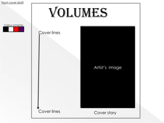
Front cover draft


                         Volumes
  Colour scheme:


                    Cover lines


                                  Artist’s image


                    Cover lines   Cover story
The name of my magazine will be “Volumes”, this is because it links to the idea of music and as this
is a music magazine I think it works well. Looking at my research of Rolling Stone, Billboard and Q
magazine I realized that the name of the magazine is very important: it has to be short,
memorable and quick. I need to make the name of the magazine a logo, something identifiable
and recognizable. So I believed Volumes would do this, it’s short, snappy, attention grabbing and
relates to music.
The layout of the front cover is going to be fairly ordered with an element of clutter to make it
exciting and a little bit quirky – I think this will help it to be an original and thus successful product.
The image of the artist is going to be a mid shot or close up because this seems to be the
convention for pop genre magazines and I need to make my product conventional. This image is
going to take up most of the page – I think this will fit in with the style I’m trying to create for my
magazine, not only will it have numerous features I also want to include lots of images, this is
because many people in my survey wanted to see photo galleries in my magazine. I also think this
idea will make my product slightly different to the major pop magazines around today, therefore it
will be something original that can appeal to a mass audience. After speaking to many people
about pop magazines and looking at what is currently a trend, Instagram, I have realized a major
focus nowadays is on photos and so I want to use this in my magazine to make it more appealing
and up to date with society today.
I want to put cover lines on the left third of the page as this is the most dominant side of the page
and through my research I have found out that this helps make the magazine successful as
magazines are placed on a shelf with only their left third showing – so I want to make this part full
of cover lines to appeal to a mass amount of people. The use of the left third of the page like this is
very conventional for pop genre magazines so will help my magazine appeal to its target
audience.
The front page of my magazine has to be both appealing and original – there are many pop
music magazines already available to my target audience so in order to make my product
successful it has to offer something else, this will be the originality offered by Volumes. Hopefully,
through the use of conventions and feedback from my target audience the front cover will be
both appealing and original.
For my masthead/logo I want to use a serif typography – this is because it seems most
conventional, however I want it to be fairly clear and easy to read but I think that by using a serif
typography for the masthead (which is to become my logo) it will be easily recognizable and
therefore help me to create the brand identity that I want. I also want to incorporate the colours
selected through audience and similar products research. The masthead will be the biggest size of
typography on the page. It will be behind the artists image – as this is conventional for pop genre
magazines.
For the cover lines and cover story, I want to use a mixture of serif and san serif typography in
different sizes to create the quirky and original identity for my product. I think this mixture will also
help me to create the cluttered element I want for the front cover but will also allow me to keep
the uniformed and ordered layout.
The cover story needs to be attention-grabbing, it will be in a completely different typography to
the rest of the front cover, this way it will stand out against the layout of the page. It will be in front
of the image and cover the less important parts of the image. This is because it is conventional to
do this and also so that the main focus is on the cover story and image.
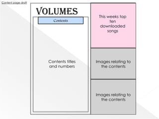
Content page draft


                     Volumes              This weeks top
                         Contents               ten
                                           downloaded
                                               songs


                       Contents titles   Images relating to
                       and numbers         the contents


                                         Images relating to
                                           the contents
The contents page for my magazine, Volumes, is going to try to include the conventions set out by other
pop magazines in order to appeal to my target audience. I have decided that after close research into
the pop magazine Billboard I would like to include a chart listing like Billboard. This is because I think it
really appeals to music listeners, however, I am only going to use the top ten tracks downloaded from
iTunes. This is because I think that by linking with Apple and iTunes I can make my product much more
successful as many of my target audience will have iPod's/iPhone's and will have to use iTunes to
download music – it is also a very successful part of the music business so by using them I can appeal to
those who are interested in that. I am going to put this top ten in the top right hand corner as then it is
separated from the rest of the contents page – but is still a major part of it.
Continuing with my idea of creating a consistent style I am going to have a smaller logo/masthead in
the top left hand corner – just so that the style is created consistently and this will help to make the logo
that is the masthead more recognized. Also continuing with this style I am going to put two images in
the contents page – linking to what is in the magazine. I think this will help me to have more of a
balance between photos and text, these images will have the numbers of the pages that link to them in
the bottom left corner of the photo as this appears to be what is conventional for pop music
magazines.
The actual contents with the titles of the features, reviews, interviews etc. of the magazine will be in a
listed on the left side of the page – this was conventional in Q magazine. I will have the titles in a larger
and bold font and the stand firsts after them in a smaller and not bold font. I have decided that the
numbers relating to pages of the magazine (both in the contents and on the images) with be in the
same font but italic and black so they keep a consistent style.
The images are going to be of different features in the magazine, I think I will have a male solo artist and
a band as the two images on the front cover, I think this will help appeal to my target audience.
I also want to include hobbies and interests of my target audience as cover lines and then as headings
in the contents page.
Cover story:
Jess Deeps: over the worst
Exclusive interview! She is back and better than ever...

Cover lines:
Taylor Swift & Red – new album, track by track interview.

One Direction
It’s been two years since they started on the music scene, what have they achieved?

Adele – baby’s coming!
TOP TEN iTUNES
                                                             DOWNLOADS THIS
12. The Script –
                                                             WEEK
     After Danny’s appearance on the voice and the
      massive success of their latest album what are the     1.               6.
      band planning for their next move in the music         2.               7.
      business?                                              3.               8.
26. Taylor Swift - Red                                       4.               9.
     Taylor’s new album is finally out and we are            5.               10.
      excited! Track-by-track interview with the beautiful
      blonde herself as she talks us through Red.
34. JUSTIN BIEBER - PHOTO GALLERY
     An exclusive sneak preview of Justin Bieber’s tour
      bus as we talk to him about the Believe Tour & the
      surprises Beliebers can expect!
39. Jess Deeps – Girl back in the spotlight                           16
     We talk about what happened in the last two
      years, straight from the girl herself, and she
      discusses her new music and how she’s
      transformed herself
45. We The Kings – concert pictures
     Yes those lovable boys are featured this week as
      we look at a gallery of pictures from their latest
      concerts and talk about what you thought about
      the concerts.
56. Upcoming events
    Guide to the hottest places to be for new music this              41
      month!
Double page spread draft


                           HEADLINE              Image of the artist relating to the
                                  Byline
                                                feature – with a background. Mid
                             Stand first – to
                                                          shot/wide shot
                             introduce the
                                 feature
        Long shot
          of the
        featured
          artist                                   Continuing the feature –
                           Body text – in two      more body text, again in
                           columns, fairly         two columns, the same
                           small typography        typography and size of
                           but large enough        the other body text.
                           to clearly see.


         Caption
The double page spread for my magazine needs to keep the consistent style of Volumes that I
am trying to create, however it also has to fit in with the artists image. My double page spread is
going to be on Jess Deeps, a young female solo artist, this is also going to be the cover story. It’s
going to be about her struggle as she was flung into the spotlight. For this I will need to use a lot
of images, because I only have a double page I am not going to do a photo gallery as the
body text is what needs to be included. However, in order to keep with the style of Volumes, I
need to make sure to include a lot of images. In this draft I have decided to use two images,
one long shot of the artist and a mid or wide shot of the artist with a background relating to a
part in the article. I think I want the wide or mid shot image to relate to a pull quote in the article
– as I think this is conventional and will appeal to my target audience. For the long shot I want it
to have a caption, as this is a feature of double page spreads and will make my product more
professional. Although it is conventional to have large headings for the double page spreads
that take up a large proportion of the page, I want to use a different way to make it original, I
am going to have large headings but at the top of the first page so that it is more orderly. Also,
through my research I saw that it was conventional to use full page images on some double
page spreads. I have decided that I will do that in my magazine, however, not on this double
page spread. This is because I want an assortment of images rather than just one, also it will help
my product to be original and quirky as not every double page spread will have the same
format – making sure the magazine is not too ordered so it appeals to the wide target audience
I have.
The typography for the article is going to be serif as this reads better than san serif as it helps the
writing to flow, so in order to make sure it’s easily read the body text will be in a serif but clear
font and will be fairly small – but big enough to read. I think the typography will be black, this is
because I think I want the background to be grey stained sort of wall – but as this is only a draft
I’m not sure. But if I go with this idea the background of the page will be a black/white/grey
scale wall and the heading of the feature will be as if it’s written on the wall in a serif font also. I
think this will help the double page spread to be quite quirky and different but still original to the
style of Volumes and fitting in with the conventions.
Girl back in the spotlight                                      got to me, and I wanted it more than I’ve ever wanted
After a traumatic two years completely in the spotlight as      anything”. She also spoke about the production of her
her condition deteriorated Jess Deeps is back and staying       debut album Imperfections, “there was a lot to do, he
strong.                                                         wanted me to write it all, said that’s the only way I’ll have
                                                                success – said that I needed to make something out of the
Jess Deeps has faced some of the hardest times of her life little personality I had. Rob said all I needed to do was dig
in the past two years with exploiting managers, emotional deep, think about everything that I hated about myself and
turmoil and mental health issues, which all took place in the put it in to songs – he said he’s fix it, all those things. I guess
public eye. Rumours were spread, pictures were leaked           at this point I didn’t know how to feel, I wanted success
and at only nineteen she’s back from her recovery and is and I loved writing, I loved performing. I don’t know how to
staying strong for all her fans. Her new album, Raconteur, is explain it – he made me feel like I had everything but at the
on the way and Volumes gets an exclusive look into it track- same time like I had nothing”.
by-track and the real facts behind the stories of Jess Deeps.
                                                                Fortunately after she fell into depression and suffered
“STAY STRONG” is the phrase wisely spoken by Jess Deeps; further, someone noticed. Her new manager, David Steele,
she surfaced on the music scene back in 2010 after singing spoke to Volumes exclusively and said “I met her at a
at a talent contest in her hometown of Cambridge,               record label meeting, she lagged behind Winton, I guess I
England. After a video, recorded by a friend, was posted saw the dark circles under her eyes and the nervous and
on YouTube it went viral and she was propelled into the         jittery tone she had, she was stuck. It turns out he had
spotlight and snatched up under the management of Rob pushed her into a massive state of depression through his
Winton, a music scout from West LA. Of course Jess Deeps, pressures. She ended up self harming and grew paranoid,
being the naïve seventeen year old girl she was at the time, luckily a few of the record label’s chief executives listened
had no idea that he would be the reason for her                 to me and I was able to help her”.
breakdown. Speaking exclusively to Volumes Jess Deeps
said “he was charismatic, when he entered the room
everyone turned to look at him – everyone wanted to talk
to him. He seemed like the kind of man you could trust, so
naturally, I did. I guess the whole idea that I could be a star
went to my head and his endless promises of my name in
lights, a star on the walk of fame, this whole idea of fame
Well Volumes is happy to report that Jess Deeps is back        But what kind of direction is she going in here?
and better than ever! What has she got to say about her “I’ve kind of written this song with the influence of new
upcoming album?                                                artists, I admire artists like Lana Del Rey and Kyla La
“I’ve gone in a completely different direction, I’m finally    Grange so much, they’re a completely different type of
starting to figure out who I am, my personality and the        pop, their music makes me actually feel and that’s what I
music that I want to write. My new single and music video love about it, it’s what I wanted to try to recreate. And I’m
is definitely going to show you that. I hope the fans give it a massive fan of Britney so I’ve definitely tried to get make
a big of chance because it really is so different. But I’m     my music have that can’t stop listening thing she’s got
different, I’ve written these songs from the heart, my         going on! But I’ve also used the influence from Justin
experiences: they mean a lot to me”.                           Bieber – he seems to understand his fans and that’s what
Deeps’ new album is still being recorded but she is about I’ve tried to do too”.
to release the first single after her tragic chapter.          What’s the plan for the music video?
What is your new single about?                                 “Well I don’t want to give too much away here, it’s quite a
“it’s called Damages and it’s all about my struggles, but it’s dark setting really but this was a dark period of my life. It
not the way everyone else would talk about what                uses the lyrics of the song and my real personality to show
happened, it’s about how I feel now it’s happened, what what the song means to me – I helped in writing the music
it’s left with me. I hope it can relate to situations other    video, I want to make sure my music is what I want it to be.
people my age have been in. I hope it can help them            After everything that is happened I don’t want to be
heal just as it has me”.                                       fake”.

Draft layout

  • 2.
    Style After researching popmusic magazines I have identified that they all have individual styles; in order to make my product successful I am going to try to create my own style and make sure it’s consistent to create a brand identity and therefore make my magazine successful. I have decided to that my style needs to be something original – however, I need to make sure that it follows the conventions of a pop music magazine. Unlike some pop magazines I want a fairly equal balance between images and text – this is because currently society appears to be very interested in photography and images, I know this because many people now use such things as Instagram, Picasa and Tumblr to post photos and share them with the world, this means people want to see images and so I am going to use this to make my magazine appealing to the mass audience and original compared to other magazines. In my audience research survey I asked about the colours people expected to see on a music magazine, the top results were white, black, blue, red and purple out of ten different colours. The problem is that not all of these colours look right together, and looking at my research into similar products black, red and white seemed the most conventional. So as my similar products research contradicts with my audience research I have to think of what will work best. As purple was a very popular colour I would like to use it but it connotes more of a punk/rock music magazine so I think I will have to use it sparingly. So the colours for my magazine will be black, white, red and very little purple.
  • 3.
    Front cover draft Volumes Colour scheme: Cover lines Artist’s image Cover lines Cover story
  • 4.
    The name ofmy magazine will be “Volumes”, this is because it links to the idea of music and as this is a music magazine I think it works well. Looking at my research of Rolling Stone, Billboard and Q magazine I realized that the name of the magazine is very important: it has to be short, memorable and quick. I need to make the name of the magazine a logo, something identifiable and recognizable. So I believed Volumes would do this, it’s short, snappy, attention grabbing and relates to music. The layout of the front cover is going to be fairly ordered with an element of clutter to make it exciting and a little bit quirky – I think this will help it to be an original and thus successful product. The image of the artist is going to be a mid shot or close up because this seems to be the convention for pop genre magazines and I need to make my product conventional. This image is going to take up most of the page – I think this will fit in with the style I’m trying to create for my magazine, not only will it have numerous features I also want to include lots of images, this is because many people in my survey wanted to see photo galleries in my magazine. I also think this idea will make my product slightly different to the major pop magazines around today, therefore it will be something original that can appeal to a mass audience. After speaking to many people about pop magazines and looking at what is currently a trend, Instagram, I have realized a major focus nowadays is on photos and so I want to use this in my magazine to make it more appealing and up to date with society today. I want to put cover lines on the left third of the page as this is the most dominant side of the page and through my research I have found out that this helps make the magazine successful as magazines are placed on a shelf with only their left third showing – so I want to make this part full of cover lines to appeal to a mass amount of people. The use of the left third of the page like this is very conventional for pop genre magazines so will help my magazine appeal to its target audience. The front page of my magazine has to be both appealing and original – there are many pop music magazines already available to my target audience so in order to make my product successful it has to offer something else, this will be the originality offered by Volumes. Hopefully, through the use of conventions and feedback from my target audience the front cover will be both appealing and original.
  • 5.
    For my masthead/logoI want to use a serif typography – this is because it seems most conventional, however I want it to be fairly clear and easy to read but I think that by using a serif typography for the masthead (which is to become my logo) it will be easily recognizable and therefore help me to create the brand identity that I want. I also want to incorporate the colours selected through audience and similar products research. The masthead will be the biggest size of typography on the page. It will be behind the artists image – as this is conventional for pop genre magazines. For the cover lines and cover story, I want to use a mixture of serif and san serif typography in different sizes to create the quirky and original identity for my product. I think this mixture will also help me to create the cluttered element I want for the front cover but will also allow me to keep the uniformed and ordered layout. The cover story needs to be attention-grabbing, it will be in a completely different typography to the rest of the front cover, this way it will stand out against the layout of the page. It will be in front of the image and cover the less important parts of the image. This is because it is conventional to do this and also so that the main focus is on the cover story and image.
  • 6.
    Content page draft Volumes This weeks top Contents ten downloaded songs Contents titles Images relating to and numbers the contents Images relating to the contents
  • 7.
    The contents pagefor my magazine, Volumes, is going to try to include the conventions set out by other pop magazines in order to appeal to my target audience. I have decided that after close research into the pop magazine Billboard I would like to include a chart listing like Billboard. This is because I think it really appeals to music listeners, however, I am only going to use the top ten tracks downloaded from iTunes. This is because I think that by linking with Apple and iTunes I can make my product much more successful as many of my target audience will have iPod's/iPhone's and will have to use iTunes to download music – it is also a very successful part of the music business so by using them I can appeal to those who are interested in that. I am going to put this top ten in the top right hand corner as then it is separated from the rest of the contents page – but is still a major part of it. Continuing with my idea of creating a consistent style I am going to have a smaller logo/masthead in the top left hand corner – just so that the style is created consistently and this will help to make the logo that is the masthead more recognized. Also continuing with this style I am going to put two images in the contents page – linking to what is in the magazine. I think this will help me to have more of a balance between photos and text, these images will have the numbers of the pages that link to them in the bottom left corner of the photo as this appears to be what is conventional for pop music magazines. The actual contents with the titles of the features, reviews, interviews etc. of the magazine will be in a listed on the left side of the page – this was conventional in Q magazine. I will have the titles in a larger and bold font and the stand firsts after them in a smaller and not bold font. I have decided that the numbers relating to pages of the magazine (both in the contents and on the images) with be in the same font but italic and black so they keep a consistent style. The images are going to be of different features in the magazine, I think I will have a male solo artist and a band as the two images on the front cover, I think this will help appeal to my target audience. I also want to include hobbies and interests of my target audience as cover lines and then as headings in the contents page.
  • 8.
    Cover story: Jess Deeps:over the worst Exclusive interview! She is back and better than ever... Cover lines: Taylor Swift & Red – new album, track by track interview. One Direction It’s been two years since they started on the music scene, what have they achieved? Adele – baby’s coming!
  • 9.
    TOP TEN iTUNES DOWNLOADS THIS 12. The Script – WEEK After Danny’s appearance on the voice and the massive success of their latest album what are the 1. 6. band planning for their next move in the music 2. 7. business? 3. 8. 26. Taylor Swift - Red 4. 9. Taylor’s new album is finally out and we are 5. 10. excited! Track-by-track interview with the beautiful blonde herself as she talks us through Red. 34. JUSTIN BIEBER - PHOTO GALLERY An exclusive sneak preview of Justin Bieber’s tour bus as we talk to him about the Believe Tour & the surprises Beliebers can expect! 39. Jess Deeps – Girl back in the spotlight 16 We talk about what happened in the last two years, straight from the girl herself, and she discusses her new music and how she’s transformed herself 45. We The Kings – concert pictures Yes those lovable boys are featured this week as we look at a gallery of pictures from their latest concerts and talk about what you thought about the concerts. 56. Upcoming events Guide to the hottest places to be for new music this 41 month!
  • 10.
    Double page spreaddraft HEADLINE Image of the artist relating to the Byline feature – with a background. Mid Stand first – to shot/wide shot introduce the feature Long shot of the featured artist Continuing the feature – Body text – in two more body text, again in columns, fairly two columns, the same small typography typography and size of but large enough the other body text. to clearly see. Caption
  • 11.
    The double pagespread for my magazine needs to keep the consistent style of Volumes that I am trying to create, however it also has to fit in with the artists image. My double page spread is going to be on Jess Deeps, a young female solo artist, this is also going to be the cover story. It’s going to be about her struggle as she was flung into the spotlight. For this I will need to use a lot of images, because I only have a double page I am not going to do a photo gallery as the body text is what needs to be included. However, in order to keep with the style of Volumes, I need to make sure to include a lot of images. In this draft I have decided to use two images, one long shot of the artist and a mid or wide shot of the artist with a background relating to a part in the article. I think I want the wide or mid shot image to relate to a pull quote in the article – as I think this is conventional and will appeal to my target audience. For the long shot I want it to have a caption, as this is a feature of double page spreads and will make my product more professional. Although it is conventional to have large headings for the double page spreads that take up a large proportion of the page, I want to use a different way to make it original, I am going to have large headings but at the top of the first page so that it is more orderly. Also, through my research I saw that it was conventional to use full page images on some double page spreads. I have decided that I will do that in my magazine, however, not on this double page spread. This is because I want an assortment of images rather than just one, also it will help my product to be original and quirky as not every double page spread will have the same format – making sure the magazine is not too ordered so it appeals to the wide target audience I have. The typography for the article is going to be serif as this reads better than san serif as it helps the writing to flow, so in order to make sure it’s easily read the body text will be in a serif but clear font and will be fairly small – but big enough to read. I think the typography will be black, this is because I think I want the background to be grey stained sort of wall – but as this is only a draft I’m not sure. But if I go with this idea the background of the page will be a black/white/grey scale wall and the heading of the feature will be as if it’s written on the wall in a serif font also. I think this will help the double page spread to be quite quirky and different but still original to the style of Volumes and fitting in with the conventions.
  • 12.
    Girl back inthe spotlight got to me, and I wanted it more than I’ve ever wanted After a traumatic two years completely in the spotlight as anything”. She also spoke about the production of her her condition deteriorated Jess Deeps is back and staying debut album Imperfections, “there was a lot to do, he strong. wanted me to write it all, said that’s the only way I’ll have success – said that I needed to make something out of the Jess Deeps has faced some of the hardest times of her life little personality I had. Rob said all I needed to do was dig in the past two years with exploiting managers, emotional deep, think about everything that I hated about myself and turmoil and mental health issues, which all took place in the put it in to songs – he said he’s fix it, all those things. I guess public eye. Rumours were spread, pictures were leaked at this point I didn’t know how to feel, I wanted success and at only nineteen she’s back from her recovery and is and I loved writing, I loved performing. I don’t know how to staying strong for all her fans. Her new album, Raconteur, is explain it – he made me feel like I had everything but at the on the way and Volumes gets an exclusive look into it track- same time like I had nothing”. by-track and the real facts behind the stories of Jess Deeps. Fortunately after she fell into depression and suffered “STAY STRONG” is the phrase wisely spoken by Jess Deeps; further, someone noticed. Her new manager, David Steele, she surfaced on the music scene back in 2010 after singing spoke to Volumes exclusively and said “I met her at a at a talent contest in her hometown of Cambridge, record label meeting, she lagged behind Winton, I guess I England. After a video, recorded by a friend, was posted saw the dark circles under her eyes and the nervous and on YouTube it went viral and she was propelled into the jittery tone she had, she was stuck. It turns out he had spotlight and snatched up under the management of Rob pushed her into a massive state of depression through his Winton, a music scout from West LA. Of course Jess Deeps, pressures. She ended up self harming and grew paranoid, being the naïve seventeen year old girl she was at the time, luckily a few of the record label’s chief executives listened had no idea that he would be the reason for her to me and I was able to help her”. breakdown. Speaking exclusively to Volumes Jess Deeps said “he was charismatic, when he entered the room everyone turned to look at him – everyone wanted to talk to him. He seemed like the kind of man you could trust, so naturally, I did. I guess the whole idea that I could be a star went to my head and his endless promises of my name in lights, a star on the walk of fame, this whole idea of fame
  • 13.
    Well Volumes ishappy to report that Jess Deeps is back But what kind of direction is she going in here? and better than ever! What has she got to say about her “I’ve kind of written this song with the influence of new upcoming album? artists, I admire artists like Lana Del Rey and Kyla La “I’ve gone in a completely different direction, I’m finally Grange so much, they’re a completely different type of starting to figure out who I am, my personality and the pop, their music makes me actually feel and that’s what I music that I want to write. My new single and music video love about it, it’s what I wanted to try to recreate. And I’m is definitely going to show you that. I hope the fans give it a massive fan of Britney so I’ve definitely tried to get make a big of chance because it really is so different. But I’m my music have that can’t stop listening thing she’s got different, I’ve written these songs from the heart, my going on! But I’ve also used the influence from Justin experiences: they mean a lot to me”. Bieber – he seems to understand his fans and that’s what Deeps’ new album is still being recorded but she is about I’ve tried to do too”. to release the first single after her tragic chapter. What’s the plan for the music video? What is your new single about? “Well I don’t want to give too much away here, it’s quite a “it’s called Damages and it’s all about my struggles, but it’s dark setting really but this was a dark period of my life. It not the way everyone else would talk about what uses the lyrics of the song and my real personality to show happened, it’s about how I feel now it’s happened, what what the song means to me – I helped in writing the music it’s left with me. I hope it can relate to situations other video, I want to make sure my music is what I want it to be. people my age have been in. I hope it can help them After everything that is happened I don’t want to be heal just as it has me”. fake”.