Danielle Campbell analyzed her journalism skills and magazine design for a school assignment. She decided on a friendly interview approach to represent the band she featured. For her magazine cover, she portrayed the band members as fun-loving and on equal footing. She followed magazine conventions like featuring a large central photo and credits in small type. Her design captured her target audience of young indie music fans.
Guide du référencement naturel - Copyright GoogleGuillaume Bertil
Guide du Référencement Naturel (SEO) créé par Google.
Tous droits Réservés Google
Source: https://static.googleusercontent.com/external_content/untrusted_dlcp/www.google.fr/fr/fr/intl/fr/webmasters/docs/search-engine-optimization-starter-guide-fr.pdf
Guide Publicis Consultants - LInkedIn : le contenu, moteur d'influenceyann le gigan
« Le contenu, moteur d’influence », un guide pour exploiter le potentiel de LinkedIn. C’est ce à quoi se sont attelées les équipes de Publicis Consultants pour lister les bonnes pratiques pour émerger sur LinkedIn. C’est qu’avec plus de 300 millions d’utilisateurs dans le monde, dont plus de 8 millions en France, la plateforme professionnelle a largement confirmé son leadership auprès des cibles business. Pour les marques, entreprises ou institutions, la q uestion aujourd’hui n’est plus d’être ou de ne pas être présent sur LinkedIn, mais plutôt d’utiliser ce canal comme un média pertinent et performant. Au sommaire notamment : quelle stratégie éditoriale adopter sur LinkedIn ; quels rythmes et formats privilégier ou encore comment mesurer l’impact de ses contenus ? »
The Roman Empire A Historical Colossus.pdfkaushalkr1407
The Roman Empire, a vast and enduring power, stands as one of history's most remarkable civilizations, leaving an indelible imprint on the world. It emerged from the Roman Republic, transitioning into an imperial powerhouse under the leadership of Augustus Caesar in 27 BCE. This transformation marked the beginning of an era defined by unprecedented territorial expansion, architectural marvels, and profound cultural influence.
The empire's roots lie in the city of Rome, founded, according to legend, by Romulus in 753 BCE. Over centuries, Rome evolved from a small settlement to a formidable republic, characterized by a complex political system with elected officials and checks on power. However, internal strife, class conflicts, and military ambitions paved the way for the end of the Republic. Julius Caesar’s dictatorship and subsequent assassination in 44 BCE created a power vacuum, leading to a civil war. Octavian, later Augustus, emerged victorious, heralding the Roman Empire’s birth.
Under Augustus, the empire experienced the Pax Romana, a 200-year period of relative peace and stability. Augustus reformed the military, established efficient administrative systems, and initiated grand construction projects. The empire's borders expanded, encompassing territories from Britain to Egypt and from Spain to the Euphrates. Roman legions, renowned for their discipline and engineering prowess, secured and maintained these vast territories, building roads, fortifications, and cities that facilitated control and integration.
The Roman Empire’s society was hierarchical, with a rigid class system. At the top were the patricians, wealthy elites who held significant political power. Below them were the plebeians, free citizens with limited political influence, and the vast numbers of slaves who formed the backbone of the economy. The family unit was central, governed by the paterfamilias, the male head who held absolute authority.
Culturally, the Romans were eclectic, absorbing and adapting elements from the civilizations they encountered, particularly the Greeks. Roman art, literature, and philosophy reflected this synthesis, creating a rich cultural tapestry. Latin, the Roman language, became the lingua franca of the Western world, influencing numerous modern languages.
Roman architecture and engineering achievements were monumental. They perfected the arch, vault, and dome, constructing enduring structures like the Colosseum, Pantheon, and aqueducts. These engineering marvels not only showcased Roman ingenuity but also served practical purposes, from public entertainment to water supply.
Instructions for Submissions thorugh G- Classroom.pptxJheel Barad
This presentation provides a briefing on how to upload submissions and documents in Google Classroom. It was prepared as part of an orientation for new Sainik School in-service teacher trainees. As a training officer, my goal is to ensure that you are comfortable and proficient with this essential tool for managing assignments and fostering student engagement.
The Art Pastor's Guide to Sabbath | Steve ThomasonSteve Thomason
What is the purpose of the Sabbath Law in the Torah. It is interesting to compare how the context of the law shifts from Exodus to Deuteronomy. Who gets to rest, and why?
The French Revolution, which began in 1789, was a period of radical social and political upheaval in France. It marked the decline of absolute monarchies, the rise of secular and democratic republics, and the eventual rise of Napoleon Bonaparte. This revolutionary period is crucial in understanding the transition from feudalism to modernity in Europe.
For more information, visit-www.vavaclasses.com
Welcome to TechSoup New Member Orientation and Q&A (May 2024).pdfTechSoup
In this webinar you will learn how your organization can access TechSoup's wide variety of product discount and donation programs. From hardware to software, we'll give you a tour of the tools available to help your nonprofit with productivity, collaboration, financial management, donor tracking, security, and more.
How to Make a Field invisible in Odoo 17Celine George
It is possible to hide or invisible some fields in odoo. Commonly using “invisible” attribute in the field definition to invisible the fields. This slide will show how to make a field invisible in odoo 17.
Students, digital devices and success - Andreas Schleicher - 27 May 2024..pptxEduSkills OECD
Andreas Schleicher presents at the OECD webinar ‘Digital devices in schools: detrimental distraction or secret to success?’ on 27 May 2024. The presentation was based on findings from PISA 2022 results and the webinar helped launch the PISA in Focus ‘Managing screen time: How to protect and equip students against distraction’ https://www.oecd-ilibrary.org/education/managing-screen-time_7c225af4-en and the OECD Education Policy Perspective ‘Students, digital devices and success’ can be found here - https://oe.cd/il/5yV
5. Analysing My Journalism For my journalism I looked at other magazines and the way that they did their journalisms to see how they represent the band or artist that they are interviewing and from this I found what I was looking for and the type of interview that I would do. I decided that I wanted to go for a friendly approach which would be interesting to read because it would make the interview seem for fun and exciting. I had to think of things that I wanted to ask them and I thought strongly about this and took my time. I decided to talk about them and how they met then move on to the topic of the single and the album they are planning to release. This fits with the conventional interviews as when interviewing a band the interviewer has to ask questions about the music the way they have met. I also asked about what they are going to be doing for the next year in their busy schedule. Getting to know them a little more is good for journalism because when readers buy the magazine they feel as if they are getting to know the band a little more.
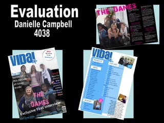
6. This band are represented as bubbly, fun and friendly. They all have smiles on their faces and look as if they are having a good time on the photo shoot. Representation of the females on my front cover as quite powerful but also very casual in their stance. The levels between them show that they are a close band but can be separated and no one is more important then the other. Analysing My Front Cover The writing next to one of the band members introduces the Top 20 bands, this is close to them indicating that they are in the new list and are of high status as a new band. I have them in casual indie clothes as this is the target audience of my magazine is both young male and female indie genre. I believe that from this layout and the style I have designed I have reached my target. I have added promotions for VIP tickets to a new band, which also represents the target audience and theme of my magazine as the band and magazine is in the genre of indie which will make readers want to buy to get the opportunity of winning. A puff is used in the main headline “exclusive” to grab the readers attention of what is to look forward to. Uses and gratifications used here, to inform entertain and escape from the normalities of daily life. I have followed the form with the mast head big bold and making sure that the magazine name is recognisable to everyone so a glimpse of the title and everyone will know what magazine it is. I followed the conventions with using a cover line to attract the readers to a main story and about the people in the image used.
7. I followed the conventions and put the name of he band bold and noticeable on the page. Also putting it on top of the picture by some of the band members indicates that this is the name of the band. I have followed the conventions of having a large photo of the band that is the main story on this front cover to show dominance of the females and the new status owned but the new band. The large photo is the back drop to the magazine cover with everything on top of it which fits well as it all mixes together perfectly. I have followed the conventions of other magazines with the barcode small in the corner of the magazine so it doesn’t block too much of the magazine out but is still noticeable and easy to access when needed. Also following the conventions of a magazine, I have put the issue date and the price of the magazine by the bar code which it is originally found. Its in small writing as I didn’t want it to be too over powering but it is still big enough to read. I chose the name of the band to be “The Dames” as it’s a indie girl band, and “Dames” can be one of two things, a lady of high status as they are knighted by the queen, or a very posh lady of a older age and as this band are young I thought the name would be good as its ironic to the way they are. They are not the ordinary sweet ladies, polite and timid, they like to rock out on stage and blurt out the music and are not posh. The colour of our mast head is in a neutral colour for both male and females. As a pair we decided this because our magazine is aimed at both male and female indie genre and we wanted to use a colour that wasn’t bias to one gender. We chose the style because we believe that this is original and creative and will capture the readers attention.
8. Analysing My Contents Page We decided to keep name of the magazine on the contents page bold and a main feature on the page. Putting the features of the magazine in categories made it easier to section and then was easy to write up the names of the artists and all the topics in the mag. We chose a easy but attractive style for the background that would fit with the colour scheme of the mast head and wouldn’t be too confusing to look at whilst reading the contents. By putting a photo on the contents page with the number indicating the page, breaks it up from just writing and also shows the different styles of how to lay contents and pictures out. By having a female artist here signifies and shows that the magazine is for both genders. By spreading the photos around the page it doesn’t make one section of the page look too busy and cramped. The number in blue also indicated the page number and that this page will be about the boy band shown above. The colour of the numbered pages are in white to stand out on the blue background and also to separate it from the title of the pages. We decided to keep the colour of the titles of the pages blue to keep with the colour scheme but a darker blue to standout on the background. To break up the contents of the pages and the editors column we decided to make the writing in black so that the readers know that this section is different to the titles.
9. Following the conventions of a normal contents page, we kept the mast head the same size and in the left hand corner. By sticking to the form I grouped the topics in the contents making it easier to categorise. Throughout the magazine we kept the writing exactly the same so it looks continuous and doesn’t confuse the reader with too many different fonts. The writing we used was “myriad pro”. We thought that this was a smart and cool to use and would fit well with the magazine and genre. By following the form we kept the editor's column on the contents page. By having a photo above of the editors column, I kept to the conventions to showing who the editor is and how they look. In this photo my editor looks fun by his facial expression but also busy at work editing other things with his laptop in front of him. To make the background look exciting and not too packed and busy, I decided to design the background in two different colours that wouldn’t clash but would go well together so the different blues overlapping went well.
10. To keep it conventional I have the name of the band big over the picture and double page to draw attention to it and make it stand out and recognisable. The photo is large and takes up half of the double page to show the band and it is eye attracting and the title above it is bright which brings out the photo. The colours are contrasting and work well together. The poses of the girls in the band show that they have a laugh and are fun. None of them are dominant to the other as they are all equal and show this in the photo. The text next to the photo is small but easy enough to read. It is a description of the band members, their names and who is sitting where. The writing in bold at the top of the text is conventional like any other magazine as it is a description of the new band and how well they are doing. It is in bold writing to draw attention to it when the reader first starts to read the copy. The text is in blocks which makes it easy to read instead of in an un ordinarily fashion over the page. By sticking to the form, I have taken important and catchy bits out of the copy and made it larger then the rest and more noticeable. Following the conventions of magazines, after a interview there is always a bit added in at the bottom to say thank you for sharing their time.
11. The writing to the right of the photo is in small print so that it doesn’t take up too much room on the page. It is conventional to have this like any other magazine so they people know the names of the members of the band. These few bold lines stand out from the rest and catch the readers eye because if they read one of these lines first and find something funny or interesting it will make them carry on and read the article. The title is in a crazy style but easy to read and eye catching. The colour is in pink as that’s the colour that the band are signified by. Also as it is a gender colour for the female. Having the band do a photo shoot were they are acting crazy and wild shows that they are up for a good time and possibly showing what they are like on stage at a gig by showing their wild side. The location for the shoot was in a school as I wanted to show that they are still young and show their young side but are very mature and independent. The name of the band member that is speaking in the interview is in pink as this goes with the colour scheme also to break up the name from the writing. The difference in colour in the copy is following the form of other magazines which makes it easy to read and to follow. Also it has a good style to it instead of being all blocked together and not knowing who is speaking each time something different is said.
12. From Preliminary to Final Production My Preliminary Magazine Front cover My Final Magazine Cover Production
13. I have improved from my school magazine to my music magazine quite dramatically. I improved my use of graphics a lot as I planned my photo shoot in advance and spent more time trying to capture the right image that I wanted to use. I used better journalism in my final production as I thought about what I wanted to say a lot more and how it would fit with the type of magazine and genre that I was aiming at. The photo editing that I used was a lot better as I found it easier to use as I have worked with Abode Photo shop many times before. This made it easier for me to design my magazine and apply things gradually. The bloging I found easier to use too as I had practise of using it in the preliminary piece. I also improved my skills of knowledge whilst doing the final product because I found it easier to know how to do things as I practised it and did it before in the first product.
14. My Use of Technology To create my magazine I used Abode Photoshop. I clicked on the edit option so that I could edit my photos first and then place everything around it and on top of the image. I used many of these tools on the tool bar to create my magazine. I used the text tool to write the text all over my magazine. I used the dodge tool to lighten any areas of the photo that were too dark. I used the burn tool to make any parts of the photo that was too bright, darker. I used the paint bucket tool to colour the background of my double paged spread. I used the custom shape tool to make the circle for my promotion on the front cover. Also the squares behind the numbers on my contents page. Also I used it to make the shapes behind the headings on my contents page. By using this tool I made the design layout for my background on my contents page. I used the move tool to move around my images and any text or graphics on my magazine pages. I used the hand tool to handle any of the images of graphic and place them in certain positions I used different layers to layer everything on top of the image used and to create my pages.
15. To create the font of the mast head and the name of my band I used a website called dafont which is a very well known font website with free downloads. Whilst on dafont I downloaded the font “eight track” to use as my font for the mast head. Once downloaded I used “eight track” through photo shop to add my mast head in. Whilst on photo shop I filled in the colour to the neutral colour that we chose. I used the font “28 days later” for the title of my band. This I also downloaded from dafont. I changed the colour to the bands logo colour through photo shop. To make my own barcode I typed in make my own bar code into google and I clicked on the second option that appeared. From clicking on this link it leads me to make my own barcode and to do this I wrote the details about me that it asked, it then generated my barcode for me which I used on my magazine front cover.