SlideShare a Scribd company logo
1 of 15
Danielle Campbell 4038 Evaluation


Analysing My Journalism For my journalism I looked at other magazines and the way that they did their  journalisms to see how they represent the band or artist that they are interviewing and from this I found what I was looking for and the type of interview that I would do. I decided that I wanted to go for a friendly approach which would be interesting to read because it would make the interview seem for fun and exciting. I had to think of things that I wanted to ask them and I thought strongly about this and took my time. I decided to talk about them and how they met then move on to the topic of the single and the album they are planning to release. This fits with the conventional interviews as when interviewing a band the interviewer has to ask questions about the music the way they have met.  I also asked about what they are going to be doing for the next year in their busy schedule. Getting to know them a little more is good for journalism because when readers buy the magazine they feel as if they are getting to know the band a little more.
This band are represented as bubbly, fun and friendly. They all have smiles on their faces and look as if they are having a good time on the photo shoot. Representation of the females on my front cover as quite powerful but also very casual in their stance. The levels between them show that they are a close band but can be separated and no one is more important then the other. Analysing My Front Cover The writing next to one of the band members introduces the Top 20 bands, this is close to them indicating that they are in the new list and are of high status as a new band. I have them in casual indie clothes as this is the target audience of my magazine is  both young male and female indie genre. I believe that from this layout and the style I have designed I have reached my target. I have added promotions for VIP tickets to a new band, which also represents the target audience and theme of my magazine as the band and magazine is in the genre of indie which will make readers want to buy to get the opportunity of winning. A puff is used in the main headline “exclusive” to grab the readers attention of what is to look forward to.  Uses and gratifications used here, to inform entertain and escape from the normalities of daily life. I have followed the form with the mast head big bold and making sure that the magazine name is recognisable to everyone so a glimpse of the title and everyone will know what magazine it is.  I followed the conventions with using a cover line to attract the readers to a main story and about the people in the image used.
I followed the conventions and put the name of he band bold and noticeable on the page. Also putting it on top of the picture by some of the band members indicates that this is the name of the band. I have followed the conventions of having a large photo of the band that is the main story on this front cover to show dominance of the females and the new status owned but the new band. The large photo is the back drop to the magazine cover with everything on top of it which fits well as it all mixes together perfectly. I have followed the conventions of other magazines with the barcode small in the corner of the magazine so it doesn’t block too much of the magazine out but is still noticeable and easy to access when needed.  Also following the conventions of a magazine, I have put the issue date and the price of the magazine by the bar code which it is originally found. Its in small writing as I didn’t want it to be too over powering but it is still big enough to read. I chose the name of the band to be “The Dames” as it’s a indie girl band, and “Dames” can be one of two things, a lady of high status as they are knighted by the queen, or a very posh lady of a older age and as this band are young I thought the name would be good as its ironic to the way they are. They are not the ordinary sweet ladies, polite and timid, they like to rock out on stage and blurt out the music and are not posh. The colour of our mast head is in a neutral colour for both male and females. As a pair we decided this because our magazine is aimed at both male and female indie genre and we wanted to use a colour that wasn’t bias to one gender. We chose the style because we believe that this is original and creative and will capture the readers attention.
Analysing  My Contents Page We decided to keep name of the magazine on the contents page bold and a main feature on the page.  Putting the features of the magazine in categories made it easier to section and then was easy to write up the names of the artists and all the topics in the mag.  We chose a easy but attractive style for the background that would fit with the colour scheme of the mast head and wouldn’t be too confusing to look at whilst reading the contents.  By putting a photo on the contents page with the number indicating the page, breaks it up from just writing and also shows the different styles of how to lay contents and pictures out. By having a female artist here signifies and shows that the magazine is for both genders.  By spreading the photos around the page it doesn’t make one section of the page look too busy and cramped. The number in blue also indicated the page number and that this page will be about the boy band shown above. The colour of the numbered pages are in white to stand out on the blue background and also to separate it from the title of the pages. We decided to keep the colour of the titles of the pages blue to keep with the colour scheme but a darker blue to standout on the background. To break up the contents of the pages and the editors column we decided to make the writing in black so that the readers know that this section is different to the titles.
Following the conventions of a normal contents page, we kept the mast head the same size and in the left hand corner.  By sticking to the form I grouped the topics in the contents making it easier to categorise.  Throughout the magazine we kept the writing exactly the same so it looks continuous and doesn’t confuse the reader with too many different fonts.  The writing we used was “myriad pro”. We thought that this was a smart and cool to use and would fit well with the magazine and genre.  By following the form we kept the editor's column on the contents page.  By having a  photo above of the editors column, I kept to the conventions to showing who the editor is and how they look. In this photo my editor looks fun by his facial expression but also busy at work editing other things with his laptop in front of him. To make the background look exciting and not too packed and busy, I decided to design the background in two different colours that wouldn’t clash but would go well together so the different blues overlapping went well.
To keep it conventional I have the name of the band big over the picture and double page to draw attention to it and make it stand out and recognisable. The photo is large and takes up half of the double page to show the band and it is eye attracting and the title above it is bright which brings out the photo. The colours are contrasting and work well together. The poses of the girls in the band show that they have a laugh and are fun. None of them are dominant to the other as they are all equal and show this in the photo.  The text next to the photo is small but easy enough to read. It is a description of the band members, their names and who is sitting where. The writing in bold at the top of the text is conventional like any other magazine as it is a description of the new band and how well they are doing. It is in bold writing to draw attention to it when the reader first starts to read the copy. The text is in blocks which makes it easy to read instead of in an un ordinarily fashion over the page. By sticking to the form, I have taken important and catchy bits out of the copy and made it larger then the rest and more noticeable.  Following the conventions of magazines, after a interview there is always a bit added in at the bottom to say thank you for sharing their time.
The writing to the right of the photo is in small print so that it doesn’t take up too much room on the page. It is conventional to have this like any other magazine so they people know the names of the members of the band. These few bold lines stand out from the rest and catch the readers eye because if they read one of these lines first and find something funny or interesting it will make them carry on and read the article. The title is in a crazy style but easy to read and eye catching. The colour is in pink as that’s the colour that the band are signified by. Also as it is a gender colour for the female.  Having the band do a photo shoot were they are acting crazy and wild shows that they are up for a good time and possibly showing what they are like on stage at a gig by showing their wild side. The location for the shoot was in a school as I wanted to show that they are still young and show their young side but are very mature and independent.  The name of the band member that is speaking in the interview is in pink as this goes with the colour scheme also to break up the name from the writing.  The difference in colour in the copy is following the form of other magazines which makes it easy to read  and to follow. Also it has a good style to it instead of being all blocked together and not knowing who is speaking each time something different is said.
From Preliminary to Final Production My Preliminary Magazine Front cover  My Final Magazine Cover Production
I have improved from my school magazine to my music magazine quite dramatically.  I improved my use of graphics a lot as I planned my photo shoot in advance and spent more time trying to capture the right image that I wanted to use. I used better journalism in my final production as I thought about what I wanted to say a lot more and how it would fit with the type of magazine and genre that I was aiming at. The photo editing that I used was a lot better as I found it easier to use as I have worked with Abode Photo shop many times before. This made it easier for me to design my magazine and apply things gradually. The bloging I found easier to use too as I had practise of using it in the preliminary piece.  I also improved my skills of knowledge whilst doing the final product because I found it easier to know how to do things as I practised it and did it before in the first product.
My Use of Technology  To create my magazine I used Abode Photoshop. I clicked on the edit option so that I could edit my photos first and then place everything around it and on top of the image. I used many of these tools on the tool bar to create my magazine. I used the text tool to write the text all over my magazine.  I used the dodge tool to lighten any areas of the photo that were too dark. I used the burn tool to make any parts of the photo that was too bright, darker.  I used the paint bucket tool to colour the background of my double paged spread. I used the custom shape tool to make the circle for my promotion on the front cover. Also the squares behind the numbers on my contents page. Also I used it to make the shapes behind the headings on my contents page. By using this tool I made the design layout for my background on my contents page. I used the move tool to move around my images and any text or graphics on my magazine pages. I used the hand tool to handle any of the images of graphic and place them in certain positions  I used different layers to layer everything on top of the image used and to create my pages.
To create the font of the mast head and the name of my band I used a website called dafont which is a very well known font website with free downloads. Whilst on dafont I downloaded the font “eight track” to use as my font for the mast head. Once downloaded I used “eight track” through photo shop to add my mast head in. Whilst on photo shop I filled in the colour to the neutral colour that we chose.  I used the font “28 days later” for the title of my band. This I also downloaded from dafont. I changed the colour to the bands logo colour through photo shop. To make my own barcode I typed in make my own bar code into google and I clicked on the second  option that appeared. From clicking on this link it leads me to make my own barcode and to do this I wrote the details about me that it asked, it then generated my barcode for me which I used on my magazine front cover.

More Related Content

What's hot

My Music magazine project
My Music magazine projectMy Music magazine project
My Music magazine projectMeganLydia
 
Magazine Analysis
Magazine AnalysisMagazine Analysis
Magazine AnalysisChantalTaylor
 
Media Studies - In what ways does your media product use, develop or challeng...
Media Studies - In what ways does your media product use, develop or challeng...Media Studies - In what ways does your media product use, develop or challeng...
Media Studies - In what ways does your media product use, develop or challeng...Sana Khurshid
 
Media vibe1 2
Media vibe1 2Media vibe1 2
Media vibe1 2ammz786
 
Textual analysis presentation
Textual analysis presentationTextual analysis presentation
Textual analysis presentationDarbySavage
 
Evaluation
EvaluationEvaluation
Evaluationblack-bird
 
Music magazine evaluation 3
Music magazine evaluation 3Music magazine evaluation 3
Music magazine evaluation 3Kiran Jandu
 
How did I attract/address my audience?
How did I attract/address my audience?How did I attract/address my audience?
How did I attract/address my audience?tashaay27
 
Evaluation:
Evaluation:Evaluation:
Evaluation:07tjames
 
Magazines in the uk
Magazines in the uk Magazines in the uk
Magazines in the uk Hannah-cowling
 
Continuation of Question 1.
Continuation of Question 1.Continuation of Question 1.
Continuation of Question 1.bernadineshaw96
 
Music Magazine analysis
Music Magazine analysisMusic Magazine analysis
Music Magazine analysislouisaelena
 
Research final
Research final Research final
Research final Tom Batty
 
Music mag evaluation
Music mag evaluationMusic mag evaluation
Music mag evaluationjohanna-asmedia
 
Music magazine evaluation complete email
Music magazine evaluation complete emailMusic magazine evaluation complete email
Music magazine evaluation complete emailJoe Barron
 
In what ways does your media product use, develop or challenge forms and conv...
In what ways does your media product use, develop or challenge forms and conv...In what ways does your media product use, develop or challenge forms and conv...
In what ways does your media product use, develop or challenge forms and conv...charlotte_abbott
 
Evalutation
EvalutationEvalutation
EvalutationLaura Jones
 

What's hot (17)

My Music magazine project
My Music magazine projectMy Music magazine project
My Music magazine project
 
Magazine Analysis
Magazine AnalysisMagazine Analysis
Magazine Analysis
 
Media Studies - In what ways does your media product use, develop or challeng...
Media Studies - In what ways does your media product use, develop or challeng...Media Studies - In what ways does your media product use, develop or challeng...
Media Studies - In what ways does your media product use, develop or challeng...
 
Media vibe1 2
Media vibe1 2Media vibe1 2
Media vibe1 2
 
Textual analysis presentation
Textual analysis presentationTextual analysis presentation
Textual analysis presentation
 
Evaluation
EvaluationEvaluation
Evaluation
 
Music magazine evaluation 3
Music magazine evaluation 3Music magazine evaluation 3
Music magazine evaluation 3
 
How did I attract/address my audience?
How did I attract/address my audience?How did I attract/address my audience?
How did I attract/address my audience?
 
Evaluation:
Evaluation:Evaluation:
Evaluation:
 
Magazines in the uk
Magazines in the uk Magazines in the uk
Magazines in the uk
 
Continuation of Question 1.
Continuation of Question 1.Continuation of Question 1.
Continuation of Question 1.
 
Music Magazine analysis
Music Magazine analysisMusic Magazine analysis
Music Magazine analysis
 
Research final
Research final Research final
Research final
 
Music mag evaluation
Music mag evaluationMusic mag evaluation
Music mag evaluation
 
Music magazine evaluation complete email
Music magazine evaluation complete emailMusic magazine evaluation complete email
Music magazine evaluation complete email
 
In what ways does your media product use, develop or challenge forms and conv...
In what ways does your media product use, develop or challenge forms and conv...In what ways does your media product use, develop or challenge forms and conv...
In what ways does your media product use, develop or challenge forms and conv...
 
Evalutation
EvalutationEvalutation
Evalutation
 

Viewers also liked

Rule number 2 studland
Rule number 2 studlandRule number 2 studland
Rule number 2 studlandguestae69189
 
Career
CareerCareer
CareerSuresh Gn
 
How did your camera
How did your cameraHow did your camera
How did your cameraFrankieTankie
 
Aurkezpena1
Aurkezpena1Aurkezpena1
Aurkezpena1annenoa
 
Evaluation presentation
Evaluation presentationEvaluation presentation
Evaluation presentationFrankieTankie
 
How did you attract address the audience
How did you attract address the audienceHow did you attract address the audience
How did you attract address the audienceFrankieTankie
 
World Web Network Corporate Presentation
World Web Network Corporate PresentationWorld Web Network Corporate Presentation
World Web Network Corporate PresentationWorld Web Network
 
Brochure for aetna
Brochure for aetnaBrochure for aetna
Brochure for aetnaguest0d4a93
 
Evaluation presentation
Evaluation presentationEvaluation presentation
Evaluation presentationFrankieTankie
 
Application blue cross adv and choice
Application blue cross adv and choiceApplication blue cross adv and choice
Application blue cross adv and choiceguest0d4a93
 
Evaluation on photography
Evaluation on photographyEvaluation on photography
Evaluation on photographyFrankieTankie
 

Viewers also liked (14)

Rule number 2 studland
Rule number 2 studlandRule number 2 studland
Rule number 2 studland
 
Career
CareerCareer
Career
 
How did your camera
How did your cameraHow did your camera
How did your camera
 
Aurkezpena1
Aurkezpena1Aurkezpena1
Aurkezpena1
 
Evaluation presentation
Evaluation presentationEvaluation presentation
Evaluation presentation
 
How did you attract address the audience
How did you attract address the audienceHow did you attract address the audience
How did you attract address the audience
 
World Web Network Corporate Presentation
World Web Network Corporate PresentationWorld Web Network Corporate Presentation
World Web Network Corporate Presentation
 
Brochure for aetna
Brochure for aetnaBrochure for aetna
Brochure for aetna
 
Q 1 part 1
Q 1 part 1Q 1 part 1
Q 1 part 1
 
Q1 part 2
Q1 part 2Q1 part 2
Q1 part 2
 
Evaluation presentation
Evaluation presentationEvaluation presentation
Evaluation presentation
 
Application blue cross adv and choice
Application blue cross adv and choiceApplication blue cross adv and choice
Application blue cross adv and choice
 
Q1 part 3
Q1 part 3Q1 part 3
Q1 part 3
 
Evaluation on photography
Evaluation on photographyEvaluation on photography
Evaluation on photography
 

Similar to E:\media\evaluation

Shannons Evaluation
Shannons EvaluationShannons Evaluation
Shannons Evaluationgranshan06
 
Media evaluation proper
Media evaluation properMedia evaluation proper
Media evaluation properasmediaellie
 
Evaluation
EvaluationEvaluation
Evaluationblack-bird
 
Presentation1 music magazine (4)
Presentation1 music magazine (4)Presentation1 music magazine (4)
Presentation1 music magazine (4)billiewilson_
 
Presentation1 music magazine (4)
Presentation1 music magazine (4)Presentation1 music magazine (4)
Presentation1 music magazine (4)billiewilson_
 
Presentation1 music magazine (4) (1)
Presentation1 music magazine (4) (1)Presentation1 music magazine (4) (1)
Presentation1 music magazine (4) (1)billiewilson_
 
Making of my magazine
Making of my magazineMaking of my magazine
Making of my magazinebilliewilson_
 
My evaluation
My evaluationMy evaluation
My evaluationKaris Hays
 
My evaluation
My evaluationMy evaluation
My evaluationKaris Hays
 
Evaluation, 1
Evaluation, 1Evaluation, 1
Evaluation, 1PopSap
 
Evaluation 5
Evaluation 5Evaluation 5
Evaluation 5asmediag12
 
Evaluation[1]
Evaluation[1]Evaluation[1]
Evaluation[1]guest90eaa03
 
Megan Howarth media AS evaluation
Megan Howarth  media AS evaluationMegan Howarth  media AS evaluation
Megan Howarth media AS evaluationablizz
 
Generationpresentation
GenerationpresentationGenerationpresentation
GenerationpresentationBeckie Wickham
 
41 Evaluation
41  Evaluation41  Evaluation
41 EvaluationJordan
 
Research and planning all 3
Research and planning all 3Research and planning all 3
Research and planning all 3ReecebahiaGAD
 
Evaluation copy
Evaluation copyEvaluation copy
Evaluation copyThisIsBilly_
 

Similar to E:\media\evaluation (20)

Shannons Evaluation
Shannons EvaluationShannons Evaluation
Shannons Evaluation
 
Media evaluation proper
Media evaluation properMedia evaluation proper
Media evaluation proper
 
Evaluation
EvaluationEvaluation
Evaluation
 
Evaluation
EvaluationEvaluation
Evaluation
 
Presentation1 music magazine (4)
Presentation1 music magazine (4)Presentation1 music magazine (4)
Presentation1 music magazine (4)
 
Presentation1 music magazine (4)
Presentation1 music magazine (4)Presentation1 music magazine (4)
Presentation1 music magazine (4)
 
Presentation1 music magazine (4) (1)
Presentation1 music magazine (4) (1)Presentation1 music magazine (4) (1)
Presentation1 music magazine (4) (1)
 
Making of my magazine
Making of my magazineMaking of my magazine
Making of my magazine
 
Evaluation
EvaluationEvaluation
Evaluation
 
My evaluation
My evaluationMy evaluation
My evaluation
 
My evaluation
My evaluationMy evaluation
My evaluation
 
Evaluation, 1
Evaluation, 1Evaluation, 1
Evaluation, 1
 
Evaluation 5
Evaluation 5Evaluation 5
Evaluation 5
 
Evaluation
EvaluationEvaluation
Evaluation
 
Evaluation[1]
Evaluation[1]Evaluation[1]
Evaluation[1]
 
Megan Howarth media AS evaluation
Megan Howarth  media AS evaluationMegan Howarth  media AS evaluation
Megan Howarth media AS evaluation
 
Generationpresentation
GenerationpresentationGenerationpresentation
Generationpresentation
 
41 Evaluation
41  Evaluation41  Evaluation
41 Evaluation
 
Research and planning all 3
Research and planning all 3Research and planning all 3
Research and planning all 3
 
Evaluation copy
Evaluation copyEvaluation copy
Evaluation copy
 

Recently uploaded

CARE OF CHILD IN INCUBATOR..........pptx
CARE OF CHILD IN INCUBATOR..........pptxCARE OF CHILD IN INCUBATOR..........pptx
CARE OF CHILD IN INCUBATOR..........pptxGaneshChakor2
 
Kisan Call Centre - To harness potential of ICT in Agriculture by answer farm...
Kisan Call Centre - To harness potential of ICT in Agriculture by answer farm...Kisan Call Centre - To harness potential of ICT in Agriculture by answer farm...
Kisan Call Centre - To harness potential of ICT in Agriculture by answer farm...Krashi Coaching
 
Accessible design: Minimum effort, maximum impact
Accessible design: Minimum effort, maximum impactAccessible design: Minimum effort, maximum impact
Accessible design: Minimum effort, maximum impactdawncurless
 
The Most Excellent Way | 1 Corinthians 13
The Most Excellent Way | 1 Corinthians 13The Most Excellent Way | 1 Corinthians 13
The Most Excellent Way | 1 Corinthians 13Steve Thomason
 
SOCIAL AND HISTORICAL CONTEXT - LFTVD.pptx
SOCIAL AND HISTORICAL CONTEXT - LFTVD.pptxSOCIAL AND HISTORICAL CONTEXT - LFTVD.pptx
SOCIAL AND HISTORICAL CONTEXT - LFTVD.pptxiammrhaywood
 
Russian Call Girls in Andheri Airport Mumbai WhatsApp 9167673311 đź’ž Full Nigh...
Russian Call Girls in Andheri Airport Mumbai WhatsApp  9167673311 đź’ž Full Nigh...Russian Call Girls in Andheri Airport Mumbai WhatsApp  9167673311 đź’ž Full Nigh...
Russian Call Girls in Andheri Airport Mumbai WhatsApp 9167673311 đź’ž Full Nigh...Pooja Nehwal
 
Sports & Fitness Value Added Course FY..
Sports & Fitness Value Added Course FY..Sports & Fitness Value Added Course FY..
Sports & Fitness Value Added Course FY..Disha Kariya
 
Grant Readiness 101 TechSoup and Remy Consulting
Grant Readiness 101 TechSoup and Remy ConsultingGrant Readiness 101 TechSoup and Remy Consulting
Grant Readiness 101 TechSoup and Remy ConsultingTechSoup
 
The byproduct of sericulture in different industries.pptx
The byproduct of sericulture in different industries.pptxThe byproduct of sericulture in different industries.pptx
The byproduct of sericulture in different industries.pptxShobhayan Kirtania
 
Presentation by Andreas Schleicher Tackling the School Absenteeism Crisis 30 ...
Presentation by Andreas Schleicher Tackling the School Absenteeism Crisis 30 ...Presentation by Andreas Schleicher Tackling the School Absenteeism Crisis 30 ...
Presentation by Andreas Schleicher Tackling the School Absenteeism Crisis 30 ...EduSkills OECD
 
Interactive Powerpoint_How to Master effective communication
Interactive Powerpoint_How to Master effective communicationInteractive Powerpoint_How to Master effective communication
Interactive Powerpoint_How to Master effective communicationnomboosow
 
Software Engineering Methodologies (overview)
Software Engineering Methodologies (overview)Software Engineering Methodologies (overview)
Software Engineering Methodologies (overview)eniolaolutunde
 
The basics of sentences session 2pptx copy.pptx
The basics of sentences session 2pptx copy.pptxThe basics of sentences session 2pptx copy.pptx
The basics of sentences session 2pptx copy.pptxheathfieldcps1
 
1029 - Danh muc Sach Giao Khoa 10 . pdf
1029 -  Danh muc Sach Giao Khoa 10 . pdf1029 -  Danh muc Sach Giao Khoa 10 . pdf
1029 - Danh muc Sach Giao Khoa 10 . pdfQucHHunhnh
 
APM Welcome, APM North West Network Conference, Synergies Across Sectors
APM Welcome, APM North West Network Conference, Synergies Across SectorsAPM Welcome, APM North West Network Conference, Synergies Across Sectors
APM Welcome, APM North West Network Conference, Synergies Across SectorsAssociation for Project Management
 
Student login on Anyboli platform.helpin
Student login on Anyboli platform.helpinStudent login on Anyboli platform.helpin
Student login on Anyboli platform.helpinRaunakKeshri1
 
BAG TECHNIQUE Bag technique-a tool making use of public health bag through wh...
BAG TECHNIQUE Bag technique-a tool making use of public health bag through wh...BAG TECHNIQUE Bag technique-a tool making use of public health bag through wh...
BAG TECHNIQUE Bag technique-a tool making use of public health bag through wh...Sapna Thakur
 
Ecosystem Interactions Class Discussion Presentation in Blue Green Lined Styl...
Ecosystem Interactions Class Discussion Presentation in Blue Green Lined Styl...Ecosystem Interactions Class Discussion Presentation in Blue Green Lined Styl...
Ecosystem Interactions Class Discussion Presentation in Blue Green Lined Styl...fonyou31
 
Z Score,T Score, Percential Rank and Box Plot Graph
Z Score,T Score, Percential Rank and Box Plot GraphZ Score,T Score, Percential Rank and Box Plot Graph
Z Score,T Score, Percential Rank and Box Plot GraphThiyagu K
 
Paris 2024 Olympic Geographies - an activity
Paris 2024 Olympic Geographies - an activityParis 2024 Olympic Geographies - an activity
Paris 2024 Olympic Geographies - an activityGeoBlogs
 

Recently uploaded (20)

CARE OF CHILD IN INCUBATOR..........pptx
CARE OF CHILD IN INCUBATOR..........pptxCARE OF CHILD IN INCUBATOR..........pptx
CARE OF CHILD IN INCUBATOR..........pptx
 
Kisan Call Centre - To harness potential of ICT in Agriculture by answer farm...
Kisan Call Centre - To harness potential of ICT in Agriculture by answer farm...Kisan Call Centre - To harness potential of ICT in Agriculture by answer farm...
Kisan Call Centre - To harness potential of ICT in Agriculture by answer farm...
 
Accessible design: Minimum effort, maximum impact
Accessible design: Minimum effort, maximum impactAccessible design: Minimum effort, maximum impact
Accessible design: Minimum effort, maximum impact
 
The Most Excellent Way | 1 Corinthians 13
The Most Excellent Way | 1 Corinthians 13The Most Excellent Way | 1 Corinthians 13
The Most Excellent Way | 1 Corinthians 13
 
SOCIAL AND HISTORICAL CONTEXT - LFTVD.pptx
SOCIAL AND HISTORICAL CONTEXT - LFTVD.pptxSOCIAL AND HISTORICAL CONTEXT - LFTVD.pptx
SOCIAL AND HISTORICAL CONTEXT - LFTVD.pptx
 
Russian Call Girls in Andheri Airport Mumbai WhatsApp 9167673311 đź’ž Full Nigh...
Russian Call Girls in Andheri Airport Mumbai WhatsApp  9167673311 đź’ž Full Nigh...Russian Call Girls in Andheri Airport Mumbai WhatsApp  9167673311 đź’ž Full Nigh...
Russian Call Girls in Andheri Airport Mumbai WhatsApp 9167673311 đź’ž Full Nigh...
 
Sports & Fitness Value Added Course FY..
Sports & Fitness Value Added Course FY..Sports & Fitness Value Added Course FY..
Sports & Fitness Value Added Course FY..
 
Grant Readiness 101 TechSoup and Remy Consulting
Grant Readiness 101 TechSoup and Remy ConsultingGrant Readiness 101 TechSoup and Remy Consulting
Grant Readiness 101 TechSoup and Remy Consulting
 
The byproduct of sericulture in different industries.pptx
The byproduct of sericulture in different industries.pptxThe byproduct of sericulture in different industries.pptx
The byproduct of sericulture in different industries.pptx
 
Presentation by Andreas Schleicher Tackling the School Absenteeism Crisis 30 ...
Presentation by Andreas Schleicher Tackling the School Absenteeism Crisis 30 ...Presentation by Andreas Schleicher Tackling the School Absenteeism Crisis 30 ...
Presentation by Andreas Schleicher Tackling the School Absenteeism Crisis 30 ...
 
Interactive Powerpoint_How to Master effective communication
Interactive Powerpoint_How to Master effective communicationInteractive Powerpoint_How to Master effective communication
Interactive Powerpoint_How to Master effective communication
 
Software Engineering Methodologies (overview)
Software Engineering Methodologies (overview)Software Engineering Methodologies (overview)
Software Engineering Methodologies (overview)
 
The basics of sentences session 2pptx copy.pptx
The basics of sentences session 2pptx copy.pptxThe basics of sentences session 2pptx copy.pptx
The basics of sentences session 2pptx copy.pptx
 
1029 - Danh muc Sach Giao Khoa 10 . pdf
1029 -  Danh muc Sach Giao Khoa 10 . pdf1029 -  Danh muc Sach Giao Khoa 10 . pdf
1029 - Danh muc Sach Giao Khoa 10 . pdf
 
APM Welcome, APM North West Network Conference, Synergies Across Sectors
APM Welcome, APM North West Network Conference, Synergies Across SectorsAPM Welcome, APM North West Network Conference, Synergies Across Sectors
APM Welcome, APM North West Network Conference, Synergies Across Sectors
 
Student login on Anyboli platform.helpin
Student login on Anyboli platform.helpinStudent login on Anyboli platform.helpin
Student login on Anyboli platform.helpin
 
BAG TECHNIQUE Bag technique-a tool making use of public health bag through wh...
BAG TECHNIQUE Bag technique-a tool making use of public health bag through wh...BAG TECHNIQUE Bag technique-a tool making use of public health bag through wh...
BAG TECHNIQUE Bag technique-a tool making use of public health bag through wh...
 
Ecosystem Interactions Class Discussion Presentation in Blue Green Lined Styl...
Ecosystem Interactions Class Discussion Presentation in Blue Green Lined Styl...Ecosystem Interactions Class Discussion Presentation in Blue Green Lined Styl...
Ecosystem Interactions Class Discussion Presentation in Blue Green Lined Styl...
 
Z Score,T Score, Percential Rank and Box Plot Graph
Z Score,T Score, Percential Rank and Box Plot GraphZ Score,T Score, Percential Rank and Box Plot Graph
Z Score,T Score, Percential Rank and Box Plot Graph
 
Paris 2024 Olympic Geographies - an activity
Paris 2024 Olympic Geographies - an activityParis 2024 Olympic Geographies - an activity
Paris 2024 Olympic Geographies - an activity
 

E:\media\evaluation

  • 5. Analysing My Journalism For my journalism I looked at other magazines and the way that they did their journalisms to see how they represent the band or artist that they are interviewing and from this I found what I was looking for and the type of interview that I would do. I decided that I wanted to go for a friendly approach which would be interesting to read because it would make the interview seem for fun and exciting. I had to think of things that I wanted to ask them and I thought strongly about this and took my time. I decided to talk about them and how they met then move on to the topic of the single and the album they are planning to release. This fits with the conventional interviews as when interviewing a band the interviewer has to ask questions about the music the way they have met. I also asked about what they are going to be doing for the next year in their busy schedule. Getting to know them a little more is good for journalism because when readers buy the magazine they feel as if they are getting to know the band a little more.
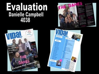
  • 6. This band are represented as bubbly, fun and friendly. They all have smiles on their faces and look as if they are having a good time on the photo shoot. Representation of the females on my front cover as quite powerful but also very casual in their stance. The levels between them show that they are a close band but can be separated and no one is more important then the other. Analysing My Front Cover The writing next to one of the band members introduces the Top 20 bands, this is close to them indicating that they are in the new list and are of high status as a new band. I have them in casual indie clothes as this is the target audience of my magazine is both young male and female indie genre. I believe that from this layout and the style I have designed I have reached my target. I have added promotions for VIP tickets to a new band, which also represents the target audience and theme of my magazine as the band and magazine is in the genre of indie which will make readers want to buy to get the opportunity of winning. A puff is used in the main headline “exclusive” to grab the readers attention of what is to look forward to. Uses and gratifications used here, to inform entertain and escape from the normalities of daily life. I have followed the form with the mast head big bold and making sure that the magazine name is recognisable to everyone so a glimpse of the title and everyone will know what magazine it is. I followed the conventions with using a cover line to attract the readers to a main story and about the people in the image used.
  • 7. I followed the conventions and put the name of he band bold and noticeable on the page. Also putting it on top of the picture by some of the band members indicates that this is the name of the band. I have followed the conventions of having a large photo of the band that is the main story on this front cover to show dominance of the females and the new status owned but the new band. The large photo is the back drop to the magazine cover with everything on top of it which fits well as it all mixes together perfectly. I have followed the conventions of other magazines with the barcode small in the corner of the magazine so it doesn’t block too much of the magazine out but is still noticeable and easy to access when needed. Also following the conventions of a magazine, I have put the issue date and the price of the magazine by the bar code which it is originally found. Its in small writing as I didn’t want it to be too over powering but it is still big enough to read. I chose the name of the band to be “The Dames” as it’s a indie girl band, and “Dames” can be one of two things, a lady of high status as they are knighted by the queen, or a very posh lady of a older age and as this band are young I thought the name would be good as its ironic to the way they are. They are not the ordinary sweet ladies, polite and timid, they like to rock out on stage and blurt out the music and are not posh. The colour of our mast head is in a neutral colour for both male and females. As a pair we decided this because our magazine is aimed at both male and female indie genre and we wanted to use a colour that wasn’t bias to one gender. We chose the style because we believe that this is original and creative and will capture the readers attention.
  • 8. Analysing My Contents Page We decided to keep name of the magazine on the contents page bold and a main feature on the page. Putting the features of the magazine in categories made it easier to section and then was easy to write up the names of the artists and all the topics in the mag. We chose a easy but attractive style for the background that would fit with the colour scheme of the mast head and wouldn’t be too confusing to look at whilst reading the contents. By putting a photo on the contents page with the number indicating the page, breaks it up from just writing and also shows the different styles of how to lay contents and pictures out. By having a female artist here signifies and shows that the magazine is for both genders. By spreading the photos around the page it doesn’t make one section of the page look too busy and cramped. The number in blue also indicated the page number and that this page will be about the boy band shown above. The colour of the numbered pages are in white to stand out on the blue background and also to separate it from the title of the pages. We decided to keep the colour of the titles of the pages blue to keep with the colour scheme but a darker blue to standout on the background. To break up the contents of the pages and the editors column we decided to make the writing in black so that the readers know that this section is different to the titles.
  • 9. Following the conventions of a normal contents page, we kept the mast head the same size and in the left hand corner. By sticking to the form I grouped the topics in the contents making it easier to categorise. Throughout the magazine we kept the writing exactly the same so it looks continuous and doesn’t confuse the reader with too many different fonts. The writing we used was “myriad pro”. We thought that this was a smart and cool to use and would fit well with the magazine and genre. By following the form we kept the editor's column on the contents page. By having a photo above of the editors column, I kept to the conventions to showing who the editor is and how they look. In this photo my editor looks fun by his facial expression but also busy at work editing other things with his laptop in front of him. To make the background look exciting and not too packed and busy, I decided to design the background in two different colours that wouldn’t clash but would go well together so the different blues overlapping went well.
  • 10. To keep it conventional I have the name of the band big over the picture and double page to draw attention to it and make it stand out and recognisable. The photo is large and takes up half of the double page to show the band and it is eye attracting and the title above it is bright which brings out the photo. The colours are contrasting and work well together. The poses of the girls in the band show that they have a laugh and are fun. None of them are dominant to the other as they are all equal and show this in the photo. The text next to the photo is small but easy enough to read. It is a description of the band members, their names and who is sitting where. The writing in bold at the top of the text is conventional like any other magazine as it is a description of the new band and how well they are doing. It is in bold writing to draw attention to it when the reader first starts to read the copy. The text is in blocks which makes it easy to read instead of in an un ordinarily fashion over the page. By sticking to the form, I have taken important and catchy bits out of the copy and made it larger then the rest and more noticeable. Following the conventions of magazines, after a interview there is always a bit added in at the bottom to say thank you for sharing their time.
  • 11. The writing to the right of the photo is in small print so that it doesn’t take up too much room on the page. It is conventional to have this like any other magazine so they people know the names of the members of the band. These few bold lines stand out from the rest and catch the readers eye because if they read one of these lines first and find something funny or interesting it will make them carry on and read the article. The title is in a crazy style but easy to read and eye catching. The colour is in pink as that’s the colour that the band are signified by. Also as it is a gender colour for the female. Having the band do a photo shoot were they are acting crazy and wild shows that they are up for a good time and possibly showing what they are like on stage at a gig by showing their wild side. The location for the shoot was in a school as I wanted to show that they are still young and show their young side but are very mature and independent. The name of the band member that is speaking in the interview is in pink as this goes with the colour scheme also to break up the name from the writing. The difference in colour in the copy is following the form of other magazines which makes it easy to read and to follow. Also it has a good style to it instead of being all blocked together and not knowing who is speaking each time something different is said.
  • 12. From Preliminary to Final Production My Preliminary Magazine Front cover My Final Magazine Cover Production
  • 13. I have improved from my school magazine to my music magazine quite dramatically. I improved my use of graphics a lot as I planned my photo shoot in advance and spent more time trying to capture the right image that I wanted to use. I used better journalism in my final production as I thought about what I wanted to say a lot more and how it would fit with the type of magazine and genre that I was aiming at. The photo editing that I used was a lot better as I found it easier to use as I have worked with Abode Photo shop many times before. This made it easier for me to design my magazine and apply things gradually. The bloging I found easier to use too as I had practise of using it in the preliminary piece. I also improved my skills of knowledge whilst doing the final product because I found it easier to know how to do things as I practised it and did it before in the first product.
  • 14. My Use of Technology To create my magazine I used Abode Photoshop. I clicked on the edit option so that I could edit my photos first and then place everything around it and on top of the image. I used many of these tools on the tool bar to create my magazine. I used the text tool to write the text all over my magazine. I used the dodge tool to lighten any areas of the photo that were too dark. I used the burn tool to make any parts of the photo that was too bright, darker. I used the paint bucket tool to colour the background of my double paged spread. I used the custom shape tool to make the circle for my promotion on the front cover. Also the squares behind the numbers on my contents page. Also I used it to make the shapes behind the headings on my contents page. By using this tool I made the design layout for my background on my contents page. I used the move tool to move around my images and any text or graphics on my magazine pages. I used the hand tool to handle any of the images of graphic and place them in certain positions I used different layers to layer everything on top of the image used and to create my pages.
  • 15. To create the font of the mast head and the name of my band I used a website called dafont which is a very well known font website with free downloads. Whilst on dafont I downloaded the font “eight track” to use as my font for the mast head. Once downloaded I used “eight track” through photo shop to add my mast head in. Whilst on photo shop I filled in the colour to the neutral colour that we chose. I used the font “28 days later” for the title of my band. This I also downloaded from dafont. I changed the colour to the bands logo colour through photo shop. To make my own barcode I typed in make my own bar code into google and I clicked on the second option that appeared. From clicking on this link it leads me to make my own barcode and to do this I wrote the details about me that it asked, it then generated my barcode for me which I used on my magazine front cover.